Fabulous English Kitchen Designs
Guild Anderson Furniture celebrate their fifteenth anniversary this year. Launched in 2003 by Nick and Hannah Anderson, this story is one of British entrepreneurial success. Founded in parallel with bringing up their young family, Guild Anderson started out like many business ventures in small premises on the family farm. Today, the company is split between the new Design Studio in Tisbury for our admin and design teams, and a busy workshop for our craftsmen and operations based on the Fonthill Estate in Wiltshire .
Nick remains personally involved in every project, meeting new customers and interpreting hopes and wishes into final designs. His energy and positive nature is one of the secrets behind Guild Anderson’s success. As an independent business, the workshop remains light on its feet and responds well to client requests and ideas as projects progress. Described by clients as ‘a hidden gem’, the workshop evidently strikes the right balance on quality, price and understated but elegant design work.
Cottage kitchen
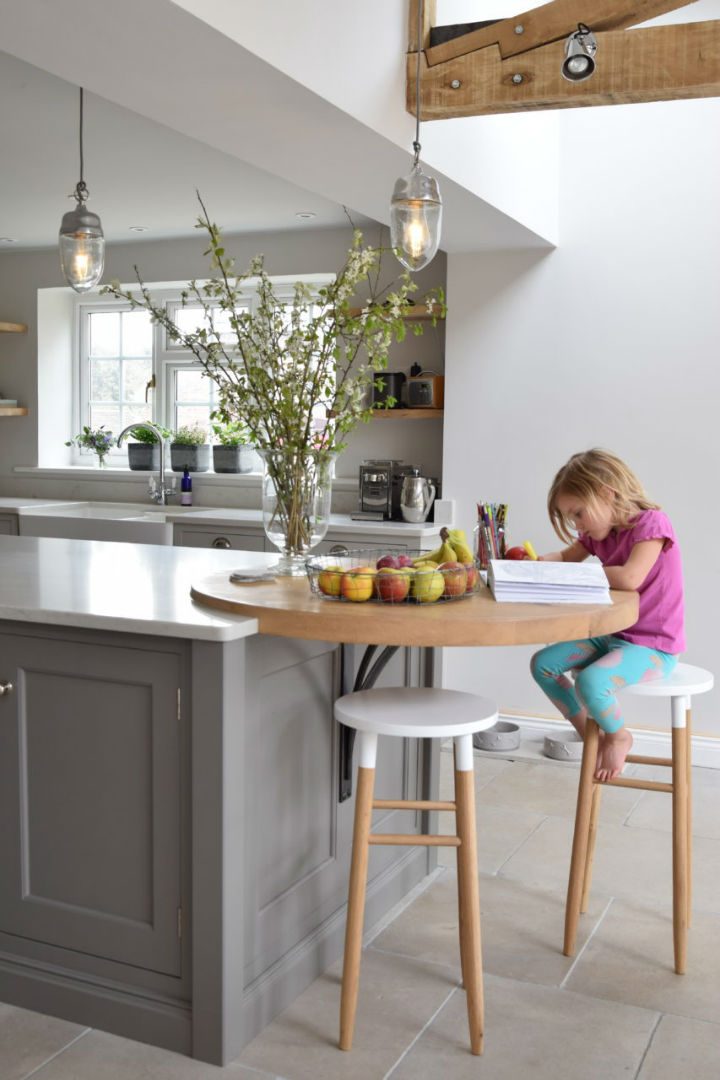
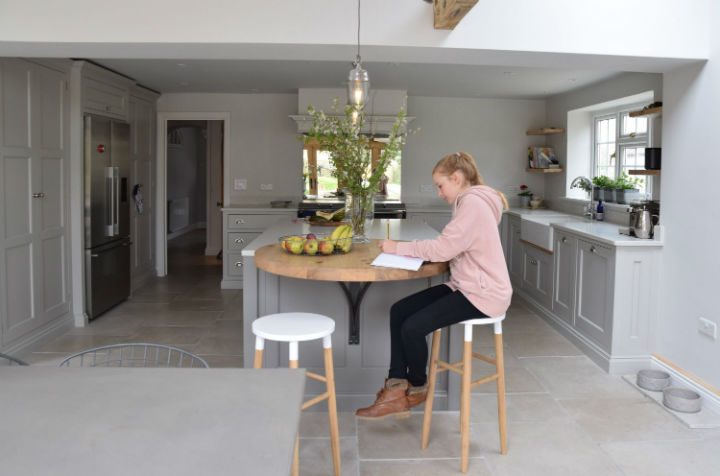
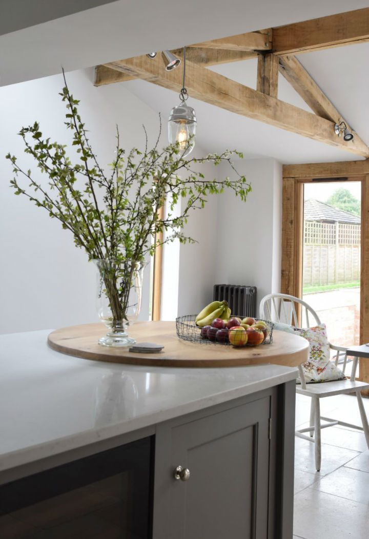
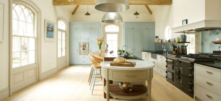
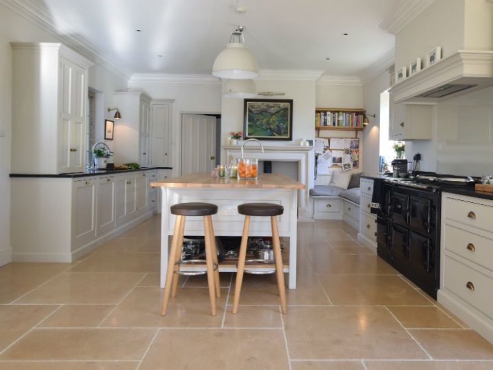
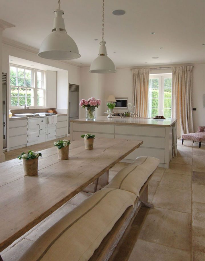
The addition of a new extension and a Guild Anderson kitchen for this cottage in the Wylye Valley has completely changed how this young family live, where they were once crushed into a tiny cottage kitchen with a hot Aga they now have a lovely light and spacious family room that as well as being a kitchen serves as a place to entertain, for the girls to do their art in and of course to cook and eat in.
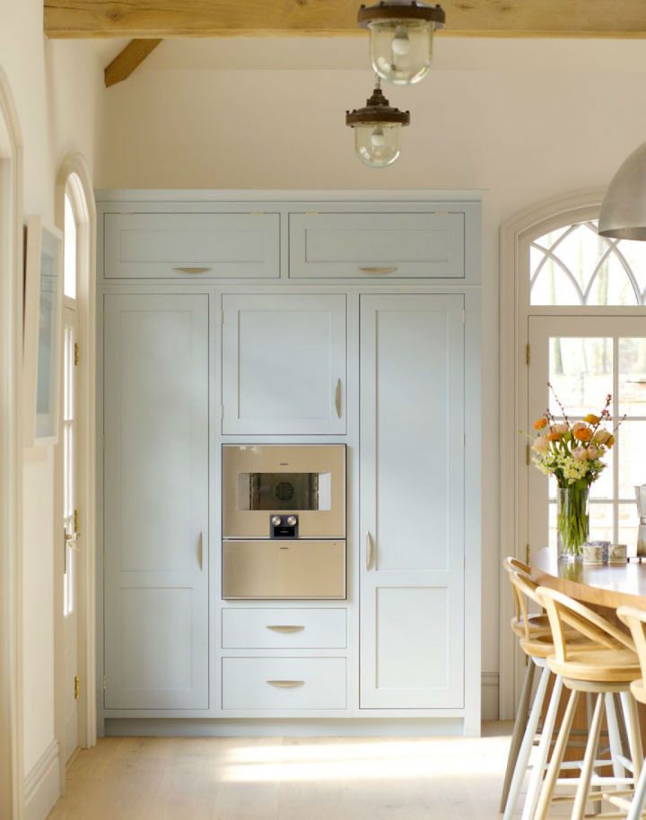
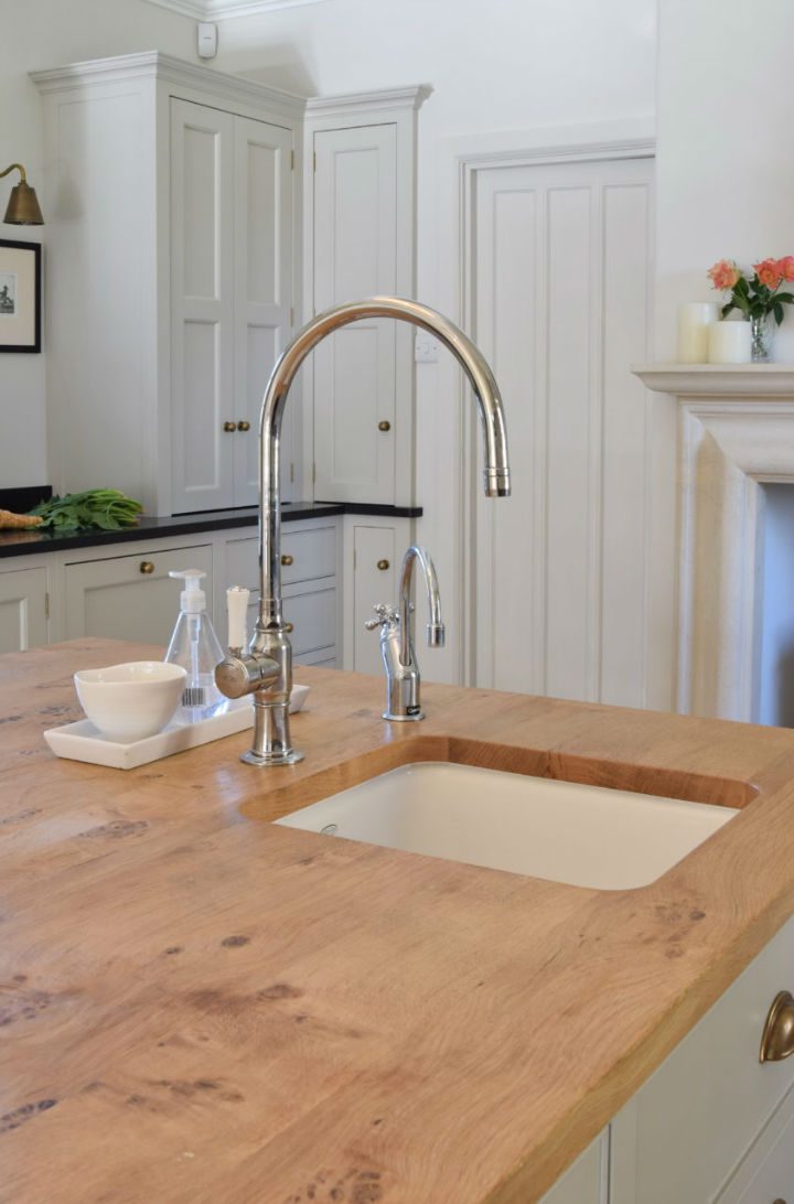
The gentle Farrow & Ball colours with Mole’s Breath on the island, Purbeck Stone on the cabinetry and Amonite on the walls all work to compliment the Teltos Carrera Onyx worktops and the circular oak top. Storage comes in the form of tall run of cabinets with adjustable shelving and great internal lighting and a Fisher & Paykel fridge sits between them. The Everhot 120i in Graphite runs at a much cooler temperature than the old oil fired Aga and is far easier to control.
A townhouse renovation
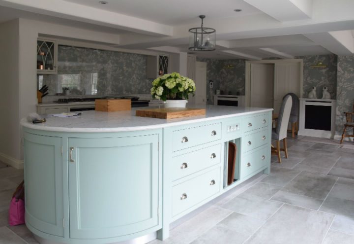
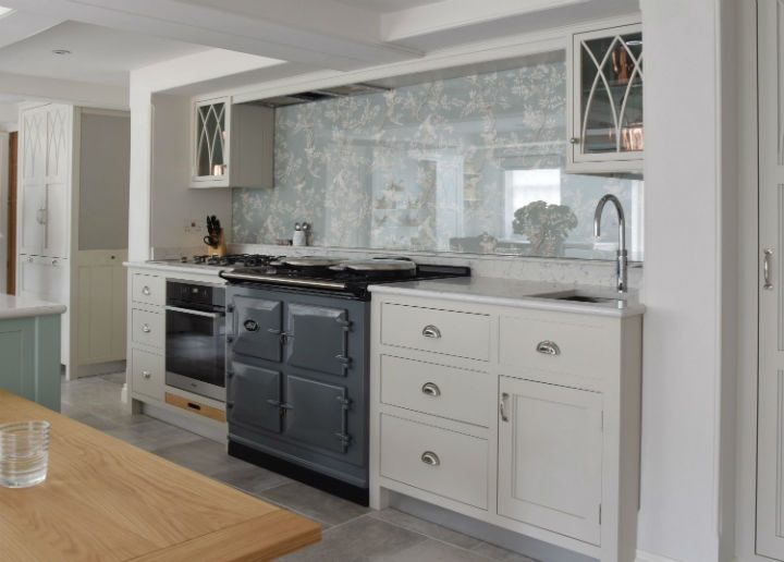
This project it has to be said was quite a challenge, with a tricky room shape and an exceedingly low ceiling with lots of beams Nick Anderson had to work hard to make the design work. The kitchen was made for a client who does an exceptional amount of cooking in fact you could say it is her day job, so Nick made the kitchen to be incredibly practical as well as a delight to be in. An Aga was installed in the new Slate colour and above the Aga Westin bespoke extractors made a neat extraction system that could be tucked in the tiny space between the beams. Behind the Aga the client had individually designed for her a beautiful wallpaper by Lewis and Wood which was then covered in a 3 metre length single sheet of glass with no visible fixings.
The client very much liked the Gothic arch design which she had seen used in a previous standalone piece of furniture by Guild Anderson, so Nick then applied this design within the kitchen which then tied in with the dining chairs and the rather beautiful oak sunburst veneer dining table. For less formal dining a trestle type oak table was created at the end of the island where the client and her husband can have breakfast together.
Hannah assisted in making the colour choices and Little Greene’s Aquamarine and Slaked Lime were chosen to tie in with the wallpaper, walls and worktops.
Refurbished and renovated Old Rectory
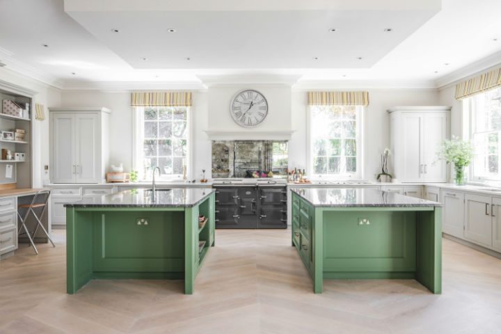
This beautiful Old Rectory located deep in the Wiltshire countryside has been beautifully updated bringing it up to the modern living standards that the clients desired.
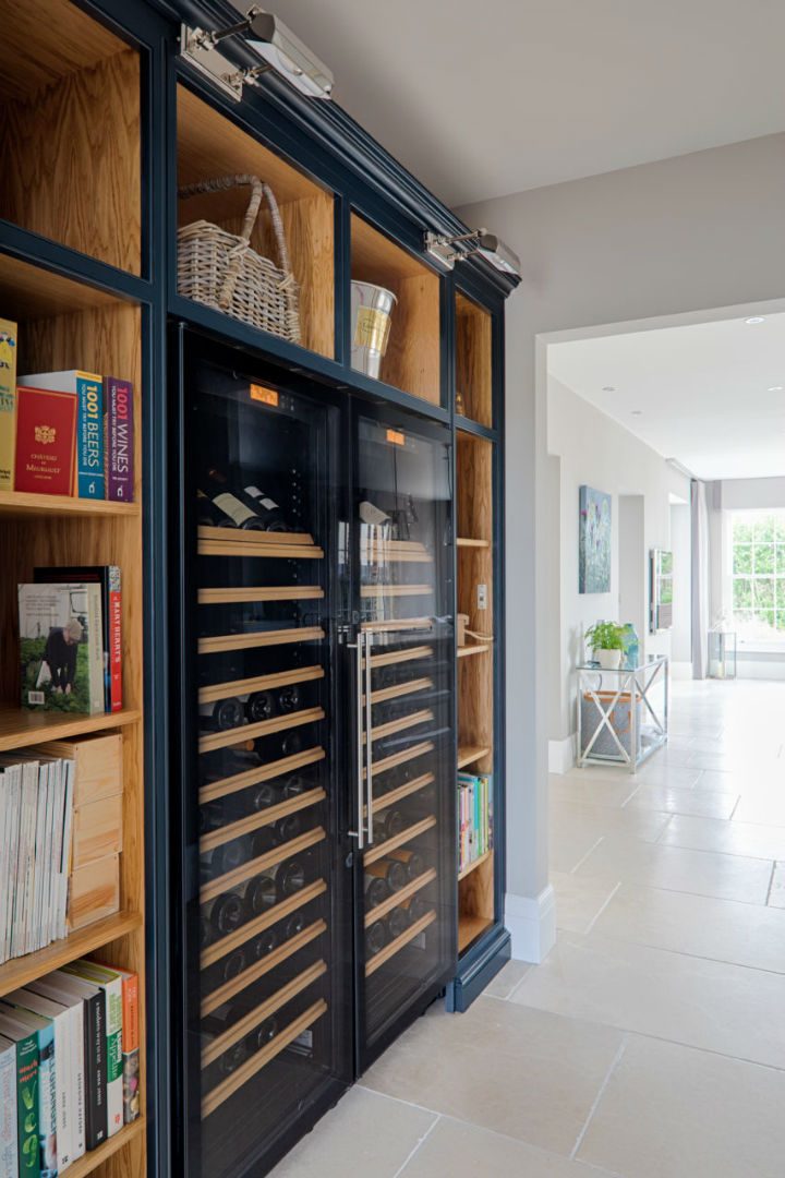
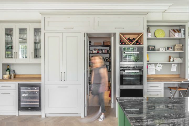
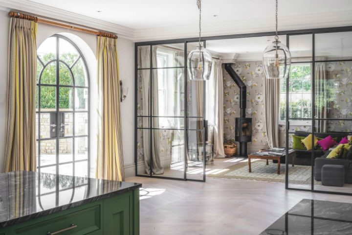
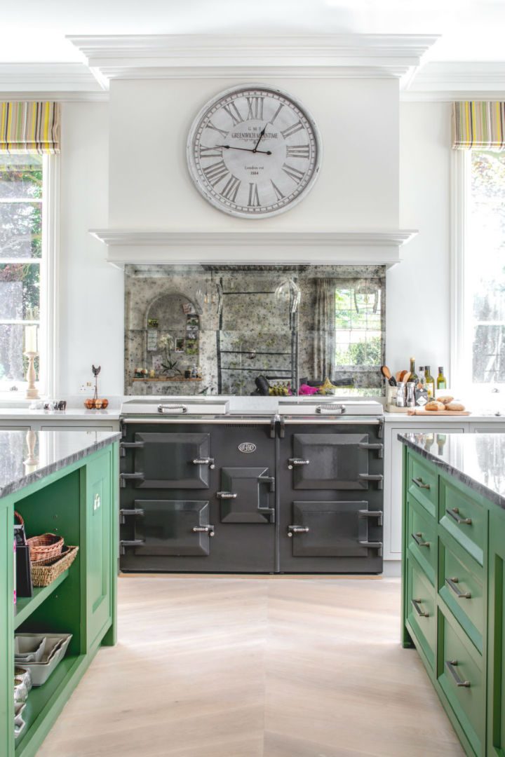
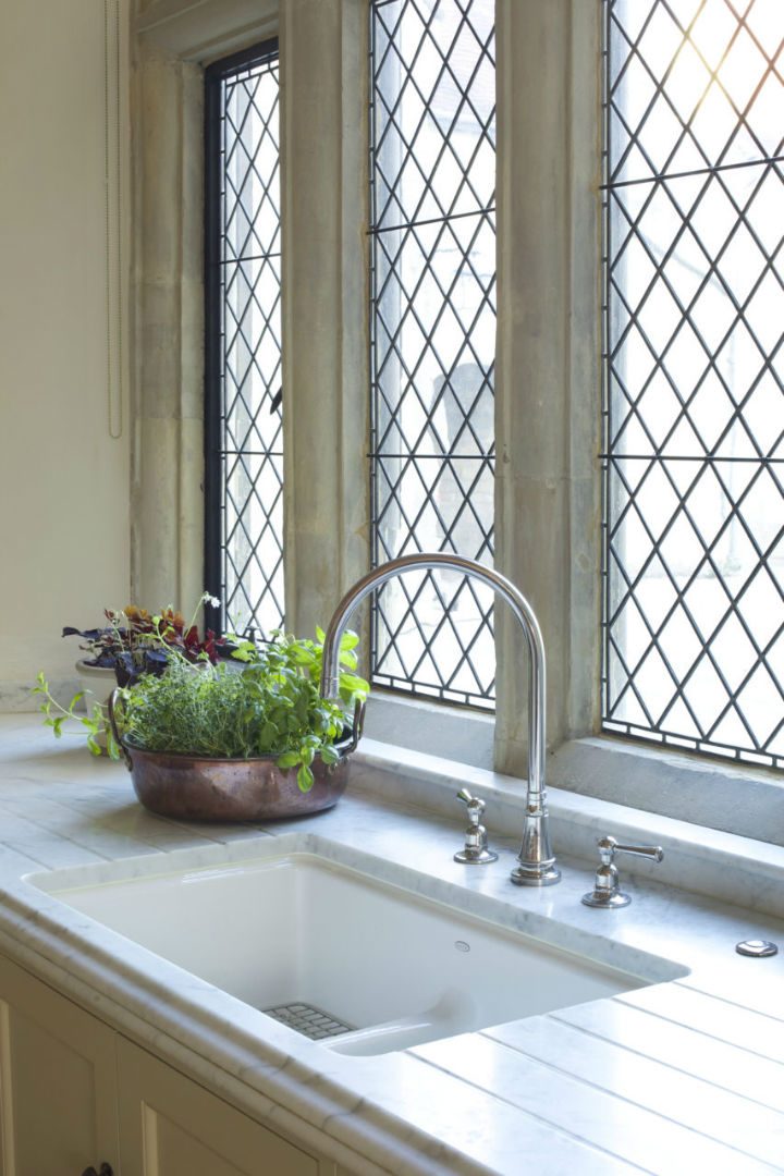
With the luxury of space the kitchen was designed to incorporate many different areas, all beautifully symmetrical whichever way you are standing in the room everything is perfectly aligned and therefore comforting to the eye. There is of course the cooking and preparation areas for which there are two beautifully dressed islands, both clad in Quartzite Eclipsia worktops and painted in eye catching Paint and Paper Library Apple Smiles 11, they are surrounded by the calmer work area painted in Paint and Paper Library Slate V with a more understated worktop. Flanking the walk through pantry there is a work desk area to the right and a drinks serving area on the left with a Miele wine fridge for ease. Adjoining the kitchen is a beautiful snug seating area separated by a handmade crittle window. This truly is a most luxurious set of rooms.
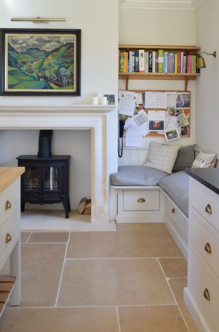
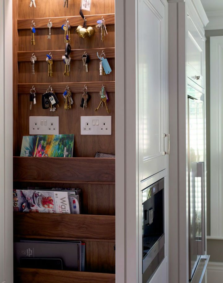
A handmade pin board languishes between the snug and the stable door to the boot room, the perfect spot to drop your keys and pin up your invites and ‘to do’ notes.
An updated Cotswold farmhouse
This client returned to Guild Anderson for a second time as they had decided to move back towards London. It is always a pleasure to work on a clients next kitchen as we have any understanding of their likes and needs and the client comes to know of what to expect from a Guild Anderson kitchen.
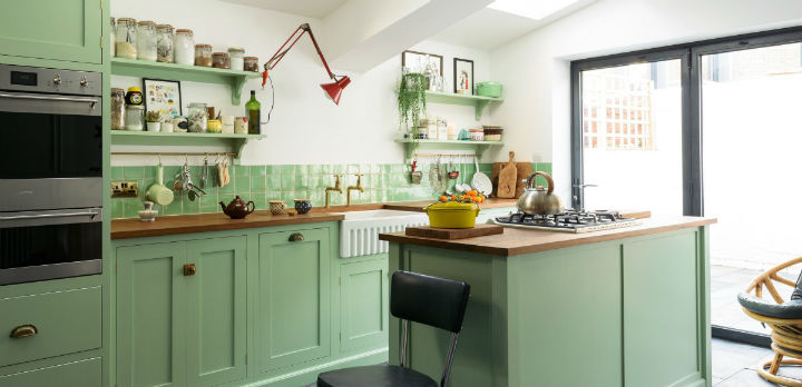
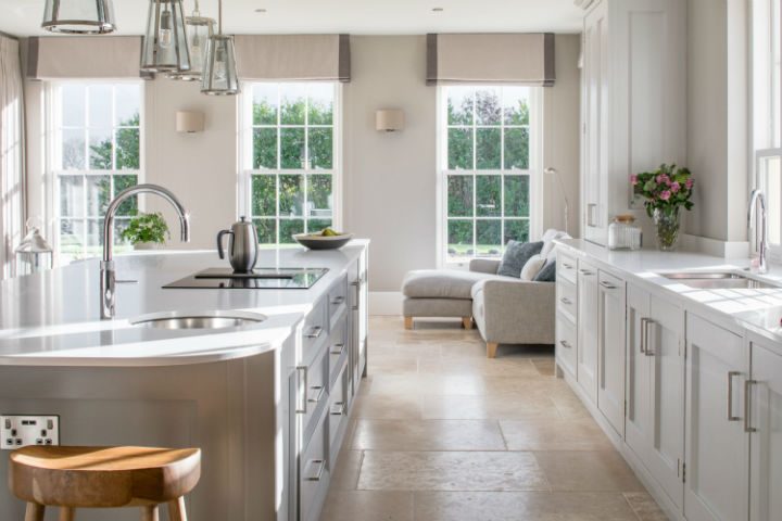
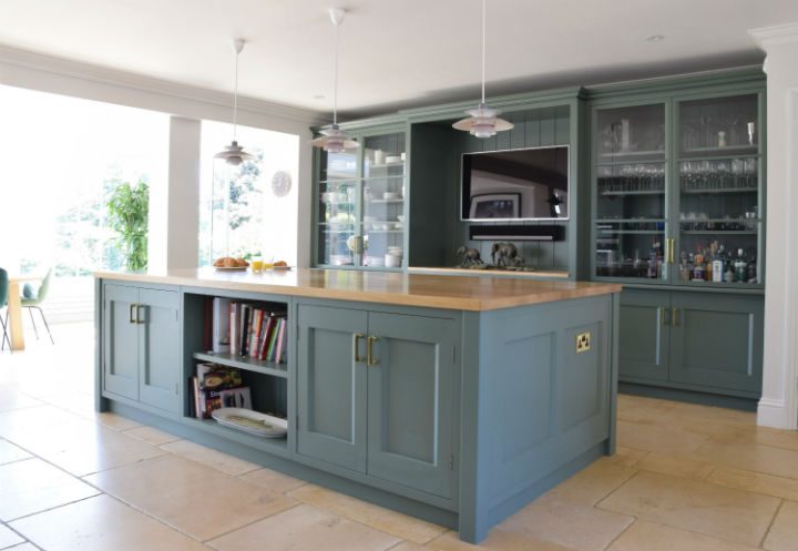
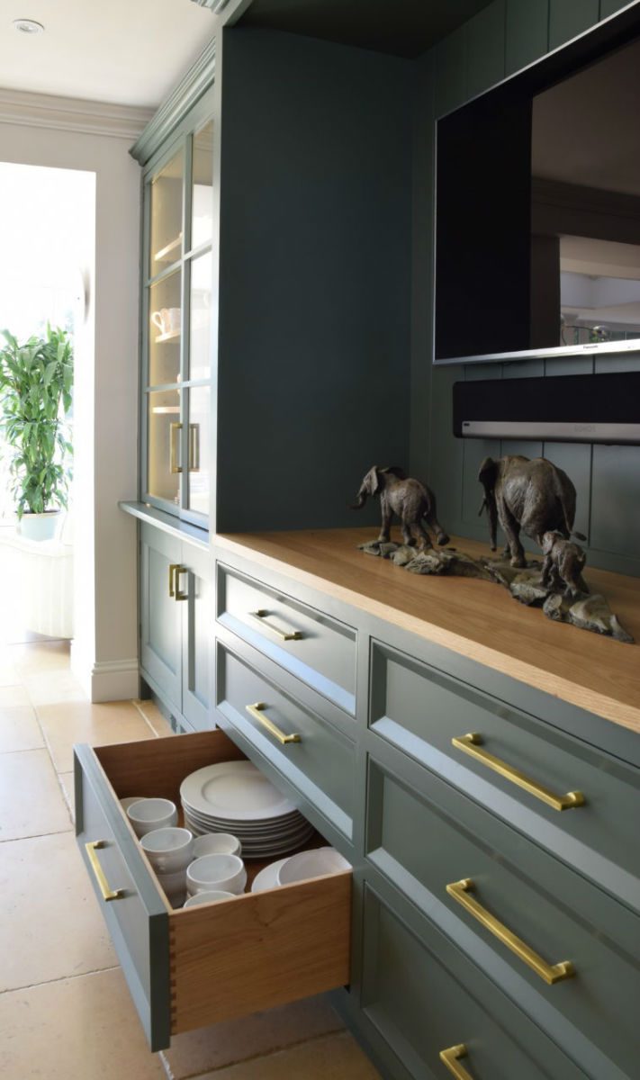
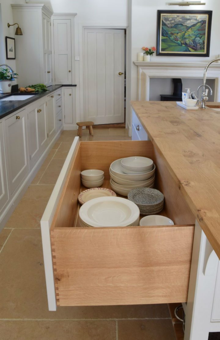
As in their previous home this kitchen was in a large space and Nick designed for them two islands; the main one for cooking and prepping has a flush mounted Miele hob set into a Ceaserstone composite Quartz Bianco, a composite which is quite indestructible but really looks the part, the secondary island with it’s large oiled oak worktop is a family space, it’s there to eat breakfast at before school and for catching up with the news on the easily located TV, it is also within close proximity to cabinetry housing all the crockery and plates. All cabinetry is designed in our Viewfield design and the entire kitchen has been painted in Farrow & Ball Green Smoke, providing an up to date look in this characterful building, without overstepping too much into the modern.
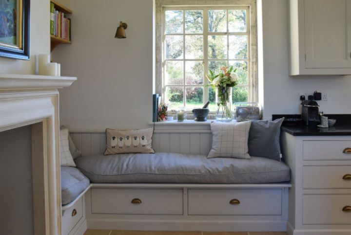
With three hungry children to feed the clients opted for a new Mastercool fridge by Miele which sits squarely between two window seats and provides vast fridge space that is perfectly lit and maintained at a temperature controlled level for each shelf. The only thing it doesn’t do is clean itself.
Victorian family home
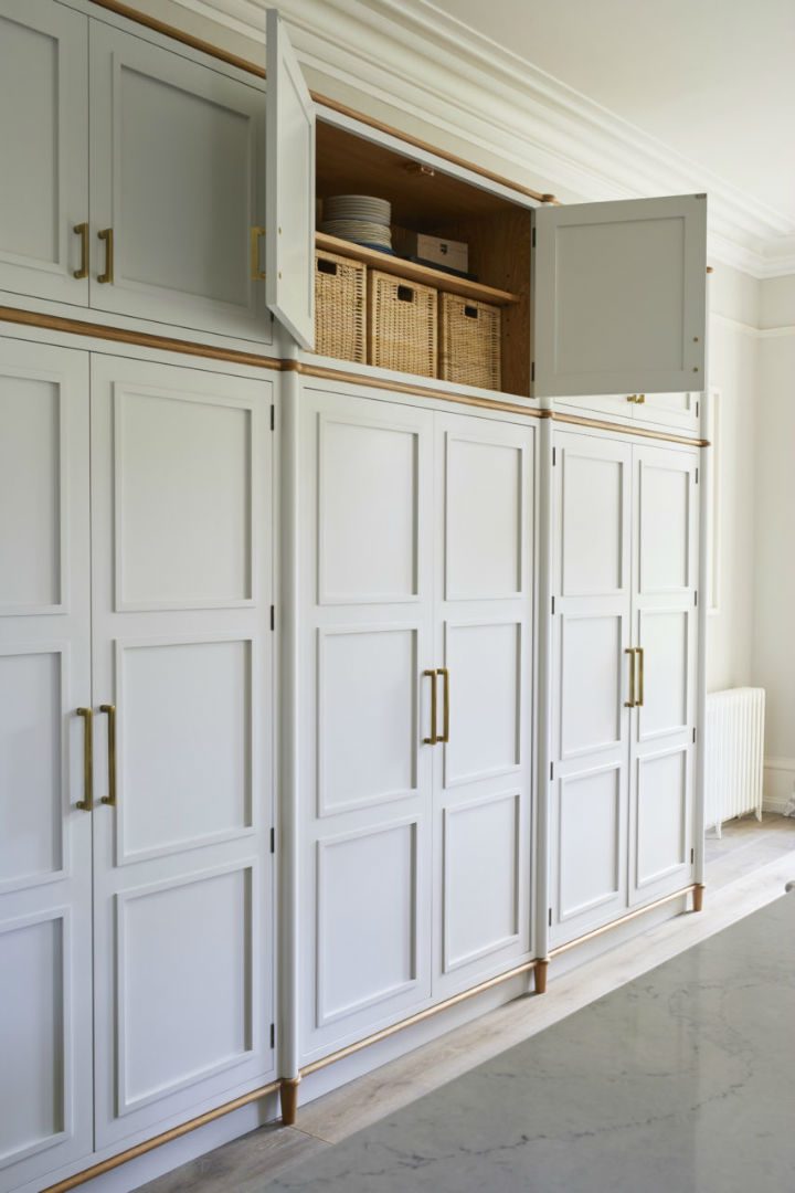
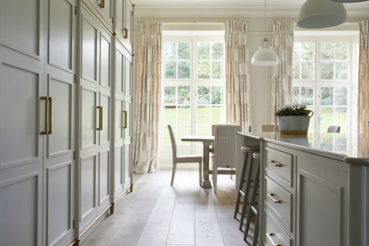
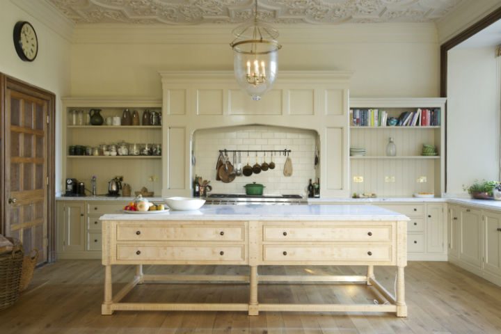
The Bucknowle design is a new cabinetry design to Guild Anderson, it was developed from a dressing room previously designed for another client and Nick felt that the style and beauty of it could be progressed into a kitchen. This Victorian house in Oxfordshire underwent a full refurbishment and the client was hugely open to ideas and was looking for something different to the norm, a prospect that Nick relished.
The cabinetry style with its round corner posts follow the cabinet full height to create a beautiful softening effect on the room, the Caeserstone Noble Grey top also follows the curves and you can’t help yourself but touch the rounded shapes and admire the ergonomic lines which curve and flow. There is a lightness of touch to this kitchen, all of the cabinetry even the tall run, stands on fine oak legs with a recessed plinth colour matched to the cabinets which completes this light feel of elevation. The divide created by the slice of oak running the length of the tall cabinets creates a break in the design in what would otherwise be a huge piece of pale storage.
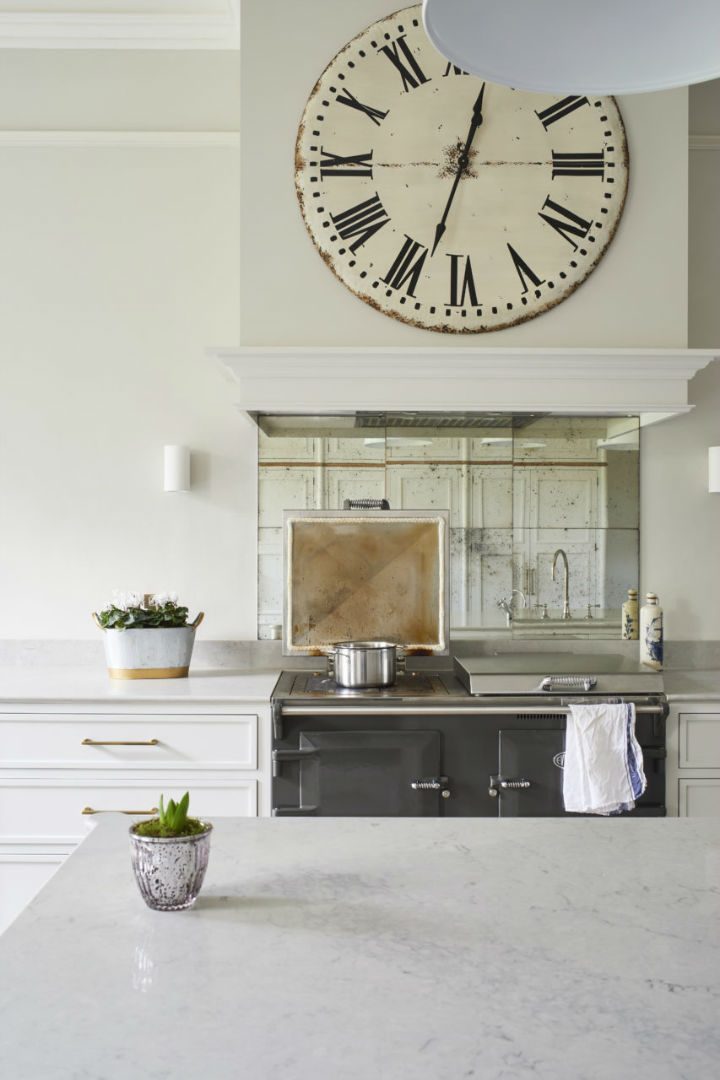
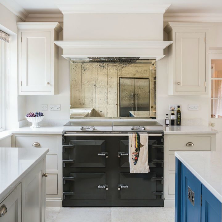
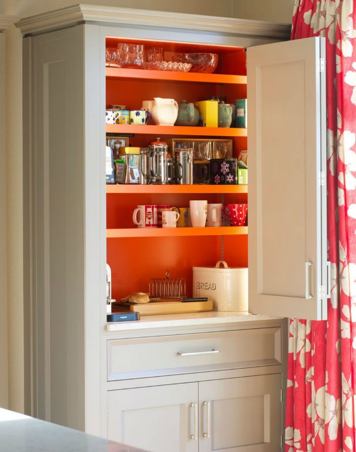
Everything in this kitchen is about the look, but as with all Guild Anderson kitchens there is some fun to be had – in this case the interior of the central cabinet has been painted in Little Greene Heat adding a touch of zing when compared to the rest of the kitchen which is painted in Little Greene French Grey Pale. The tiled antique vintage mirror glass which is splashed behind the Everhot 120i, makes for a pretty compliment. Practicality comes in the form of a Fisher & Paykel french door fridge freezer and a Miele Pureline steam oven.
Country cottage kitchen
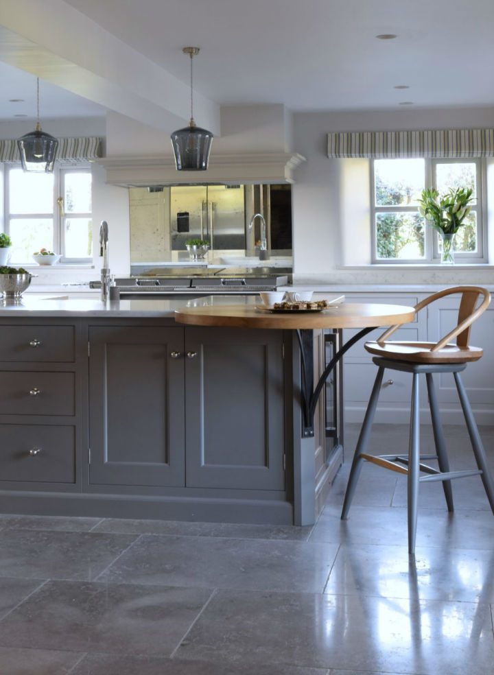
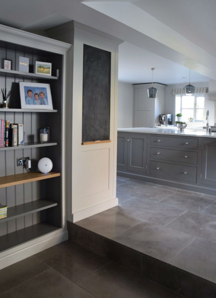
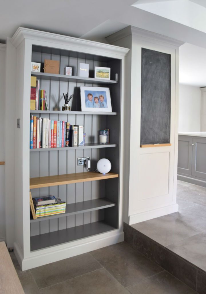
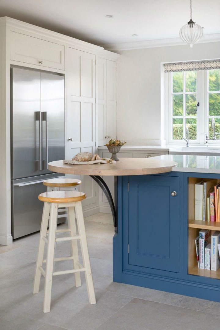
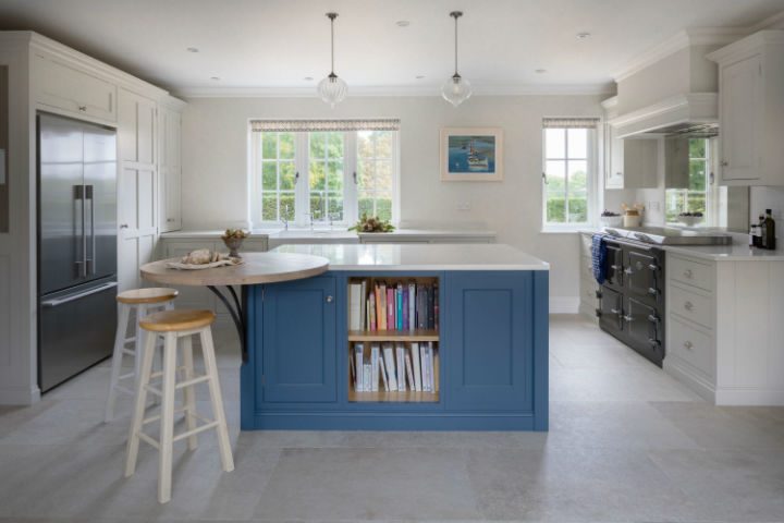
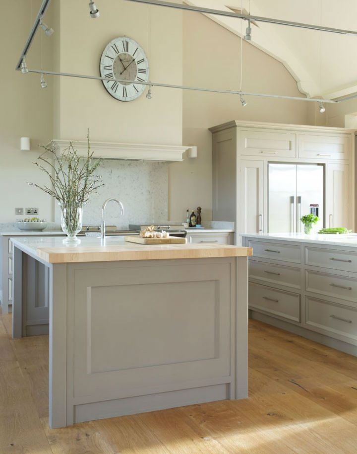
This kitchen is a very calm place to be, considering that three boys live here in this incredibly rural location in Dorset it is both immaculate and an oasis of tranquillity. Very early on in the project Hannah helped the family to consider the colour options for the space, the clients were looking for soft neutral shades but with a notable colour difference on the island. Farrow & Ball was the paint of choice and the main run of cabinets was in Purbeck Stone, the island in Mole’s Breath. In order to create a break between the kitchen and the dining area the bookcase was painted in Ammonite with Mole’s Breath interior.
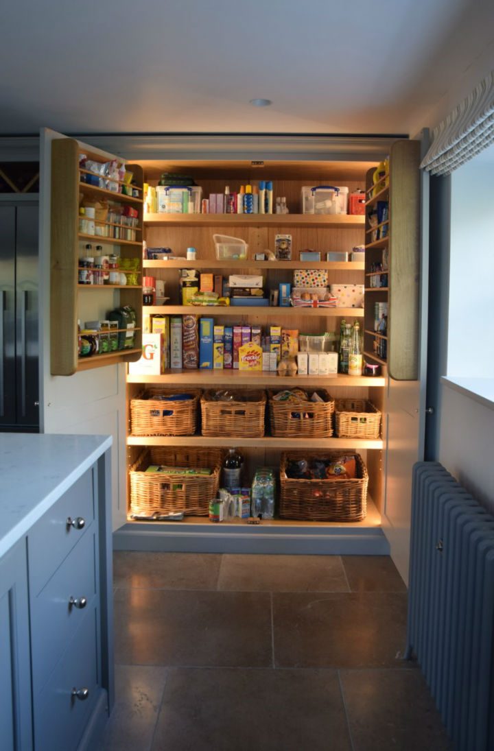
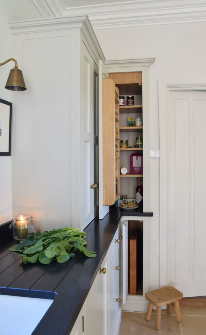
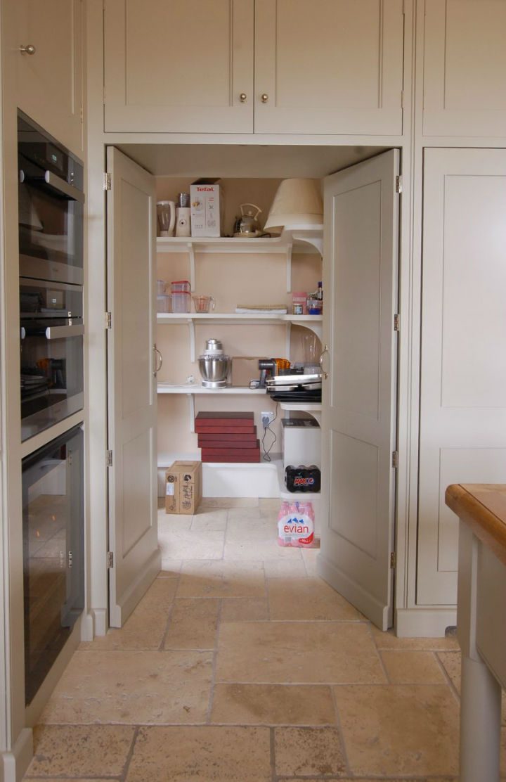
The Lucca flooring ties all of these colours together being a warm grey and the Teltos Carrera Onyx worktops add light to the entire room, the fact that this is a traditional cottage with tiny windows and not a huge amount of daylight, it is amazing how much light and how spacious this room feels. A request by the client was for a large food storage area as there is no pantry, so Nick designed an immense double door larder cupboard that house’s everything from cereal to celery and requires no bending down or rummaging around in to find exactly what you are looking for.
Old Estate Workers Cottage
On plan this newly created space for the kitchen just looked like a regular sized room, however the client had seen a number of kitchen companies before meeting with Nick and most had suggested the rather mundane wrap around kitchen look, with three sides of the room in cabinetry and the island in the middle.
Nick’s approach was to create an area that has definite symmetry and in this instance the best place for this was around the Everhot 120i, in order to do this he created a break in the cabinetry under the window, not an obvious solution but once in the kitchen it is exactly as it should be and in fact lightens and creates a sense of style in the space while only minimally reducing the working area.
The worktop is a simple and clean Silestone Snowy Ibizia with a character oak breakfast bar situated at the far end, which compliments the Little Greene Hicks Blue colour scheme on the island. To master the colour scheme Hannah spent time with the clients looking at colour combinations with them, the clients hugely appreciated this service that we offer as part of the project. They had a paint consultancy out to advise them previously which was expensive and cost them a great deal in samples but by contrast with Guild Anderson this is not an added extra cost, we do this because many of our clients don’t have the time to experiment with colour and have little idea of interior colours that work together.
‘The paint consultancy was brilliant: as a time-poor working couple, compared to the ………..colour service, the time we spent going via Guild Anderson to decide on colours for the new kitchen was by far the best value for time/money it was the easiest part of the renovation and we really appreciated this.’
A kitchen for juicing
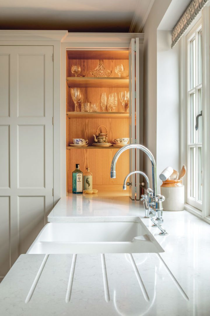
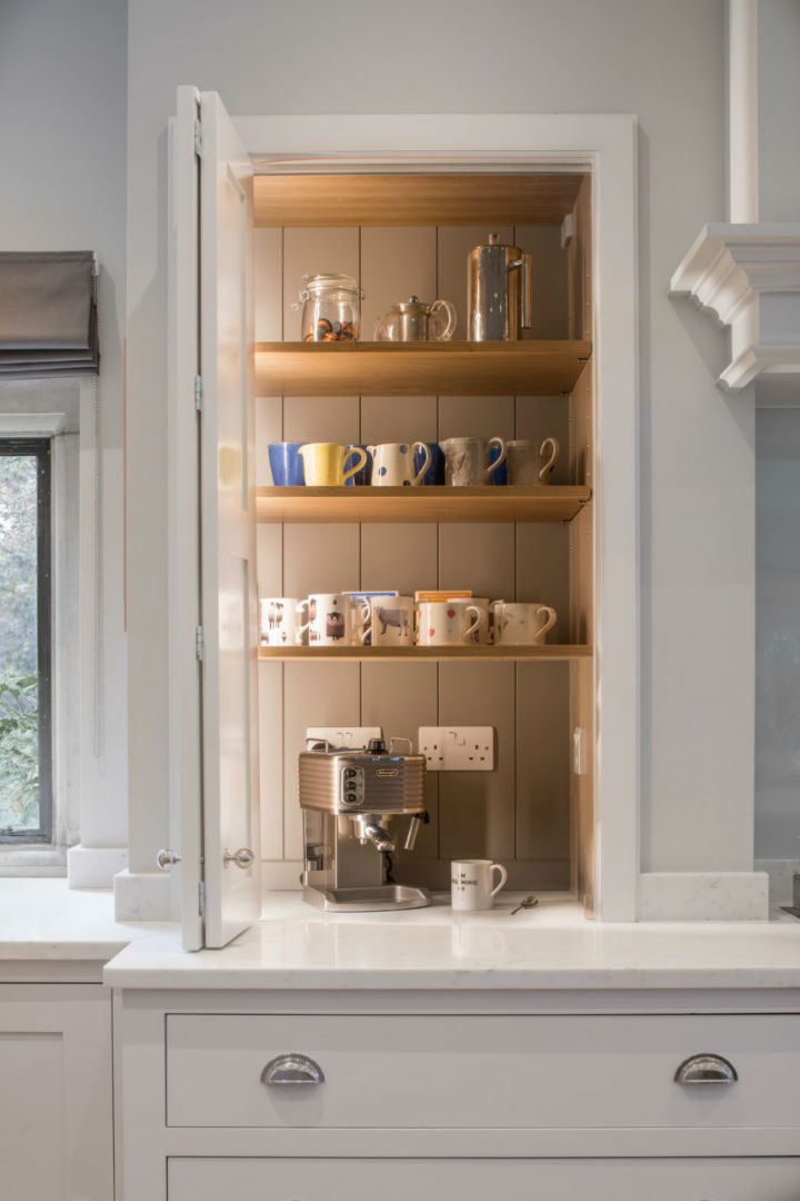
This kitchen was all about the clients morning obsession, namely her juicing. In her old kitchen the incongruous juicer had to be lifted up out of a cupboard and onto the work surface before rummaging around in a small under counter fridge for her fruit and veggies. Her new kitchen was in a vast new extension that had been added onto the cottage a few years before. To break the big space up Nick created a false chimney breast for the Everhot to sit in and either side Bowman cabinets which were set into the false wall and added structure to the room and of course created the storage space that her juicer required. This Bowman sits directly on the work surface with fold back doors so it can be slid in and out, there is also a plug within the cabinet so no need for dangling wires.
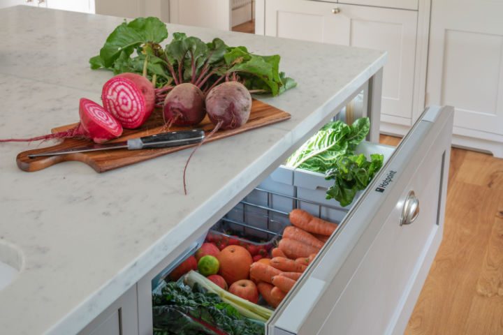
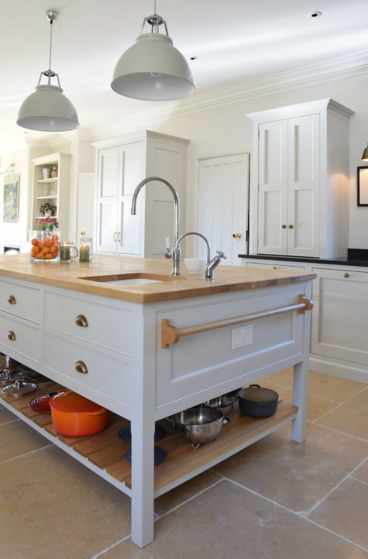
Directly opposite on the island is the fridge drawer where the client keeps all her lovely fresh veggies dug straight out of the garden, so it takes no time at all to give them a quick rinse in the sink behind and whizz them straight through the juicer.
“Nick designed my new kitchen around my juicer! I juice everyday and love it! Moroever, he was able to hide the juicer in a Bowman cupboard and the chopping apparatus in a drawer of the island. I like it as it is convenient, it makes it so easy to do this and a pleasure every morning. In my old kitchen, it was my no. 1 daily annoyance. Now it is the reverse. Also the large island means I can work around everyone else in my space with minimal clutter.”
Our mission is simple: we are passionate about designing furniture that is practical and easy to use and also looks fabulous. This applies to every kitchen, boot room, dressing room, study or table that we make. Quality, service – and above all, happy customers – mean a great deal to us.
Clients often ask what the difference is between us and bigger industry names and I suppose it is a mix of many things: quality of design and construction, service, price, our very personal approach and the fact that every piece I design is a reflection of that individual person and their home.

