10 Cool Ways To Maximize Storage With Corner Cabinets
Instead of thinking of room corners as being just some dead spaces that you can’t put anything in, a much better approach would be to check out all the cool and interesting ways in which you can actually make the most of those spaces. For example, a corner cabinet would be a wonderful idea for a space like the kitchen where it’s always great to have more storage. The same can be said about a bathroom, entryway, office space and even the living room. Check out the great corner cabinets ideas we have gathered below.
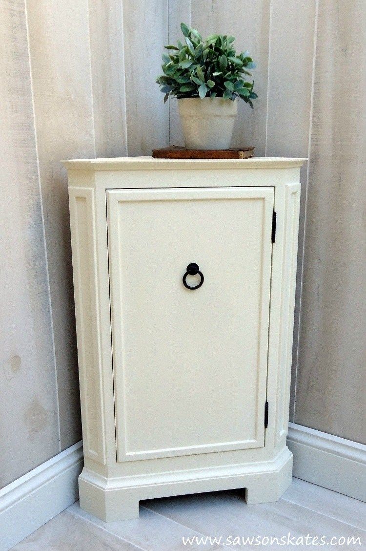
First on our list is a DIY corner cabinet which is simply perfect for any bathroom that has an empty corner area. The design is elegant and simple but at the same time filled with various accent details which give it character. Inside there are three small shelves for storing extra toilet paper rolls and toiletries. Check out the plans on sawsonskates.
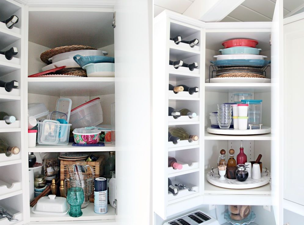
The kitchen is the room that would benefit most from a corner cabinet and the best way to take advantage of that is with lazy susan platforms. You can turn your corner area into a space packed with clever storage solutions. Add rotating shelves on which you can keep your spice jars, dishes and all sorts of other things. Find out more about this corner cabinet design in the iheartorganizing tutorial.
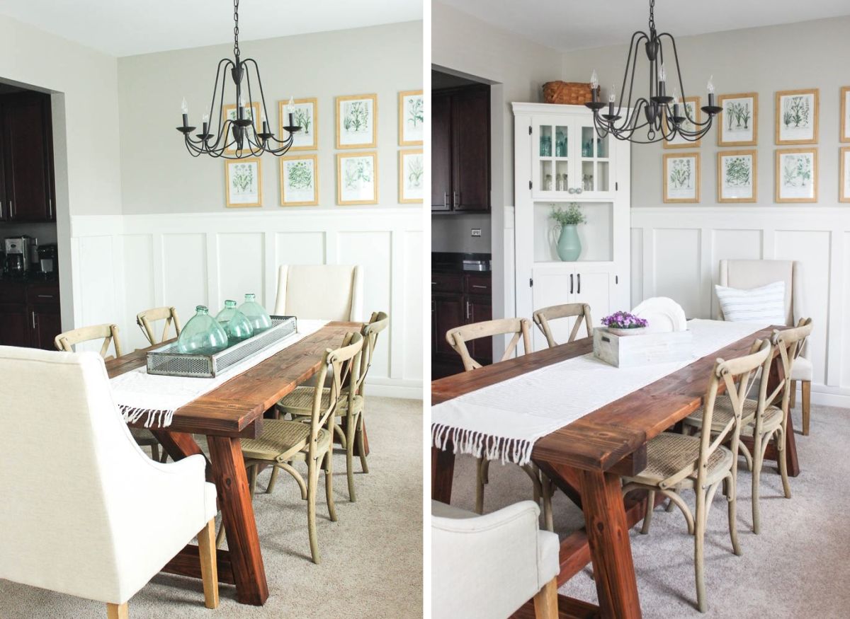
For the dining room, we suggest this lovely farmhouse corner cabinet which we found on delightfullynotedblog. It really looks like a cabinet suited for such a space and because it fits perfectly in the corner it helps you save space while actually increasing storage. The glass door panels on the top section and the open module at the center give the cabinet a really elegant look.
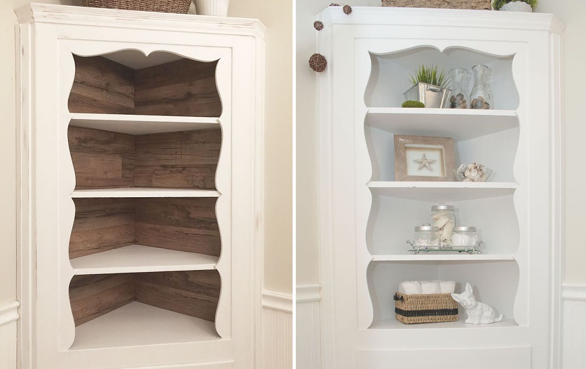
If you already have a corner cabinet you might enjoy the idea of giving it a makeover. It can be a purely aesthetically-oriented makeover or it can also include some structural changes designed to make the cabinet more storage-efficient. Either way we suggest checking out the project featured on salvagedinspirations first.
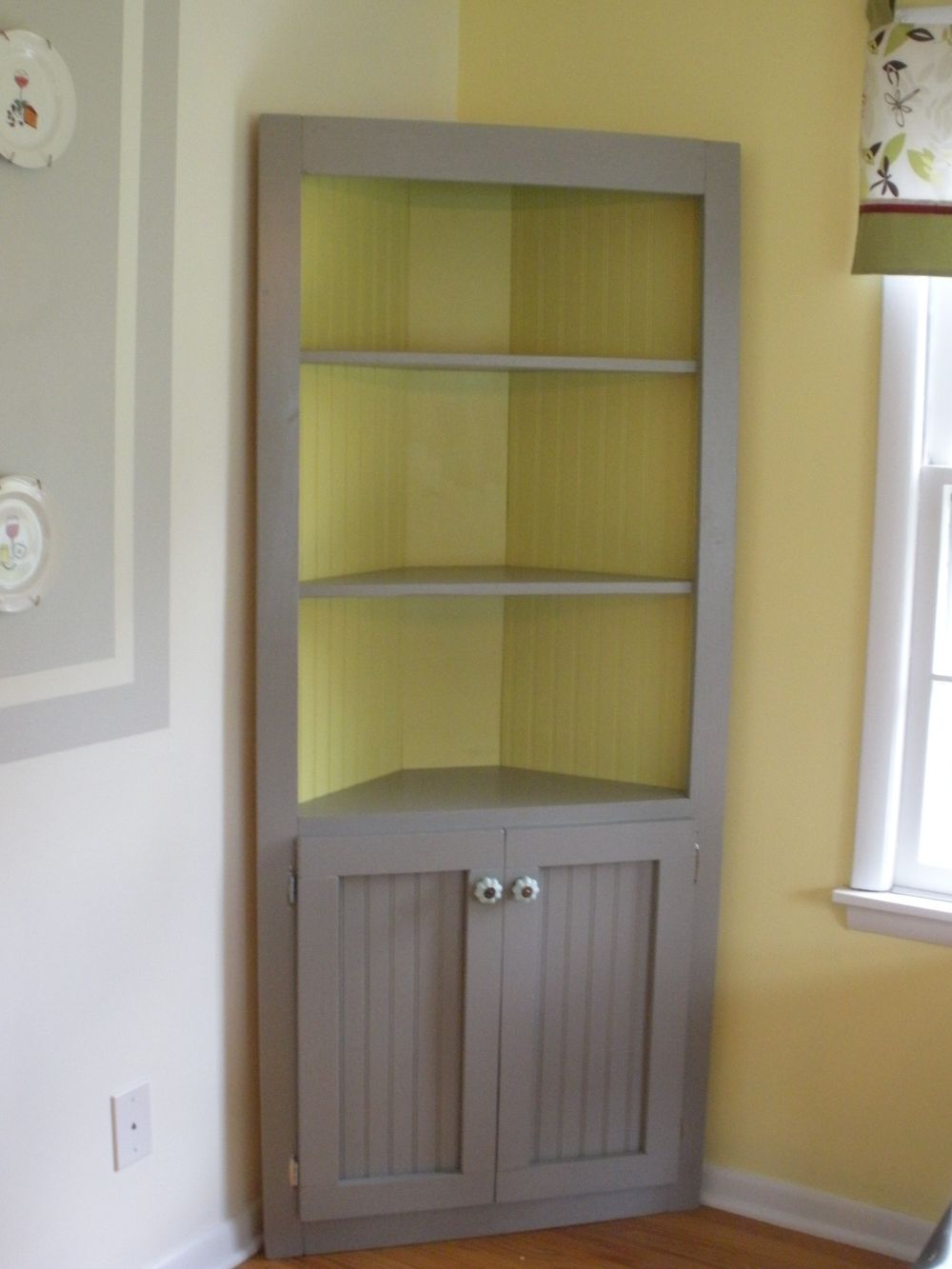
Corner cabinets such as the one featured on ana-white are really inspiring because they fit perfectly in those awkward space between the window and the wall or the door and the wall where you can’t really place anything big but which end up being wasted spaces if left empty. This corner cabinet is quite easy to build and has a closed storage section at the bottom and a set of open shelves on the upper section which is a nice balance of different storage options for various different items.
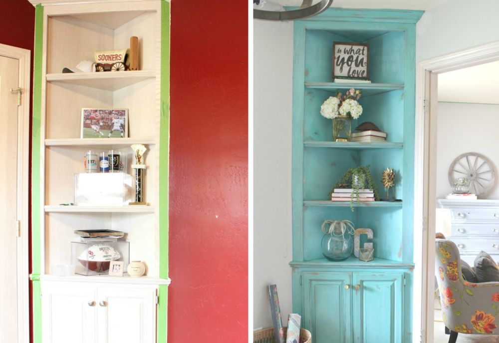
This style of corner cabinet is super handy and user-friendly because it’s just so versatile and can look great and be useful in any room of the house. For example, if you place it in your home office or craft room you can use the open shelves as bookshelves or as space where you can put items on display. The bottom section is good for storing boxes, documents and anything you’d rather keep out of sight. Check out refunkmyjunk to find out the story of this cabinet.
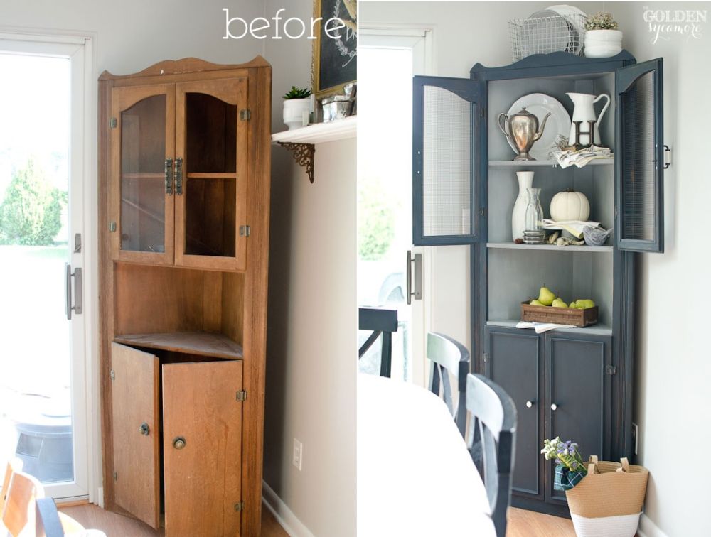
We’re going to have a look at more different variations of the same type of corner cabinet and see how it can be customized to suit different purposes and spaces. In the example from thegoldensycamore the two shelves at the top have glass doors and serve as a sort of display area. The doors keep the contents visible but don’t let the dust get inside.
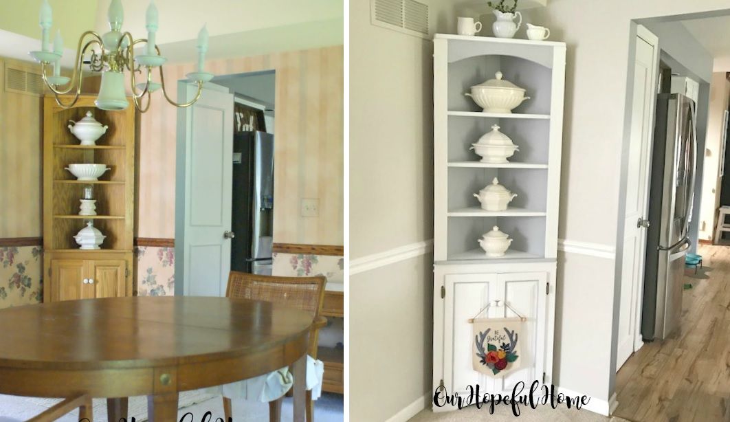
Another stylish variation of the dining room corner cabinet is featured on ourhopefulhome. This time the upper section has four open shelves which are triangular in shape so they’re not able to hold sets of wide plates or lots of other items but are perfect for displaying cute vases and all sorts of decorative things. Pick whatever suits your style.
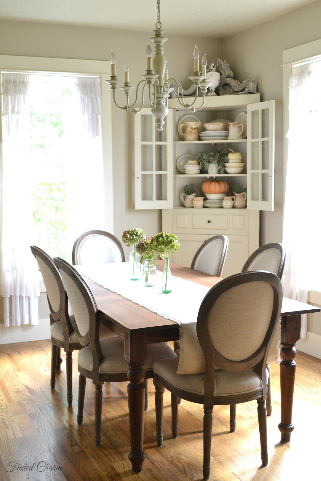
We should also mention that a corner cabinet doesn’t necessarily need to be very narrow. Its proportions are determined by how much space is available as well as the type of design and style preferred for it. You can check out fadedcharmcottage to find out a bit more about this idea and about corner cabinets and dining room decors in general.
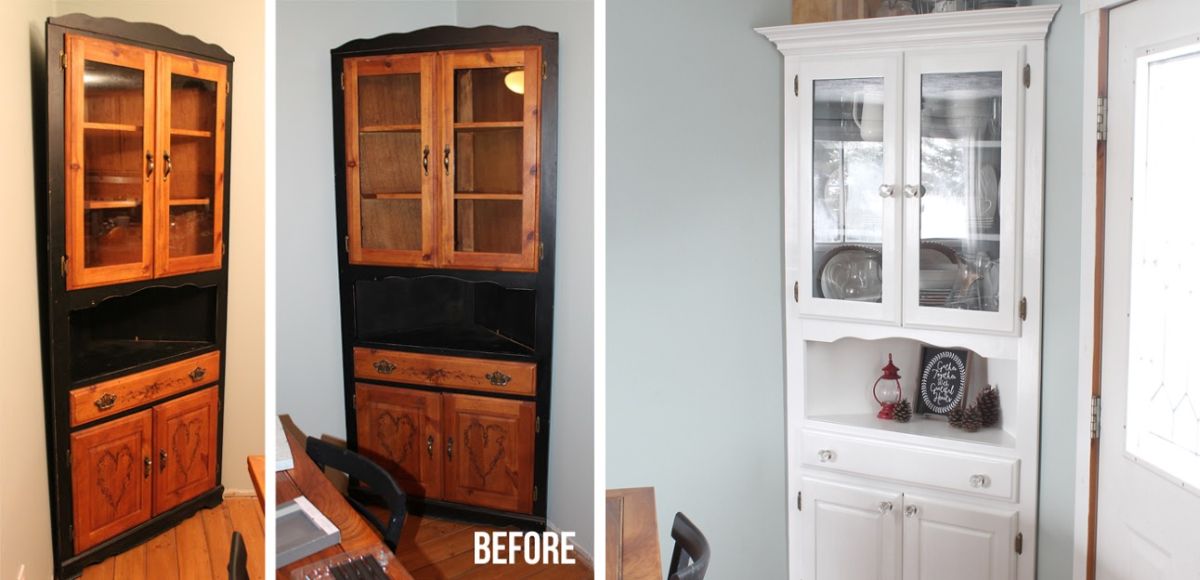
Last but not least we’d like to share with you an interesting and inspiring before and after project involving a corner cabinet. On the left you can see the cabinet’s original design and on the right, you can see how it looks after it’s been painted white and got new hardware. Its overall design changed a bit too. This is easy to notice at the top where the lines became simpler and give the cabinet a more modern appearance without taking away its character. The project is featured on thecraftpatchblog.
