Black and White Bathroom Designs That Show Simple Can Also Be Interesting
Because a bathroom focuses mainly on the functionality you don’t want to go overboard with the interior design or with the colors but you still want it to look beautiful and stylish. That makes the black and white combination perfect for any bathroom, regardless of size or style. The combo is truly timeless so you don’t have to worry about the trend going away any time soon. To inspire you, we’d like to show some of our favorite black and white bathroom interiors:
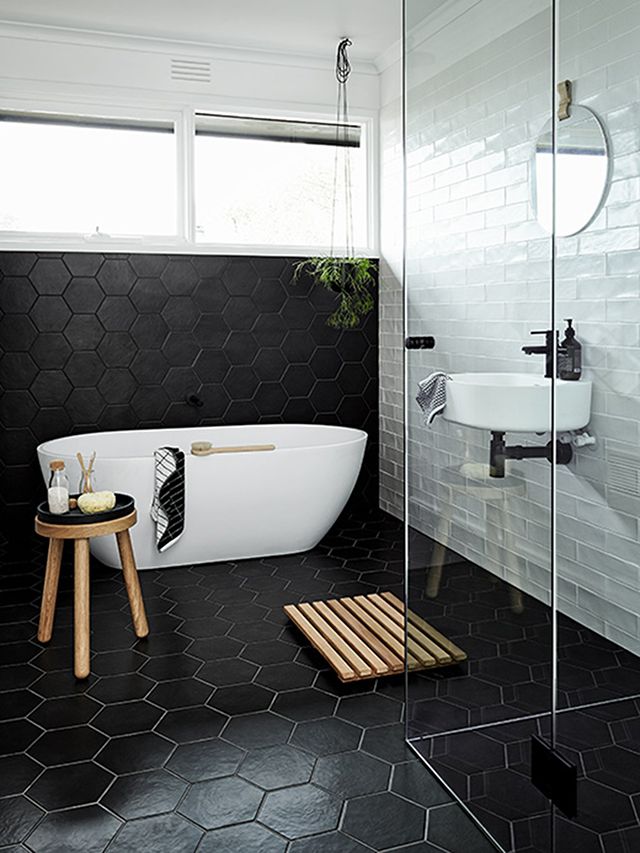
Even if you’re not throwing any crazy color to the design, you can still give your bathroom a cool and eye-catching look. There are many different ways to do this. For example, you can opt for hexagon-shaped tiles for the floor and for the walls. The classical subway tile pattern is also a nice option. Here you can see them combined. Check out the rest of this stylish house on thedesignchaser.
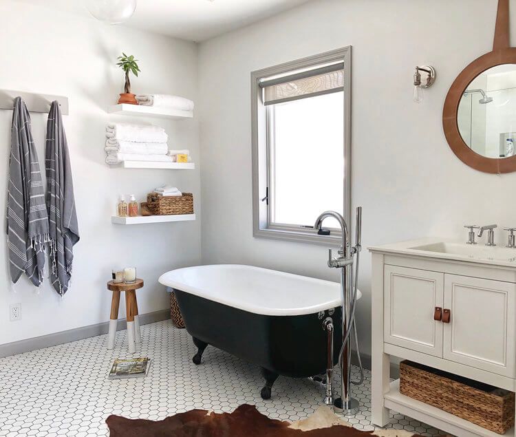
This bathroom designed by Alison Kist is mostly white, with a few light beige accents and some brown-colored details nicely spread throughout the space. The elegant clawfoot freestanding tub has a black exterior and a white interior, an elegant and classy combo in tone with the rest of the decor.
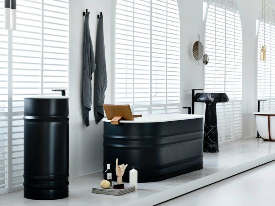
Speaking of stylish-looking black and white bathtubs, check out this oval-shaped model designed by The Stella Collective. Add a matching sink and let this duo become the center of attention and the focal points of your bathroom. They’re cool enough to stand out but also simple enough to blend in which is great either way.
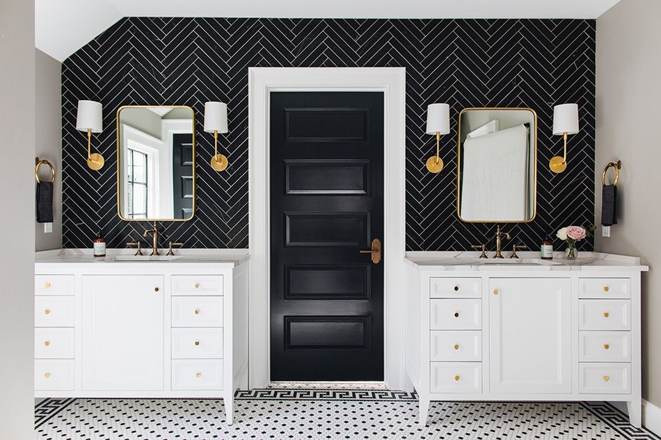
It’s not just the tub that can add color to a bathroom. In fact, that’s actually very rarely the case. A much more common option is to make this room interesting with your choice of wall and floor tiles. In this case, studio Jean Stoffer Design chose a black and white combo, with different patterns for diversity.
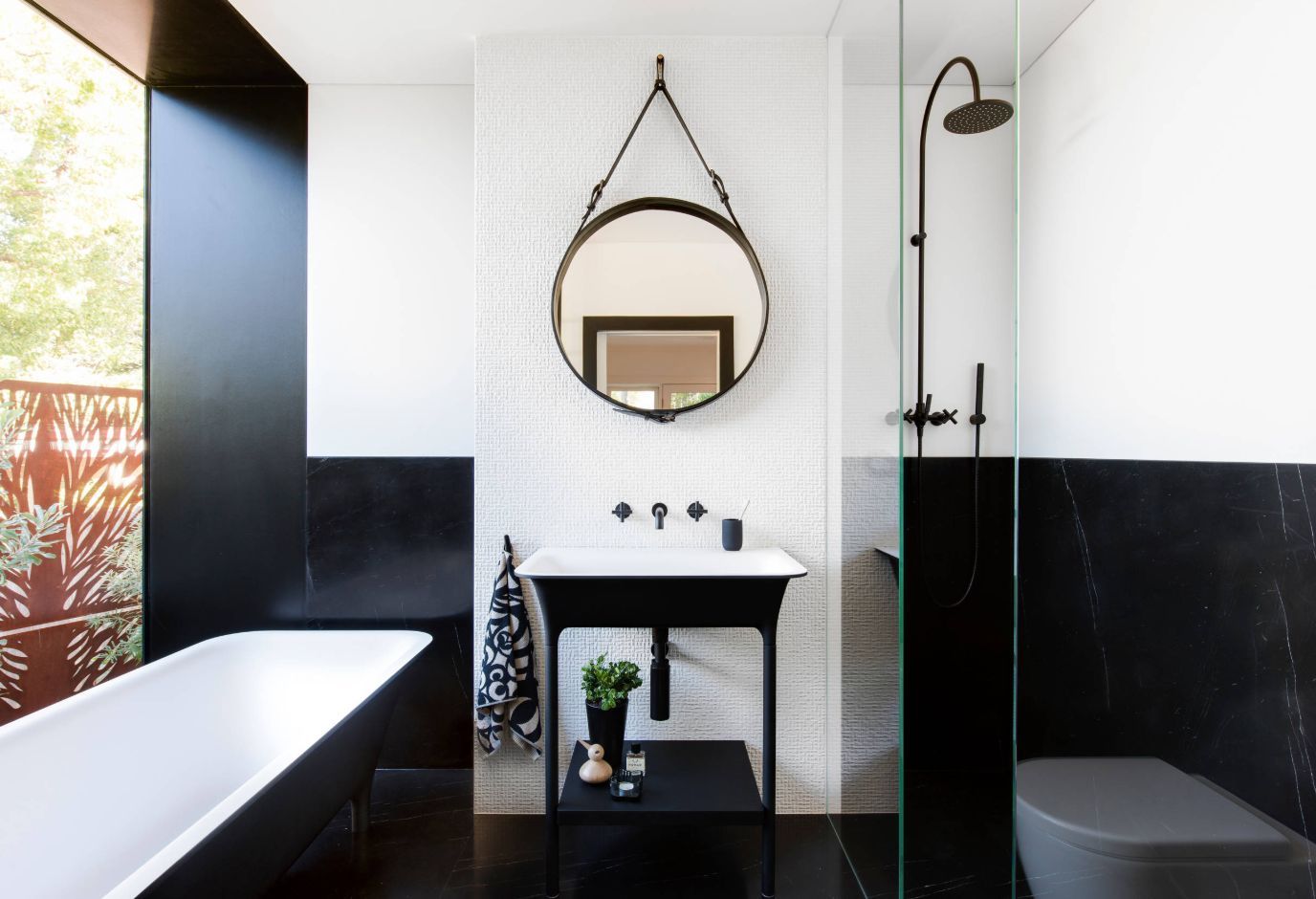
Here’s another example of a well-balanced bathroom design focused almost exclusively on white and black tones. The bottom section of the space is black with the upper section being white, a very clear and simple distinction. The black and white tub and sink ground the decor even more. Check out Minosa for more design options.
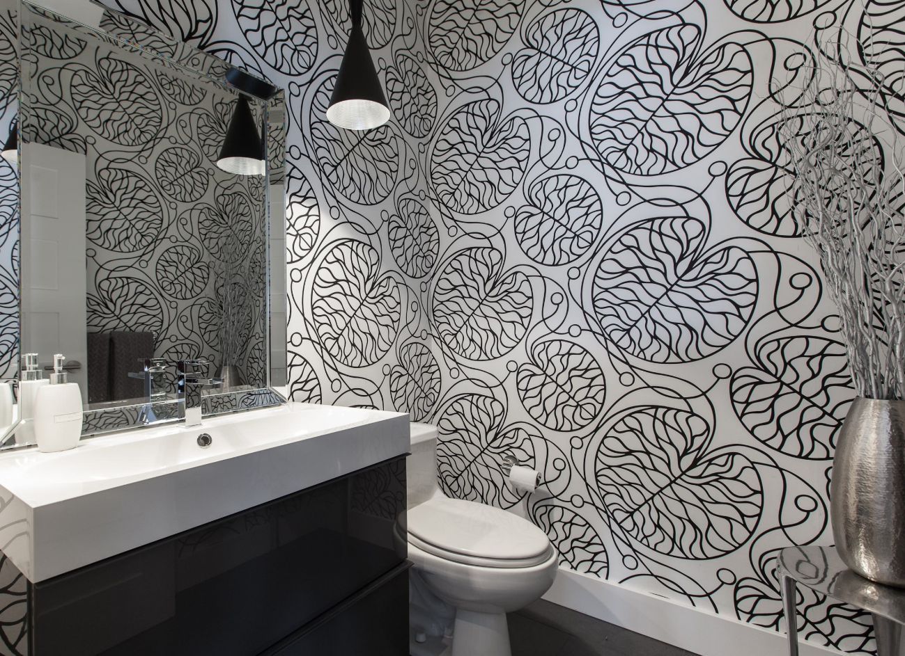
The black and white color combination is a nice option when the goal is to highlight a certain pattern or to emphasize the lines and shapes of a design rather than focusing on the chromatic palette. This here is a cool example of how you can apply that when designing and decorating your bathroom.
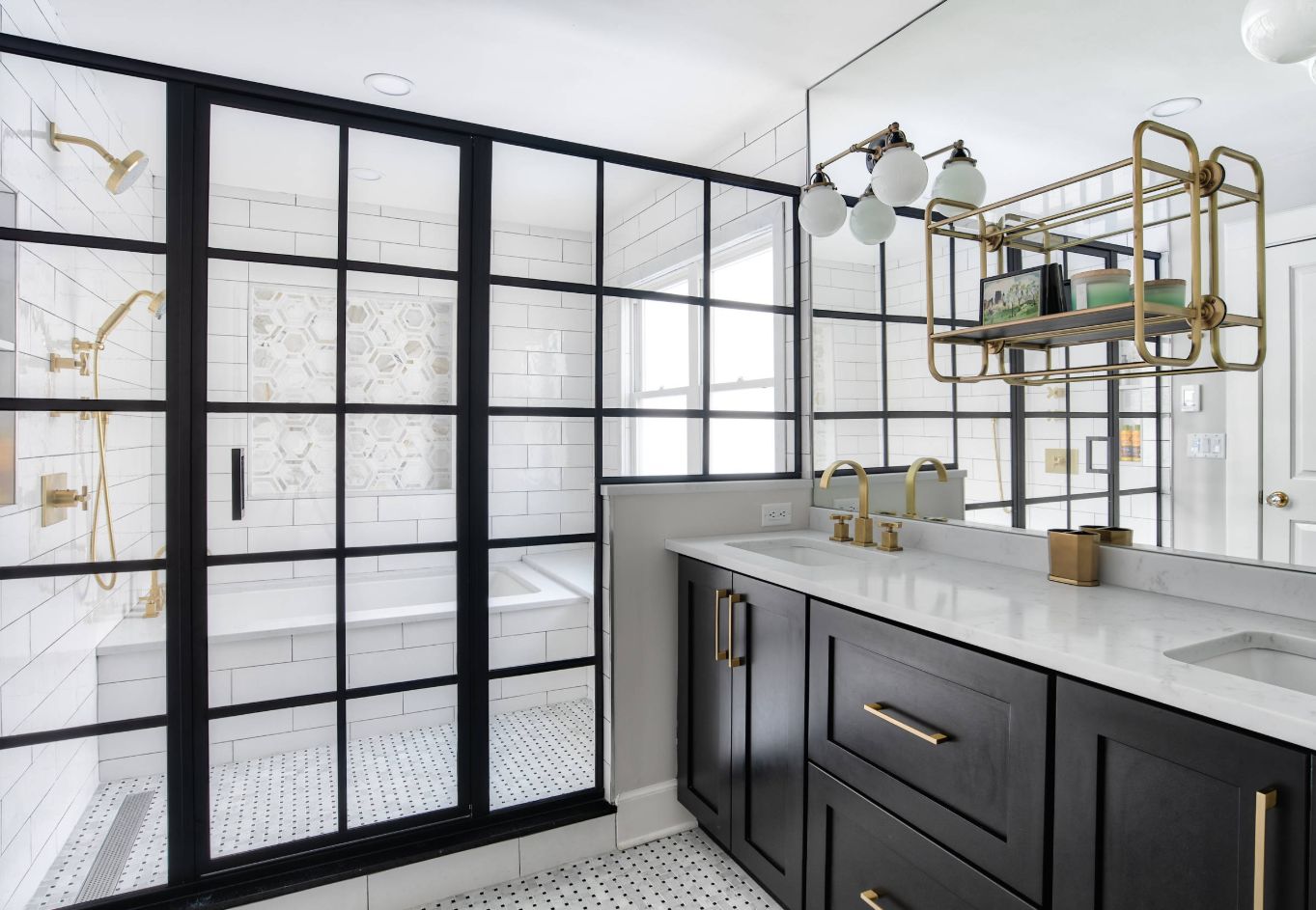
If you’re only using black and white to design the interior of a space, the result might not necessarily be a boring-looking room but might end up missing something and appearing incomplete. In this case, the golden metallic accents really give this bathroom more personality.
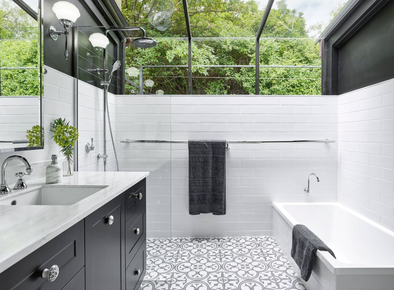
When renovating this now awesome-looking bathroom, Briliant chose black and white as the only colors for the walls, floor, tub, sink and vanity and yet the space is vibrant and colorful. That’s due to the glazed ceiling which seamlessly blends into windows on the side walls, letting the outdoors become a part of this bathroom’s decor and identity.
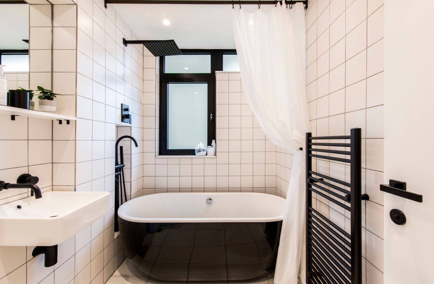
As we’ve already established, a minimal and modest color palette does not necessarily make a space look bland and boring and can in fact give it lots of character. We also mentioned how timeless the black and white combo looks so here it is featured in a contemporary bathroom which looks surprisingly welcoming and cozy and also has a lot of classic charm. This is a design done by studio Thomas Alexander.
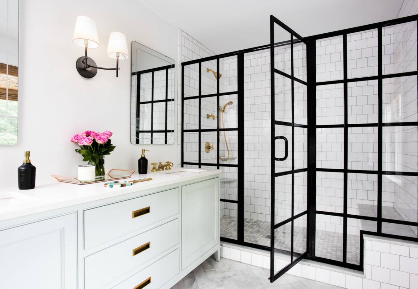
This metal and glass divider between the walk-in shower and the rest of this bathroom is the focal point of the design created by Roost Interiors. Notice the golden little accents nicely spread throughout the space. They add a bit of contrast to the decor and give it a more complete and wholesome look.
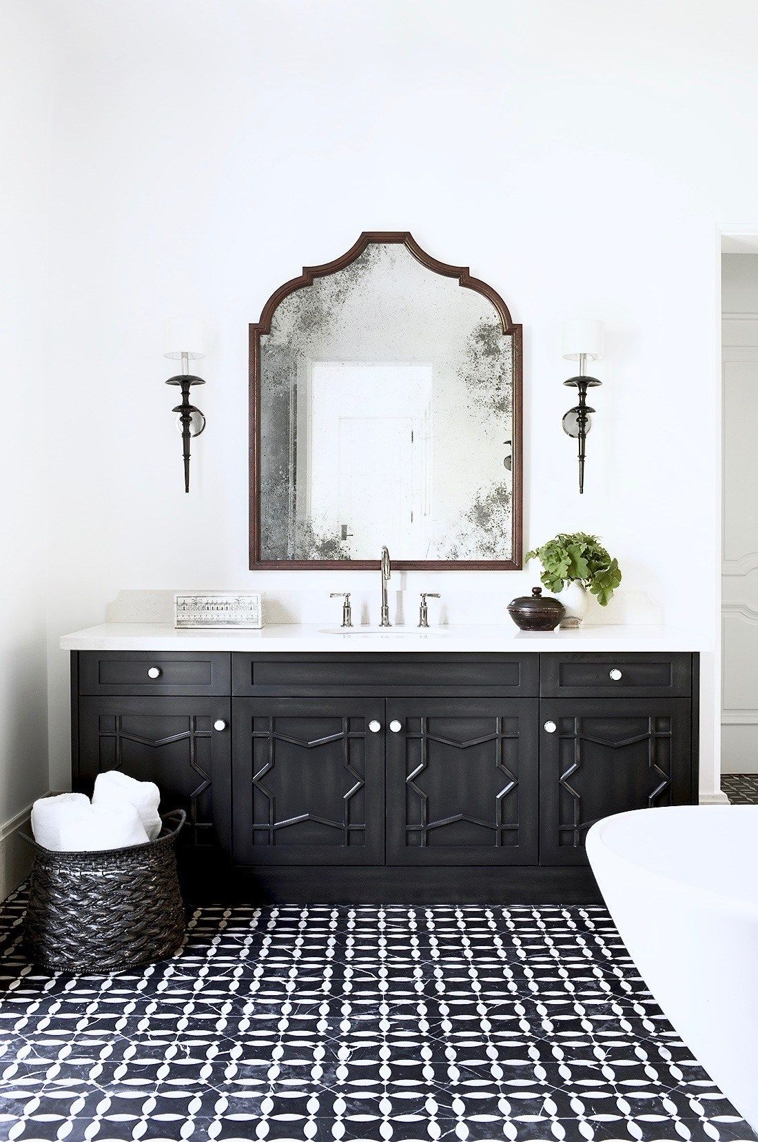
This is a Moroccan-inspired bathroom designed by Betsy Burnham. It has a lot of character, featuring eye-catching floor tiles with a geometric pattern and a very stylish vanity with detailed door fronts and a white countertop. An oval white tub adds softness to the space and the wall-mounted mirror gives it a sophisticated and luxurious look.
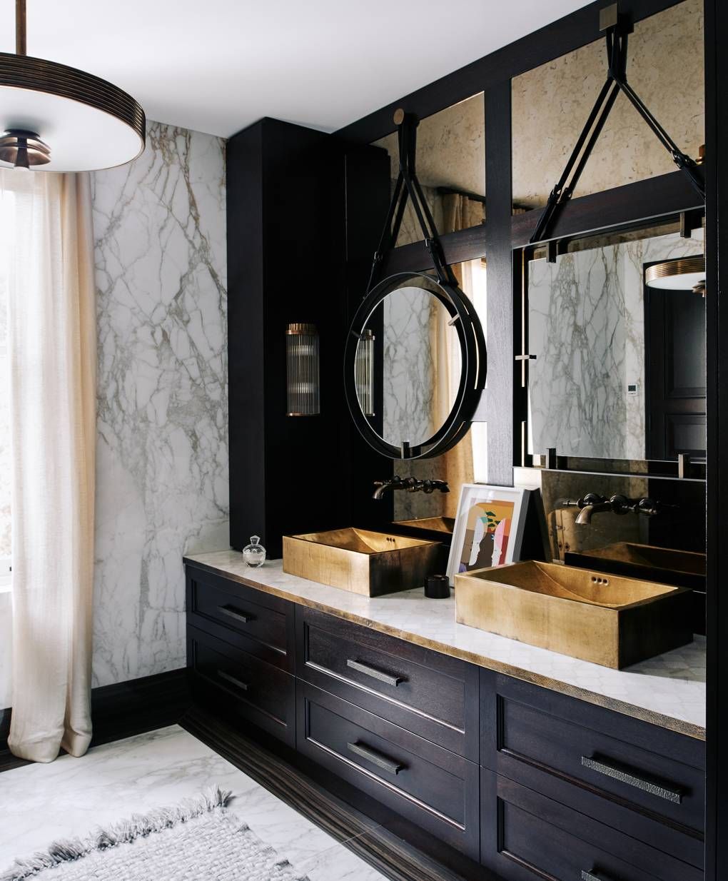
Obviously, you’re not limited to only using black and white in your bathroom. These can still be your main colors but you can also add a third color tone if you want to add more character to the space or if you feel it’s just too plain. Interior designer Shalini Misra gives here a very inspiring example of how that might look like.
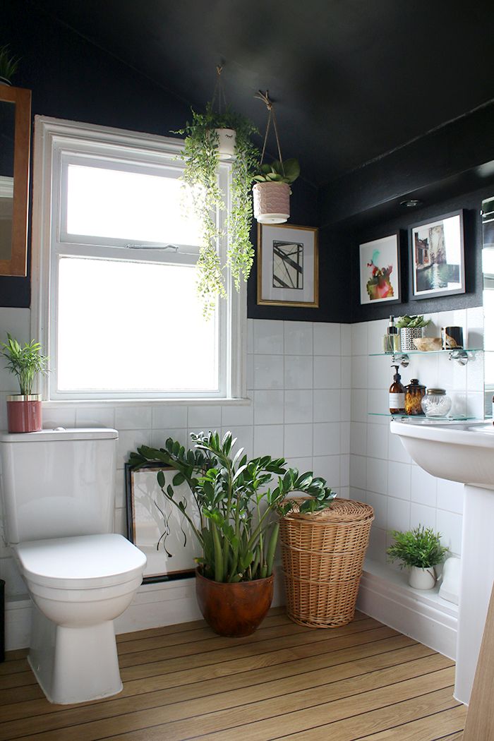
We love the simplicity of this boho chic bathroom and the fact that it looks super warm and cozy without seeming cluttered or tiny. The ceiling is black and the top section of the walls match it, with the rest being covered is small square-shaped white tiles. The wooden floor and all the indoor plants add lots of color and lots of character to the design. Check out the before and after images on swoonworthy.
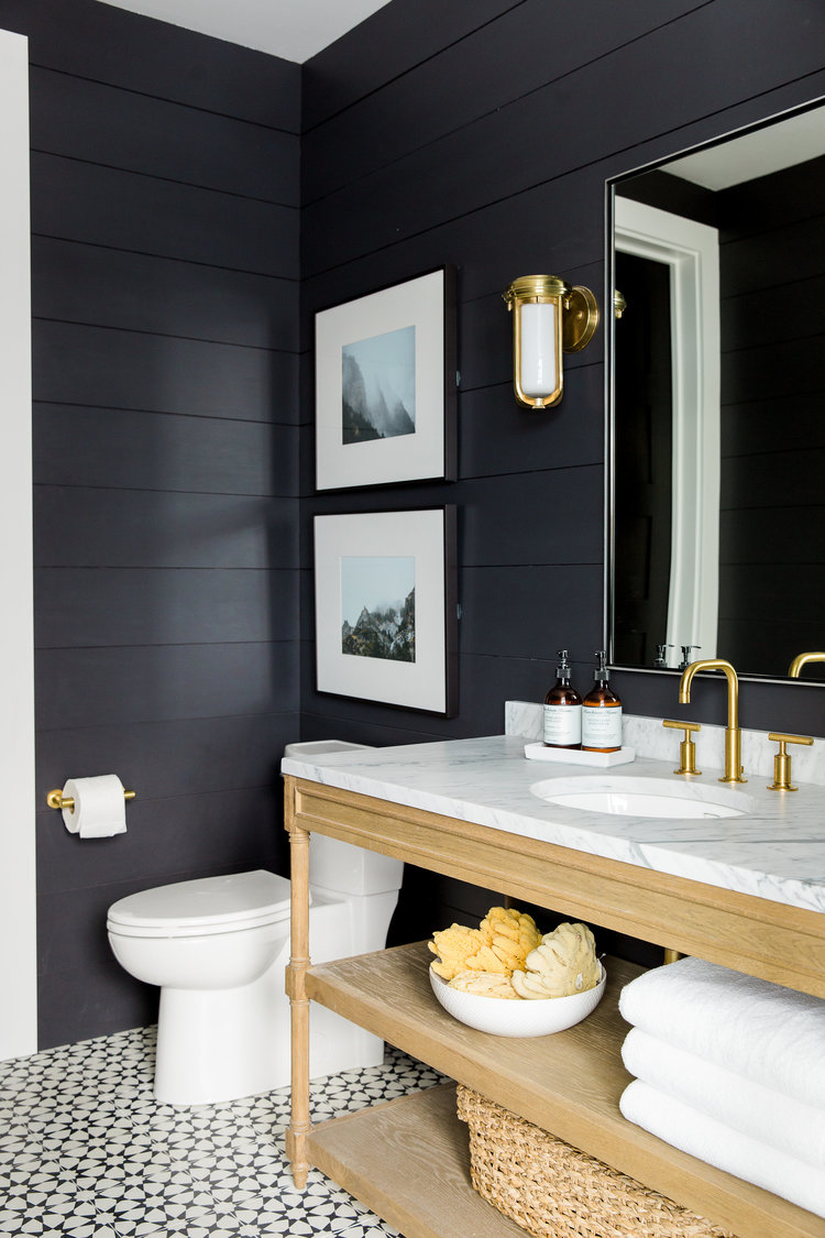
This is another case where wooden surfaces and golden accents break the monotony of a black and white bathroom design. The decor is simple and relies of pattern and texture to look distinguished and interesting, featuring a white marble vanity top with soft grey veins and black and white floor tiles. Find out more details on studio-mcgee.
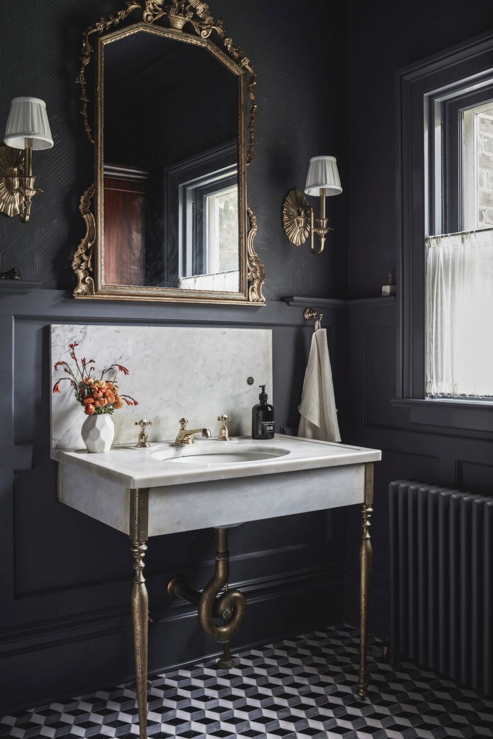
While it’s true that in some cases a choice of dark colors can make spaces look gloomy and smaller than they actually are, that shouldn’t discourage you from using black in your own home’s interior design. Black is a very elegant color which can actually give a space a highly sophisticated appearance, especially when paired with carefully-selected accent features and decorations. This bathroom featured on houseofbrinson reflects all that perfectly.
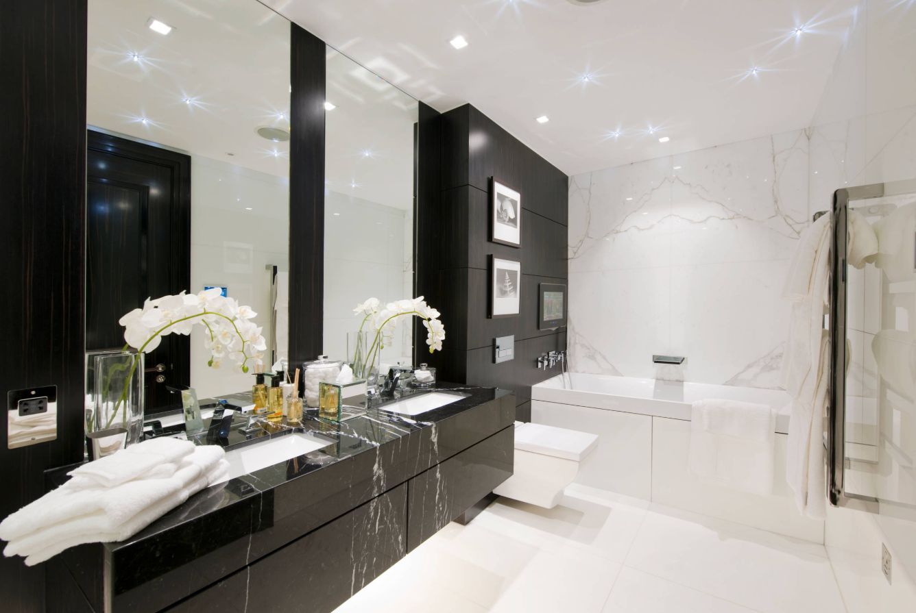
If you want to add some black and white to your bathroom but you also want to avoid making it look flat and uninteresting, marble is a wonderful option. Black and white marble will give you the elegant and sophisticated vibe you might be looking for without making the bathroom look too busy.
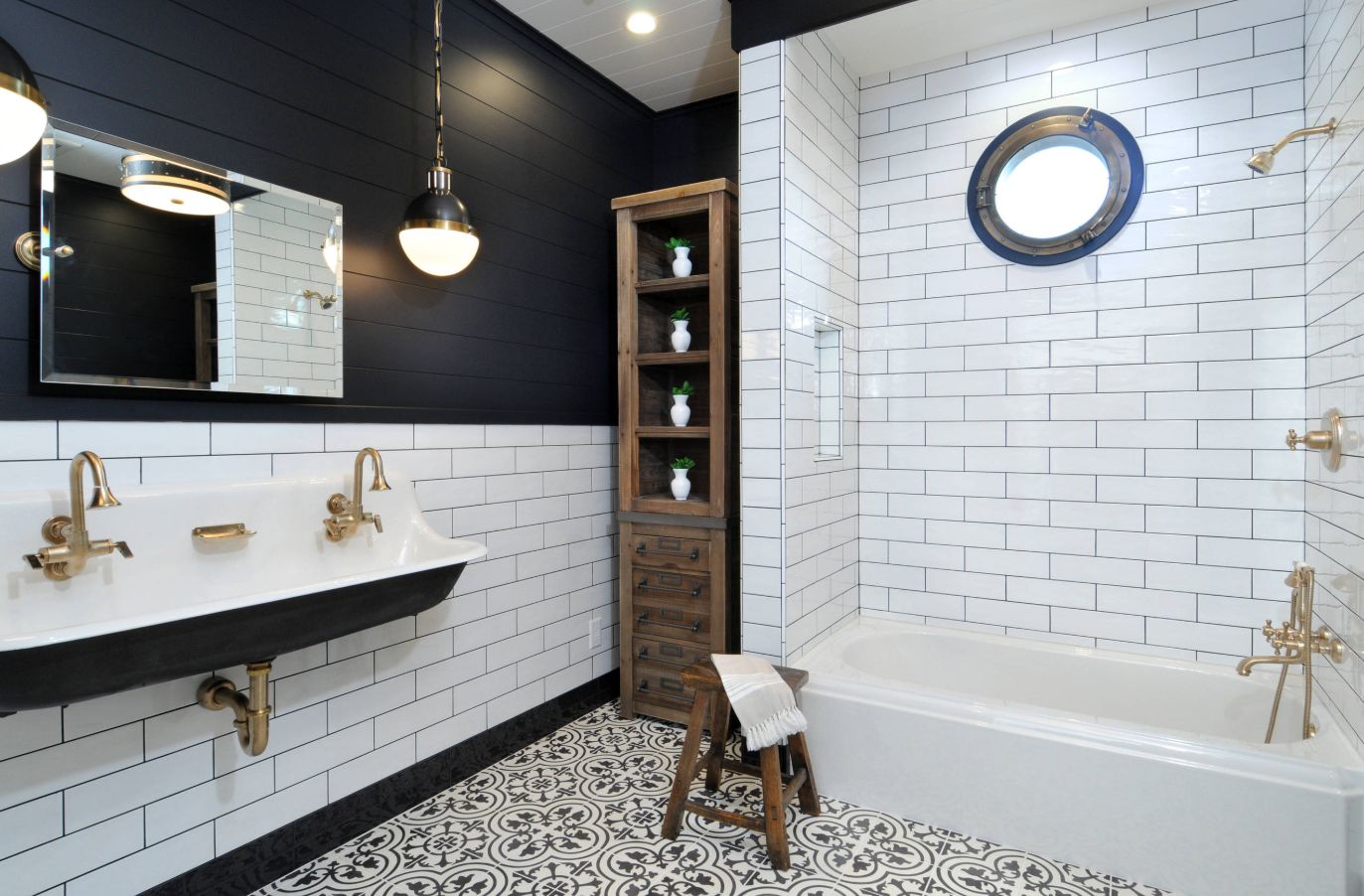
If you’re not relying on bold colors to make your bathroom stand out, pattern is always a wonderful alternative. You can mix and match different patterns like studio Luxe Design did here. Notice the busy pattern on the floor tiles complemented by a classic subway tile display on the walls mixed with simple horizontal stripes.
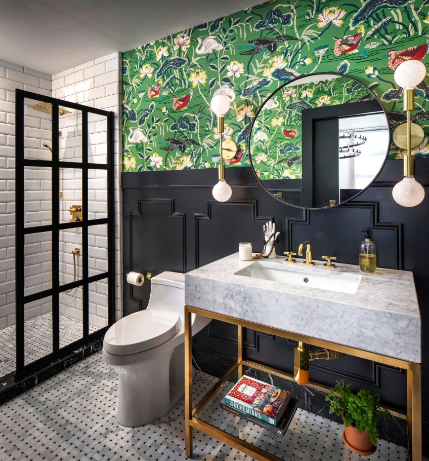
We like the idea of adding a touch of color to otherwise very simple and neutral interior design and that’s an exciting strategy which studio CM Natural Designs used here. This bathroom also bursts with a pattern, featuring a variety of designs which complement each other very nicely.
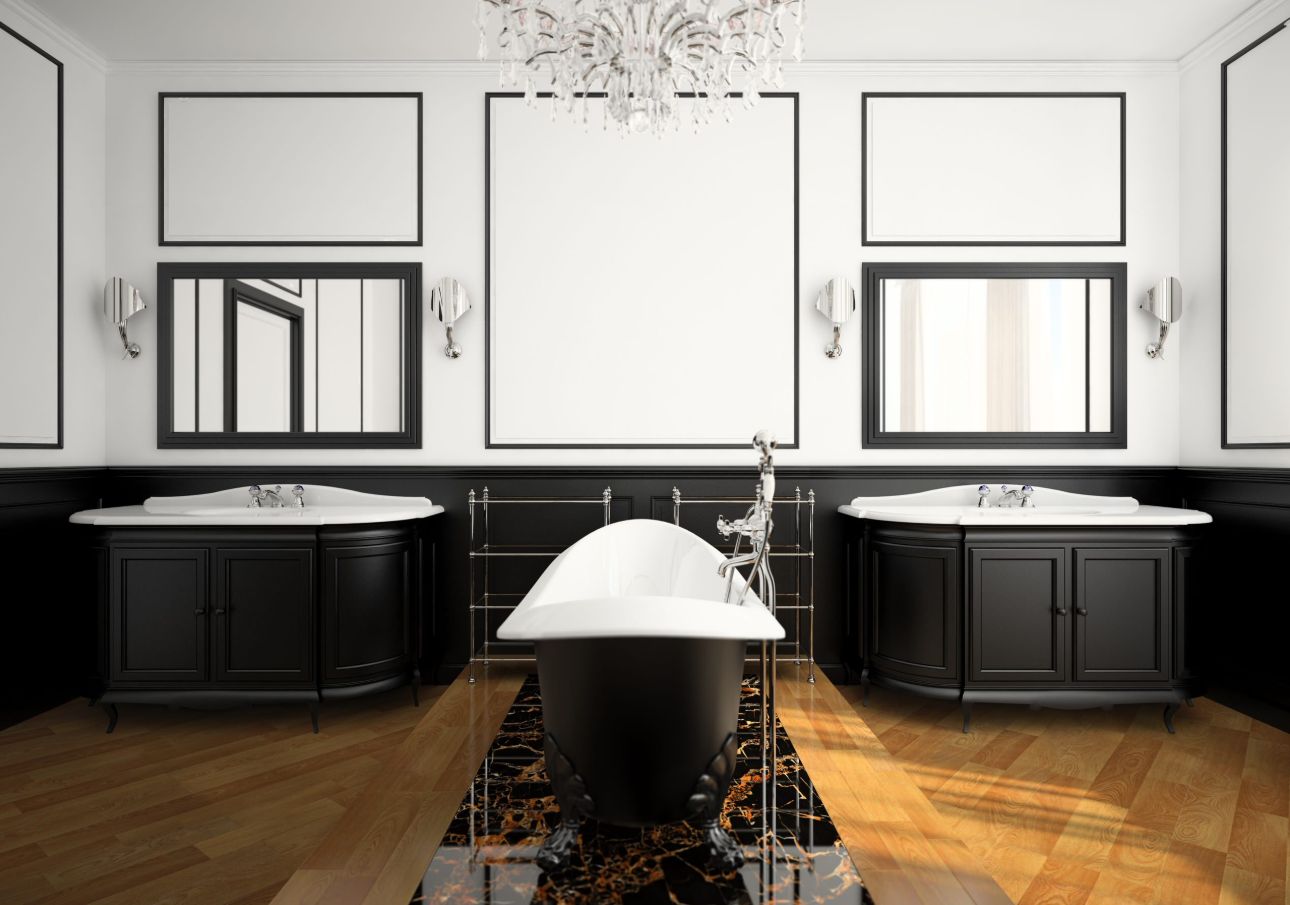
Symmetry seems to be a key feature in the design of this luxury bathroom. The freestanding clawfoot tub sits at the center of the room on a raised platform, with two vanity sinks evenly spaced apart and matching wall-mounted mirrors and light fixtures. A large chandelier hangs at the center just above the tub.
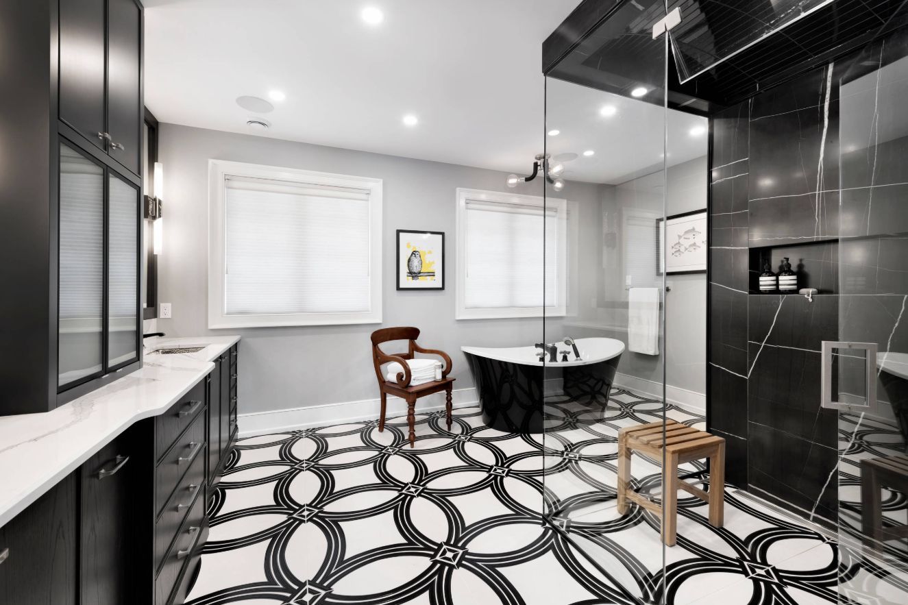
The floor is rarely the focal point of any room which is exactly what makes this bathroom designed by Style Haus Interiors so interesting. The ceiling is white and the walls are actually a very light shade of grey, giving the bathroom a less austere appearance than white walls would have.
