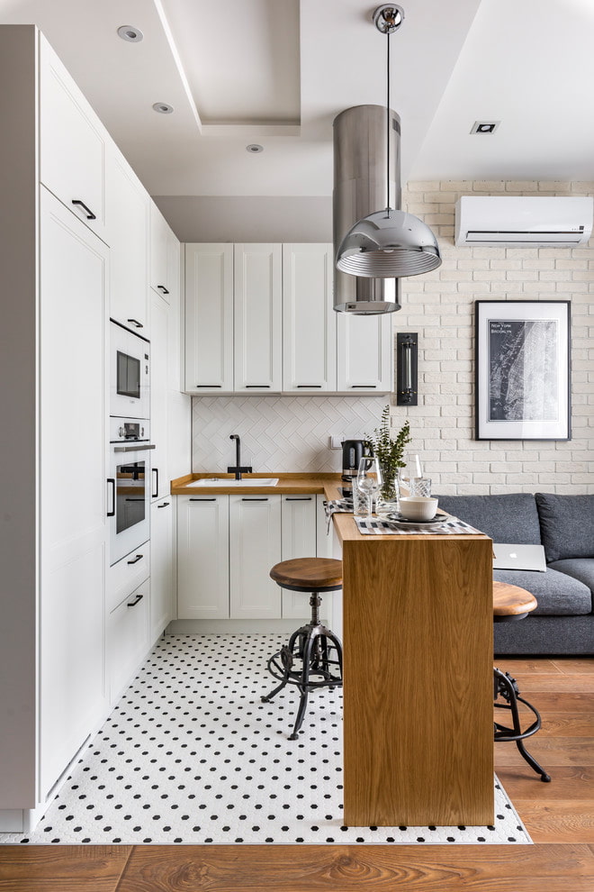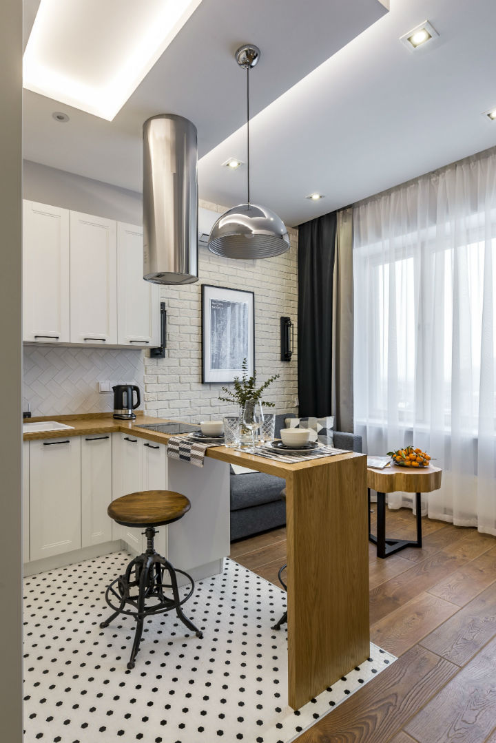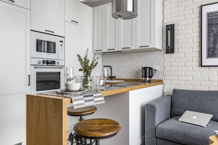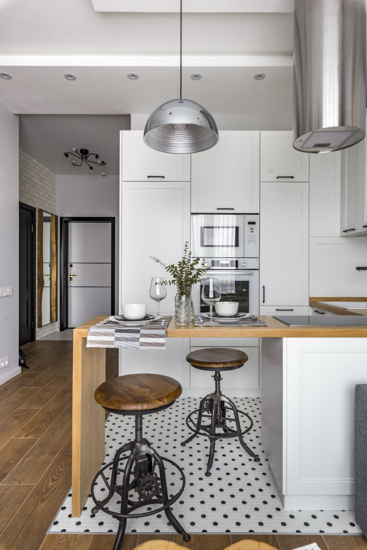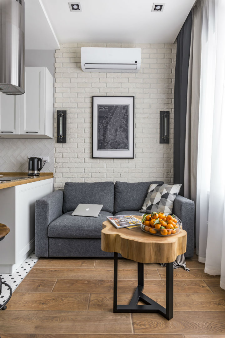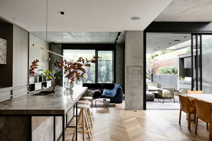
This apartment by ArchIdea, combines both, modern and classic looks. In this interior design example, the combination of old and new trends are perfectly matched and as a result, it produces a unique, yet smooth look. The kitchen and the living room are joint in one area, yet each of these two spaces has discrete looks and designs, making them look separate.
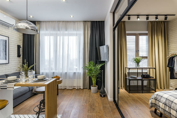
Looking at the living area, it tried to achieve more of a classic look. The walls are made from warm white bricks, which are carefully placed in a common brick pattern. It goes great with the flooring, which has medium dark, large wood plank look. The couch and the curtain are both in blue, which enhances the living room area and gives it a more fleshed-out look. Finally, the table is made out of a slice of a tree trunk, which finalizes the classic look. Keep in mind that the living room of this apartment was not designed to be completely old-fashioned, it was rather inspired by such a style. It is a modernized-classic interior.
Going to the kitchen area, it is completely modern. All white kitchen cabinets, microwave, and oven grant it such a look. In addition, the wall behind a faucet is covered in smooth white tiles put together in a modern, vertical zigzag pattern. The black details, such as cabinet handles, a faucet, and even the kettle finalizes the modern look of the kitchen area. Besides, the lamp and the kitchen hood are all-metallic, which is a great interior choice to balance out the all-white look in the kitchen. Finally, the flooring of the kitchen area is made from small white and black octagonal tiles, which produces a black-dot pattern. The majority of the tiles are white, which meshes with most of the interior, while scarcely used black pieces go together with beforehand mentioned cabinet handles and other black details.


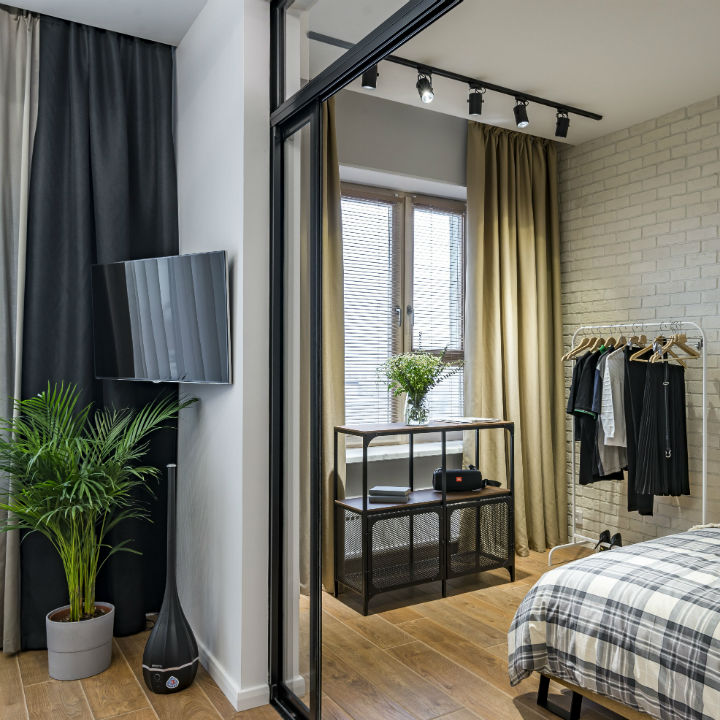
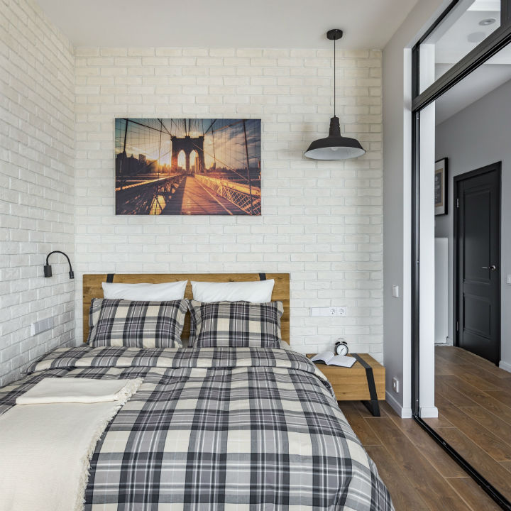
The bedroom is separated by glass sliding doors, framed in black. The walls of the bedroom are covered by the same warm-white bricks as the living-room space, and the flooring has the same wood look too. Finally, the bed and the nightstand has a slightly brighter wood look than the floors of the bedroom and the living room, which gives a little bit more contrast between the floors and the furniture.


In brief, this apartment perfectly combined modern and classic looks. Even though the living room and the kitchen are in one space, their areas are separated by different design styles. The bedroom, just like the living room. follows the same modern look inspired by the classic design.
