15 Elements to Give Your Kitchen an Incredible Mid-Century Modern Makeover
Mid-century modern is one of those timeless styles that is always in vogue, including for the kitchen. Its inherent characteristics make mid-century a perfect fit for today’s contemporary, modern and eclectic home décor styles. The clean lines and lack of excess are ideal for this most heavily used space of the home. Even if the goal is just incorporating a few mid-century modern touches, there are plenty of ways to do that in the kitchen. The shapes, colors and materials associated with this design era are perfect for mixing with today’s newer materials and on-trend styles. Here are 15 different elements to incorporate into a mid-century modern kitchen makeover, from major changes to smaller accents.
Embrace Galley Style
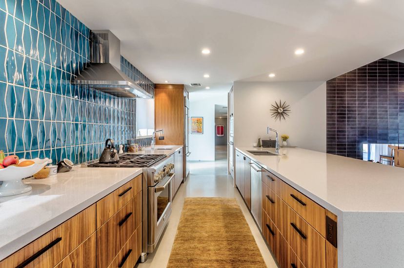
Mid-century modern design gave birth to the open floor plan concept, but the kitchens of that era were not the sprawling spaces that they are today. True mid-century kitchens are generally galley style, which may or may not be open on one side. The galley style is very efficient because it is one long space with a counter running down each side. Making the kitchen flow and feel like it has a relationship with the adjoining spaces was the main aim of that era. While today’s popular floor plans include a large open plan where the kitchen is an integral part of the living space, a galley kitchen floor plan can still be a stand-out feature that feels on-trend.{design found on kossdb}.
Laminate Countertops
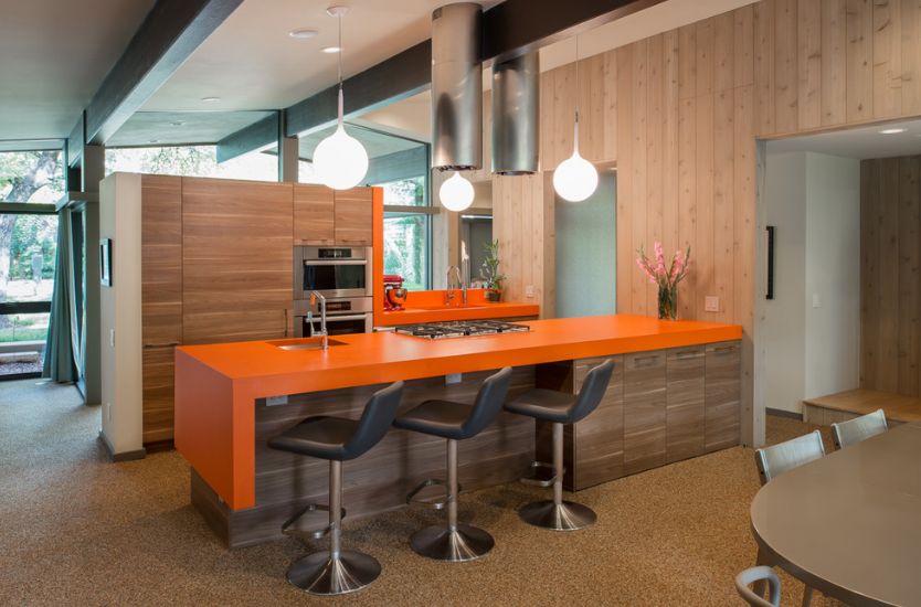
They’re baaaack! Home buyers have snubbed laminate countertops in a decades-long love affair with granite but that is definitely changing. Along with technical innovations, new types of laminates have hit the market and they are far more affordable and look way better than they did back in the 80s. While newer types mimic other materials, the new laminates are also ideal for homeowners who want a mid-century style in the kitchen. Formica was the first major company to market the material back in its initial heyday and is still producing it, only in new and improved forms. Besides being more affordable than natural materials like various stones, they are indeed durable. And, the colors that are available are a natural fit for a mid-century remodel.{found on webberstudio}.
Flooring
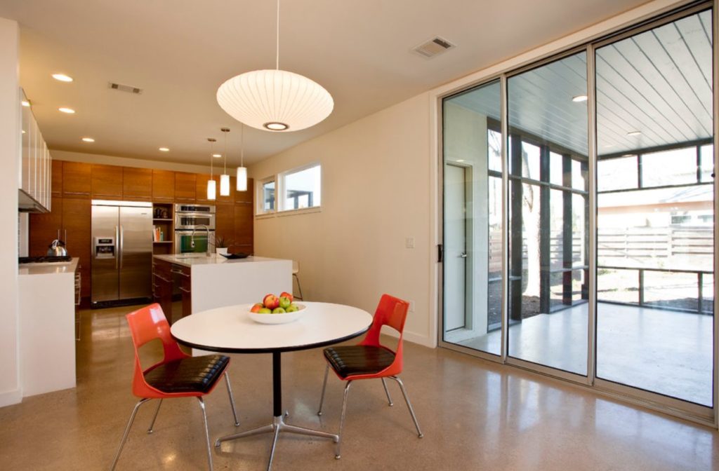
The flooring is a really essential element in the kitchen because it can set the tone for the entire space. Traditionally, mid-century modern kitchen floors were finished in natural stone floors such slate, bluestone, travertine or in terrazzo. If you like the look but don’t have the budget for these, many new tiles have the same look but at more affordable prices and with less maintenance. Other materials that work with the mid-century vibe are cork and wood, although the choice of wood is critical for fitting with the period. Pick something that is medium in tone and highlights a subtle grain. No trendy gray wide plank flooring here!
Flat Front Cabinets
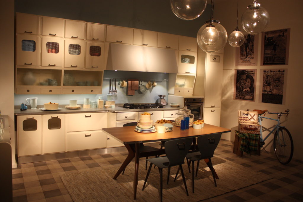
As the pendulum of popularity swung away from mid-century modern’s pared-down look, kitchen cabinets became more decorated, with trim panels dominating the market. As kitchens again became more modern and mid-century resurged, flat front — also called slab doors — started trending. Ideal for all types of modern kitchens thanks to their sleeker look, they are the only type that works in a mid-century modern kitchen. For a time, flat-front cabinets were considered undesirable because they are cheaper to produce, but this is definitely no longer the case.
Metal Cabinets
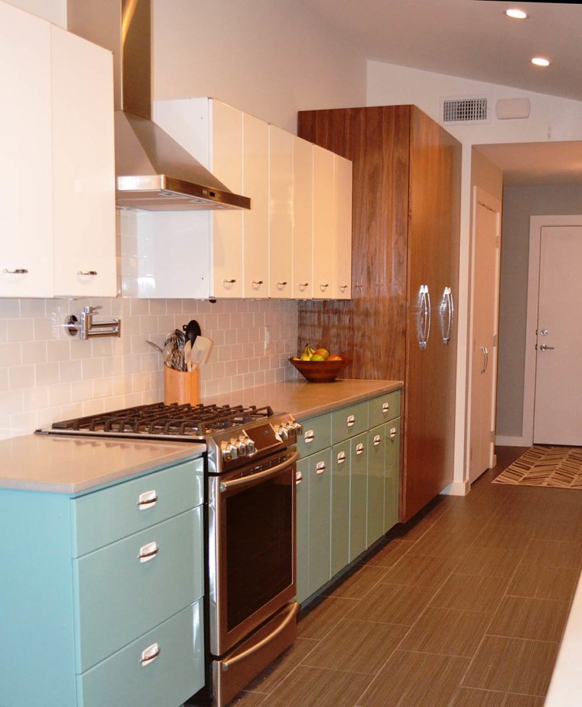
For a truly retro mid-century modern kitchen, there is no better cabinet choice than metal. Yes indeed, metal cabinets were still part of the kitchen landscape in that design era. After World War II, steel was an in-demand material for American homes, especially since production capacity had been scaled up during the war. Of course, the mid-century design era saw the emergence of new materials like plastic and plywood in home decor, and toward the beginning of the 1960’s wood was becoming more prevalent in kitchen designs as the trend for steel started to fade. Today there are manufacturers who produce modern versions of retro metal cabinetry, or you can duke it out with other enthusiasts who hunt for vintage originals that can be repainted and recoated.{found on retrorenovation}.
Open Shelving
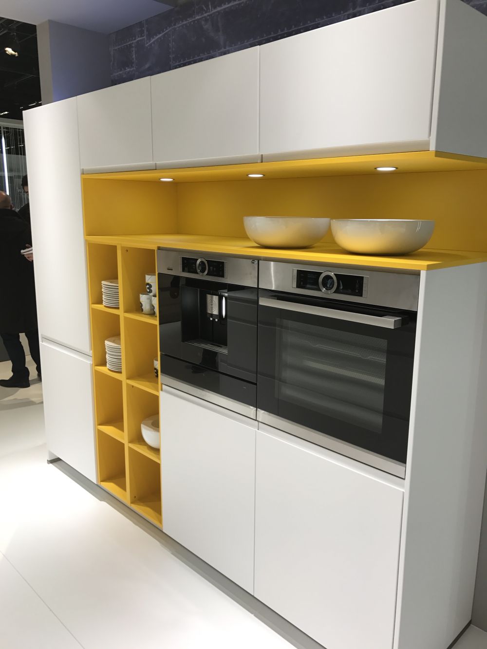
The more open vibe of mid-century modern kitchens can be emphasized by using open shelving, either as a major feature or as an accent. Even just a section of open shelves creates a totally different look. Often these can be used over the kitchen sink or at the end of a shelving unit. In any case, a confined section is also a great place to add a bold pop of color, which was very popular during this design era. Even in a mid-century kitchen that features a lot of wood, open shelving can lighten up the space and add visual appeal.
Breakfast Nook
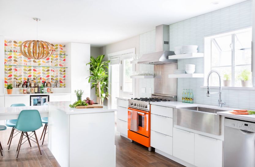
As kitchens got larger, ceilings got higher and spaces more expansive, people still wanted a defined area for casual meals. The explains the popularity of the breakfast nook in mid-century designs as well as its increasing reappearance in current kitchens. Today’s floor plans are even more open, and the built-in seats and cozy design of a nook help create a little haven in the kitchen that draws people in to share a bite or a cup of coffee.
Pastels
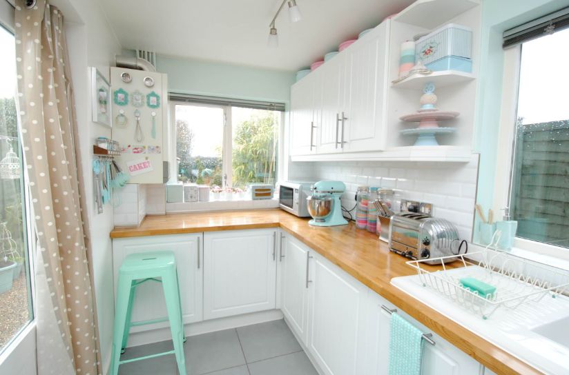
There’s nothing that says vintage like pastel colors in the kitchen! These became popular in the 1950s and continued on into the mid-century era when they eventually got bolder. Choosing a pastel color for your walls or other elements in the kitchen will most definitely make it feel cheery, especially when used in a mid-century kitchen that features a lot of brown wood. For walls, pale yellows and greens are the most common, while for painted cabinetry pale blue was also popular. Most importantly, if you’re set on incorporating colored cabinets, it’s best to stick to white or cream for the walls so it doesn’t start to feel like overkill.{found on toriejayne}.
Bold Color
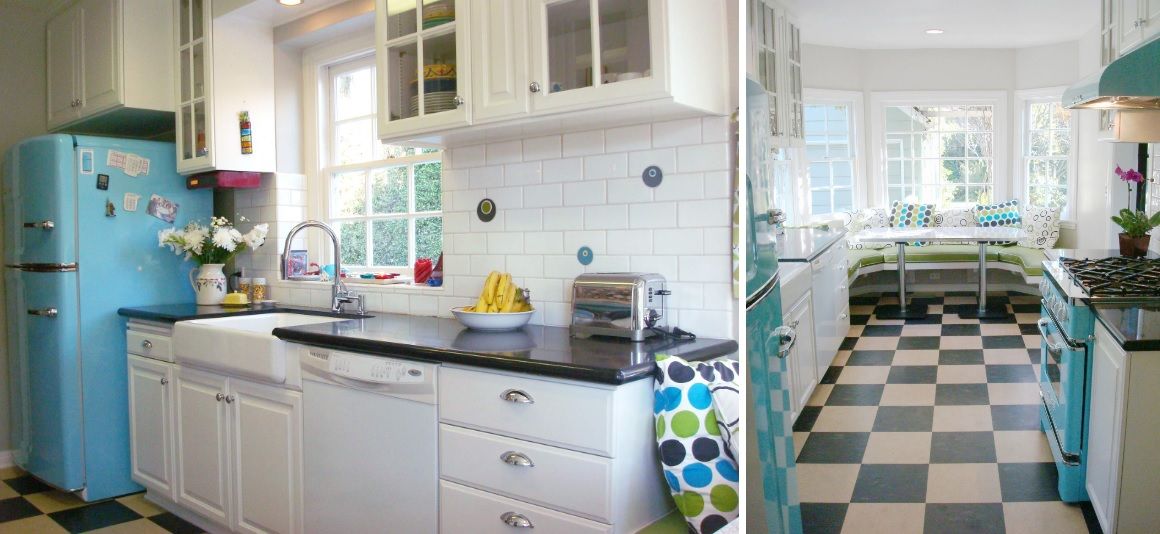
The mid-century design era might be best known for its use of bold colors like turquoise, apple green and orange. These bright hues provided a pop of color in spaces that were sometimes heavily done in wood grains, especially in the latter years of the period. That said, they were also the dominant color in the space on many occasions, splashing huge swaths of color through the kitchen as homeowners chose to use bright orange countertops, vibrant tiled backsplashes or bold paint. It was a big color shift from the cheery, sweet pastels popular until that point and the perfect backdrop for a more minimalistic aesthetic. In fact, some pieces from the mid-century design period were called “furniture candy.”{found on mercurymosaics}.
Lighting
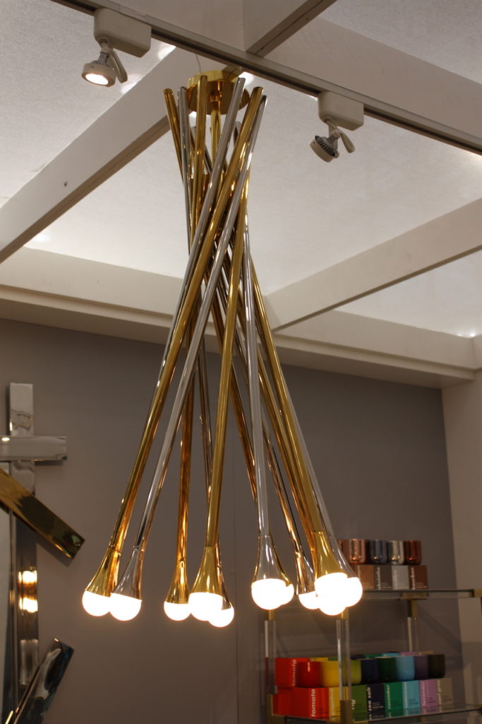
Lighting in the mid-century modern era had a definitive look that was inspired by Scandinavian and European styles, as well as new silhouettes that mimic jet and space technology. Since this was the era that saw designers experiment with new materials, lighting also was rendered in brass, steel, and early forms of plastic as well as wood. One iconic lighting design from the era is the sputnik style features, fueled by the launch of the Soviet spacecraft in 1957. Starbursts, metal and round bulbs were typical elements in the spiky designs of the mid-century period.
Retro Tile
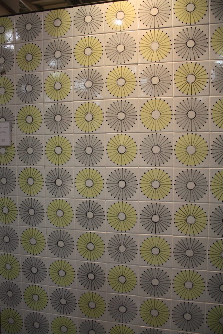
Mid-century modern homes used plenty of tile and the kitchen was no exception. To create the vibe of the era, many options are available today that go beyond what they were back in the 50s and 60s. While squares and rectangles are classic choices, they were not always the norm for mid-century modern styles. Hexagons, circles and others were found in mid-century tile designs and the styles available today have many more options. Also, a square is something altogether different when it features a retro graphic design like this retro-modern dandelion image.
Graphic Prints

One of the quickest ways to add a touch of mid-century style to the kitchen is with textiles because they are more affordable than furnishings. This is, of course, only true if you shop modern reinterpretations. True vintage textiles are expensive, small in yardages, and hard to find. Overall, they have a distinctive pattern that is usually an abstract or geometric repeat pattern. It was an era when small companies collaborated with architects, designers, or current artists to create patterned textiles. Kitchen towels, curtains and upholstery material for chairs can turn the kitchen up a notch when it comes to incorporating mid-century design.{found on beccastephens}.
Wood Grain
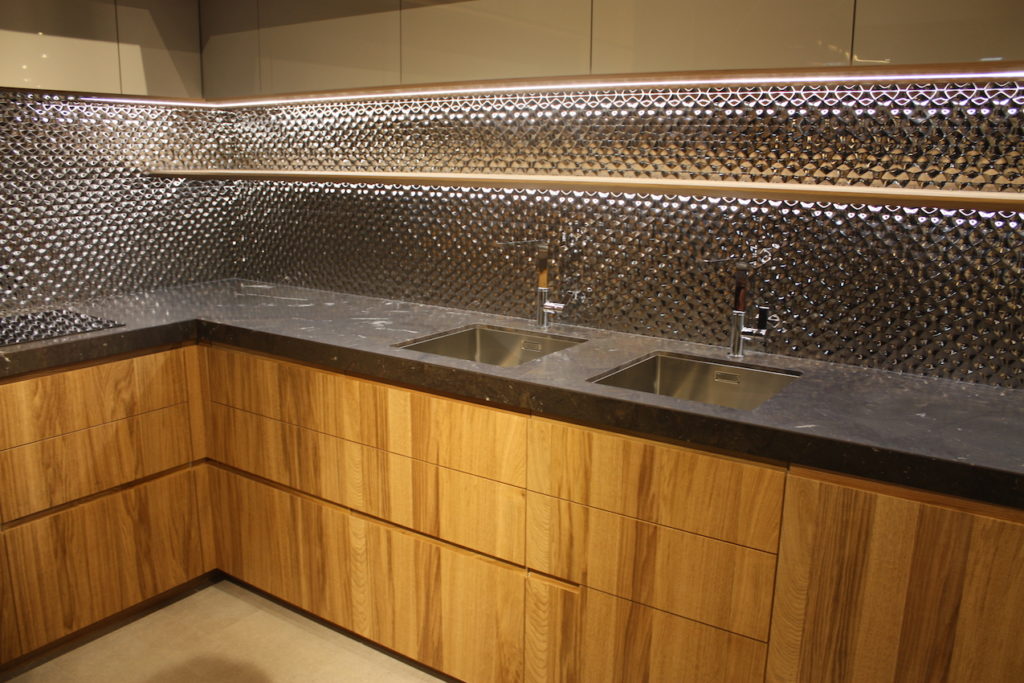
As we already mentioned, wood became popular in the kitchen as stainless steel fell out of favor in the 1950s. Mid-century kitchens started using this material for cabinetry because of its warm feeling and natural vibe, which fit well with the more open plan wooden furniture that was popular. If not used for the cabinetry, wood could be found on the ceiling and sometimes the walls of the kitchen. Moreover, the move toward mixing materials made it easy to incorporate wood in the design along with Formica countertops and tiled backsplashes. This movement was very similar to what we are seeing now among the mixed surfaces in contemporary kitchens.
Mid-Century Dining Set
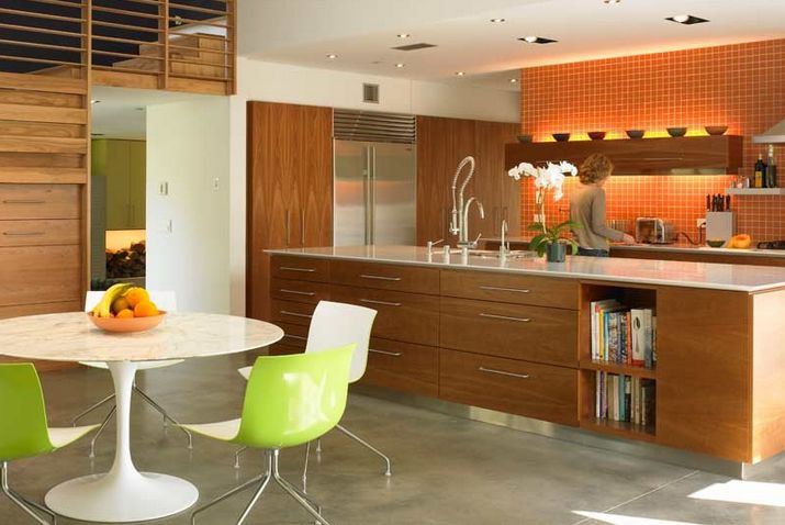
Making a big mid-century impact in your kitchen is easy if you add a dining set with the right characteristics. The iconic furniture of this era has clean lines and typically uses what were considered new materials at the time. Plastics and bent plywood are just two examples. Classic silhouettes from designers like the Eames, Panton, Bertoia and Saarinen are ideal. Here the classic tulip table is combined with molded chairs on minimal chrome legs, emphasizing the kitchen’s design era inspiration.
Vintage Accessories
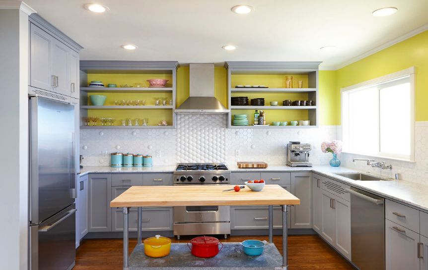
Vintage and vintage style accessories can be a godsend when trying to add a mid-century flair to your kitchen on a tighter budget. If you can’t remodel, retile, or buy a new dining set, you can add accessories that convey the sensibilities of that particular design period. A starburst clock 0r mirror, colorful mixing bowls and retro canisters can make a big difference when combined with pained accents that emphasize the era. Throw in some graphic textiles and that can do the trick.{found on nerland}.
The post 15 Elements to Give Your Kitchen an Incredible Mid-Century Modern Makeover appeared first on Home Decorating Trends – Homedit.
