Architects And Their Offices – A Sneak Peek Into Their World
An architect is part scientist and part artist with various possible sets of skills which can set them apart from the others. This unique combination often inspires an architect to create extraordinary projects and to innovate and become an inspiration for others. In the hopes to better understand how an architect’s mind works, we’re about to explore and analyze several office interiors and to discover how they reflect the unique styles and principles applies to each project that gets out these doors.
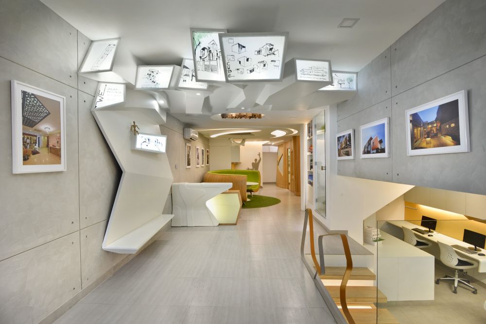
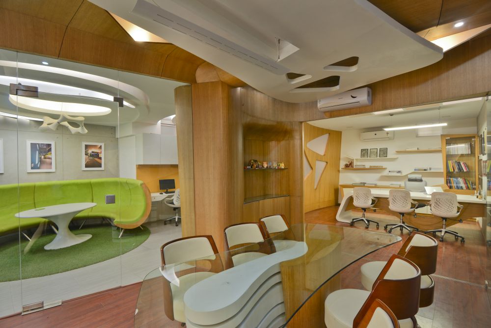
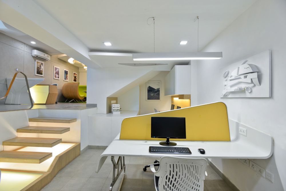
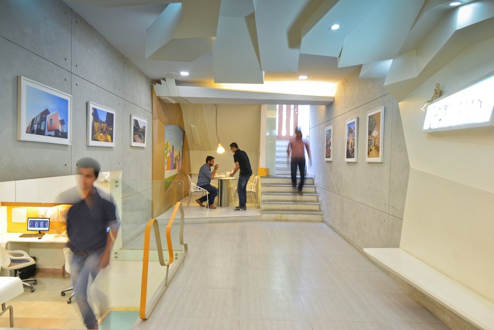
Spaces Architects@ka envisioned this office as a large and open space organized on two levels. The main idea was to create a space which inspires the architects to be creative, a workspace which they enjoy. The lower level is the workstation area and the upper one is a leisure area and gallery space. The office is located in New Delhi, India.
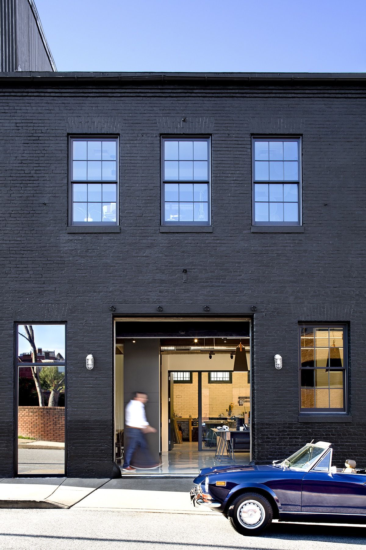
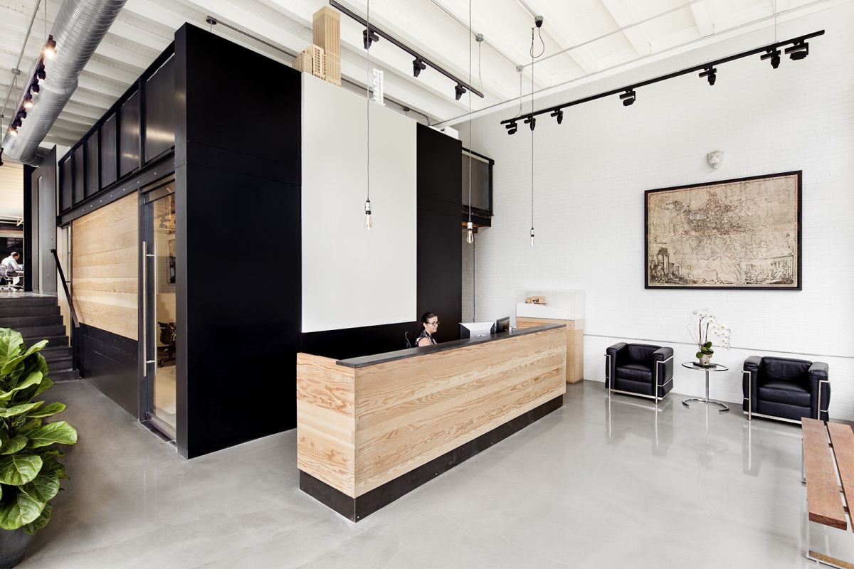
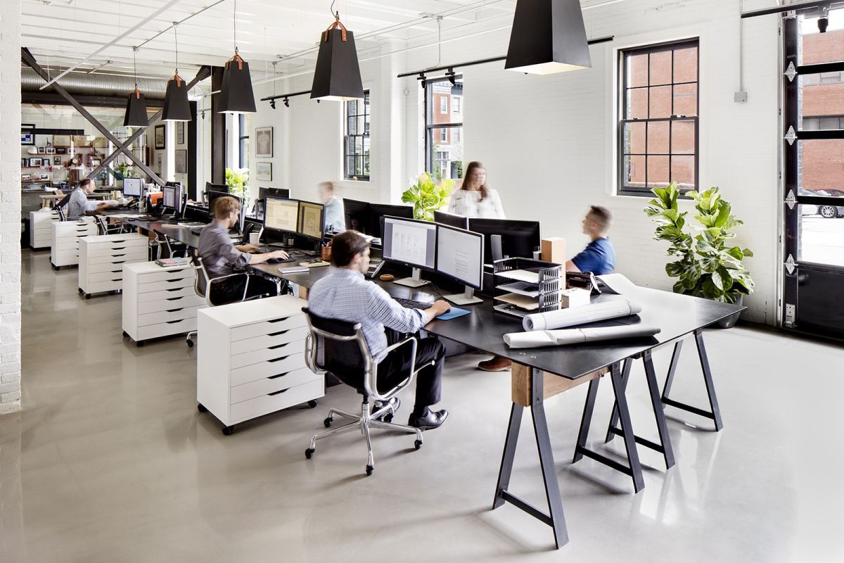
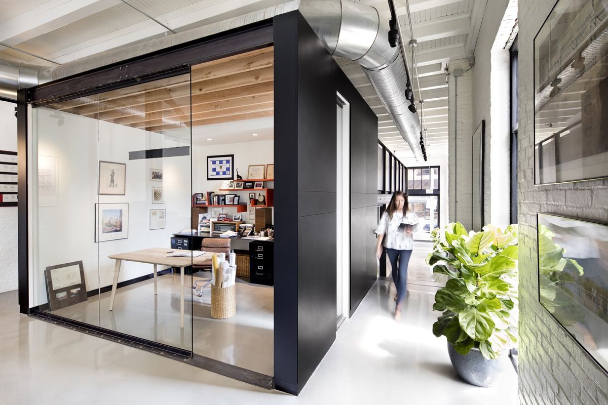
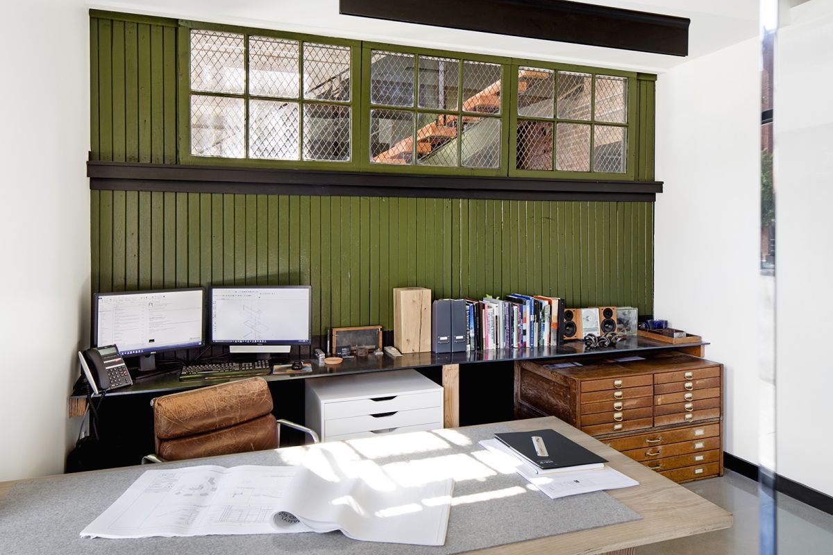
The new office of SM+P Architects located in a historic neighborhood from Baltimore uncovers the building’s past and incorporates elements which have been previously covered up and concealed. The building dates back to the 1800s and has served over the years as a stable, a car dealership, a restaurant and more. Some of the historic details have been hidden during past renovations and alterations and they have now been once again uncovered and mixed with a clean and modern aesthetic.
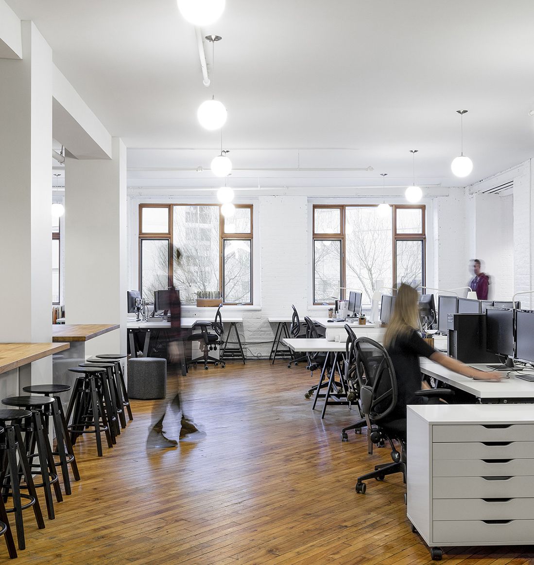
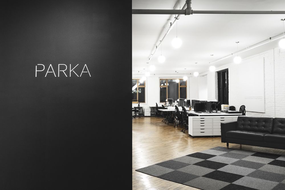
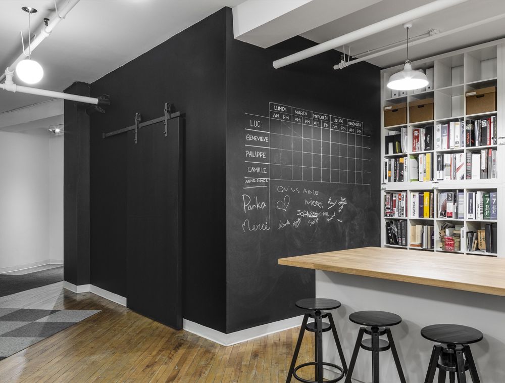
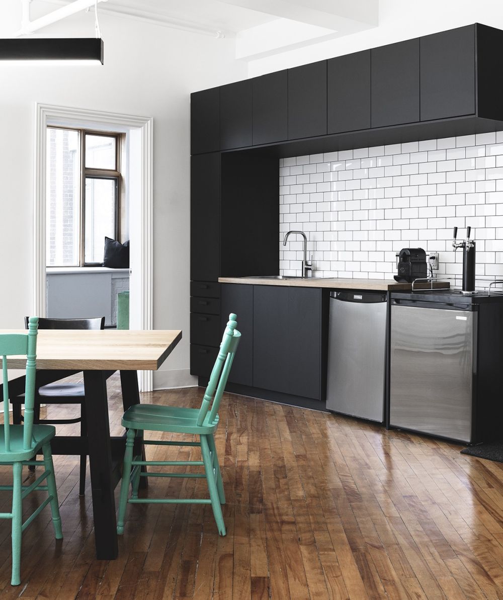
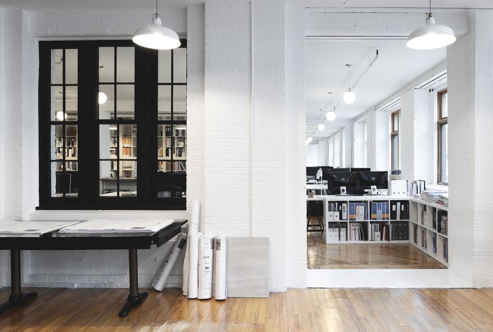
The design of this office is not only stylish and elegant but also reflective of the philosophy which drives PARKA Architecture to success. The studio places the individual at the center of it all so this office space was designed to be modest and friendly and to offer employees a variety of environments to work, socialize and interact. The office occupies an old shoe factory in Quebec, Canada.
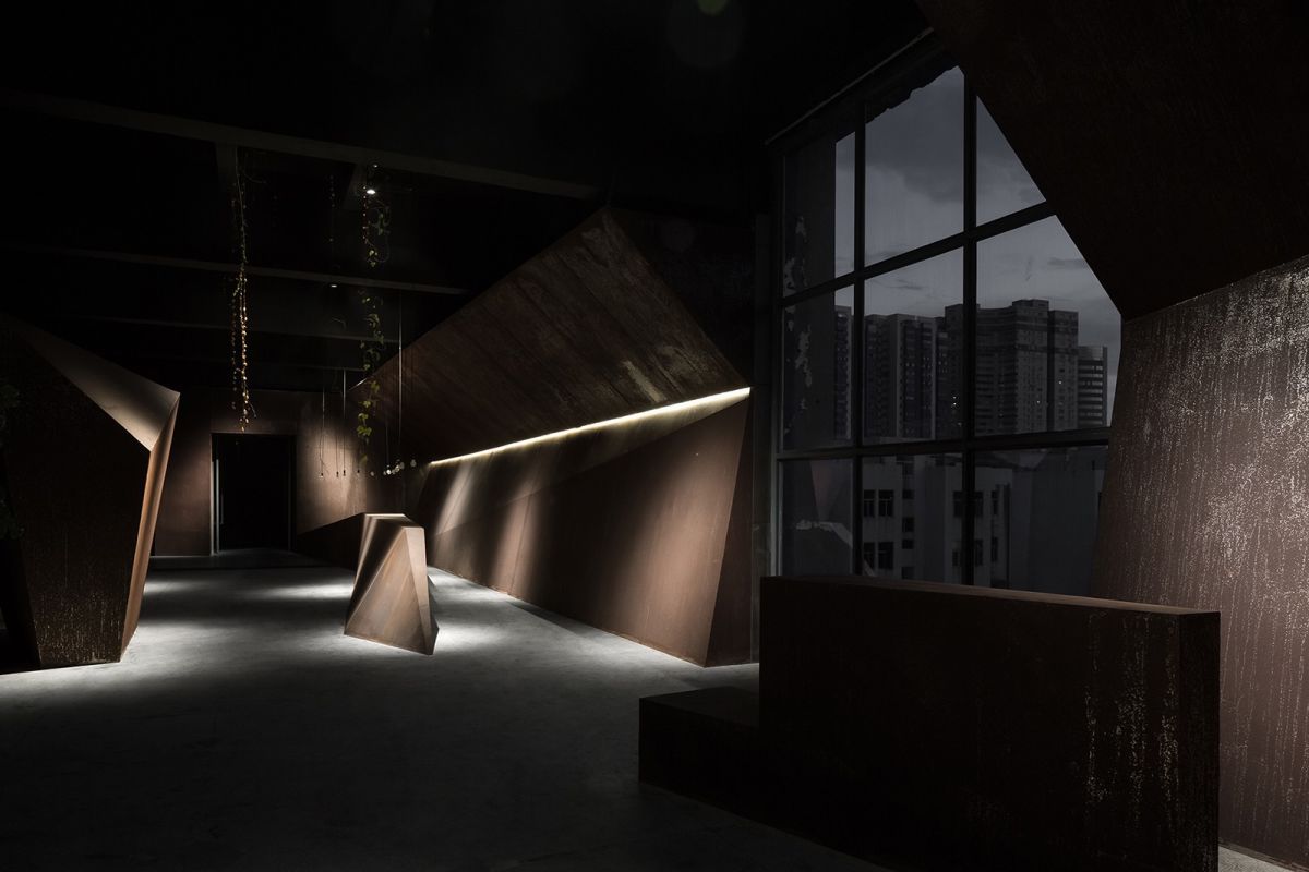
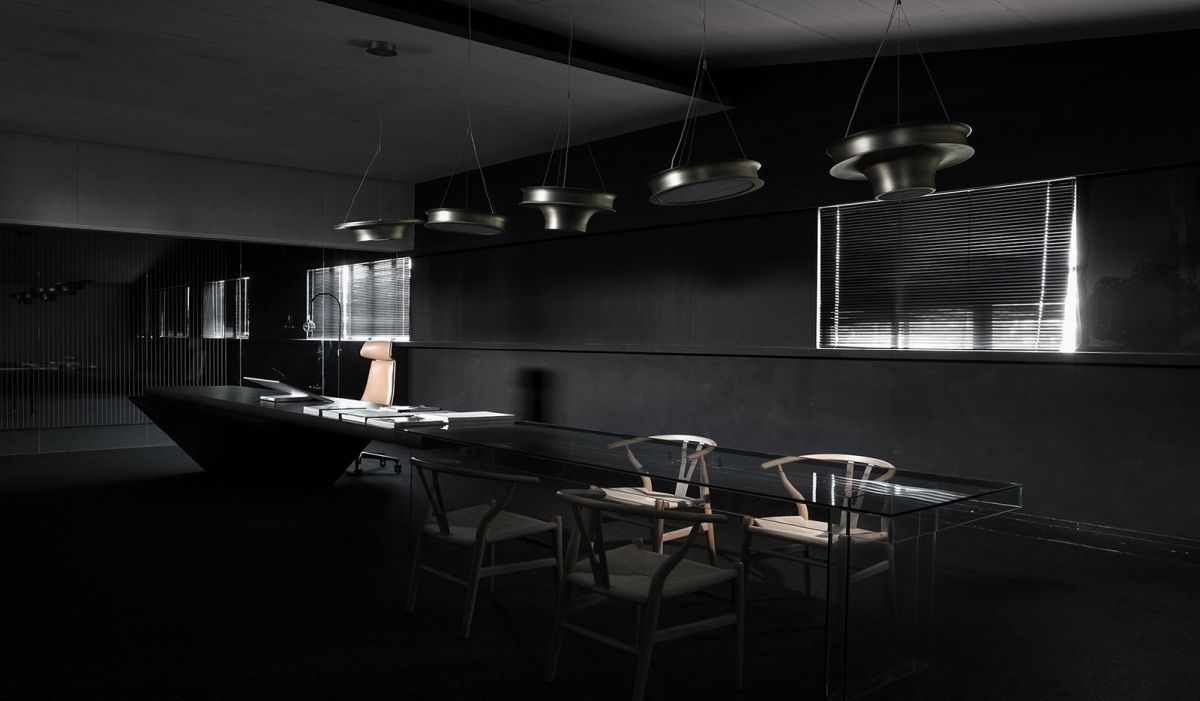
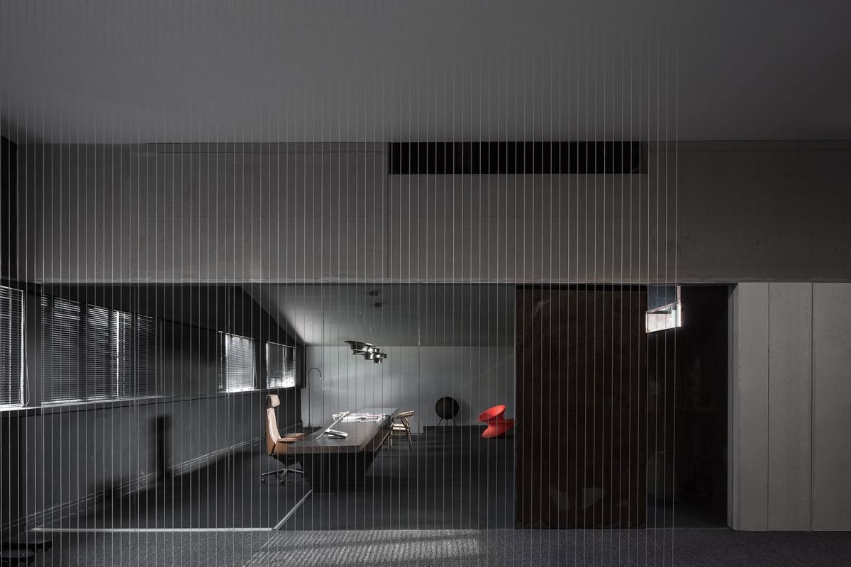
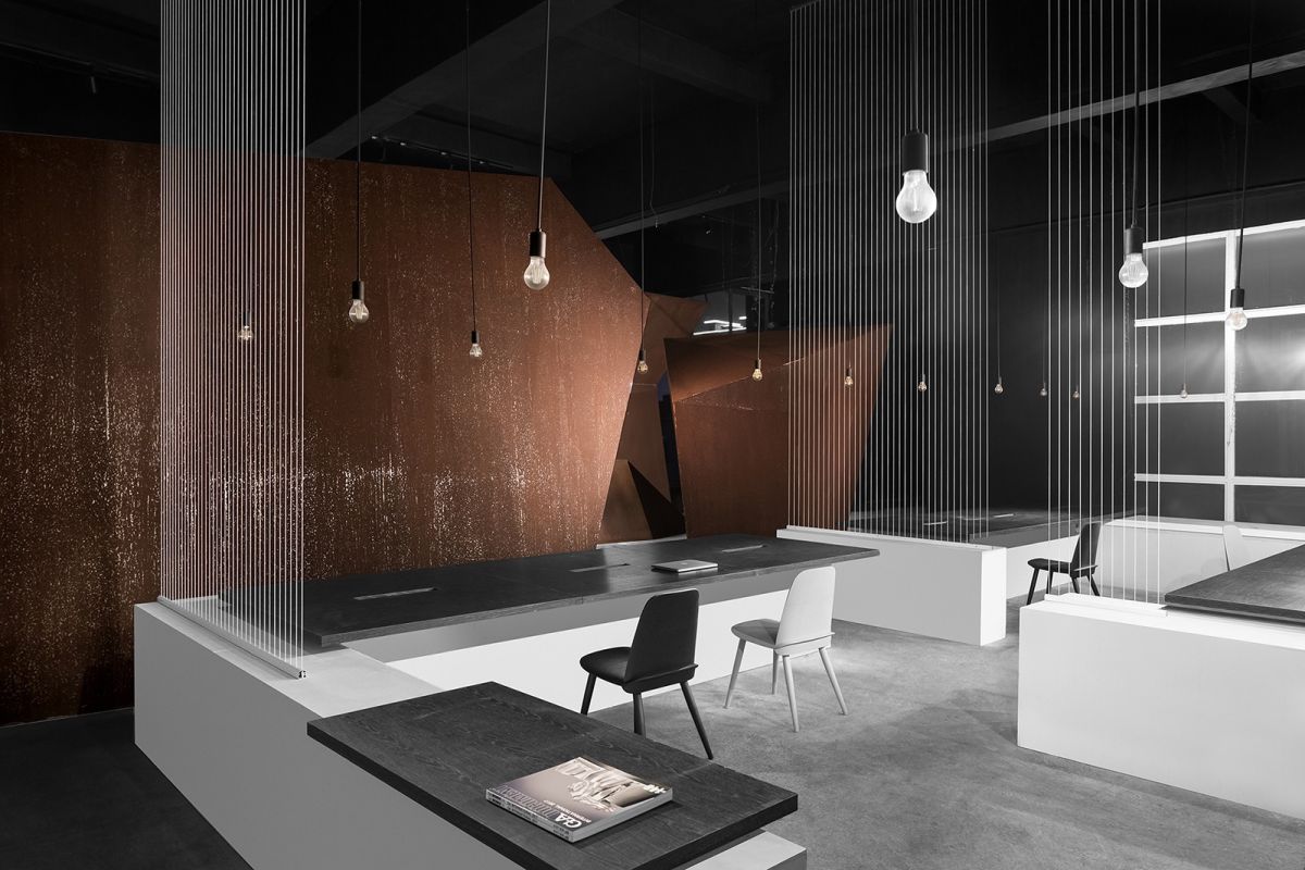
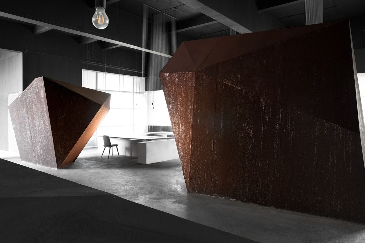
When AD Architecture designed its new office in Shantou, China, they took the time to listen to the space and to find inspiration in its past and original beauty so they didn’t change the design and the layout too much, trying to preserve the character and original charm as much as possible. The office is situated inside an old factory and takes advantage of the large space and lack of partitions and adornments. It has concrete floors, dark gray steel surfaces and iron elements which age naturally, developing a patina over time.
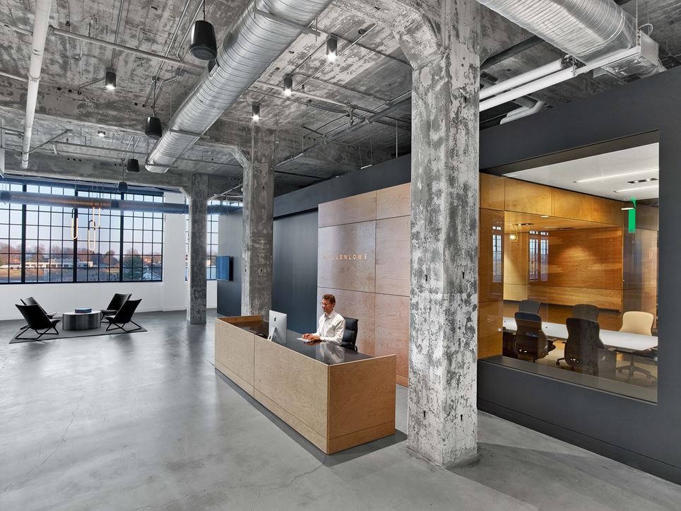
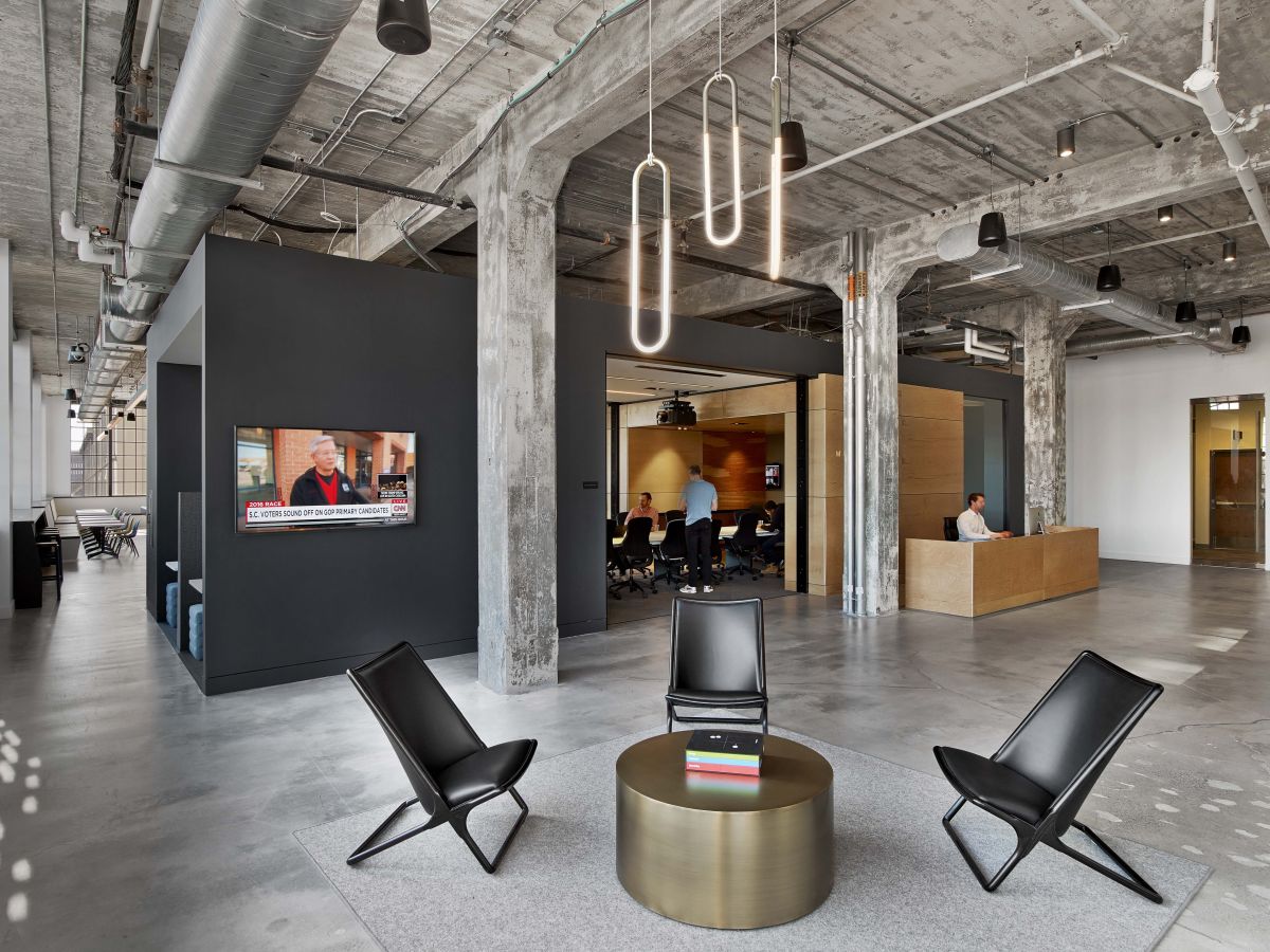
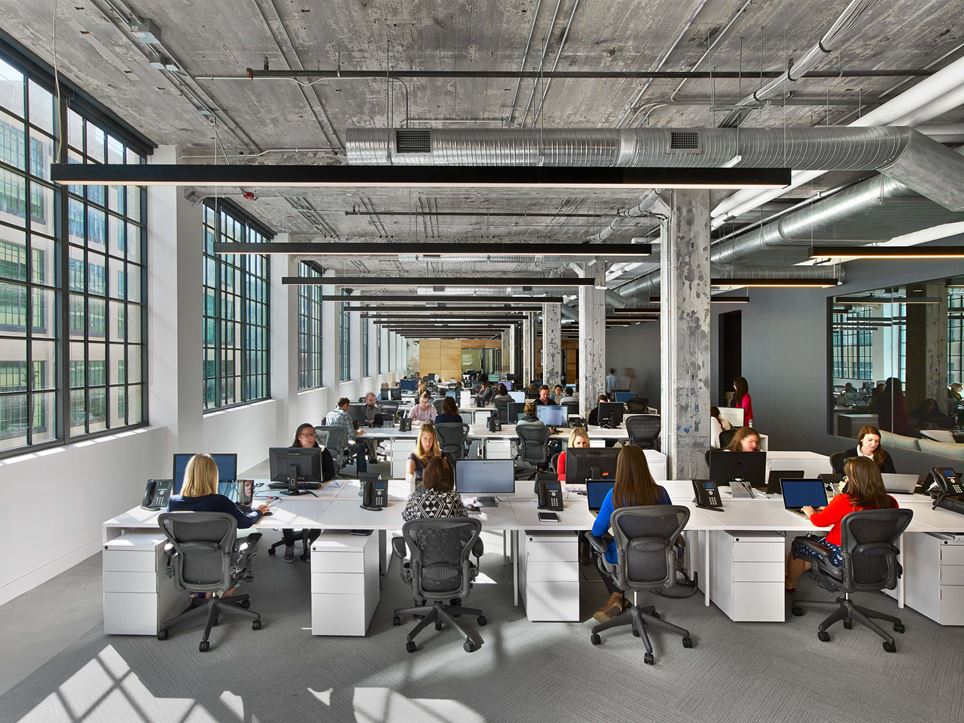
The new office of Mullen Lowe designed by TPG Architecture is pretty interesting too. It’s located inside a former tobacco factory and it makes the most of the large, open space, simple floor-plan and high ceilings. The rugged, unfinished look of the concrete beams and the ceilings combined with the metal-frame windows give the office an industrial vibe balanced by the sleek and modern furniture, carpeted floors and stylish light fixtures.

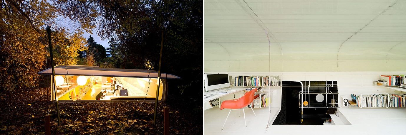
An office in the middle nature seems like a pretty inspiring place to work from but there aren’t exactly a lot of examples which actually fit this description. One of the few such projects was designed by architect Iwan Baan for his own practice, Selgas Cano. The office has a long and linear floor plan, completely open on one side and with a glass ceiling section. It’s located in Madrid, Spain.
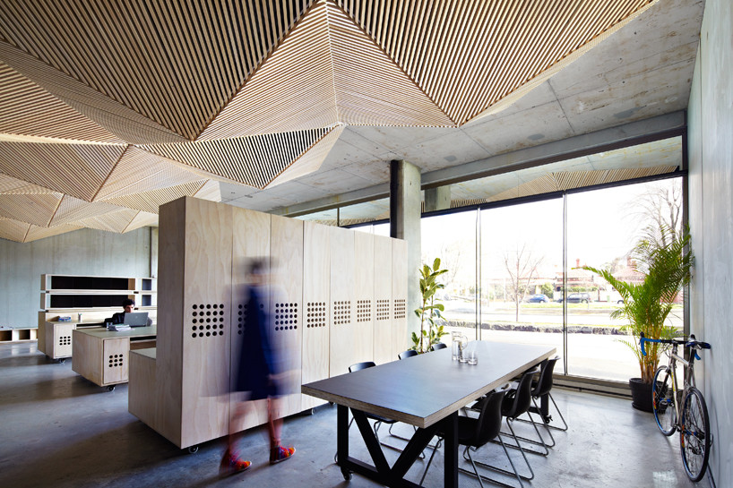
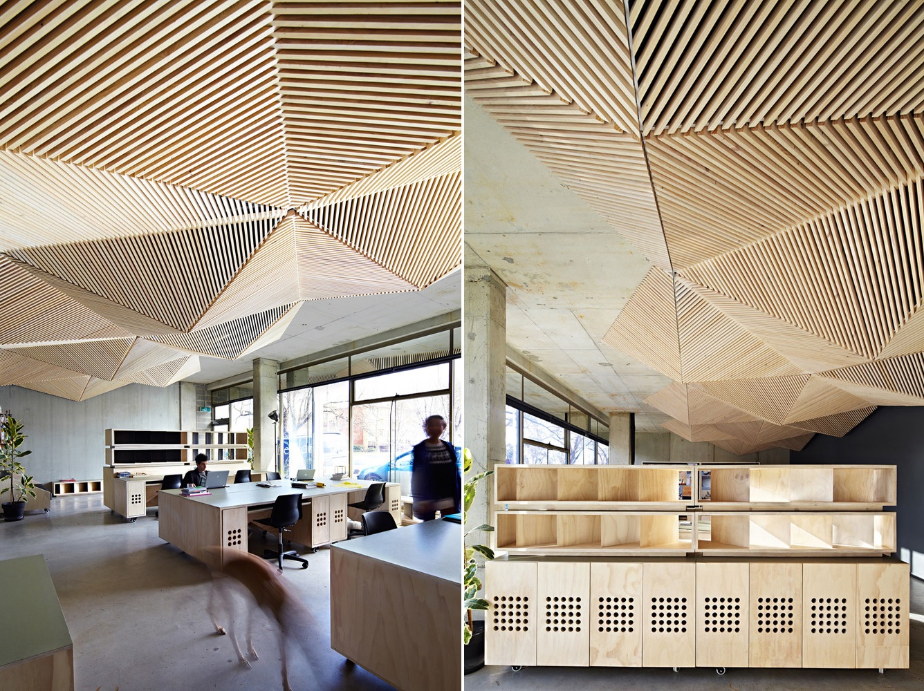
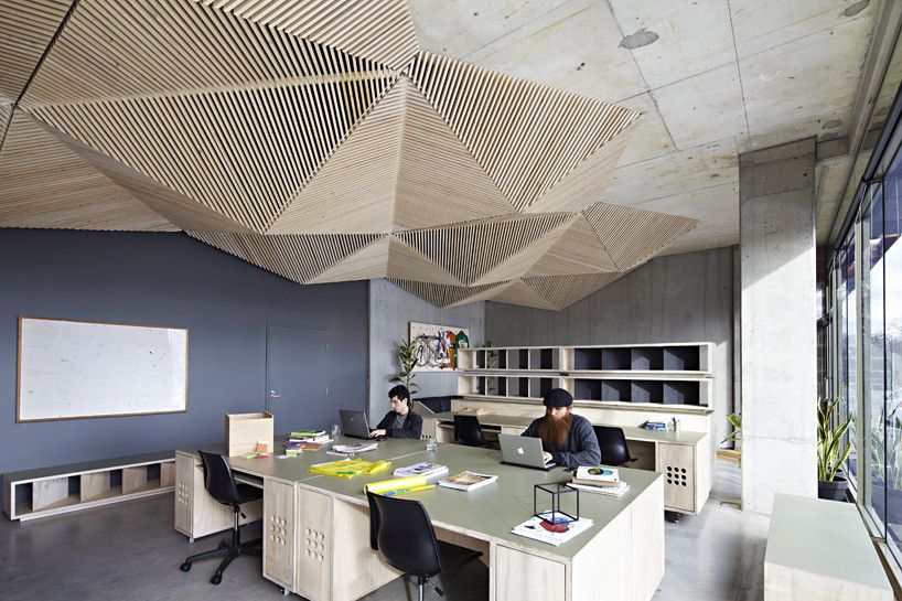
The ceiling design of this office designed by studio Assemble is definitely the focal point of the entire space. The office is located in Northcote VIC, Australia. The main objective of the project was to create a low-cost, flexible and at the same time inspiring workspace, one which would also reflect the company’s design capabilities and background.
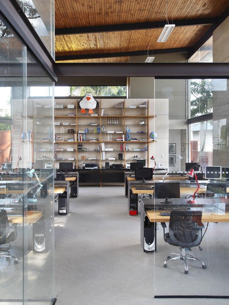
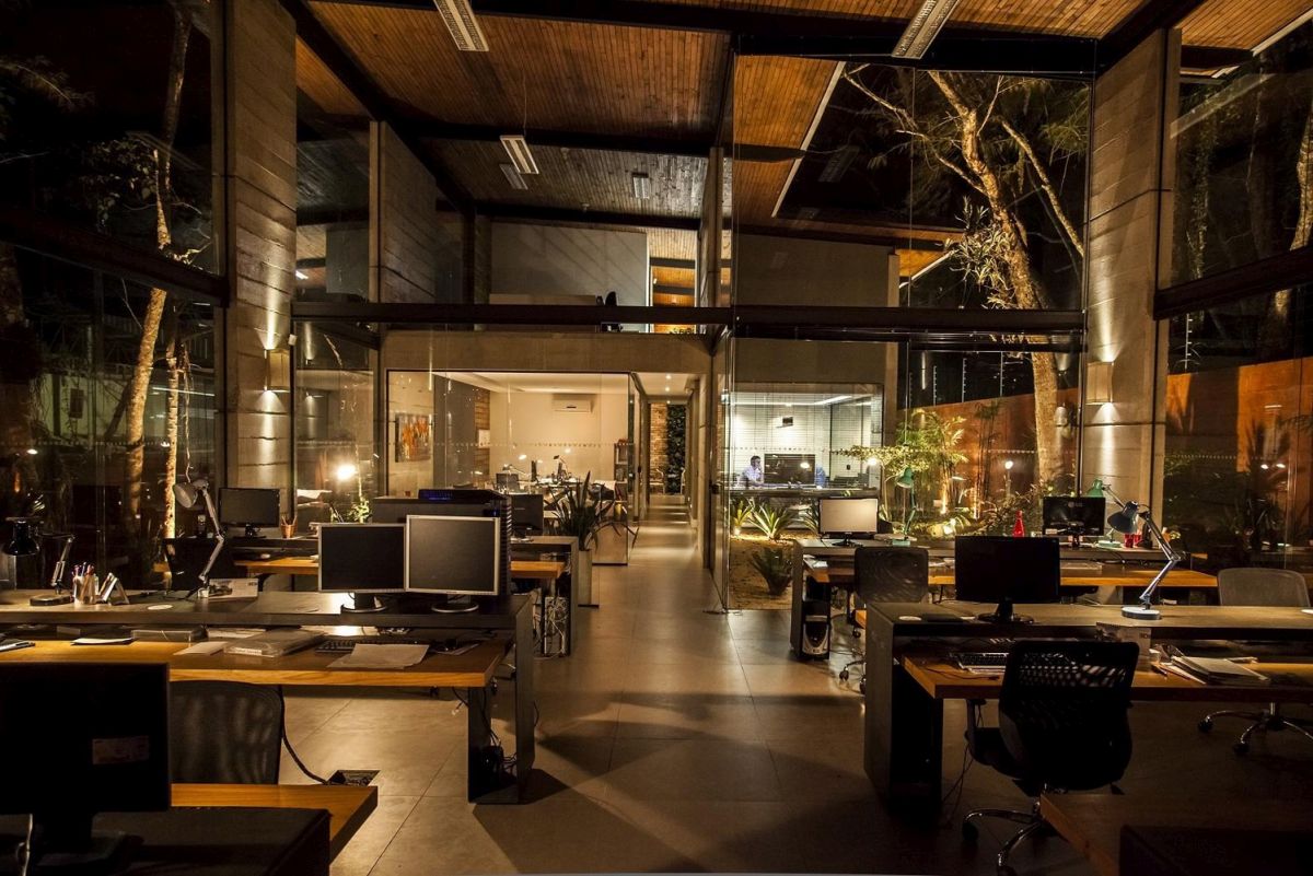
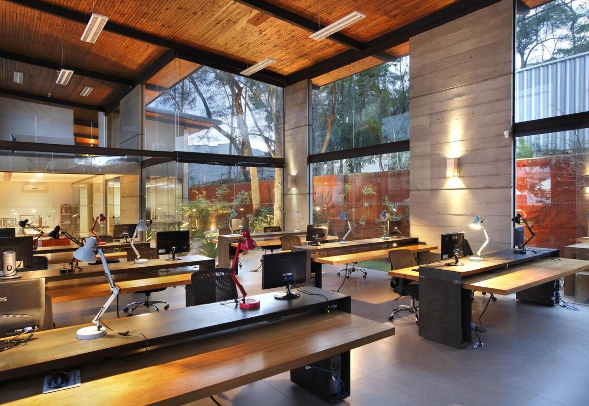
A lot of modern offices take advantage of their views and some even physically welcome the outdoors in. One example is the office space designed by Skylab Arquitetos in Juiz de Fora, Brasil. The building resembles a shed and has a very welcoming interior design which blends the comfort and coziness of a home with the professionalism of an office. Full-height windows bring in lots of natural light and nice views and the really cool thing if the fact that the trees present on the site have become an actual part of the structure.
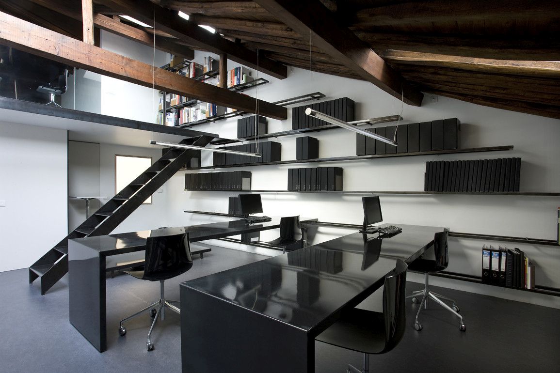
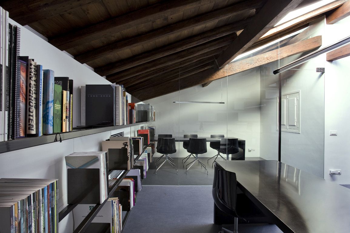
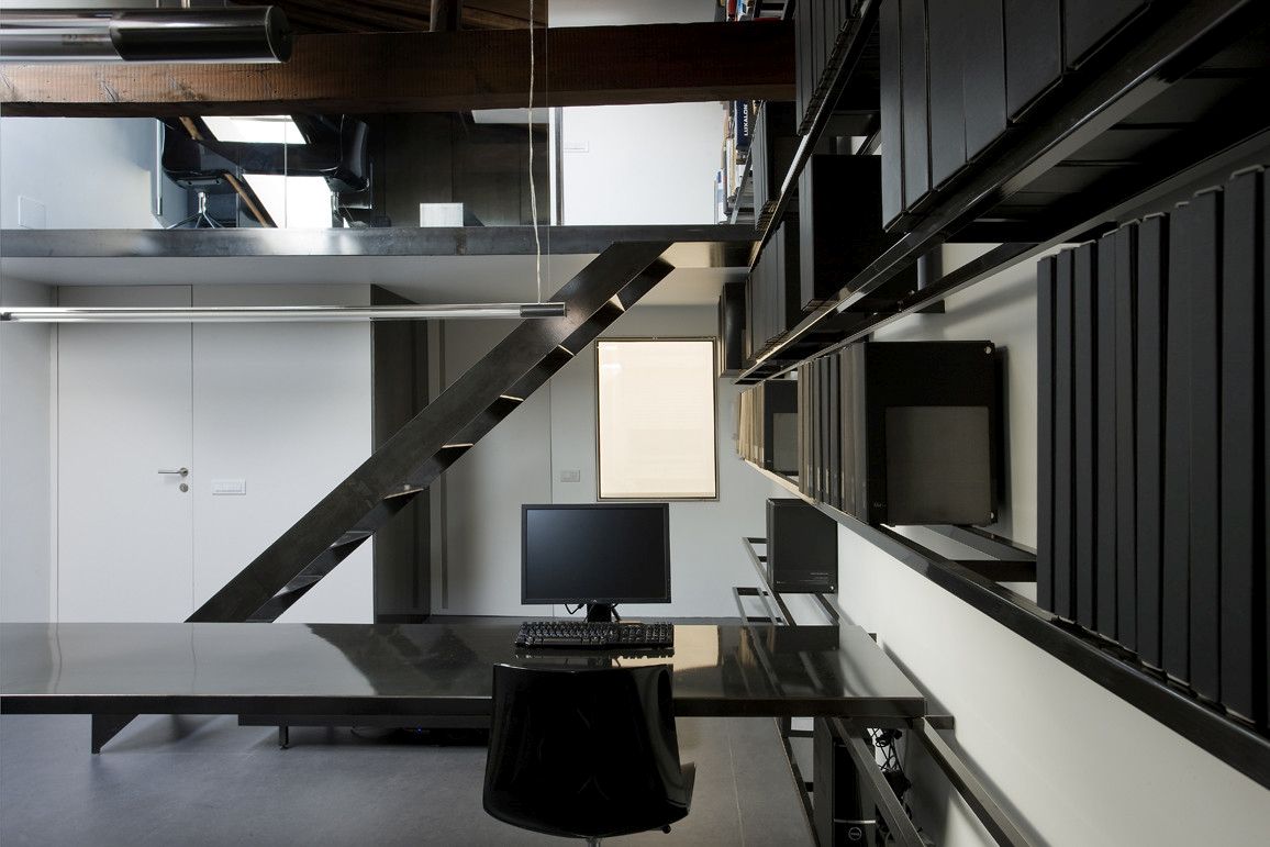
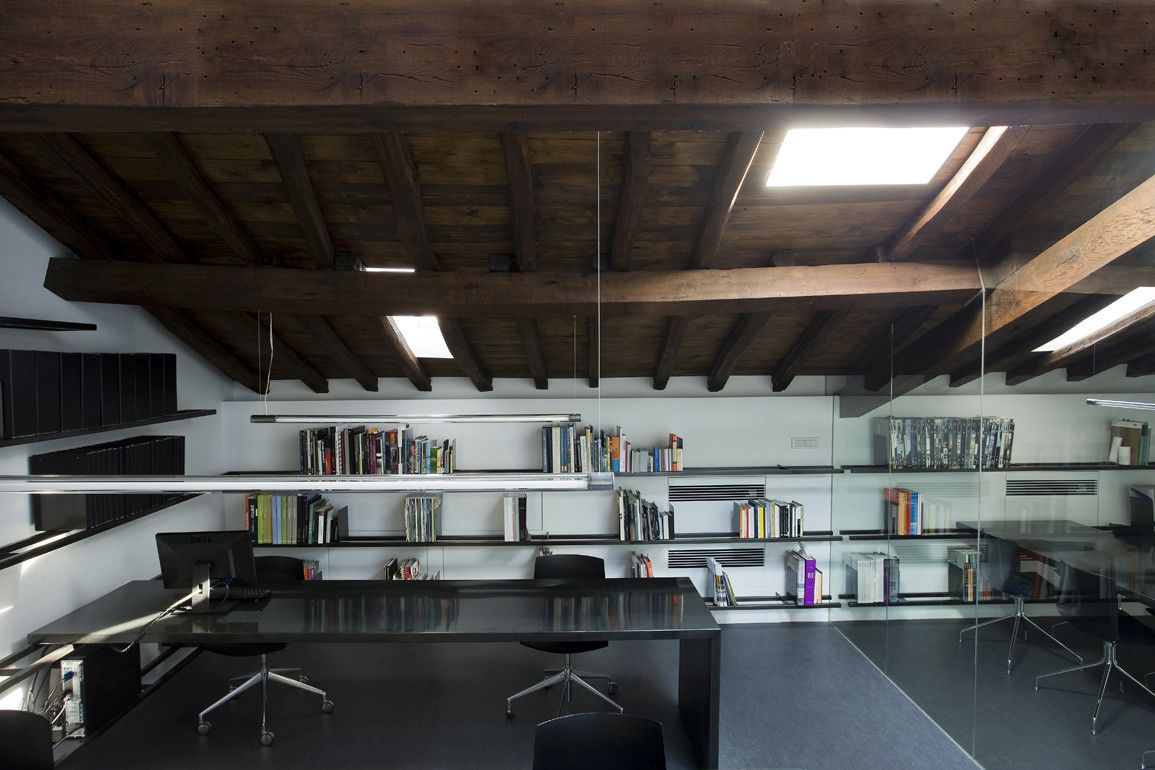
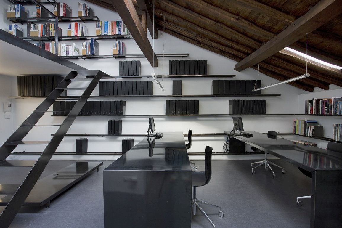
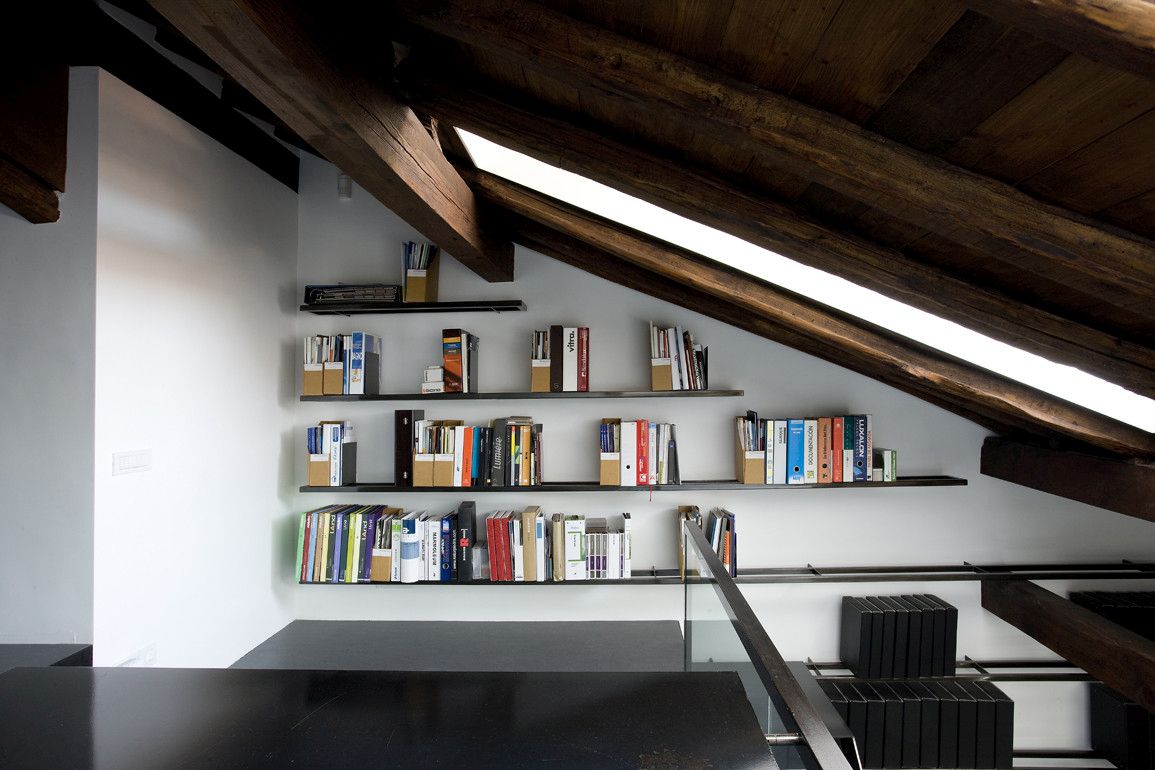
In 2009 Blur Arquitectura took on the challenge of transforming a poorly illuminated and badly ventilated space from La Rioja, Spain into a modern and spacious office. Their idea was to open up the space and bring natural light inside by creating a series of openings into the roof without damaging its integrity or interfering with its otherwise beautiful 19th century design. The interior design clearly differentiates the old from the new, featuring contrasting materials and finishes which complement each other beautifully.
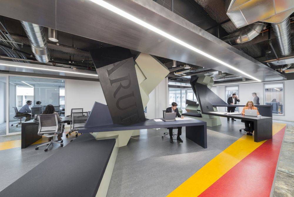
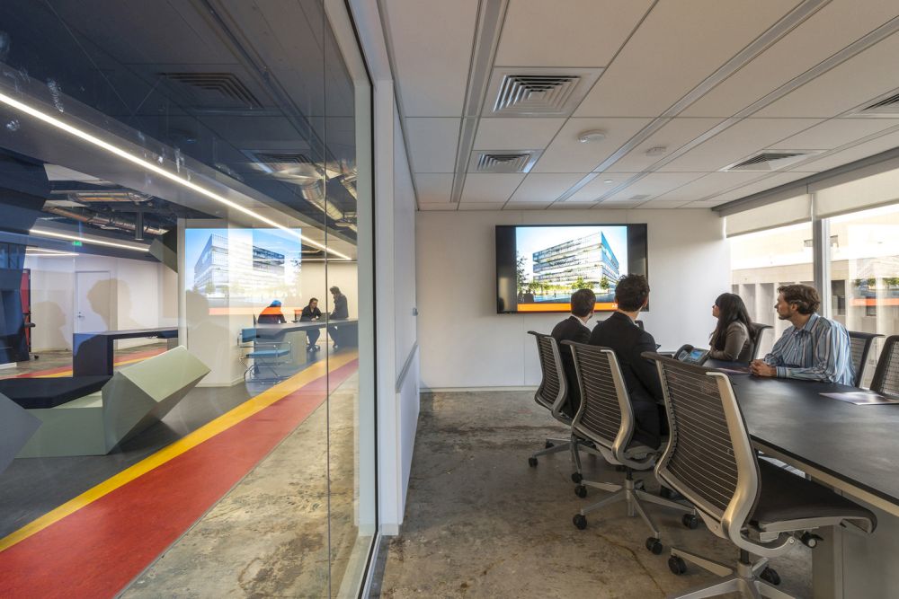
Following the activity based working model (ABW), ZAGO Architecture designed an office which abandons the conventional dedicated desk layout in favor of a more flexible and versatile structure where collaboration is encouraged. The office includes a variety of different types of workspaces designed for individual work, team projects, presentations, even hosting and video conferencing. The office was designed for and in collaboration with ARUP.
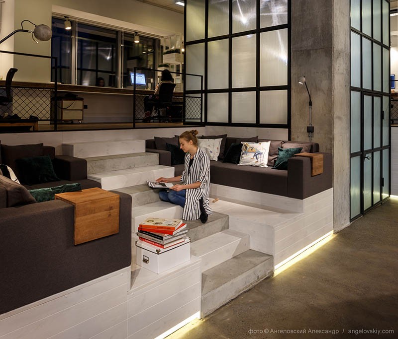
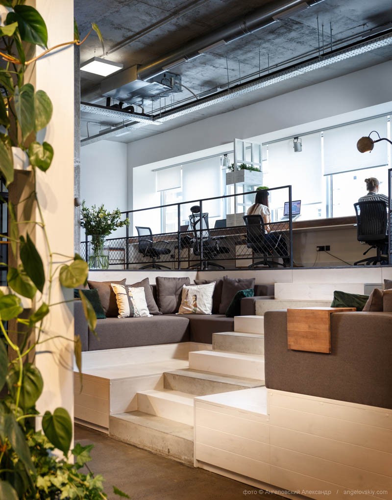
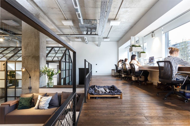
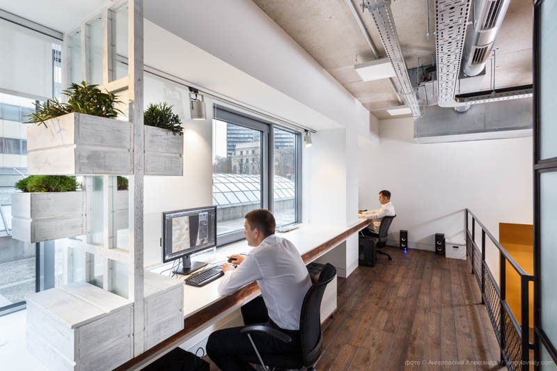
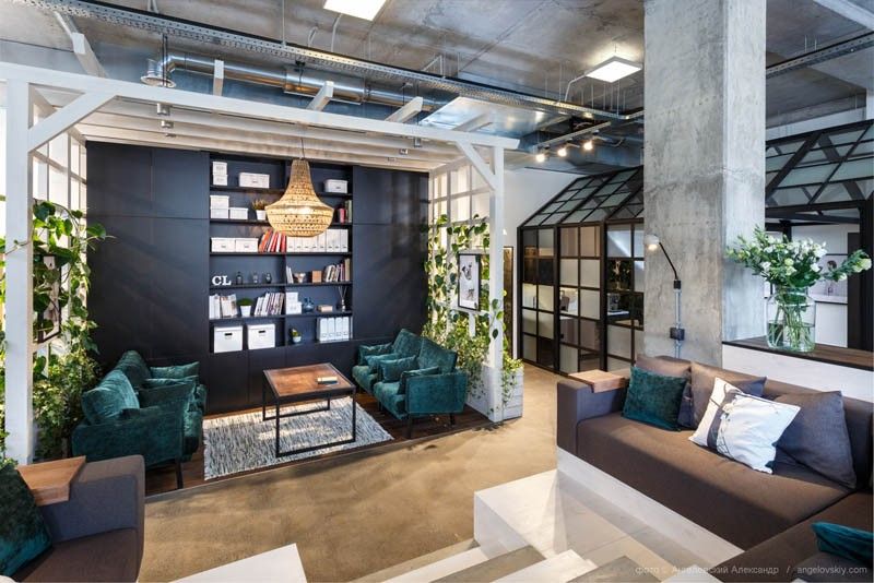
Studio Circle Line Interiors designed their own office in Dnepropetrovsk, Ukraine and they made it really cozy and welcoming. The office features desks facing the large windows and quite a few lounging areas with comfortable sofas, coffee tables, area rugs, stylish chandeliers and shelves. The office dog has a special little bed, cheering up the space every day. Potted plants are displayed throughout the office, creating a fresh vibe and complementing the palette of colors and textures featured throughout the spaces.
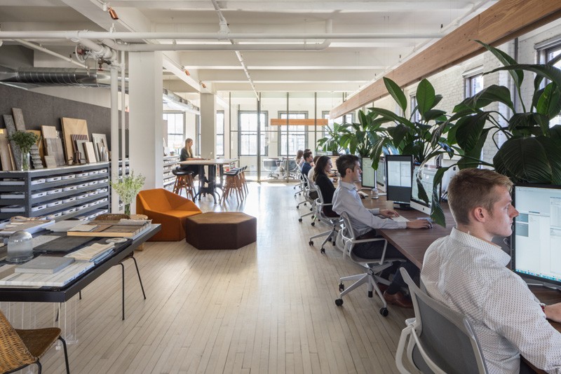
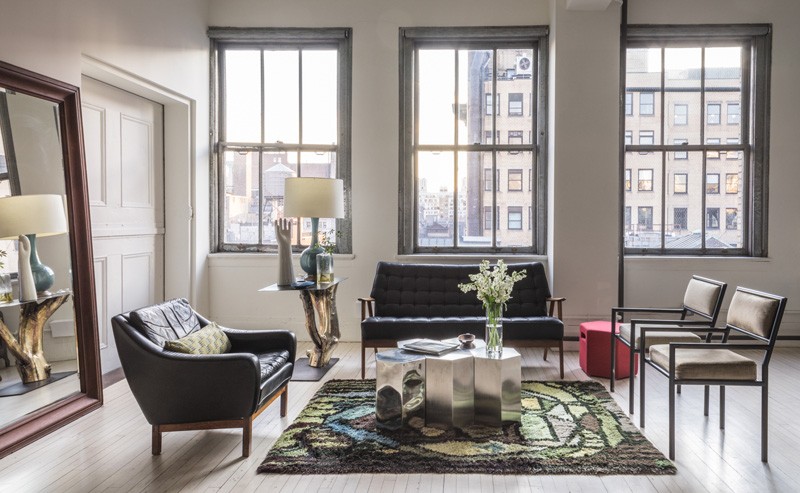
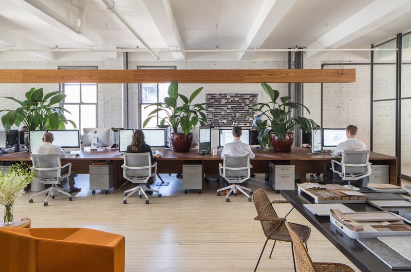
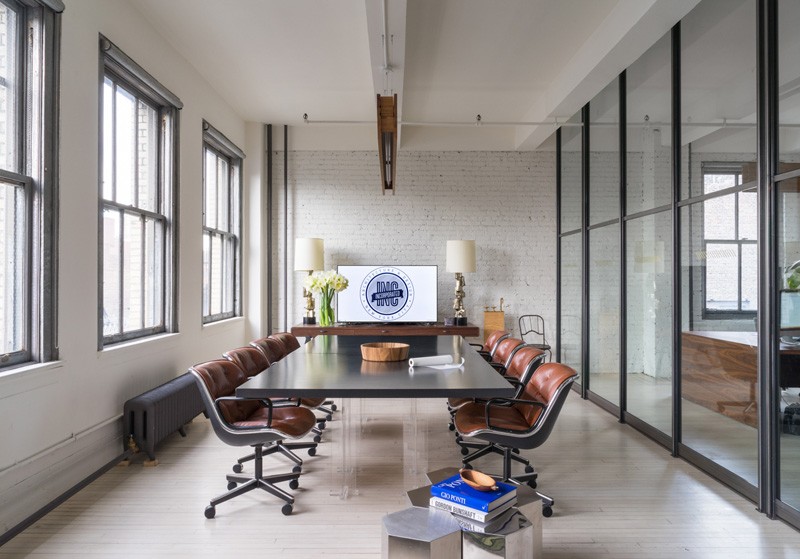
When they designed their new office in New York City, architecture and design studio INC wanted the space to reflect their company values, their spirit and philosophy and to inspire them to move forward and to evolve. The office is refined and casual and the space has been completely transformed. Everything about it is new. Simple materials, unfinished brick surfaces, maple floors and white walls create a simple shell for the various workspaces.
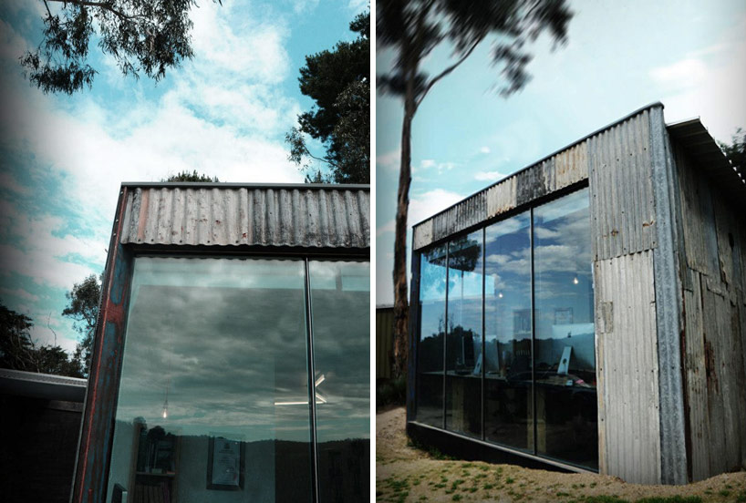
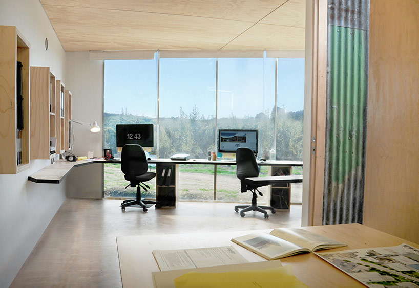
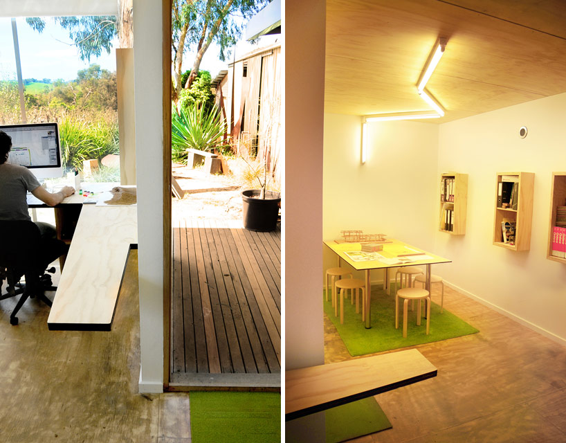
Architects brad wray and nicolas russo found all the inspiration they needed for their new office in the landscape and the terrain surrounding the site. The office is located near an orchard so it was designed with large windows and glazed surfaces which maximize the views and let in natural light. The exterior of the building is covered with old corrugated iron sheets which give it a weathered, modest look and which contrast with the clean and modern glass sections.
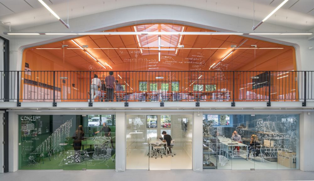
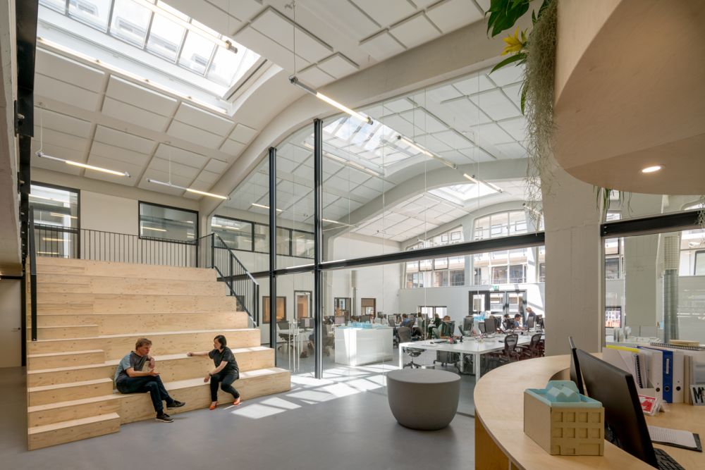
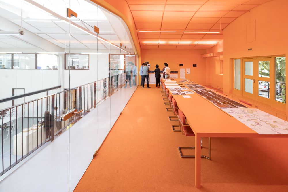
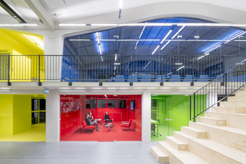
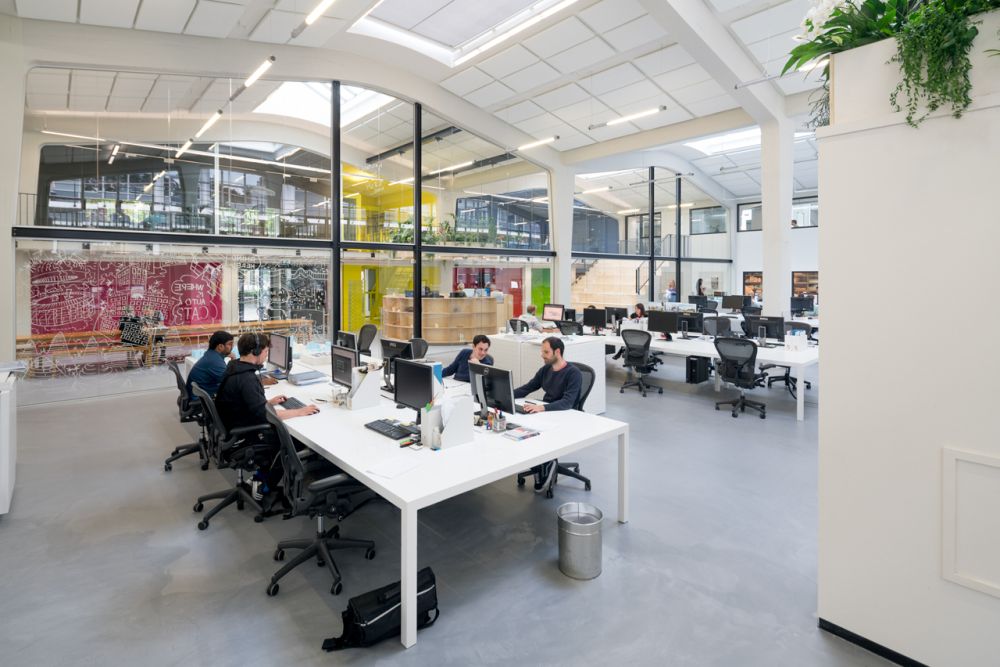
Some companies are like big families so, by extension, their offices are like huge houses. But let’s talk specifics. This is the MVRDV House, a 2400 square meter office with 150 work spaces. The studio came up with this idea for their new office after analyzing their history and learning from previous experiences. They saw how the teams interacted and worked together and translated this experience into the design of this new and more productive space.
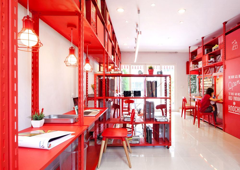
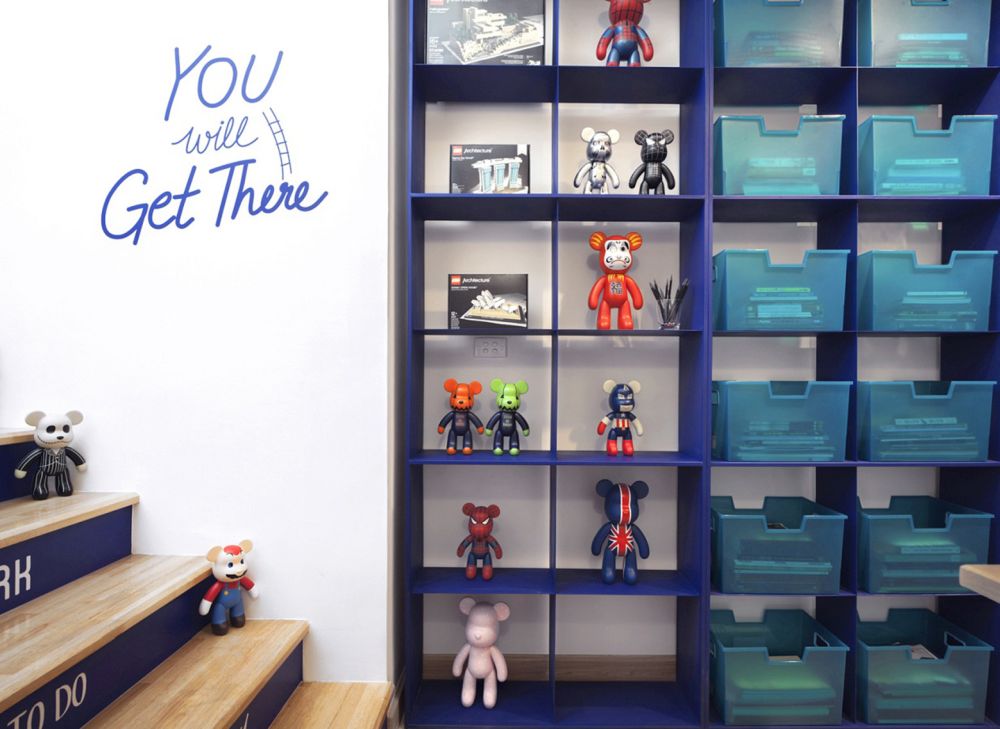
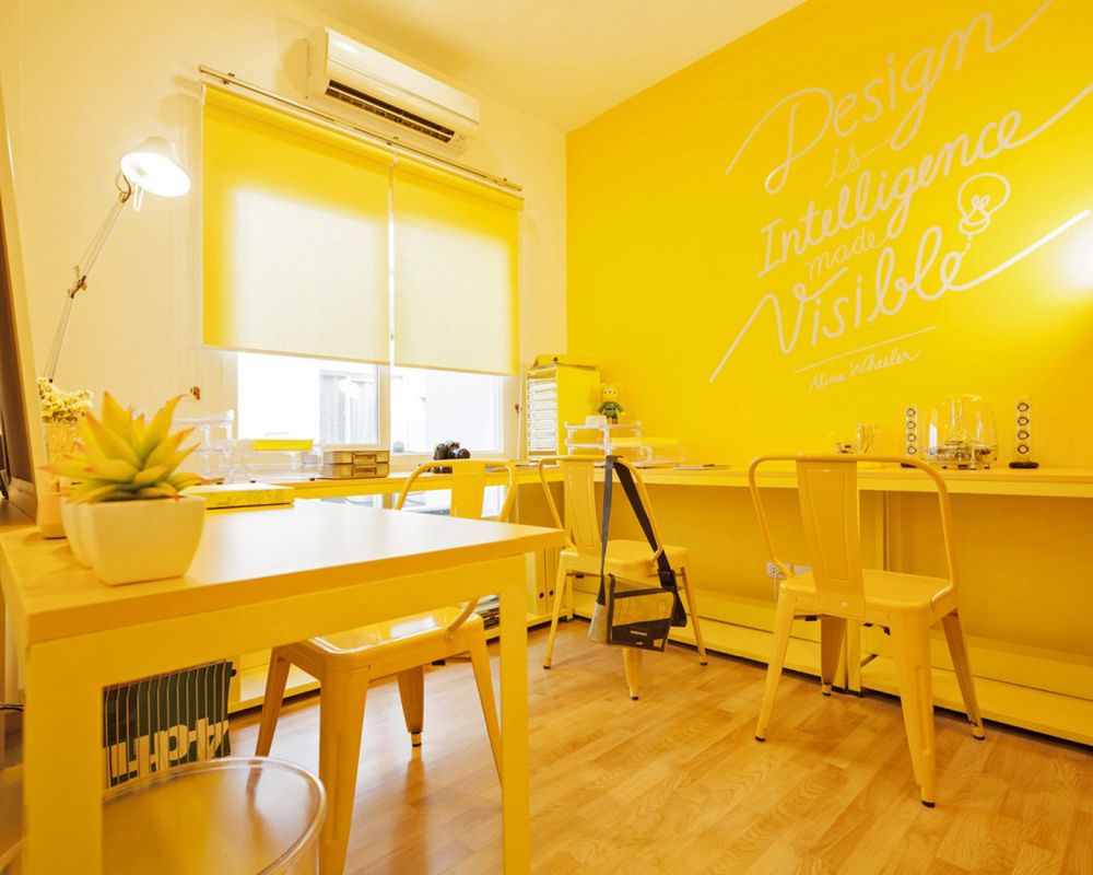
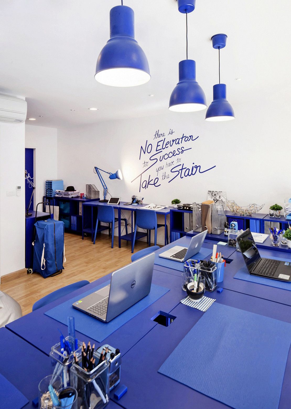
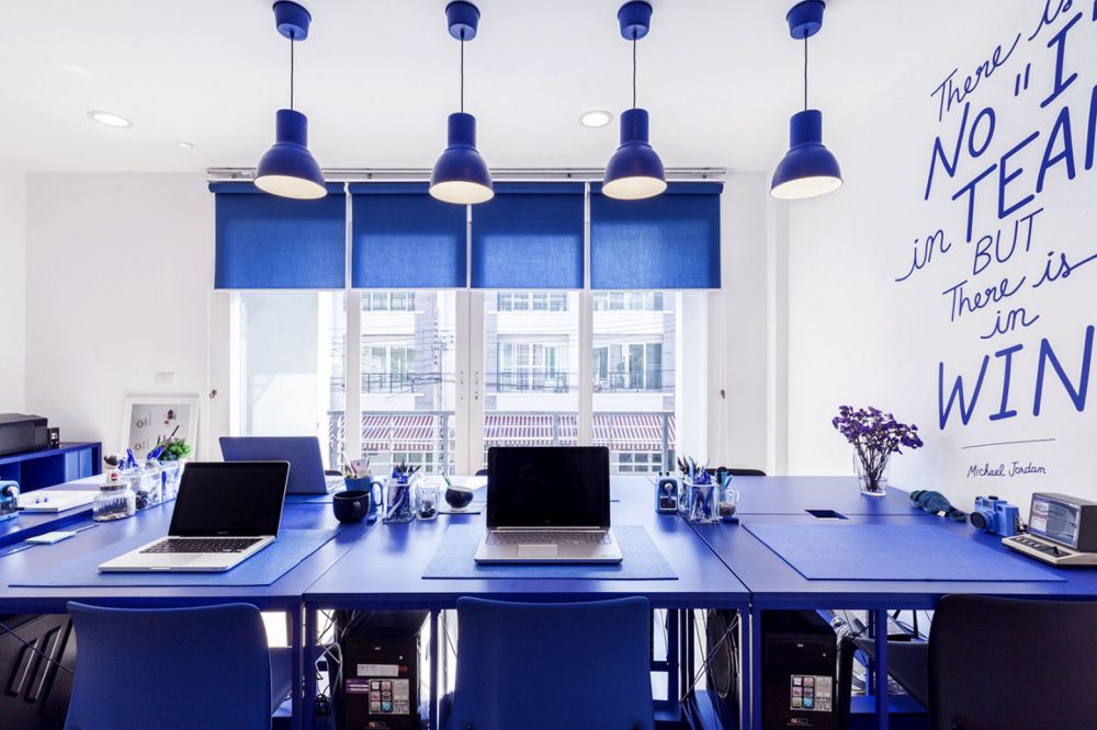
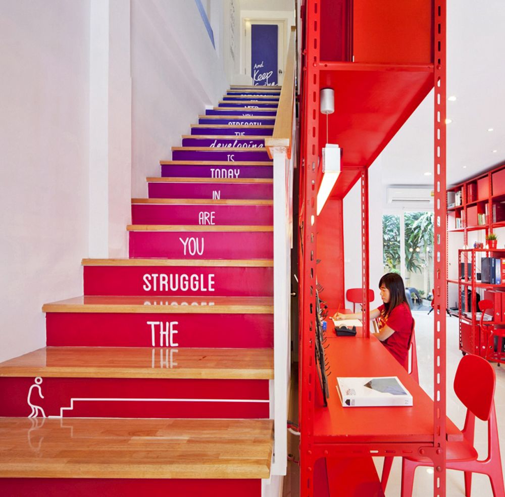
Successful companies which start small eventually grow and that means a bigger office space. However, no possibility of expansion on the site can be a problem. Apostrophy’s overcame this issue by opening a new office inside the same building as the old one. It’s organized into areas decorated with vivid primary colors: red, blue and yellow. Each level features a different color.
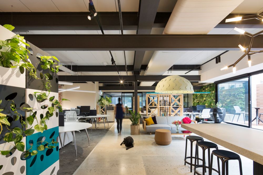
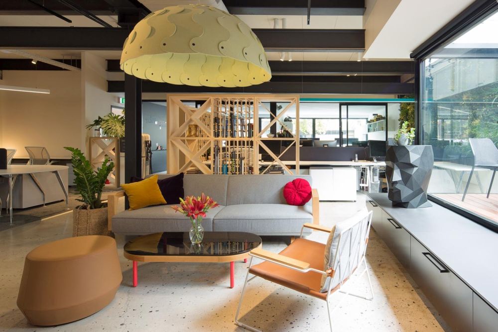
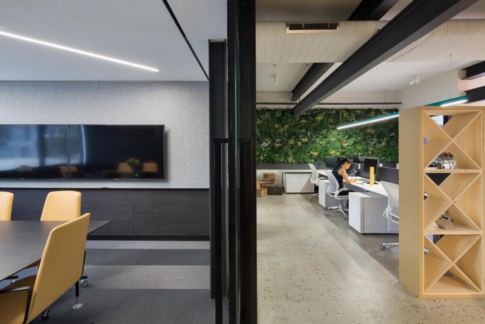
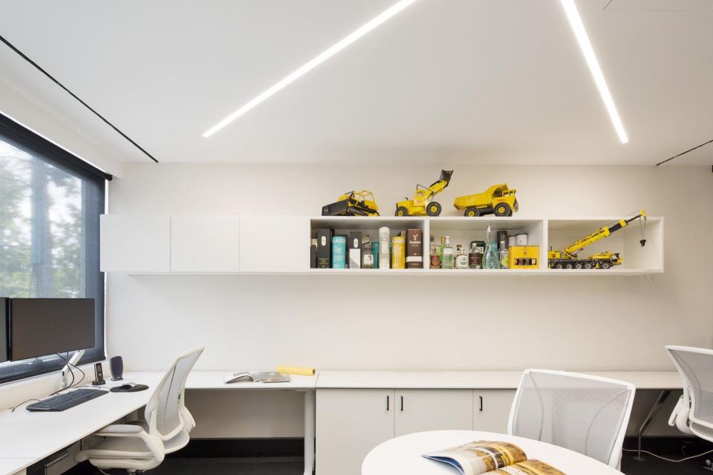
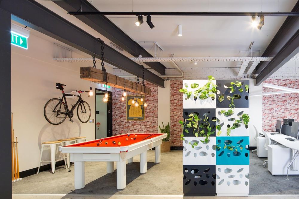
When rfa Architects designed their new office located in Sydney, Australia, they decided to not include a reception area so their visitors and clients can enter directly into the office, where all the magic happens. They’re often greeted and welcomed into the kitchen which serves as a social area, just like the kitchen in a modern home. This type of organization creates a casual and friendly ambiance and strengthens the bond between architect and client.
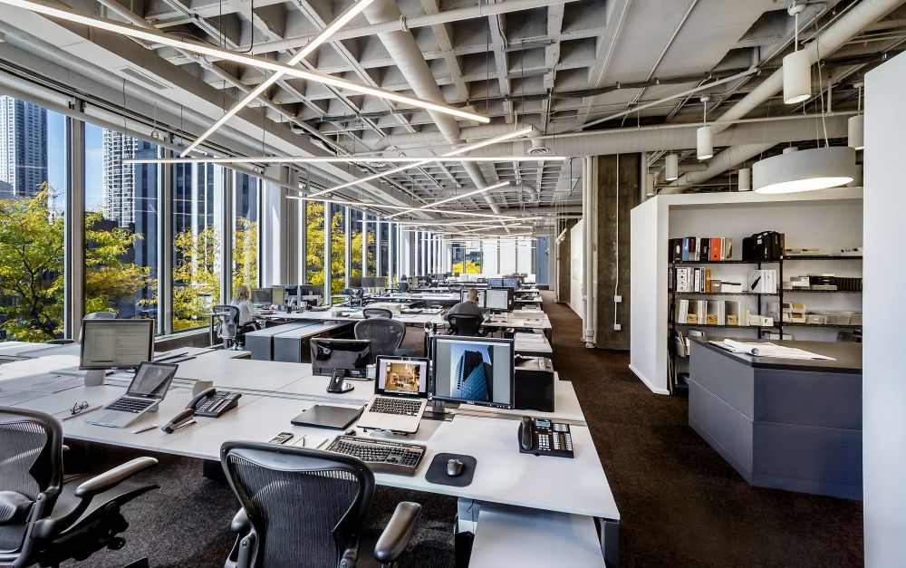
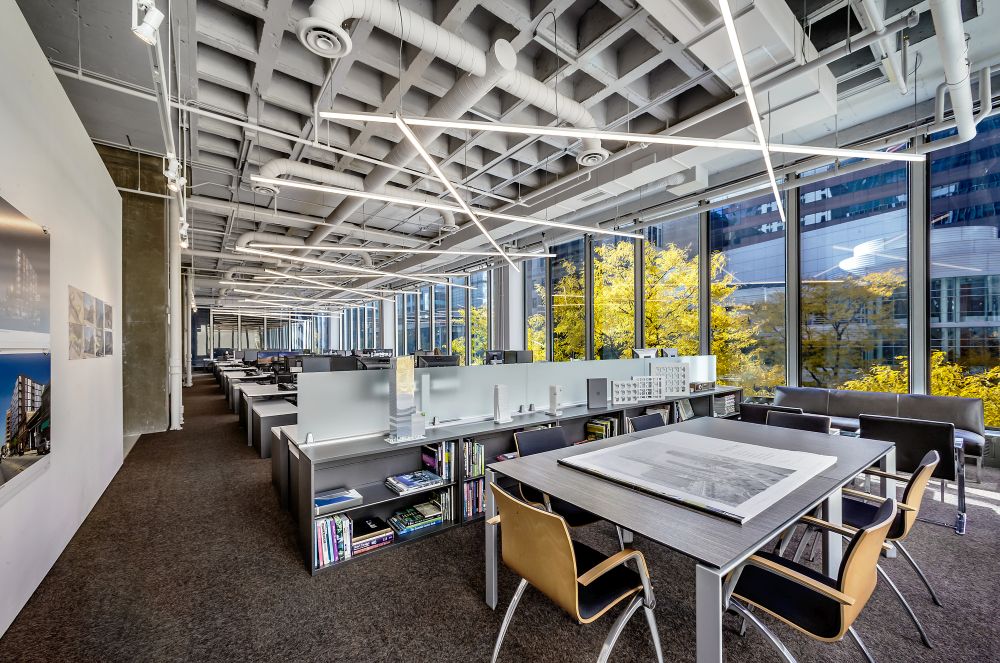
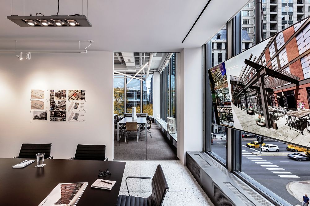
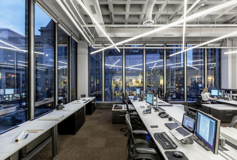
These are the offices of GREC Architects located in Chicago, Illinois, inside the 1960 John Blair Building. The views are nice and the office spaces take advantage of that by featuring large windows which stretch all across the facades. The interior design also includes exposed structural elements which are complemented by a series of polished materials and finishes. Although the color palette is simple and reduced to neutrals, the large windows bring in plenty of vibrant colors which prevent the decor from being boring.
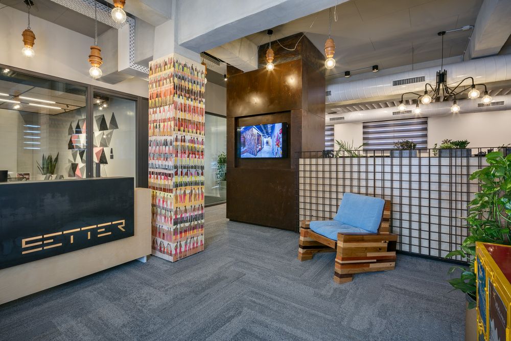
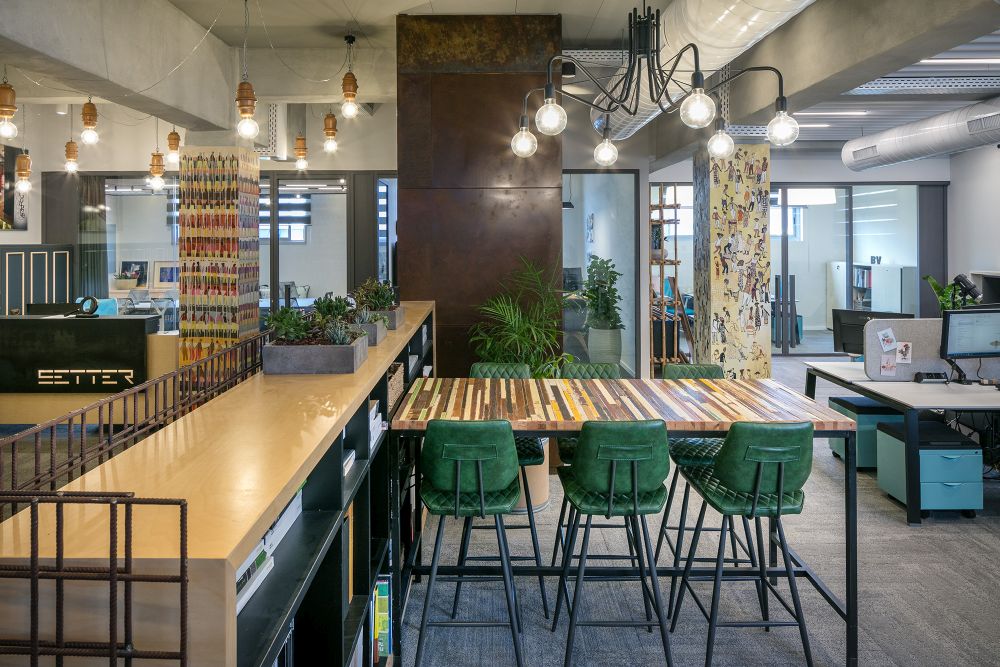
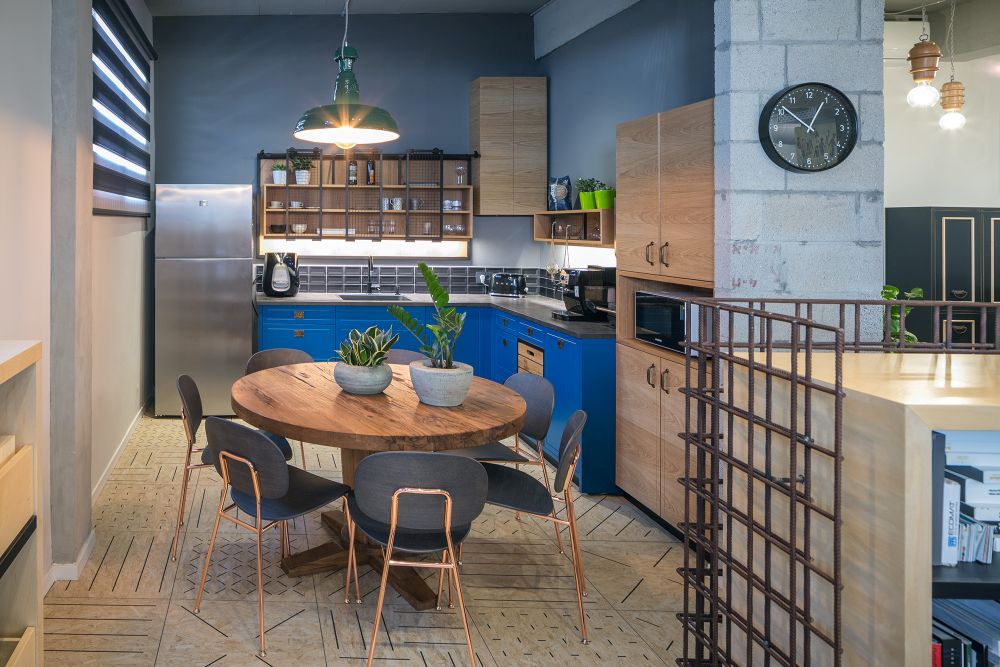
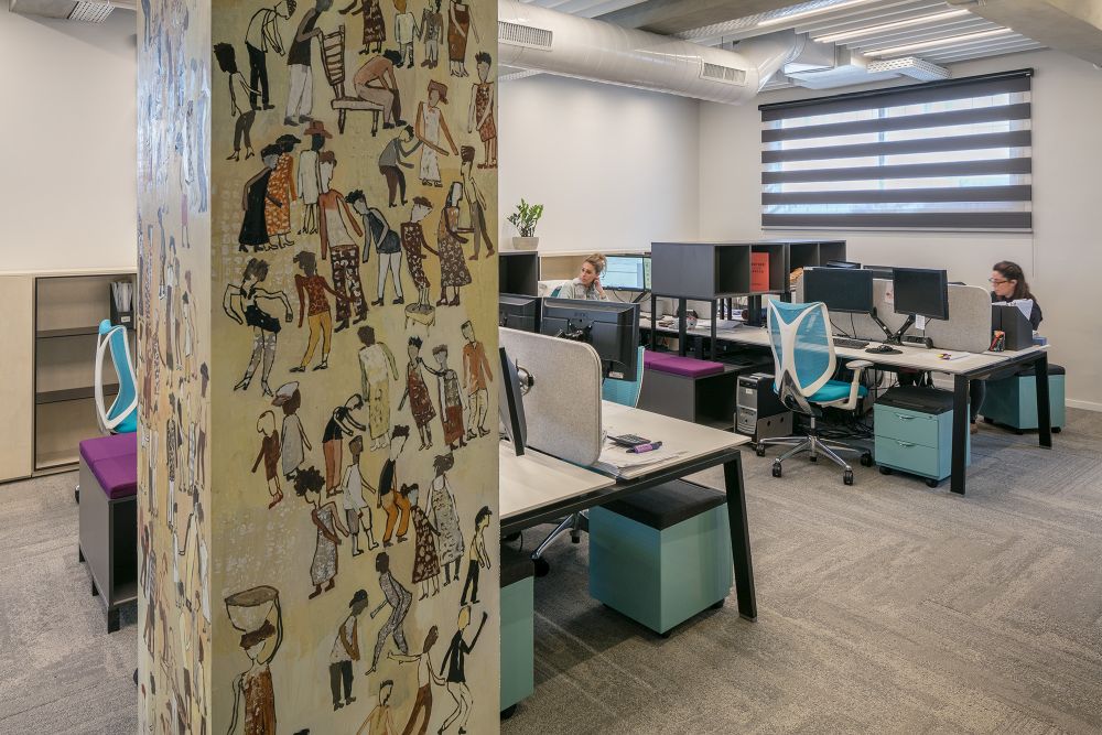
Setter Architects knew exactly what they wanted from their new office which is located in Tel Aviv, Israel. The space had to be an inspiring work environment but at the same time to feel like home. It’s a really great combo and there are numerous different ways in which it can be achieved. The strategy in this case was to bring a variety of materials and textures into the office, to pave the spaces with soft, textured carpet and to create a warm and welcoming decor.
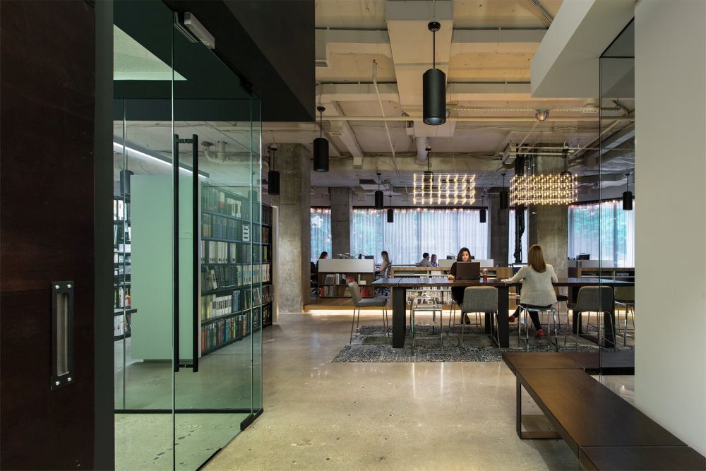
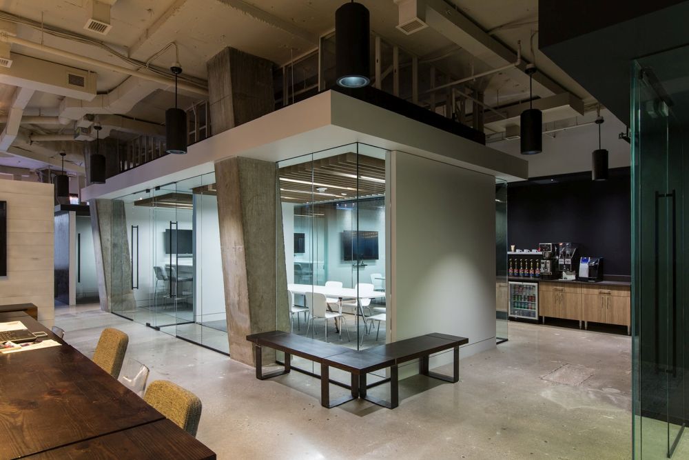
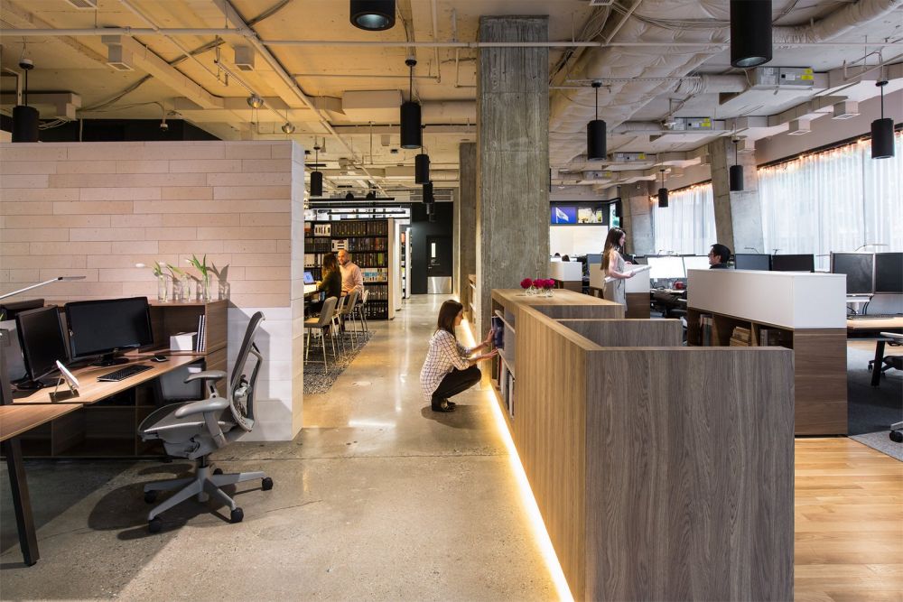
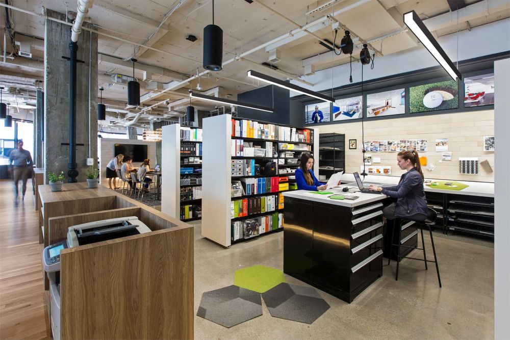
Continuous critique and a desire to create the perfect design inspired FORM Architects to ultimately give their new offices in Arlington, Virginia a minimal but also quirky look. They maximized the space’s existing raw appeal and integrated the polished concrete floors, open ceilings and unfinished columns into their design, giving it a raw aesthetic. They also used reclaimed wood to give the spaces a welcoming and comfortable ambiance.
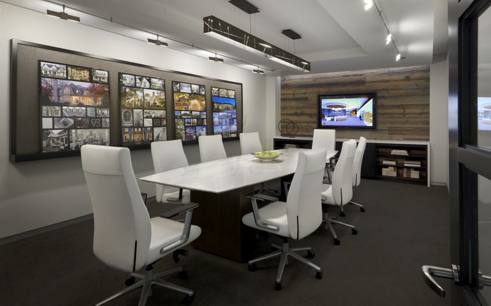
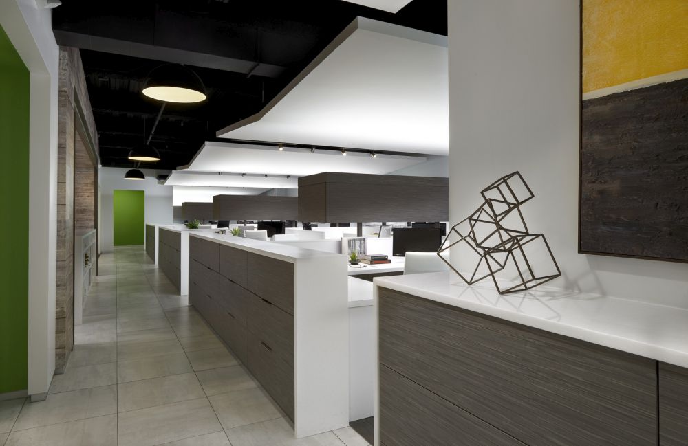
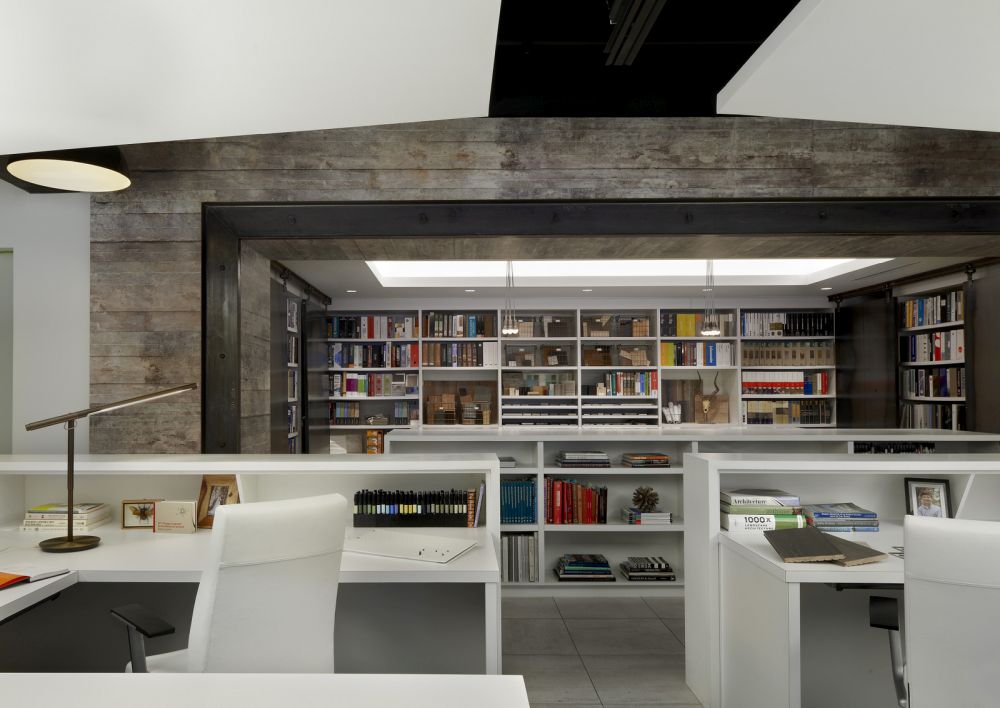
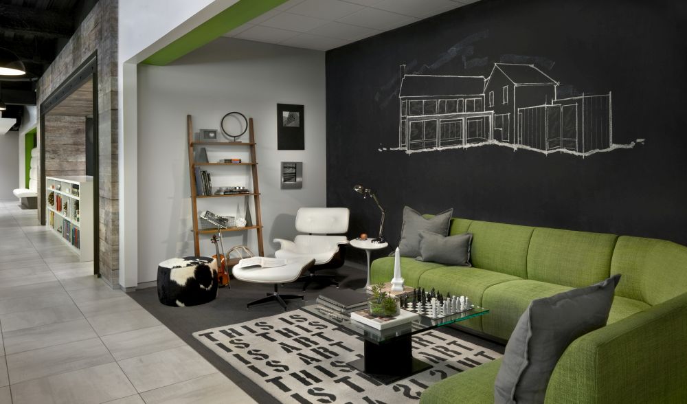
The new offices of Charles Vincent George Architects located in Naperville, Illinois are a great inspiration. The interior features a very nice palette of materials, textures and colors, mixing steel, glass, concrete and hardwood with grays, white, black and the occasional touch of green for a fresh and vibrant look. The design as a whole is imposing and refined but with a touch of casual and quirky flair.
The post Architects And Their Offices – A Sneak Peek Into Their World appeared first on Home Decorating Trends – Homedit.
