Beautiful Walk In Shower Designs That Could and Should Inspire You
A walk-in shower is the perfect blend between style and convenience. It has become a must-have feature for all modern and contemporary homes and that gives a vast array of great designs to find inspiration in in terms of layout, style, materials and finishes used as well as various little details and features that you could include in your own walk-in shower design.
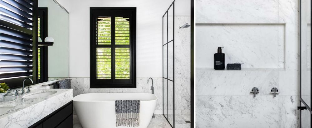
White marble is a very popular choice for a lot of bathrooms. Since this is considered a timeless material, you can’t really go wrong with it, even when used in large quantities. A marble walk-in shower always look chic and classy, like this one featured on desiretoinspire does.
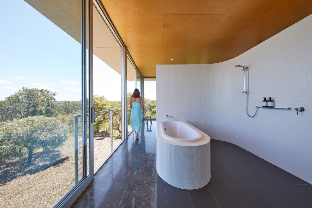
Most often than not a walk-in shower would be separated from the rest of the bathroom, usually by minimalistic glass enclosures. That however is not always the case, as this exquisite bathroom designed by Archterra Architects shows here.
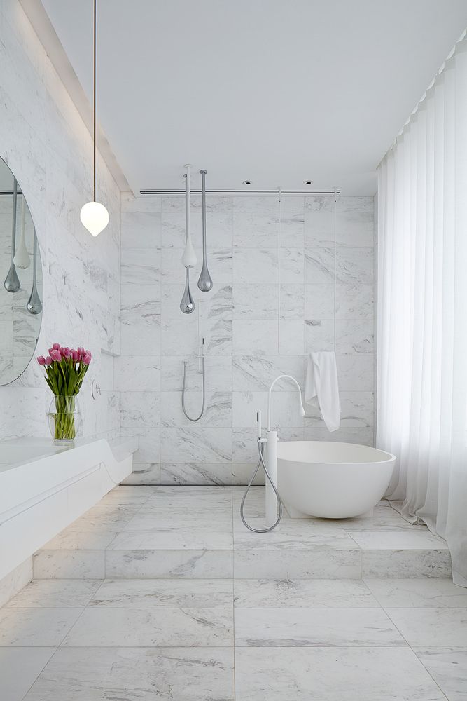
Marble tiles, as already mentioned, are incredibly versatile and ideal for walk-in showers and bathrooms in general because they add style and glamour to the space without making it look too busy and without risking of quickly becoming outdated. Another gorgeous example in this sense is this contemporary bathroom designed by Architecton.
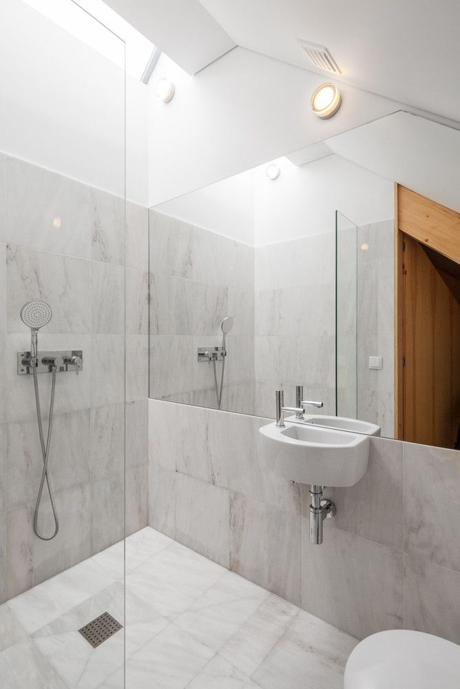
We love how clean and simple this bathroom designed by studio Tiago do Vale Arquitectos looks, walk-in shower included. The space is small but doesn’t look cramped even if the shower, sink and toilet are basically all in one space.
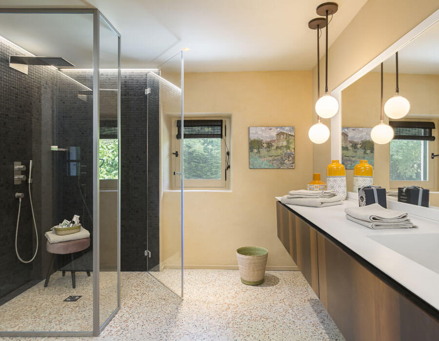
Quite the opposite can be said about this bathroom which is large and spacious and has a separate walk-in shower enclosure with black wall tiles that contrast with the rest of the space. The floor however is one continuous surface. Check out Masdebigot for more beautiful images of this property.
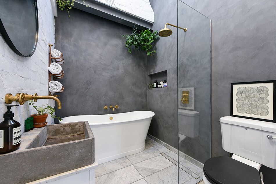
Don’t you just love the finish on the walls of this gorgeous Victorian bathroom? They add a lot of character to the space. We also like how seamlessly the walk-in shower and freestanding tub interact not just with one another but with the rest of the space as well. Check out Shootfactory for details.
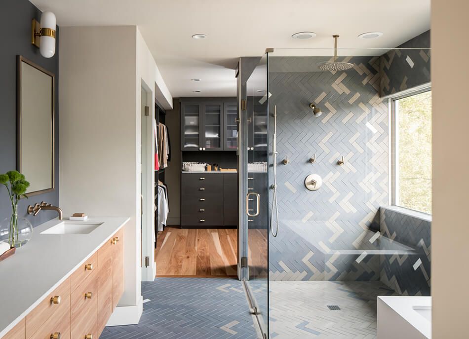
The herringbone tile pattern on the bathroom floor is also extended on the walls of the walk-in shower. It’s cool how the two colors are distributed throughout the tiles surfaces. This bathroom is part of a 1950’s ranch renovated by Design Platform.
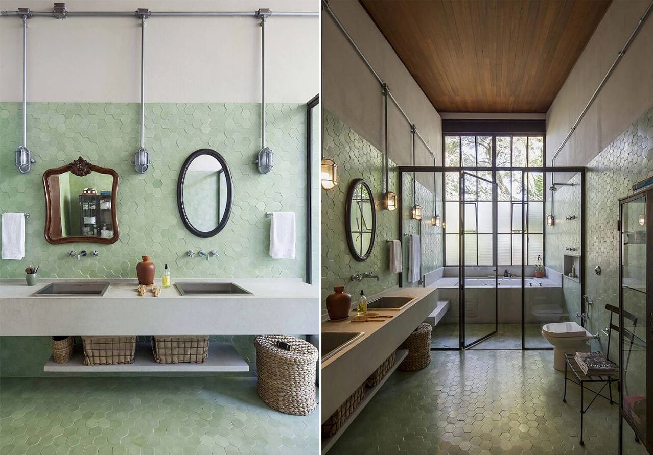
This bathroom designed by Estúdio Penha has a very pleasant vintage vibe to it. The walk-in shower and tub are combined into a separate enclosure with glass panels and a slender metal frame. Hexagon-shaped-tiles cover the floor and a large portion of the walls both in the shower section and the rest of the bathroom, ensuring a fluid and seamless transition between them.
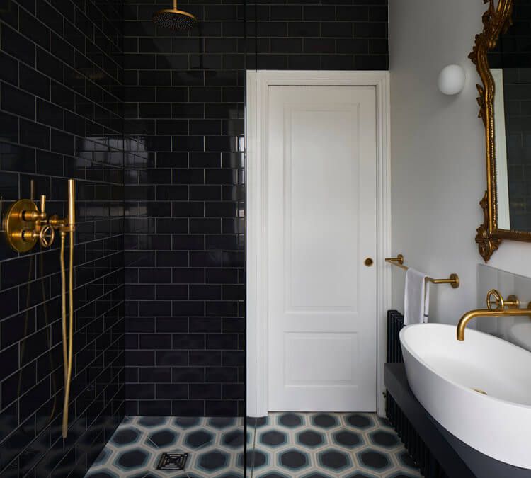
For this bathroom Heirloom Studio chose a beautiful combination of old and new details reflected in an eclectic design. The black and white combination is timeless and and works out great in this case, allowing the walk-in shower to blend in seamlessly.
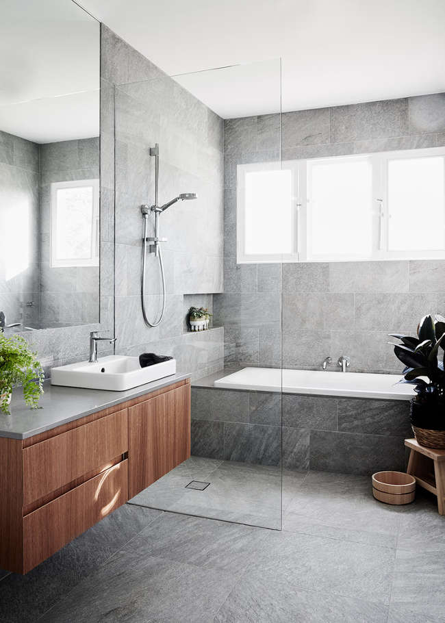
Interior design studio Freadman White renovated this bathroom along with the rest of the once outdated farmhouse that it’s a part of, creating a very fresh and modern vibe. The walk-in shower is placed between the tub and the sink, featuring a clear glass divider which keeps the whole space looking bright and airy.
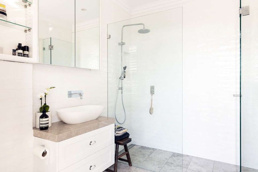
Speaking of bright and airy bathrooms, here’s another cool example featured on desiretoinspire. White subway tiles add a classy and timeless vibe to the whole space and the glass walk-in shower allows the room to seem fairly large.
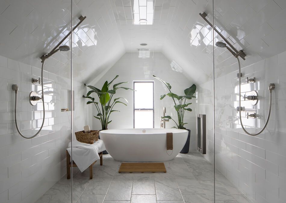
Symmetry seems to be the defining characteristic of this bathroom by Design Platform. An oval freestanding tub is placed at the center, with large potted plants on either side of it and a tall and narrow window behind it. There’s also not just one but two walk-in showers, again on opposite walls facing each other.
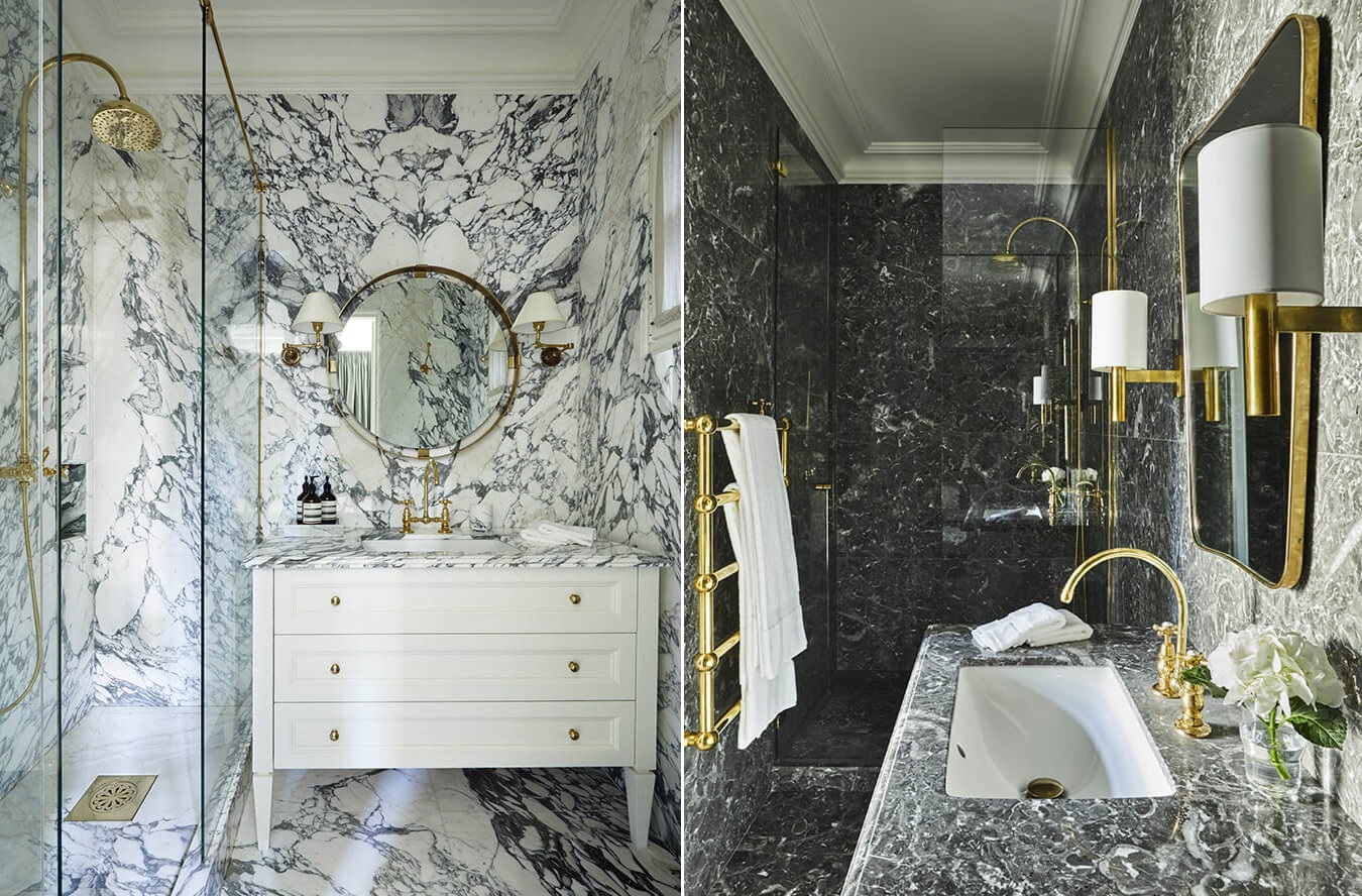
There’s a lot going on here visually even if the design created by Isabel López-Quesada is essentially quite simple. Black and white with golden accents is the main theme and the crazy patterns allow the walk-in shower to go almost unnoticed.
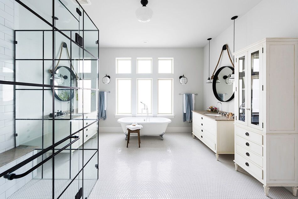
This bathroom designed by Janet Gridley is bigger than some living rooms and has everything, including a walk-in shower enclosed in glass, a tub, a large vanity and lots of storage. The light and neutral color palette suits it very well.
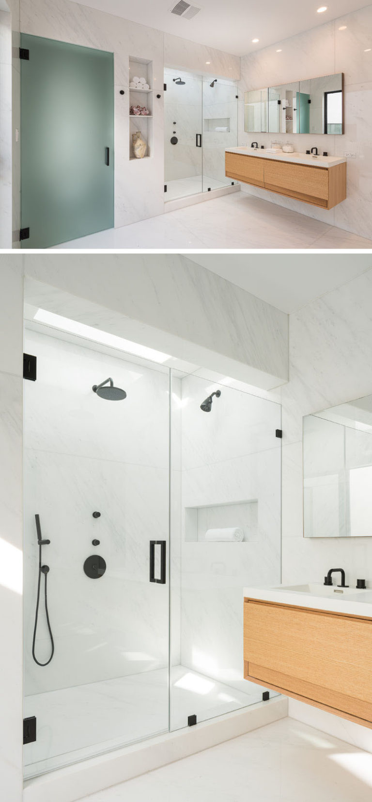
Walk-in showers are usually open at the top which gives them a fresh and airy look but also means that all the moisture gets out. In contrast, this design created by AUX Architecture gives the shower a more contained and closed off look while still maintaining an airy vibe.
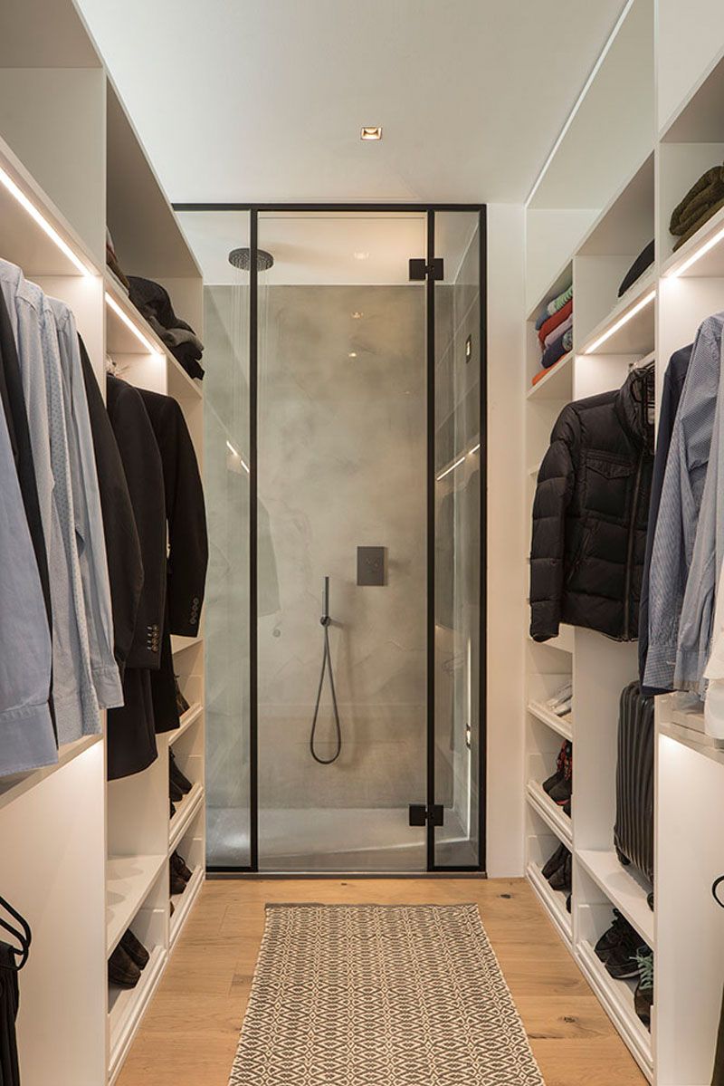
What’s special and unusual about this walk-in shower is not necessarily its design which is fairly simple actually but the fact that the entrance to it is inside the walk-in closet. Also, the shower is visible from the bedroom that it’s a part of. This combo was created by Susanna Cots Interior Design.
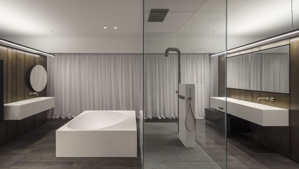
Usually, walk-in showers are placed in corners or against the walls as away to save some space or simply because the layout is asking for it. This bathroom however is different. Its walk-in shower is towards the center of the room, encased in glass. The Pipe floor-standing panel is perfect for it.
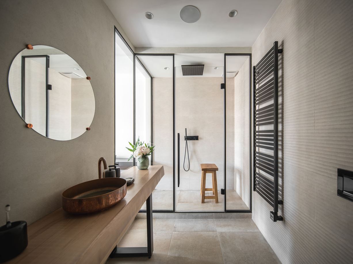
A long and narrow layout makes this bathroom pretty inconvenient but it was actually designed in a way that takes advantage of this negative trait. A walk-in shower occupies the far end of the room and the glass partitions let the natural light flow through.
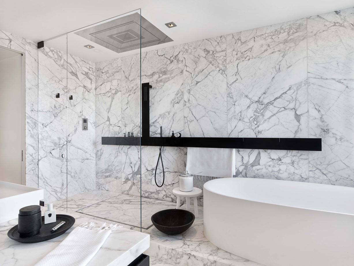
This bathroom has a very cool design too. Its walk-in shower is raised on a platform along with the tub. The transition between them is seamless thanks to the fact that there’s no physical barrier in between.
The post Beautiful Walk In Shower Designs That Could and Should Inspire You appeared first on Home Decorating Trends – Homedit.
