25 White Bathroom Design Ideas That Are Effortlessly Beautiful
Color plays an extremely important role in our lives. It’s often what defines the character of a person or a space, what makes us find a home to be welcoming and cozy or fun and exciting and what makes our lives special. In the world of interior design, each color has a different meaning and dictates how we perceive a space and everything in it.
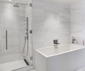
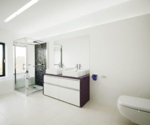
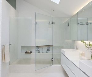
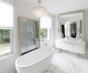
That makes even a simple task such as picking a bathroom color scheme a real challenge. To make things easy, we’re showing you images of white bathrooms which are not only easy to design and to plan but also super versatile and offer a lot of advantages.
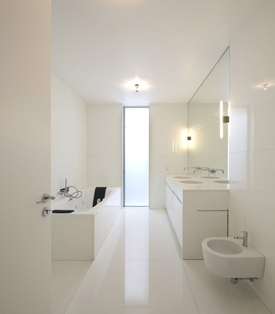
White is the absolute best color choice for small spaces and even though this bathroom designed by Paula Santos Arquitectura is not exactly tiny, we love the fact that it looks so bright and airy. The large wall-mounted mirror and the tall vertical window play a role in that as well.
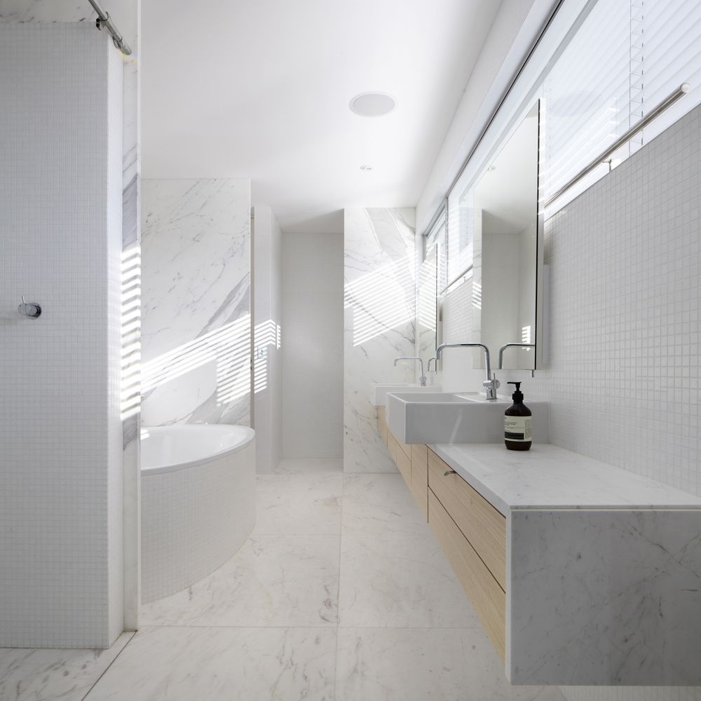
As proven by this design completed by studio Edward Szewczyk Architects, white bathrooms are not boring or mainstream. White marble with thin and delicate veins gives this bathroom an elegant and sophisticated look and the light wood integrated into the floating vanity grounds the design and gives a warm touch.
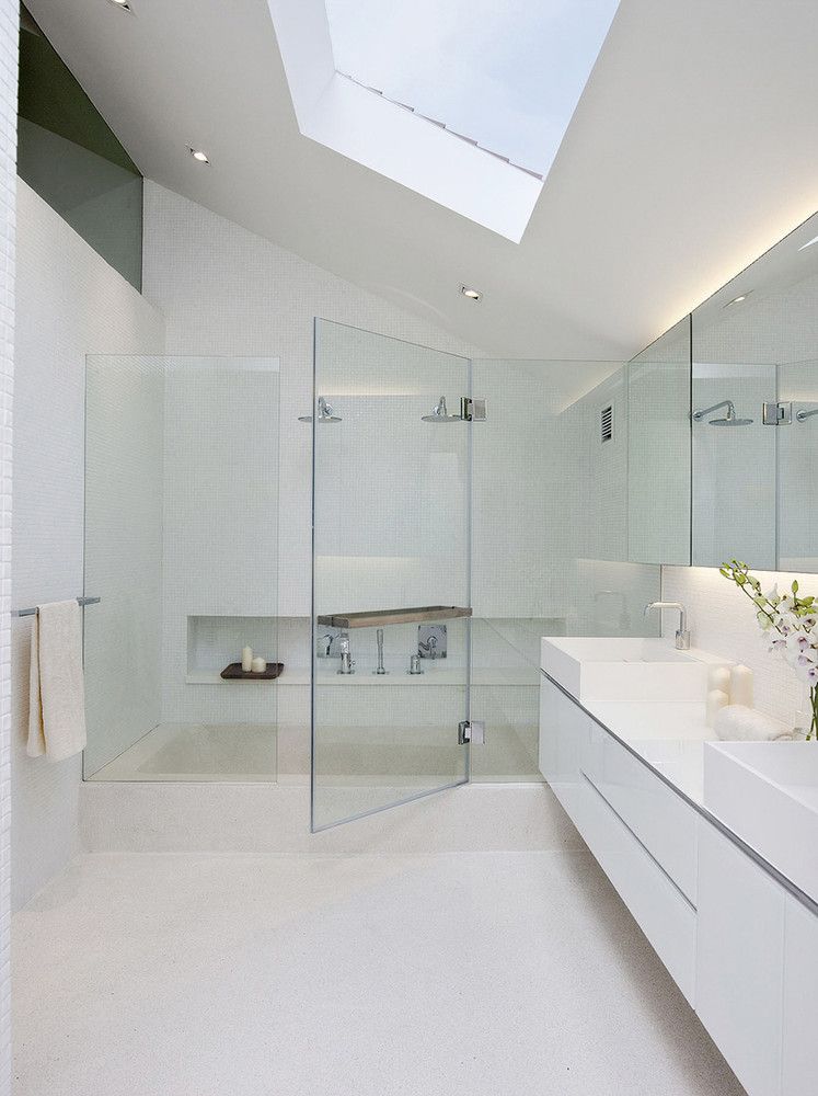
White bathrooms are great because they look very clean and airy and there are various ways in which you can emphasize that. For example, studio Ong & Ong Pte Ltd gave this bathroom a skylight and a spacious walk-in shower framed by clear glass.
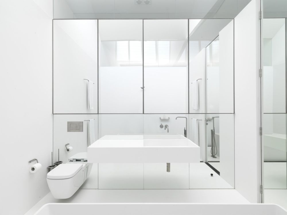
An entire wall of mirrors changes the entire perception, creating an interesting and unusual visual effect and making this bathroom appear larger than it actually is. The fact that white is the only color used throughout the room is an important detail. This is a design created by Ian Moore Architects.
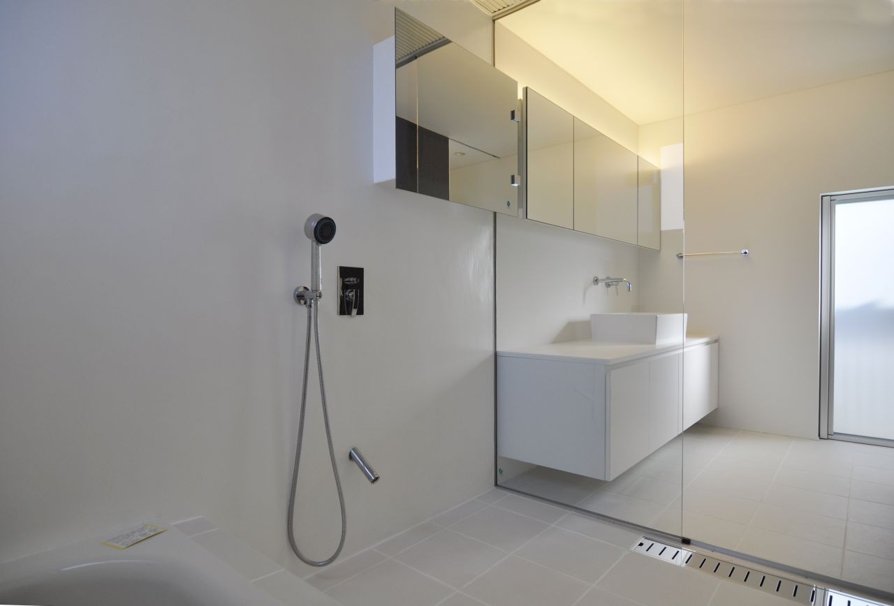
A minimalist color palette based on whites and light grey helps to give this bathroom a very spacious and open feel. D.I.G Architects made sure to use accent lighting to give it a warm and comfortable look and to also create a practical layout where a transparent glass wall separates the room into two zones.
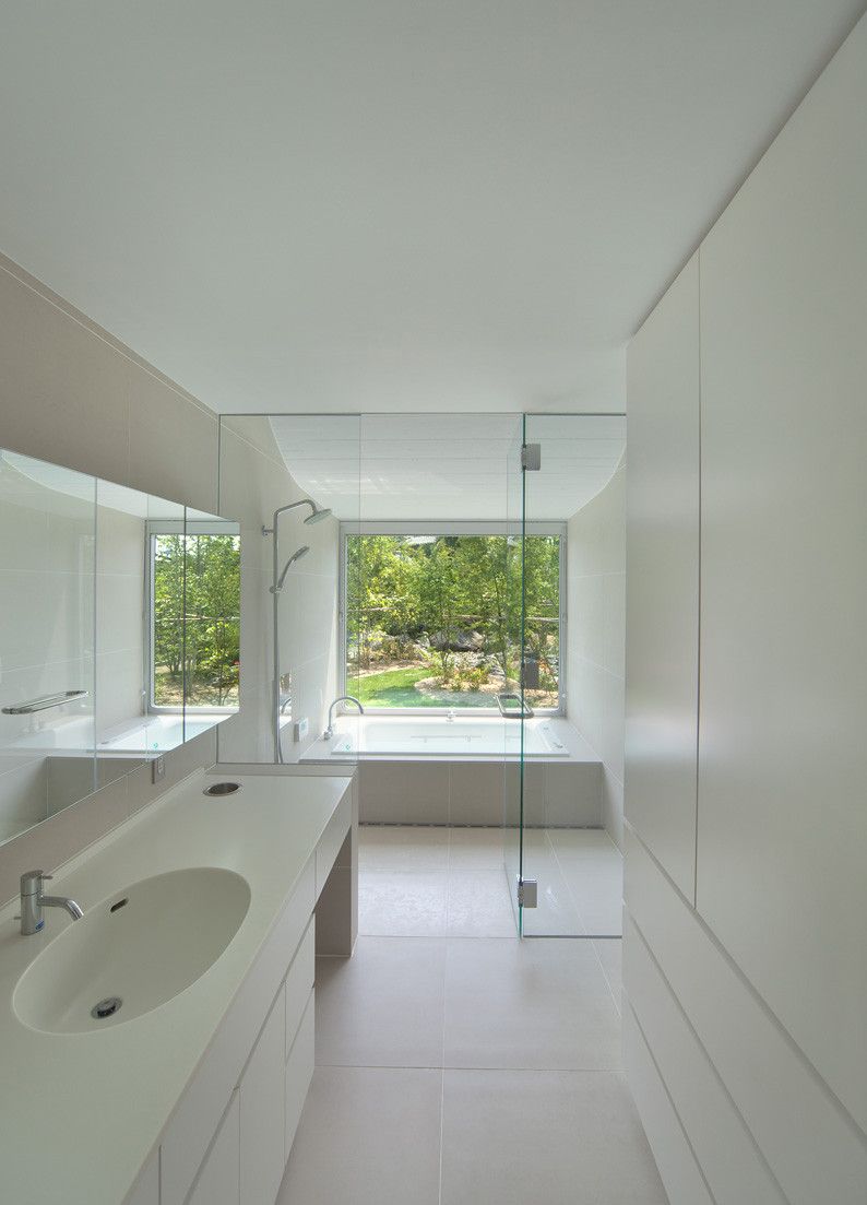
A large bathroom window is always a great feature, one which you should take advantage of. We absolutely love this white bathroom designed by NKS Architects. The tub has its own separate area which it shares with a walk-in shower, with a lovely view of the garden. he cabinet mirrors reflect the light and the view into the other section of the bathroom.
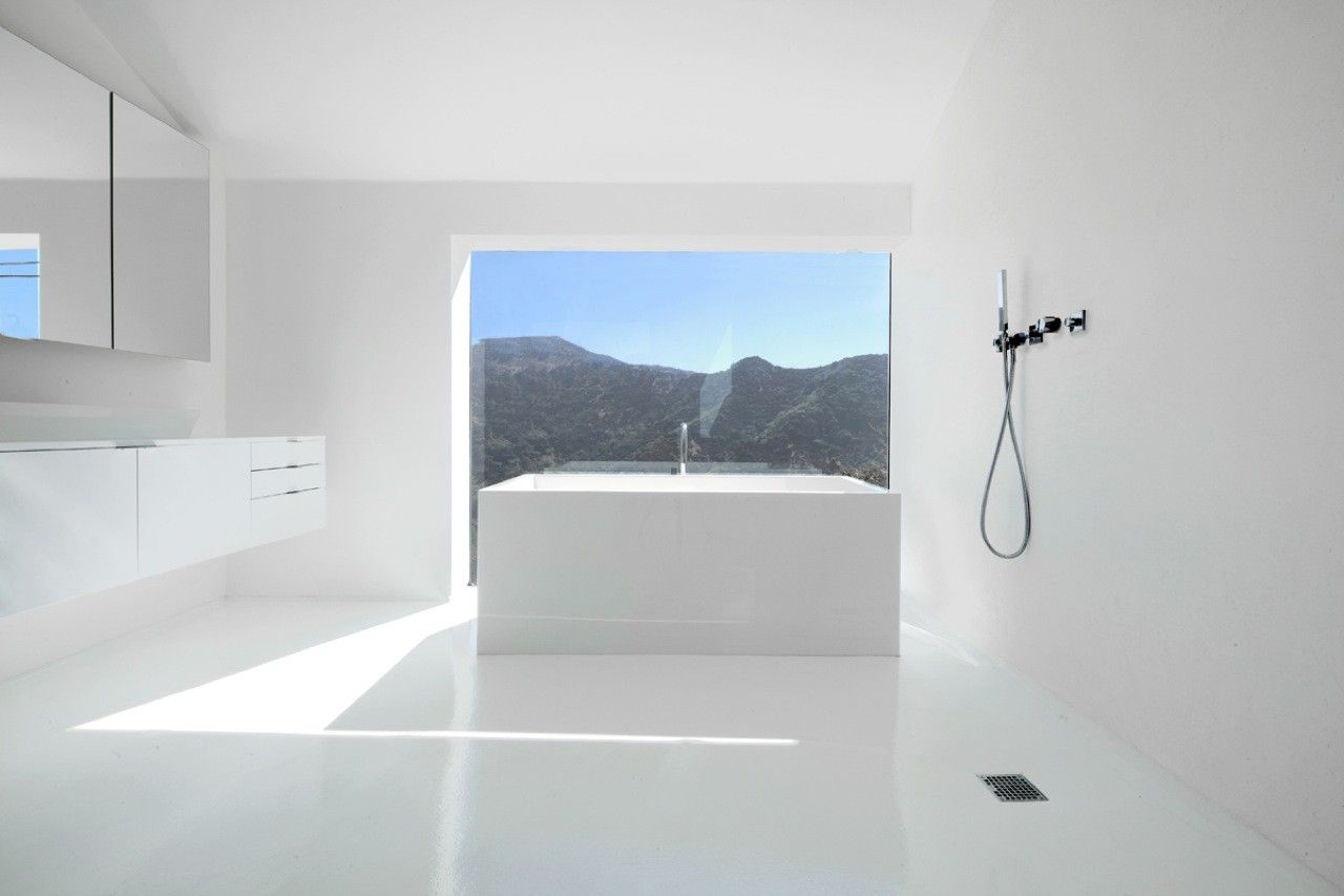
That gorgeous view is the single focal point of this entire bathroom and everything else is designed to maximize its impact and to make the most of it. The bathroom is all white and seems almost empty, with all the furniture and fixtures up against the walls and the tub at the center, in front of the window. This amazing design was created by XTEN Architecture.
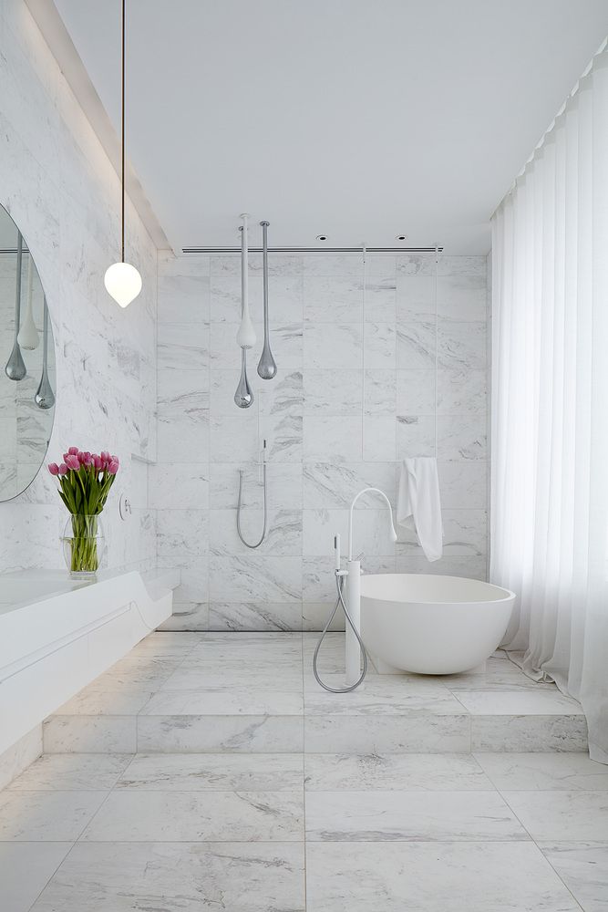
Here’s another example of a simple and at the same time very elegant and refined bathroom. This time there are long white curtains covering up the windows and it looks so delicate, giving the room a cozy and welcoming appearance. The oval tub and those droplet-shaped pendants hanging from the ceiling have a similar effect on the room. This is a project by Architecton.
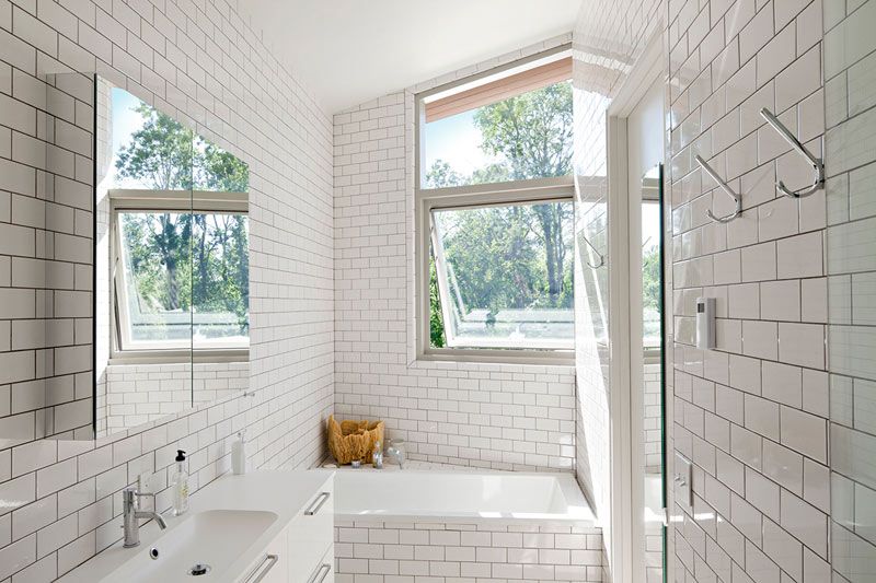
Classic white subway tiles never went out of style so you can always count of this design option if you want to maintain a simple and elegant look in your kitchen or your bathroom. This was also the strategy chosen by studio Grzywinski + Pons in this particular case and the results speak for themselves.
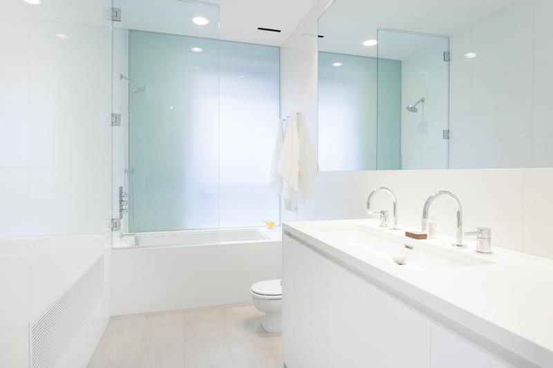
Here’s yet another example of how white can make your bathroom look exquisite. As before, the design is simple and the palette of materials and finishes is limited to only a few choices. A large mirror and glass partitions maintain an open and airy feel inside this space.
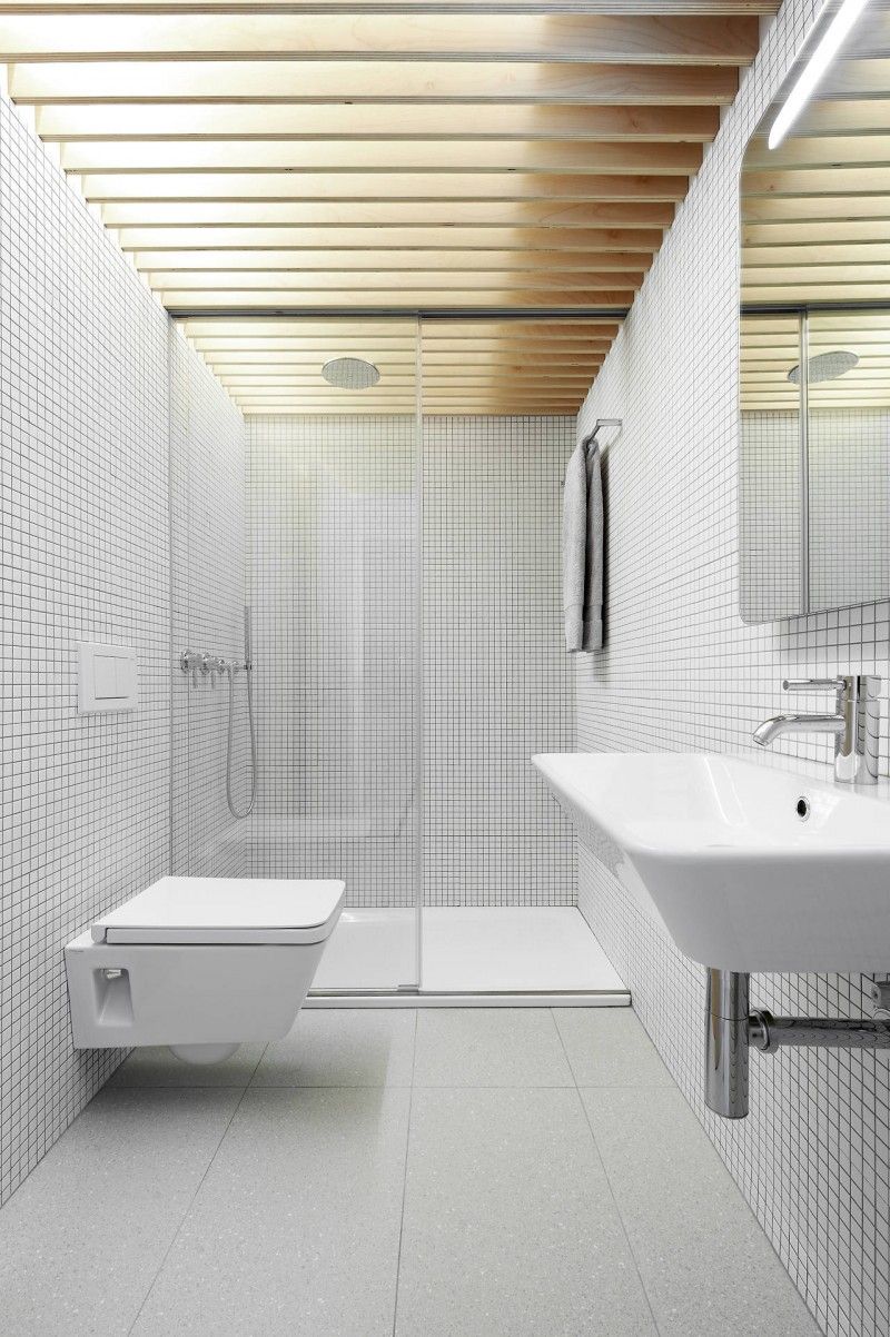
Because an all-white bathroom risks to come out as too cold and austere, it’s often a good idea to introduce pattern, texture and if possible wooden accents as a way to balance out the design and to create a more inviting and comfortable ambiance. This bathroom remodel done by Iñigo Beguiristain shows one of the ways in which you can achieve that.
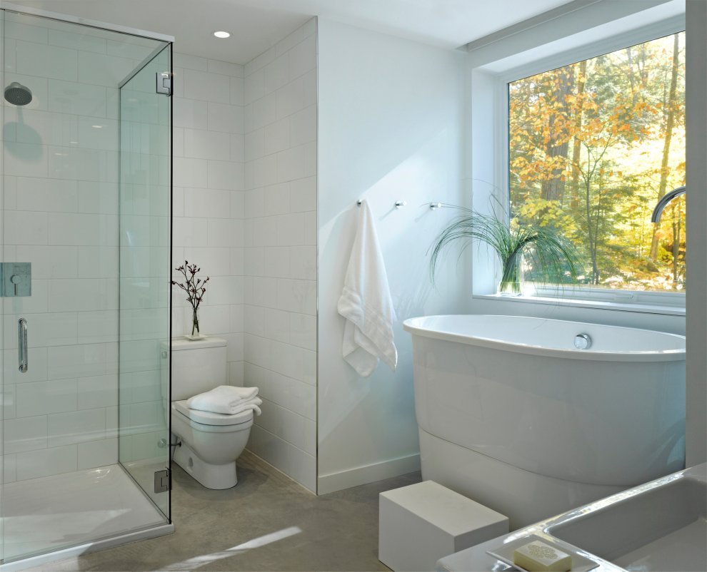
This is a small bathroom with a pretty nice and practical design. It has a deep-soaking tub set in front of a large window and everything is white except for the floor which adds a nice but still subtle contrast. The design was done by Brian Mac.
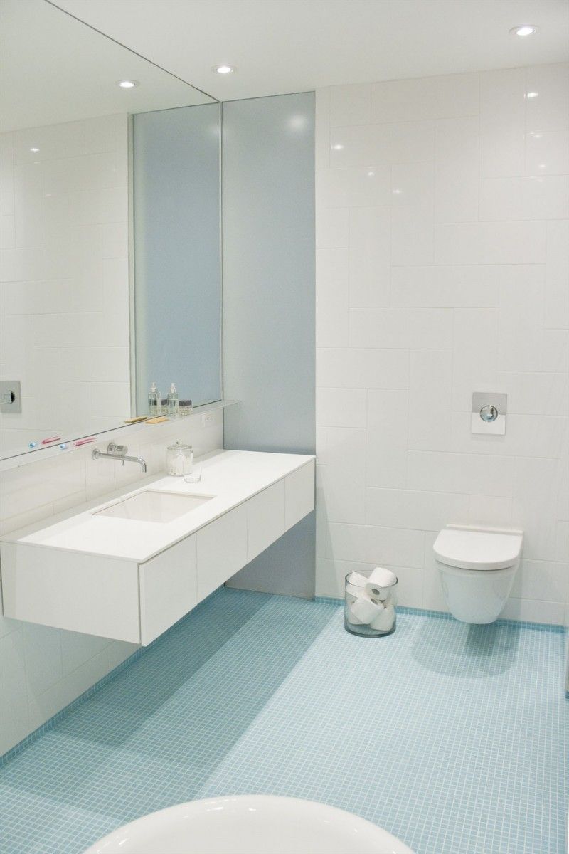
Adding a bit of color to a white bathroom is not a bad thing. In fact, it can help bring out the beauty in everything else by contrasting with all the white surfaces. A nice example is this design by La SHED Architecture. The light blue mosaic tiles installed on the floor also form a delicate borner around the walls, creating a stylish appearance.
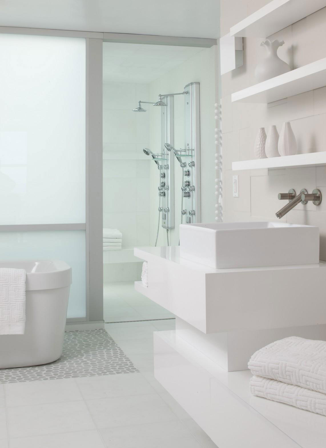
This bathroom was designed more like a living room. The vanity and shelves are the equivalents of a media center, the tub is the equivalent of the sofa and the section of the floor just below the tub looks like an area rug. It’s a very interesting and inspiring strategy used here by Group 41.
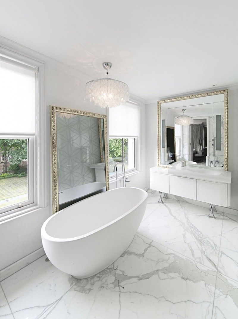
This is the luxury bathroom designed by SHH for a residence in London. It has white marble flooring, an oval freestanding tub, a chandelier and two large mirrors with golden, intricately-carved frames. These are just some of the elements which complement the minimalist color palette.
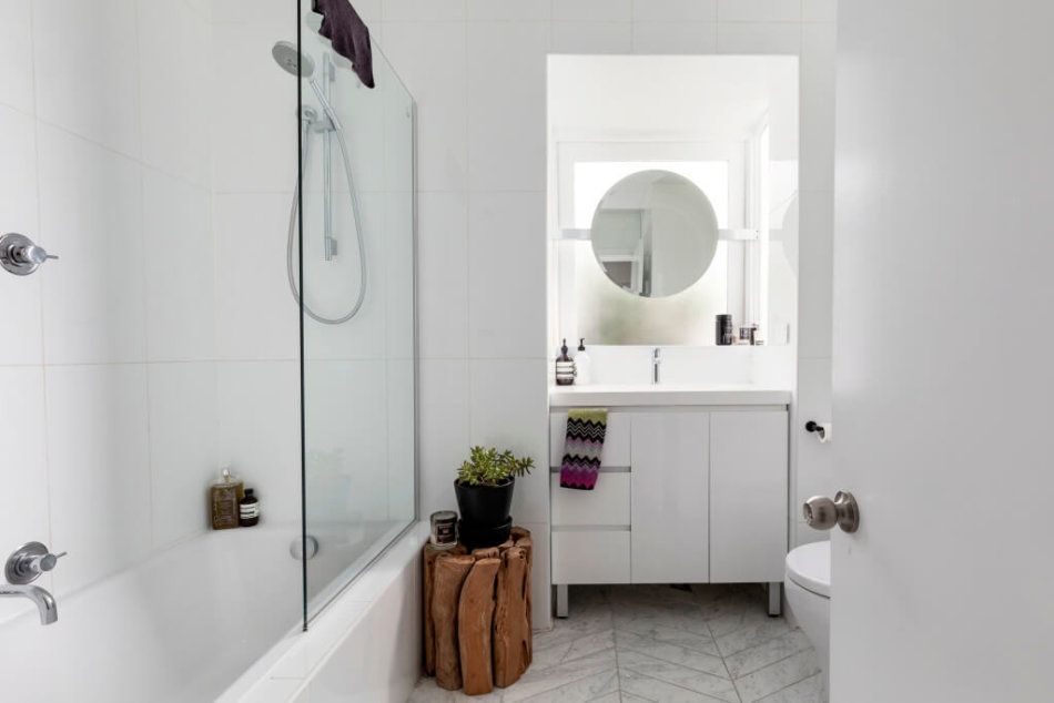
Of course, white doesn’t have to be the only color used in a room. One or more accent colors can create a more wholesome look and white can still remain the primary and dominant color. A good source of inspiration in this sense can be this spacious bathroom designed by Parasite Studio.
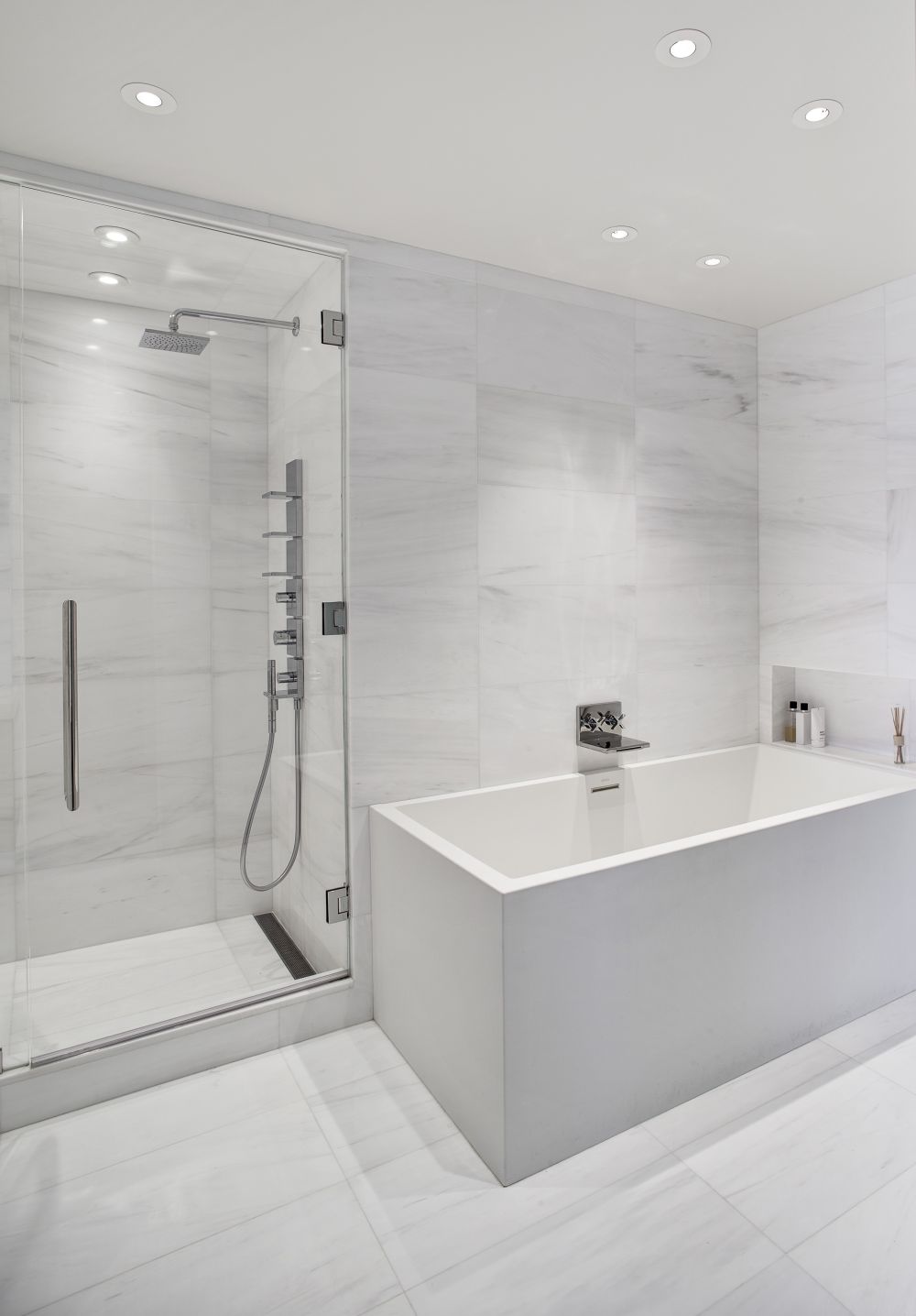
The matching wall and floor tiles give this modern bathroom design a uniform look which is often a good strategy, especially in the case of small bathrooms where too much color can overwhelm the space. The built-in wall niche is a nice little detail in this case as well.
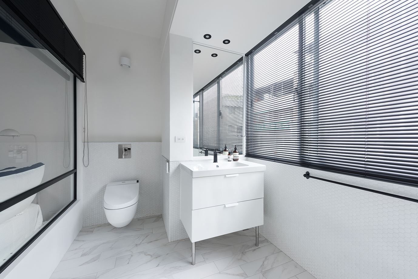
Here’s an example of a white bathroom which takes full advantage of its large windows and also the glass wall separating it from the adjacent bedroom. The wall-hung toilet and the vanity keep the floor clean and together with the wall-mounted mirror contribute to very fresh decor. This is a space designed by W&Li.
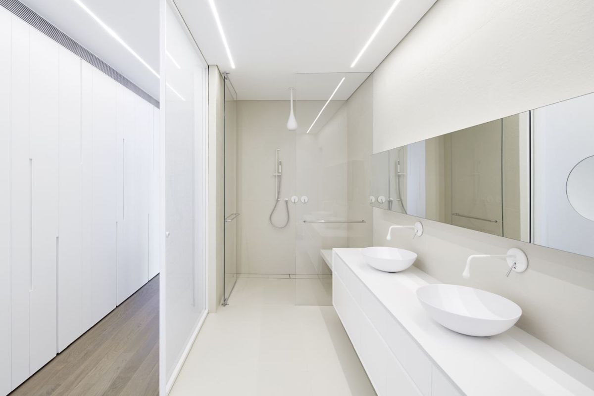
A combination of pure white and ivory/ beige surfaces give this bathroom a sophisticated allure without complicating its design in any way. If anything, this is one of the simplest design approaches possible. The walk-in shower occupies the left side of the room, featuring clear glass doors. A double sink vanity runs along the wall, accompanied by a long, horizontal mirror designed to make the bathroom look more spacious. This was a project by Pitsou Kedem Architects.
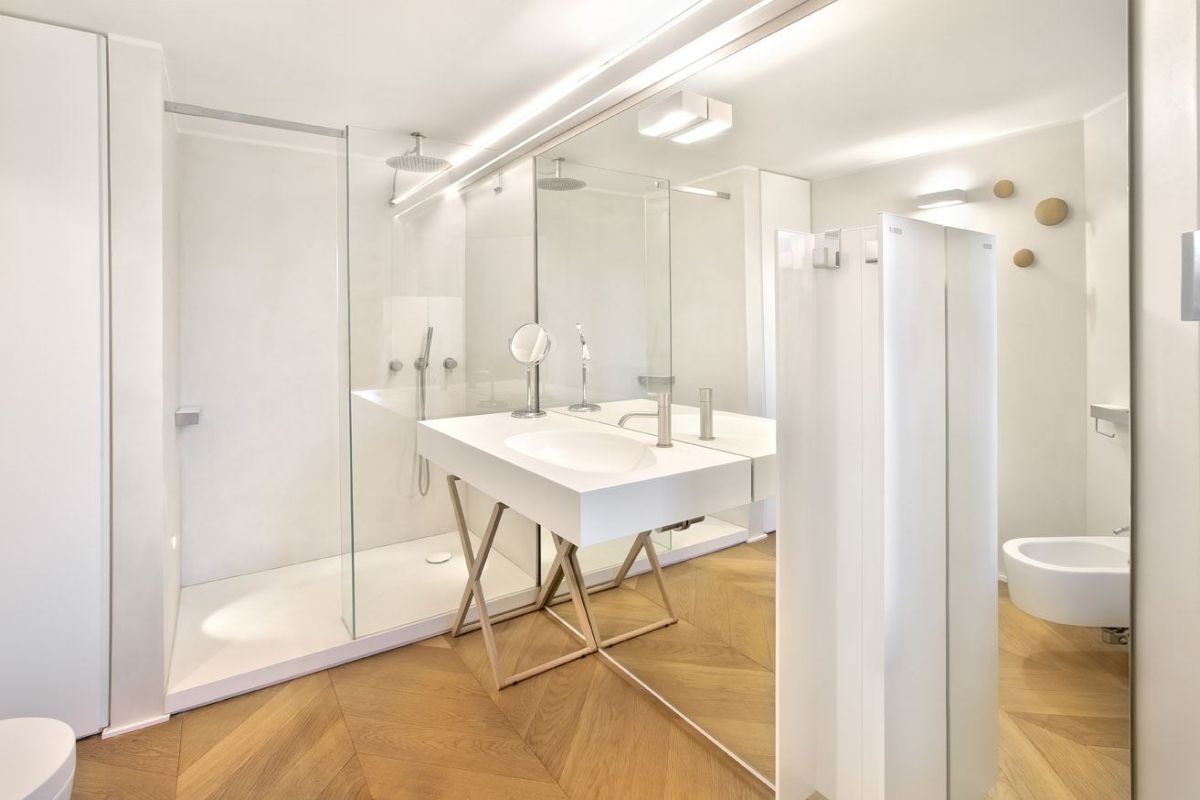
A huge floor-to-ceiling mirror covers almost an entire wall of this bathroom and has a huge impact on how the space looks and well as on the ambiance inside. The herringbone wooden floor is a nice touch as it contrasts with the white walls and creates a sense of warmth and comfort. This was a project completed by Bartoli Design.
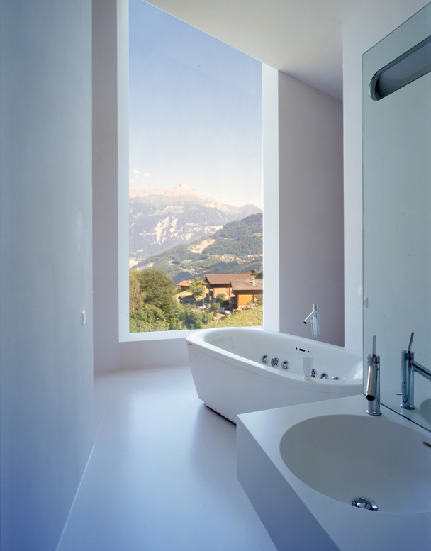
The view frame by the large window looks like a beautiful painting, giving this white bathroom a lot of character. The lack of color inside the room keeps the focus on the magnificent view of the Swiss countryside. This design is the work of studio Bonnard Woeffray Architects.
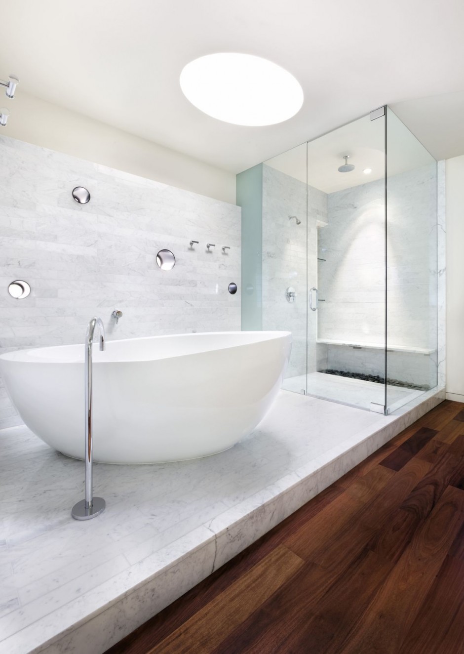
We love the idea of separate floor heights and materials for distinct sections of the bathroom. In this design created by Alterstudio the tub and walk-in shower stand of a tiled platform while the rest of the platform has warm wooden flooring. We also love the fact that everything except for this floor area is white.
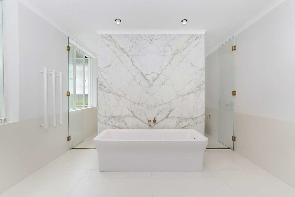
Symmetry plays an important role in the case of this white bathroom. The marble wall behind the tub is framed by glass doors on either side, adding an artistic and elegant vibe to the space. Notice the two-tone walls and the smooth transition between the two nuances. Check out more images of this wonderful house on desiretoinspire.
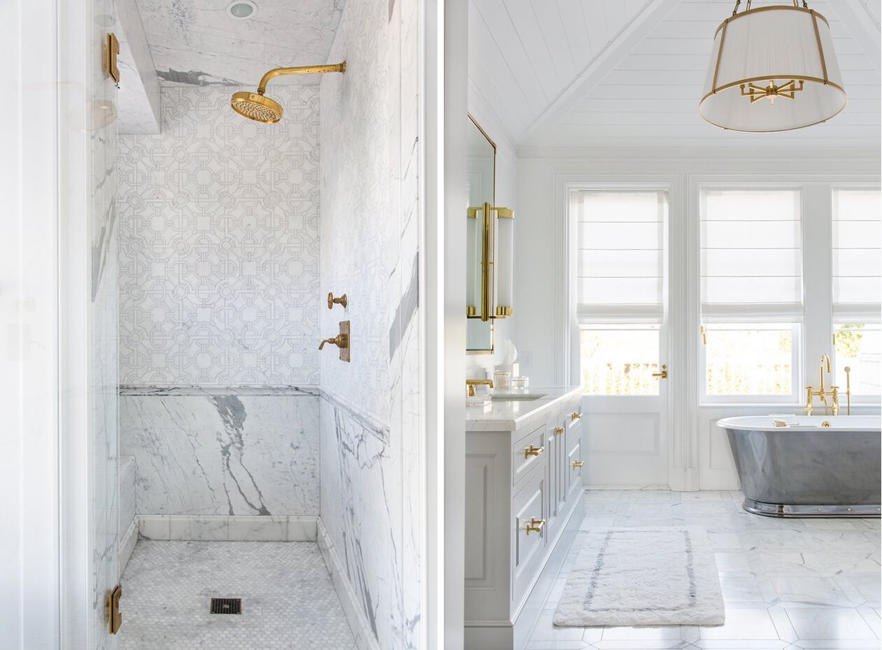
A combination of white and gold gives this bathroom designed by Kirsten Maltas a very elegant and refined look. The beauty in this case is in the details and that includes not just all the hardware and the matching metallic accents but also the tile patterns and the palette of materials and finishes used throughout the room.

Speaking of details, check out this other gorgeous white bathroom. It’s small with just enough room inside for a tub and shower combo, a vanity and toilet. Still, there’s plenty to love about the design, in particular the visual impact of that little trunk table. Check out more details on desiretoinspire.
The post 25 White Bathroom Design Ideas That Are Effortlessly Beautiful appeared first on Home Decorating Trends – Homedit.
