Modern Homes in San Francisco That Will Make You Want to Move There
San Francisco may be famous for Steiner Street and its row of Victorian homes called the “Painted Ladies,” but the city is also home to some of the most stunning modern homes. With space at a premium, these gorgeous residences make the most of the typical narrow house profile in a very stylish way. Being located in the country’s most expensive place to live, modern homes in San Francisco rely on creativity and innovative design rather than sprawling square footage to create luxurious spaces. Have a look at these fabulous places.
Focused on the Views
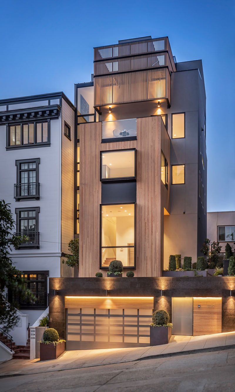
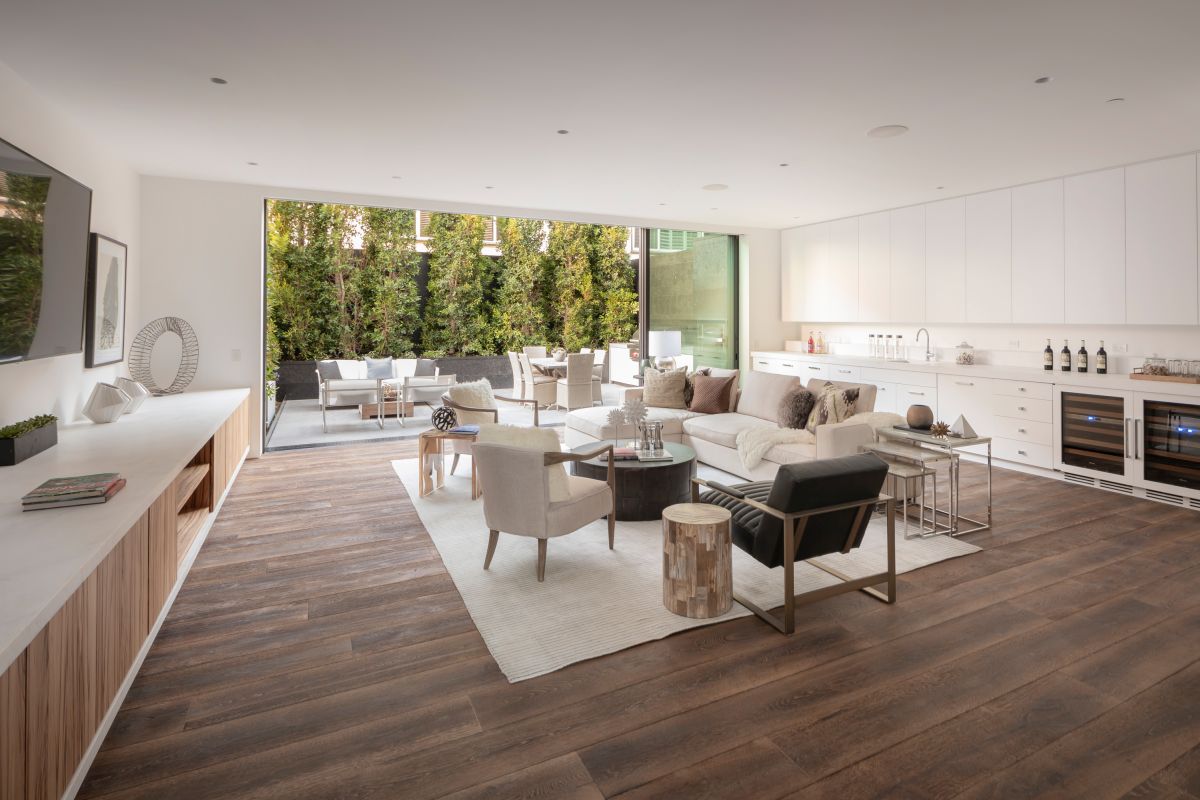
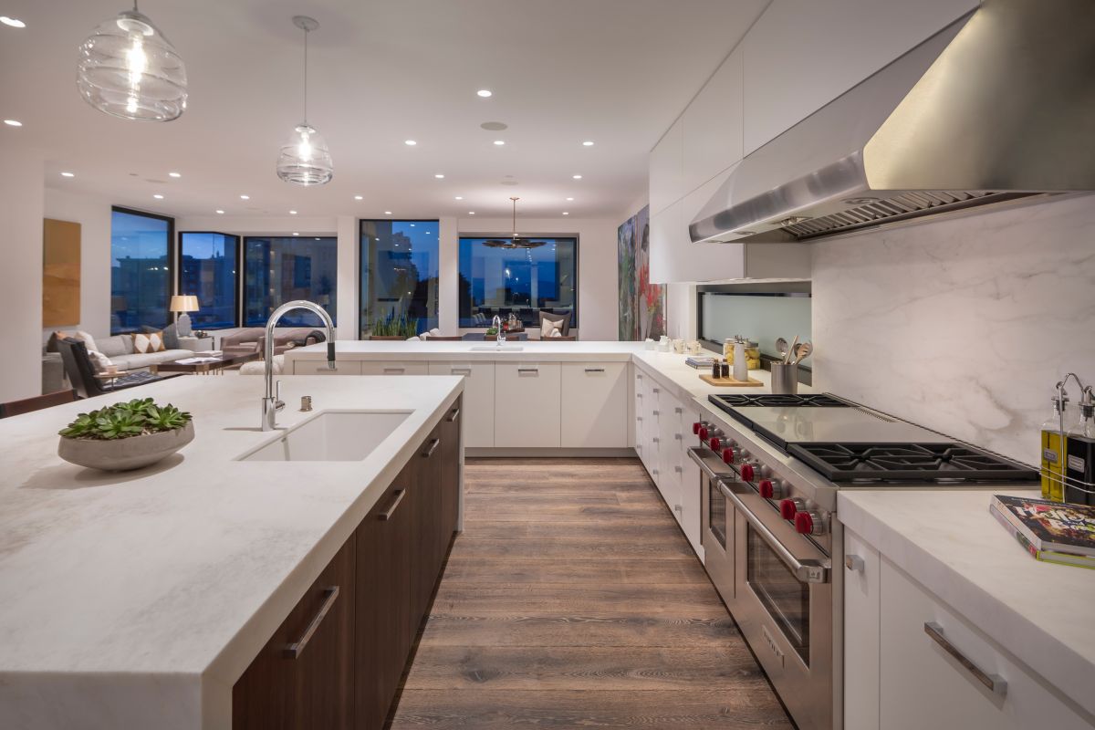
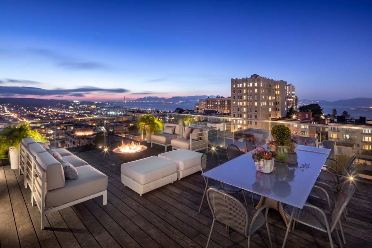
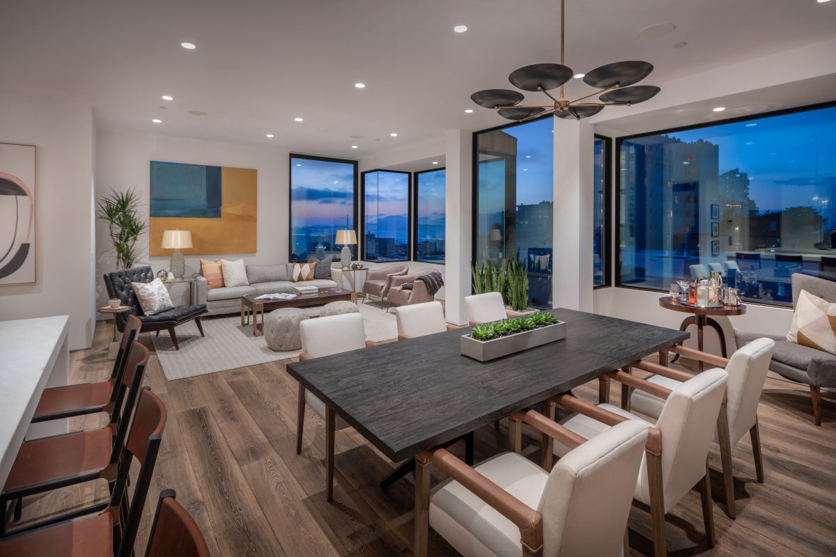
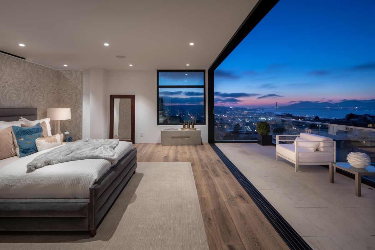
Clad in rare Siberian Larch, this home in the Russian Hill neighborhood takes full advantage of its viewpoint with tall windows and a fourth floor entirely dedicated to the master suite. The property was originally designed by architect Stanley Saitowitz and later renovated by Studio 12 Architecture. All four floors of the home are unified with wide plank engineered wood flooring. The bottom level features a great room and magnificent patio with fireplace that is made for entertaining, along with a stunning glass-doored wine room. The next level up is home to three bedrooms, including a master suite, and the third floor is dedicated to an open plan living space that includes the kitchen that has a clean, white contemporary look. The fourth-floor master suite features a large glass wall that slides open to a private balcony. The home is topped off with a rooftop deck made for lounging and enjoying the 360-degree views of the city.
Feelings of Spaciousness and Light
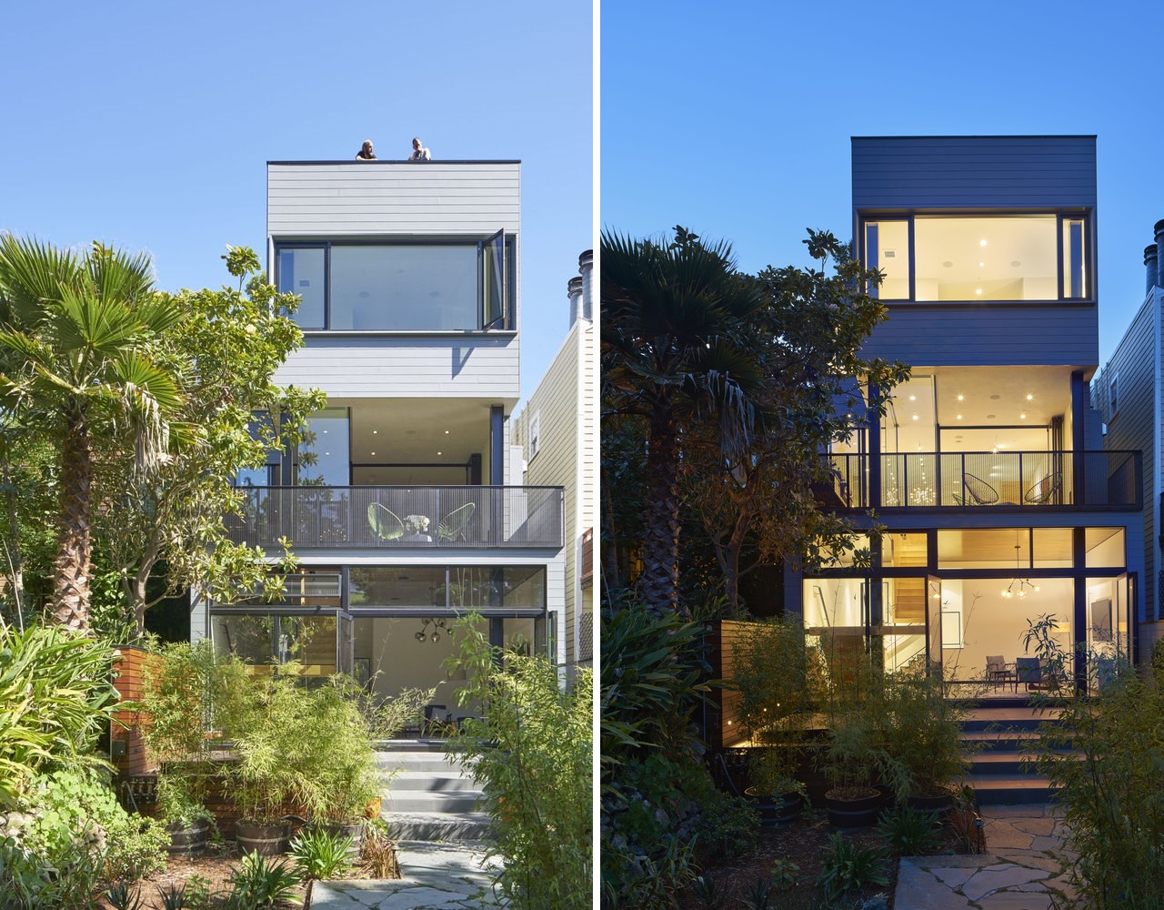
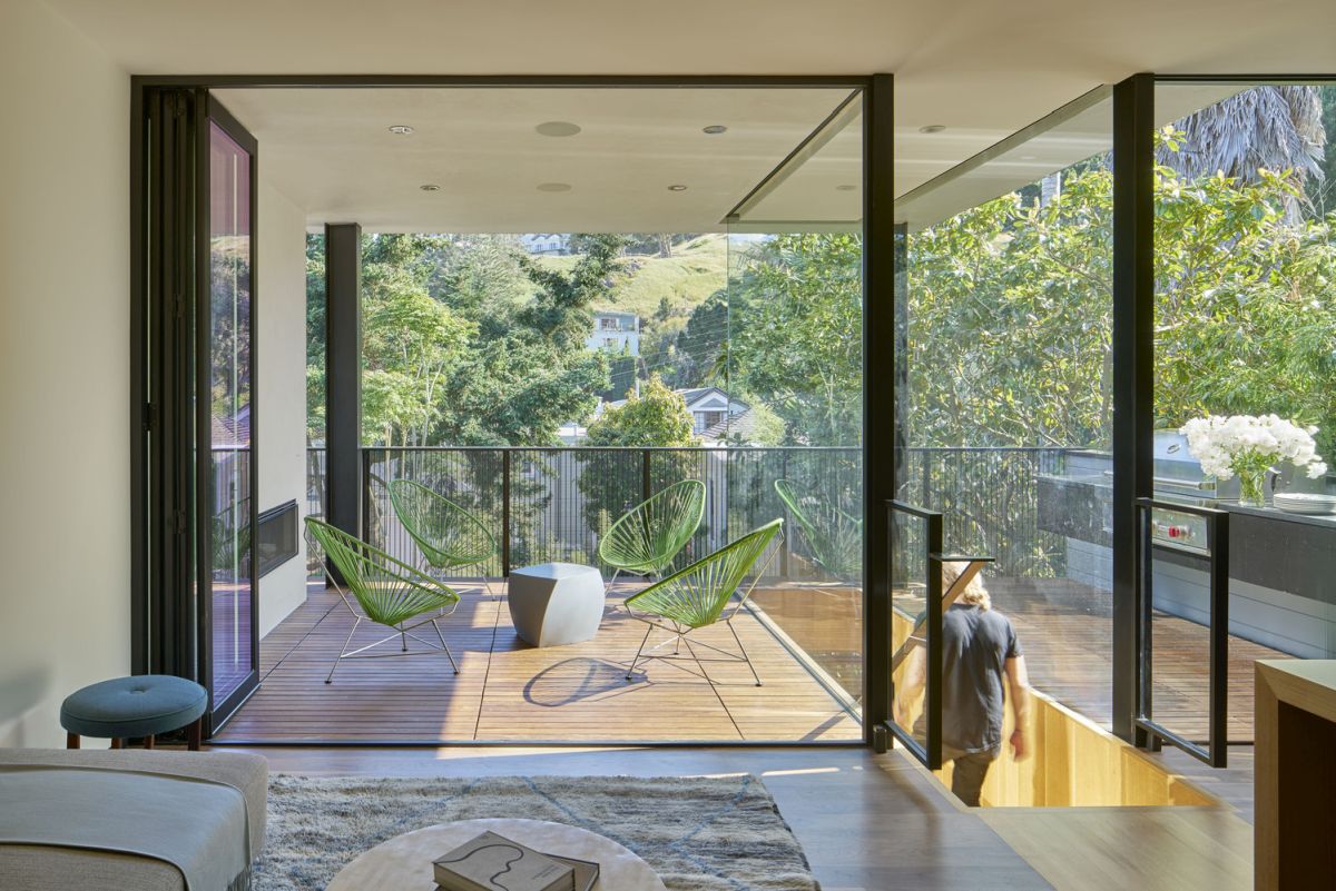
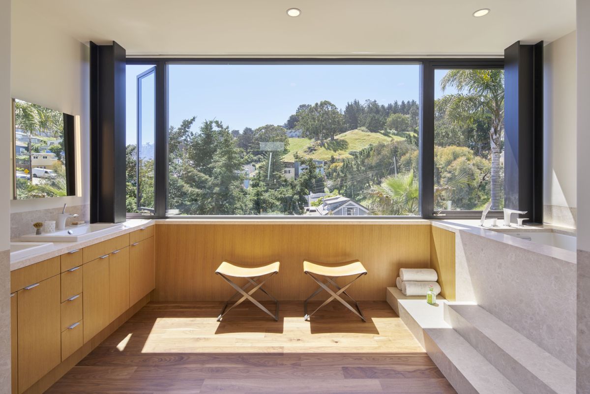
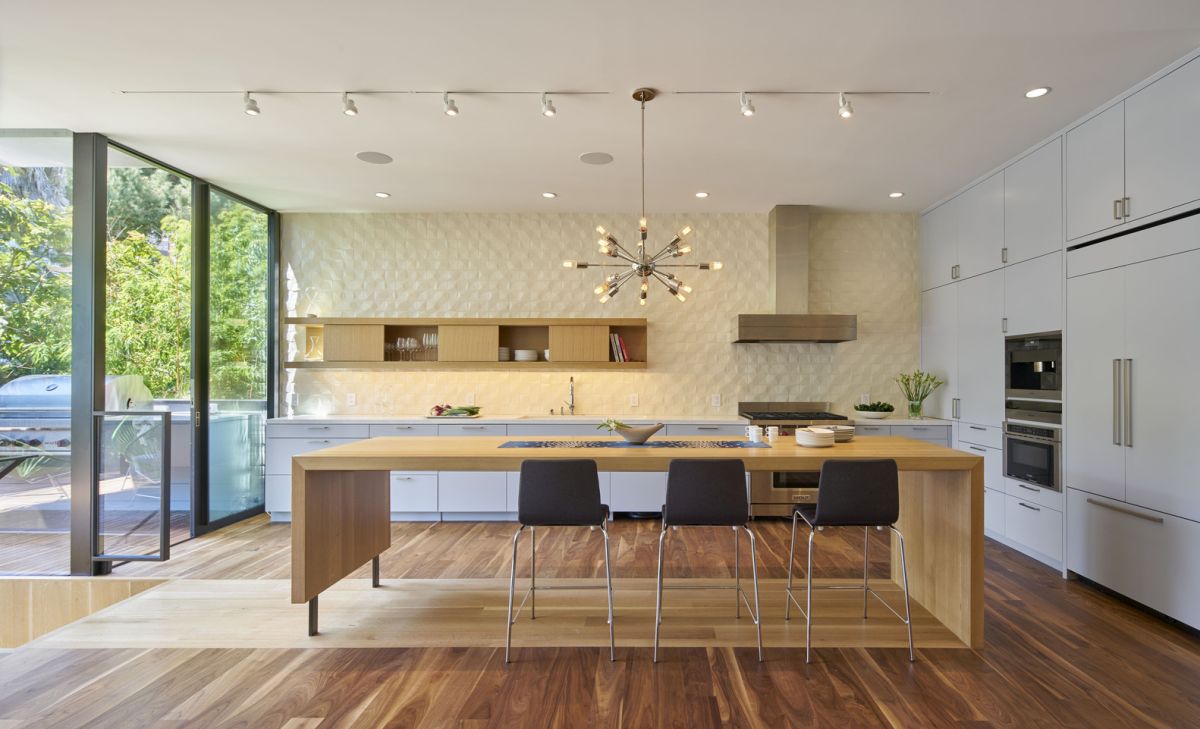
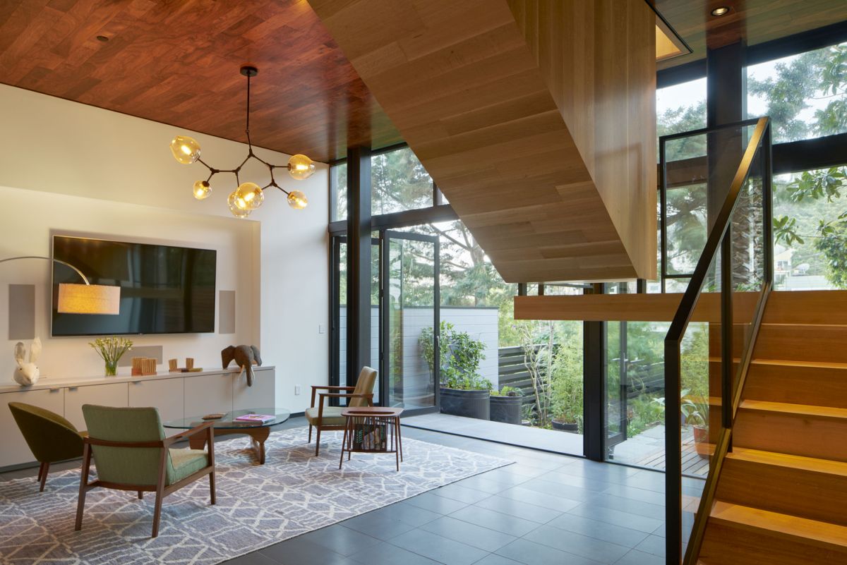
Schwartz and Architecture used a series of stairwells to create a spacious and stylish home in a very tight space. San Francisco’s urban neighborhoods generally sit on a grid of lots that are 25 feet wide. Required setbacks on each side create a design challenge that again makes the focus vertical. By treating the interior’s rift-cut white oak stairwells as sculpture, the resulting open concept makes the living spaces seem larger than they are. Plenty of large windows not only capitalize on the views but add lots of natural light and help unify the different levels. The original tiny 850-square-foot home was lifted and a new garage and ground floor were inserted, which drove the rest of the renovation. The dominance of the staircase design may be counterintuitive but works magic in creating modern living spaces that beautiful as well as highly functional.
Light-Filled Contemporary
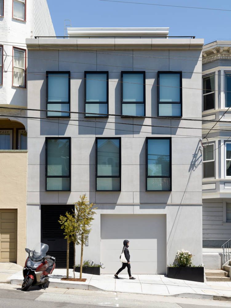
A modern concrete facade and steel box-framed windows front a contemporary residence that was once a warren of dark spaces in a very user-unfriendly floor plan. Redesigned by Feldman Architecture, this home in the Noe Valley neighborhood of San Francisco is now a delight of bright, modern living areas accented with warm wood elements. The main floor of the house holds the social spaces, including the kitchen and a formal dining room, all of which are bathed in plenty of natural light. Part of that light comes from the skylights that feature in the residence and it is emphasized by the staircase that has solid oak treads paired with a steel and glass rail that connects all four floors. On the very top, there is a real oasis in the form of a roof deck that has a low-maintenance succulent garden surrounding the seating area.

Urban Oasis of Calm
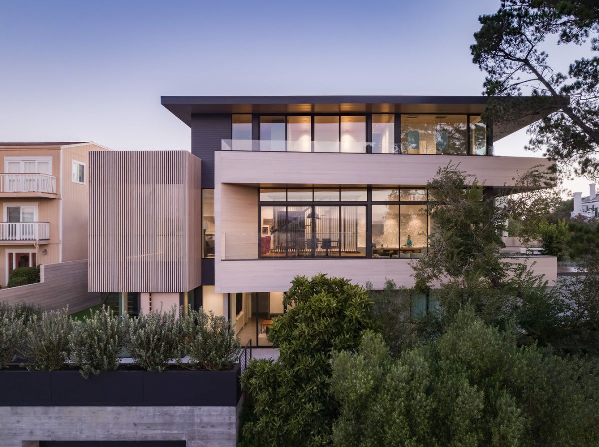
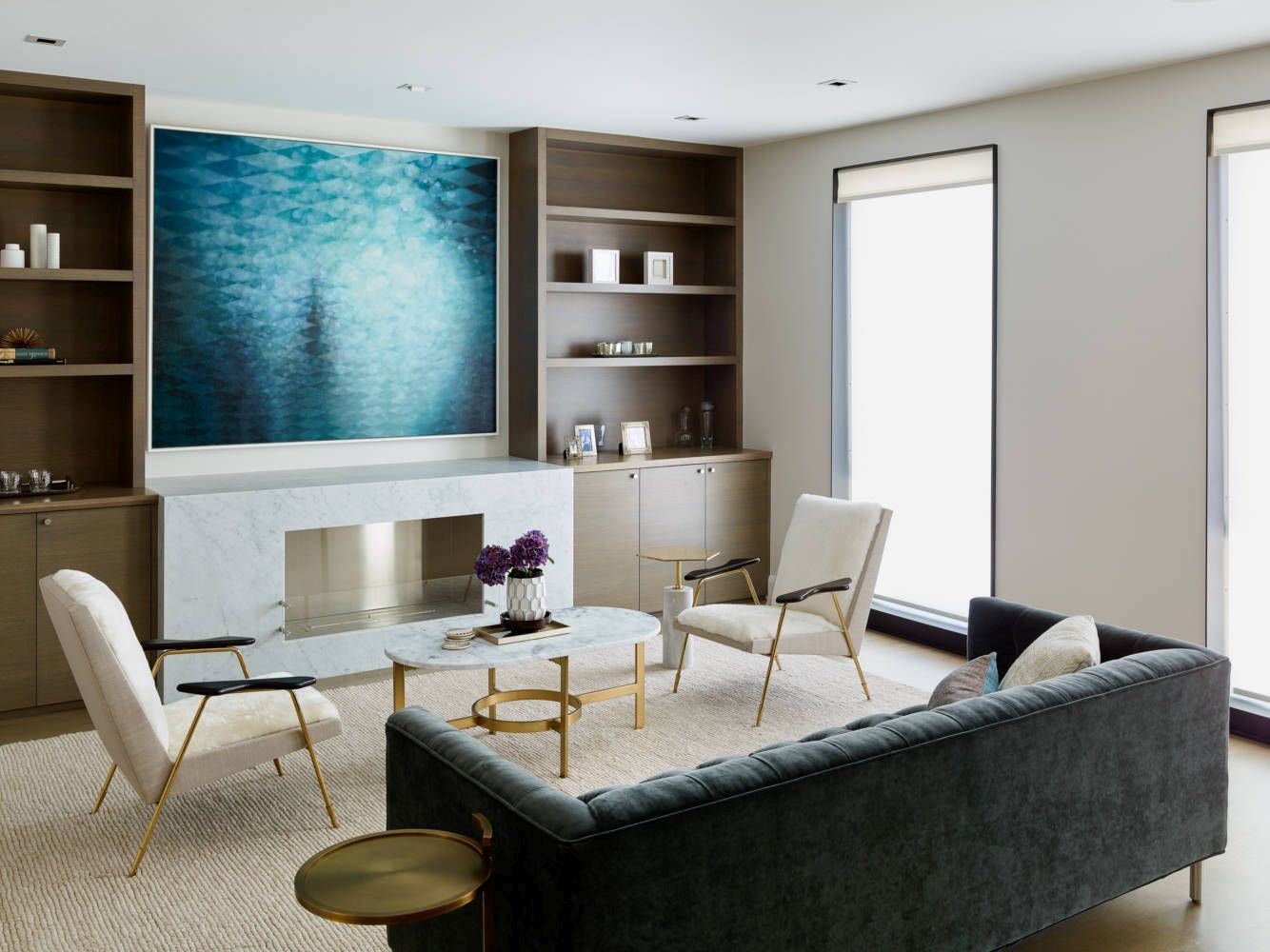
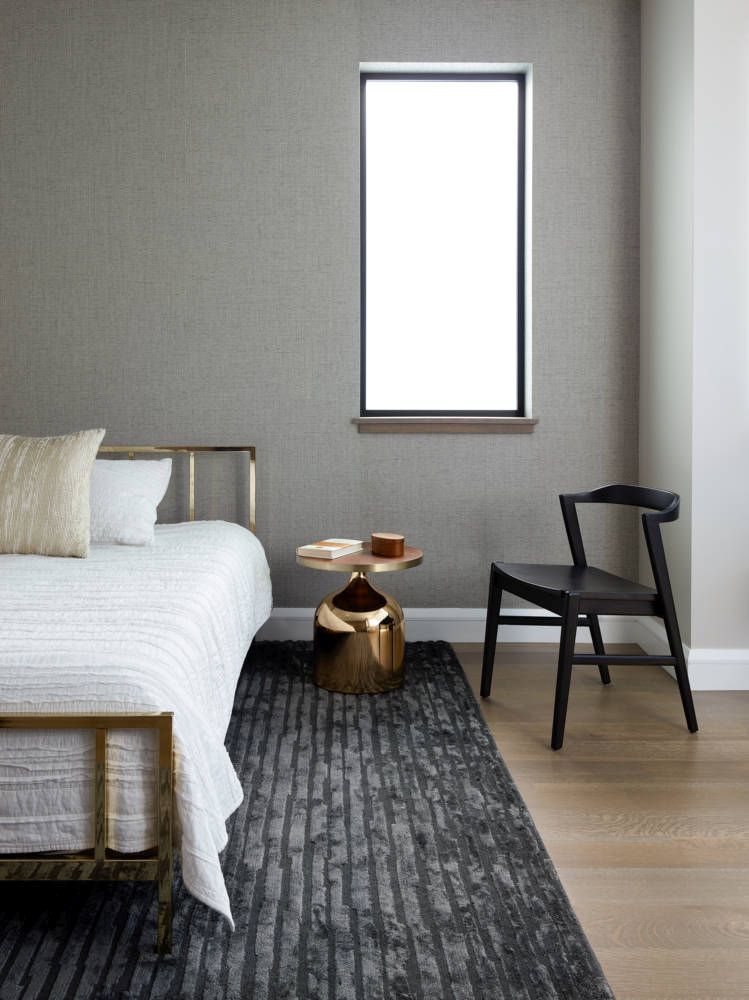
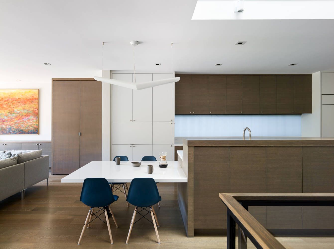
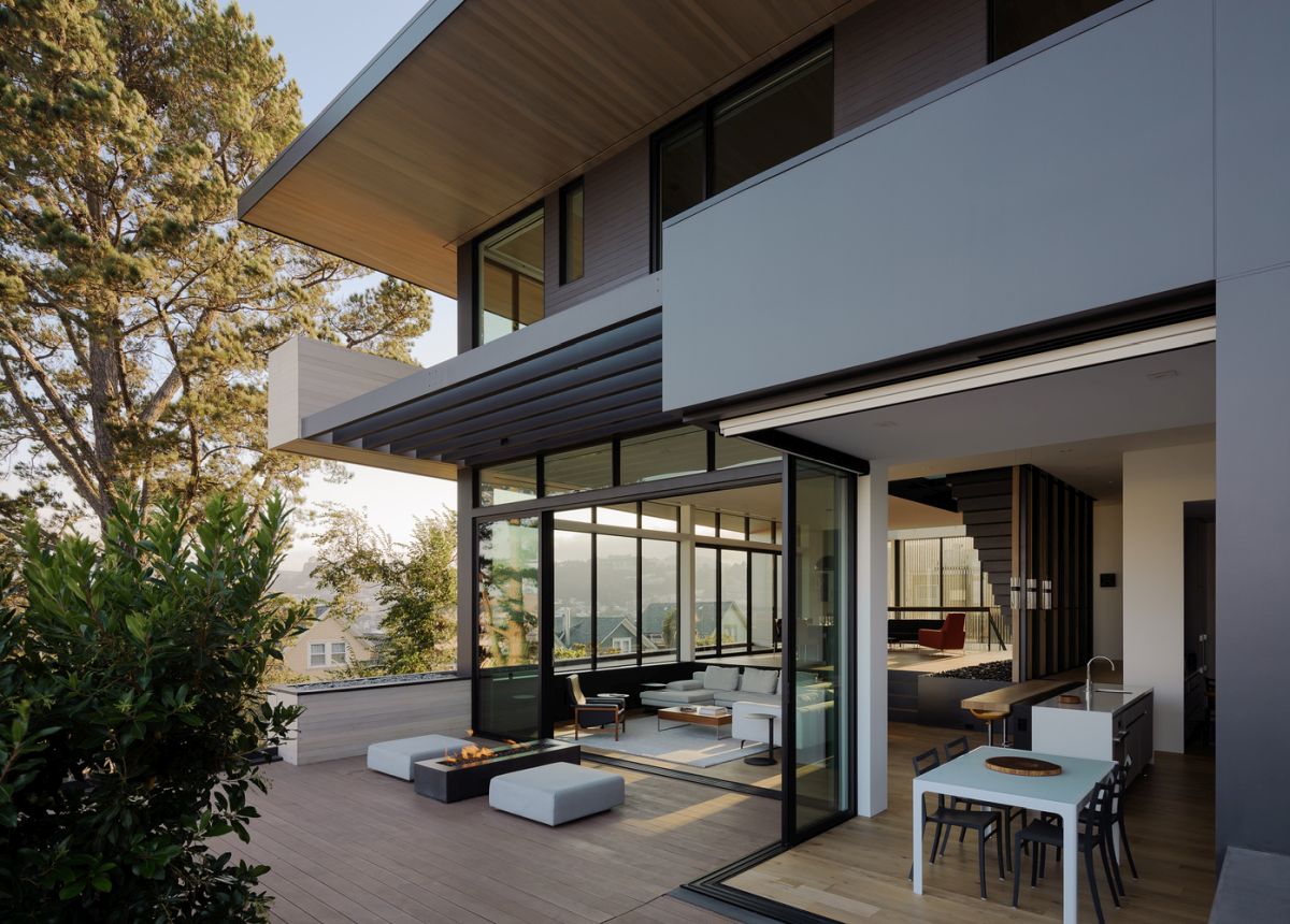
Situated on a special double lot, this San Francisco home in Dolores Heights takes full advantage of the extra space and capitalizes on the various vantage points and open sightlines. Designed by John Maniscalco Architecture, the 6000-square-foot house features deep overhangs make the most of the corner lot and lets the residents experience the changing light throughout the day. From the bottom level, the two-story entry is wrapped with cedar slats and a grand bent-steel staircase connects it to the main living area above, which has an open floor plan. The use of organic materials and a neutral palette of finishes throughout help create an interior that is a very relaxing oasis in a bustling city for a growing family.
Family-Friendly Modern Renovation
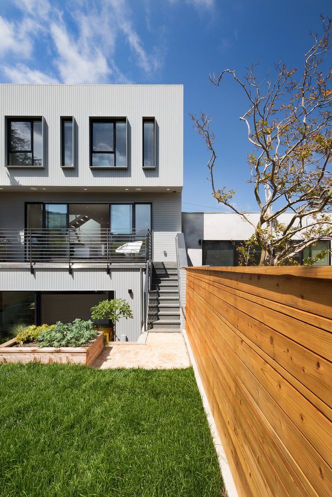
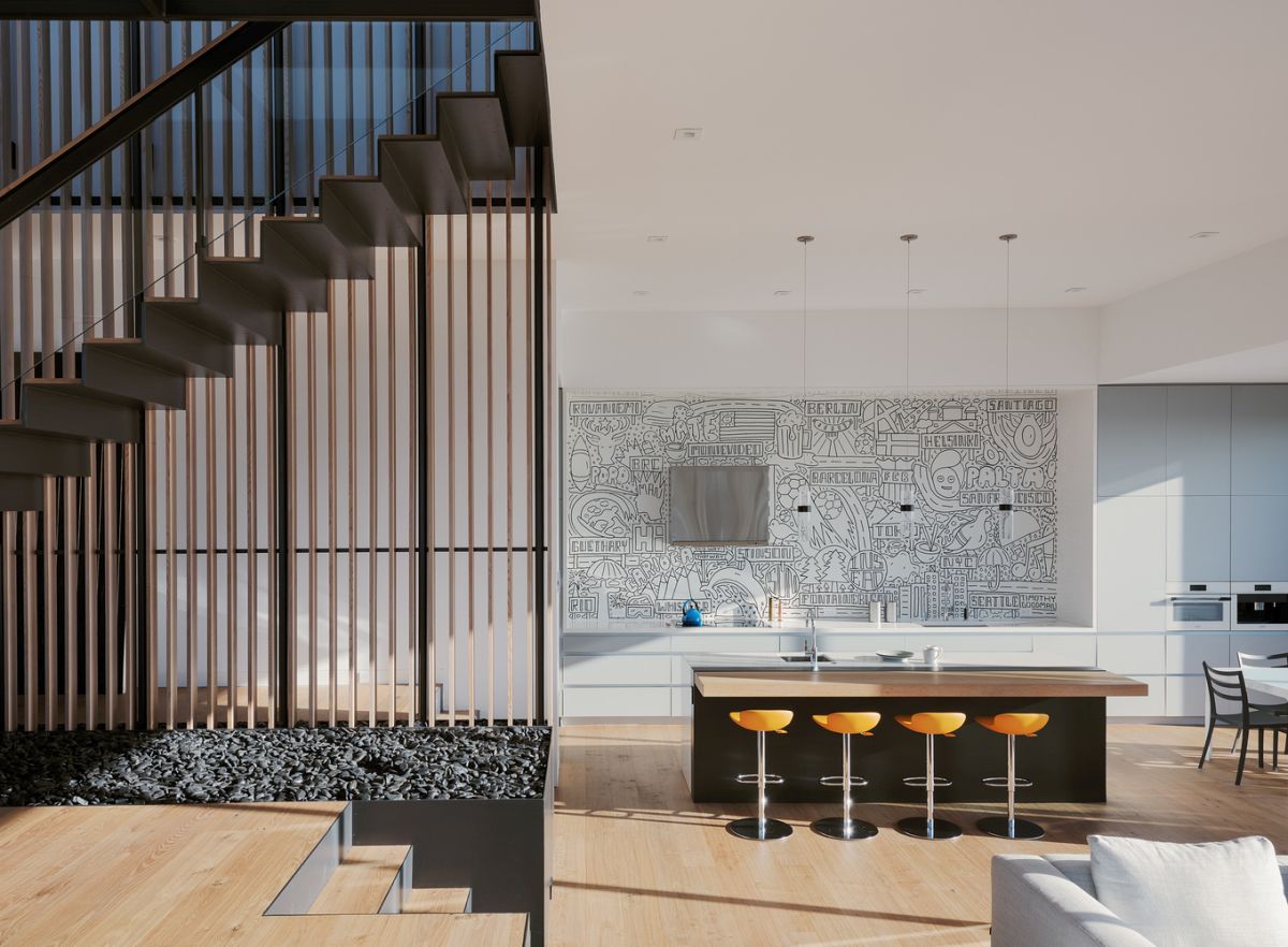
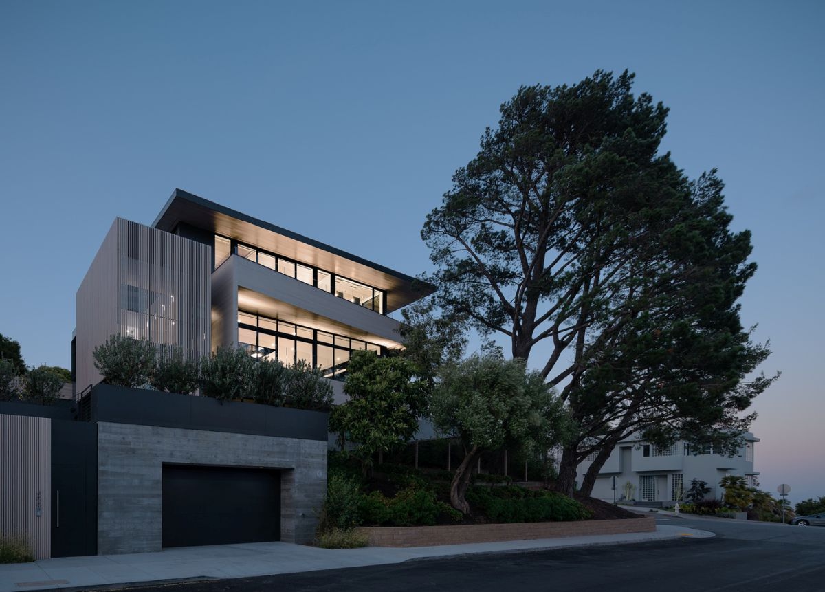
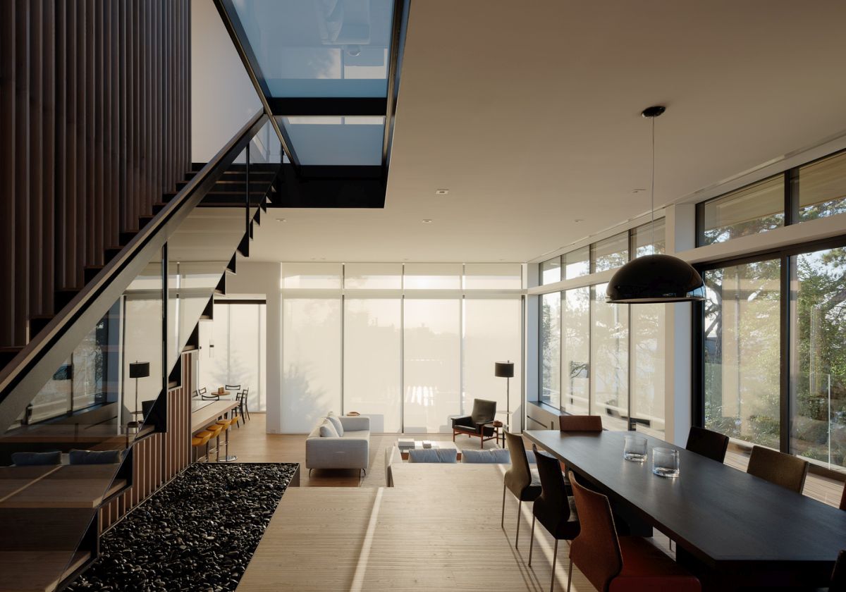
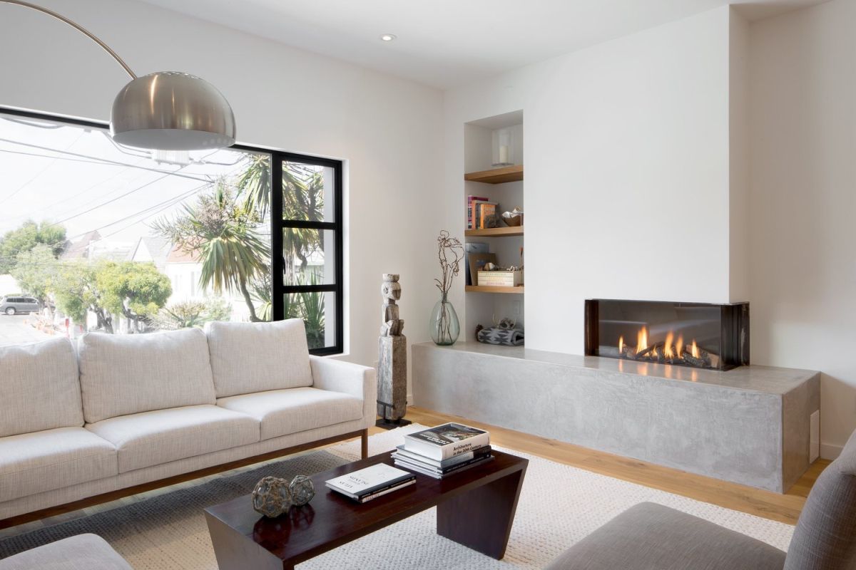
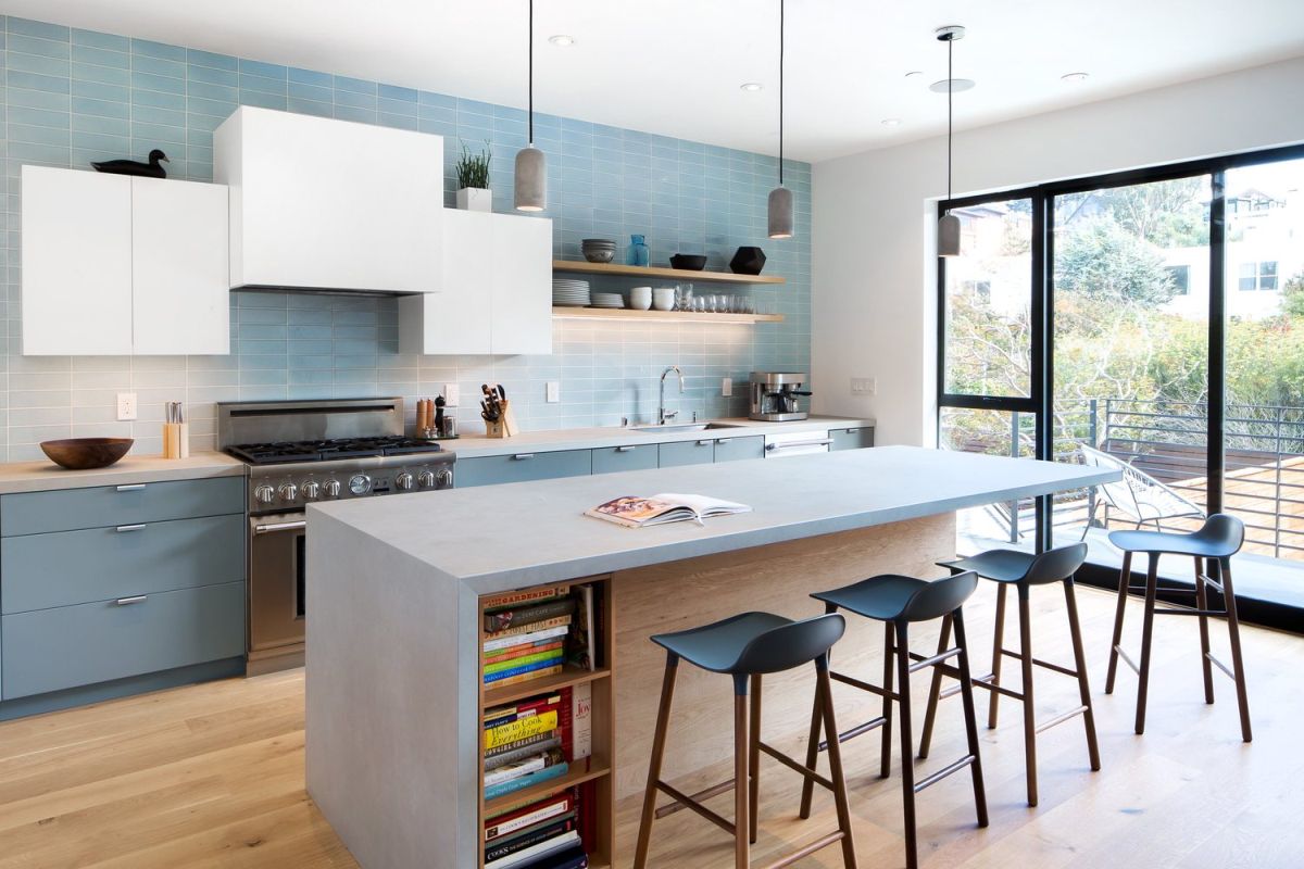
What was once a modest two-bedroom, one-bath home in Noe Valley has become a modern and highly functional home for a young family. Designpad Architecture renovated the property, expanding the home vertically in order to create a residence that connects with the backyard on the lower level and with the vista beyond from a spacious patio off the master bedroom. The open floor plan is family friendly and has bountiful natural light. The light and bright palette of materials and finishes incorporates some gentle color, such as the shades of blue in the kitchen tiles and lower cabinetry. The overall design, as well as the individual rooms, convey a feeling of casual serenity, perfect for the region.
An Architect’s Dream House
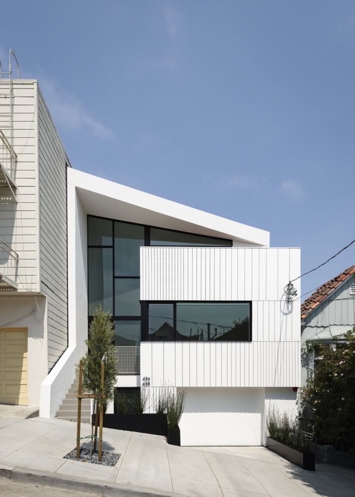
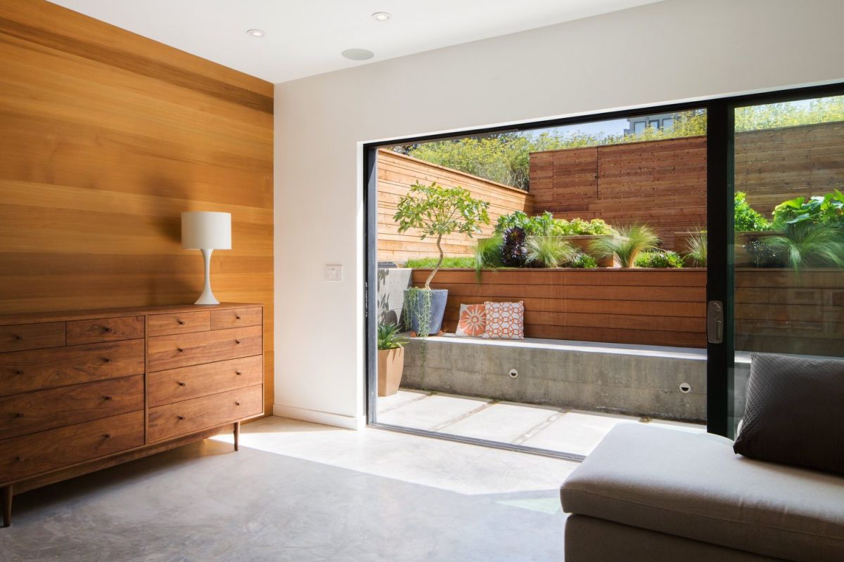
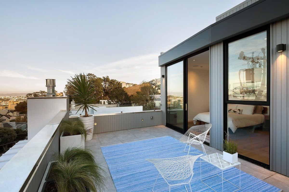
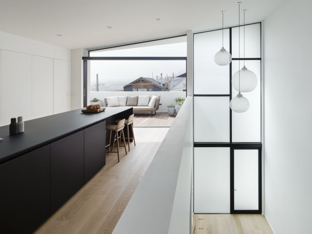
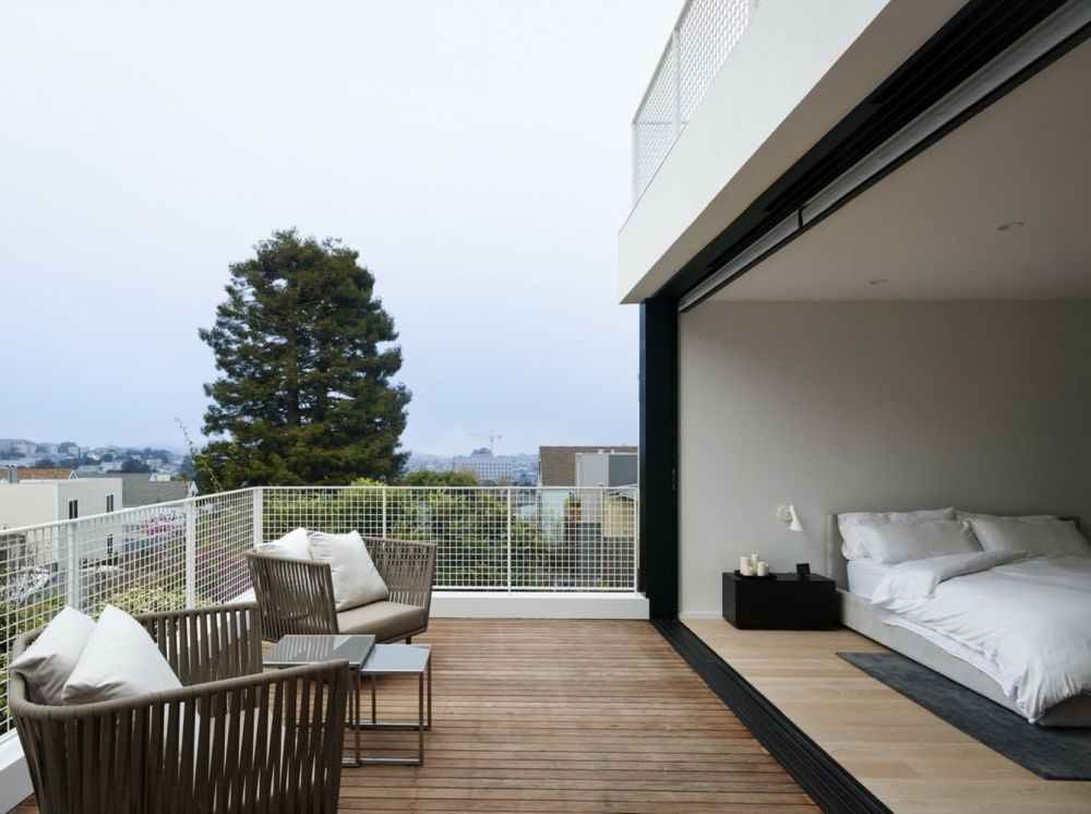
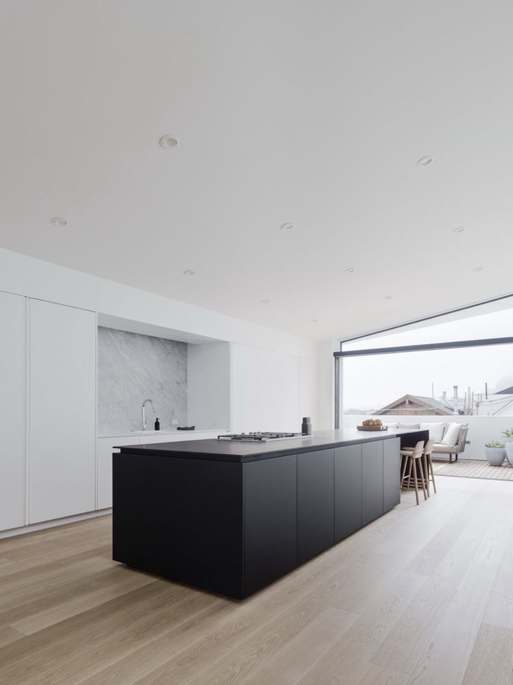
When the partners of Edmonds + Lee Architects needed to design their own home, they were able to leverage their unique insight into San Francisco’s permitting process as well as their professional expertise. The result is Switchback House, a residence that flexibly meets the needs of their family. The structure is essentially divided into two units, where the lower floor can be used as a rental property, but also can easily be incorporated back into a single-family home. The house as a flipped plan where the living spaces are on the top floors while the bedrooms are on the lower, which achieves the feeling of loft-style living that the couple wanted. Their professional knowledge also allowed them to make creative use of standard materials as well as build closets that exactly fit Ikea’s shelving units. All these little tricks yielded a stunning house on a budget.
Environmentally Conscious, Architecturally Responsive
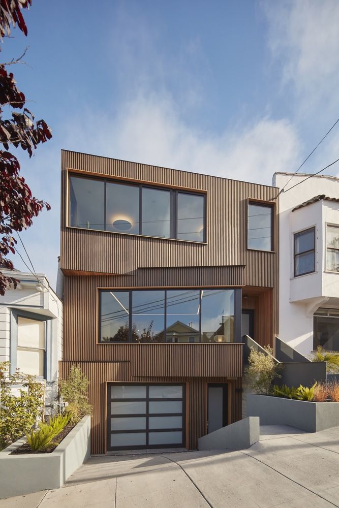
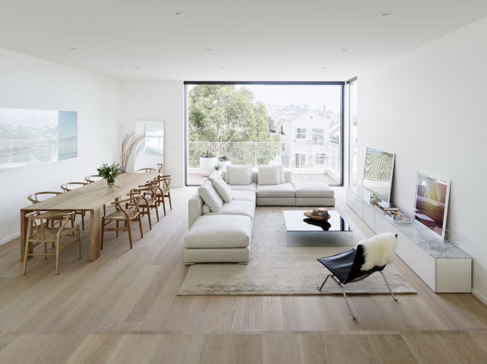
The unique facade of this Noe Valley home was the solution IwamotoScott Architecture devised to deal with different setbacks on the houses flanking the property and the downhill views to the northeast. The angled sections are highlighted by the wooden rainscreen of cedar vertical boards and black spacer boards, as well as the aluminum windows with cedar casing. The four-level home flows around a central staircase and lightwell, that brings natural illumination down through the house. The central feature also divides the living/dining and kitchen/family areas on the main living floor, and between bedroom areas for kids and the parents on the upper floor. The lower level houses a media room and guest suite, while the main floor connects to the backyard and its wood deck and stone terrace, as well as a host of other amenities. Atop the house, a rooftop deck offers bird’s eye views of downtown and the bay beyond. Last, but certainly not least, the house has a number of sustainable elements, such as a 6000-gallon rainwater capture tank under the backyard, integrated graywater treatment, and a solar array on the rooftop.
Floor-to-Ceiling Glass
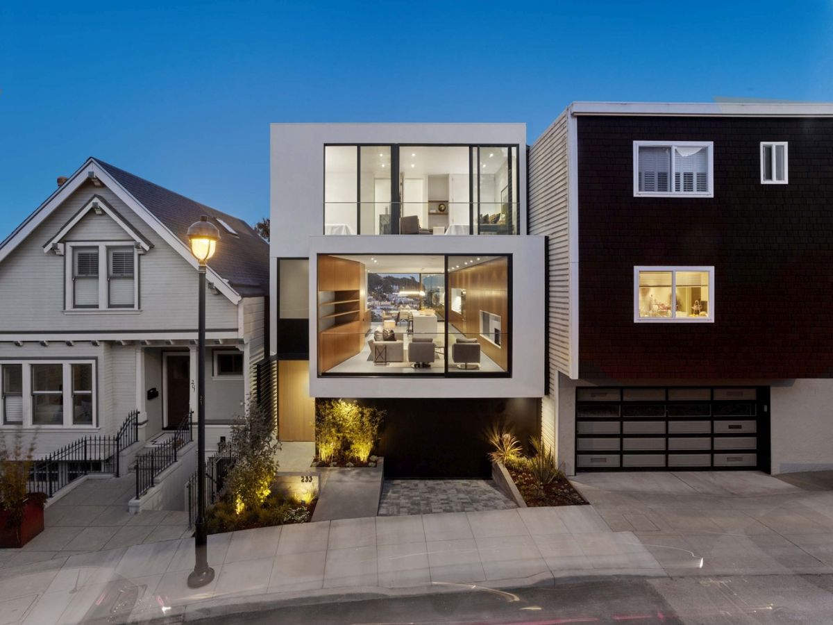
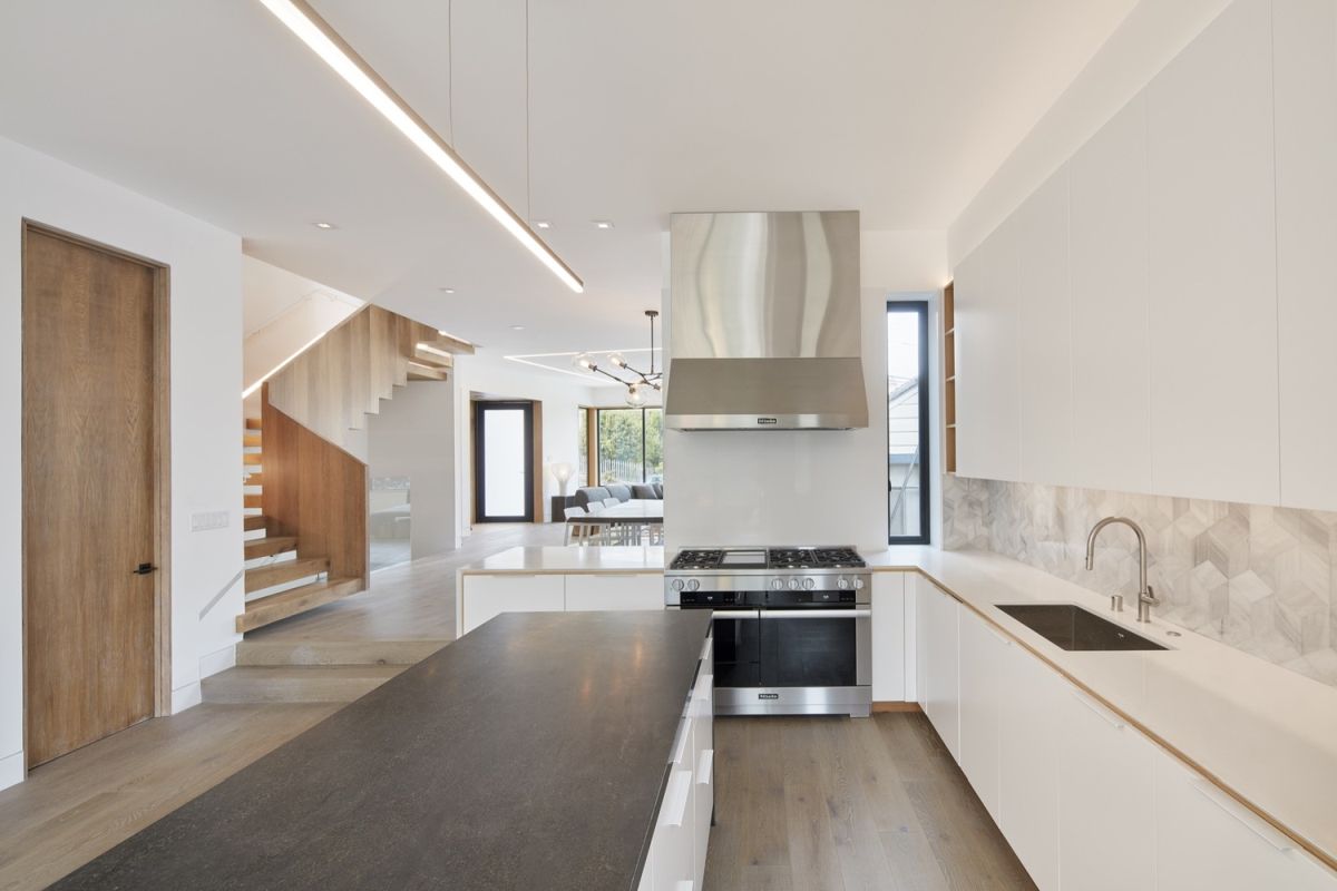
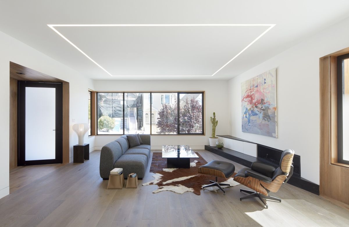
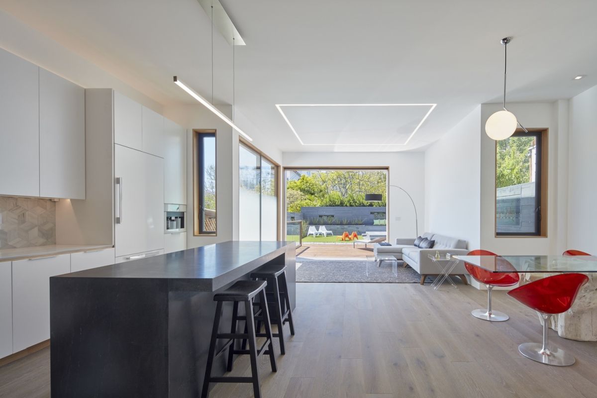
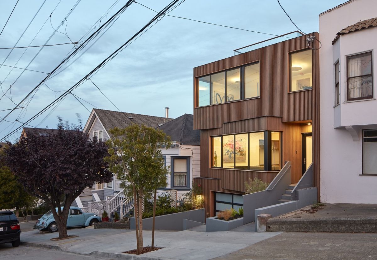
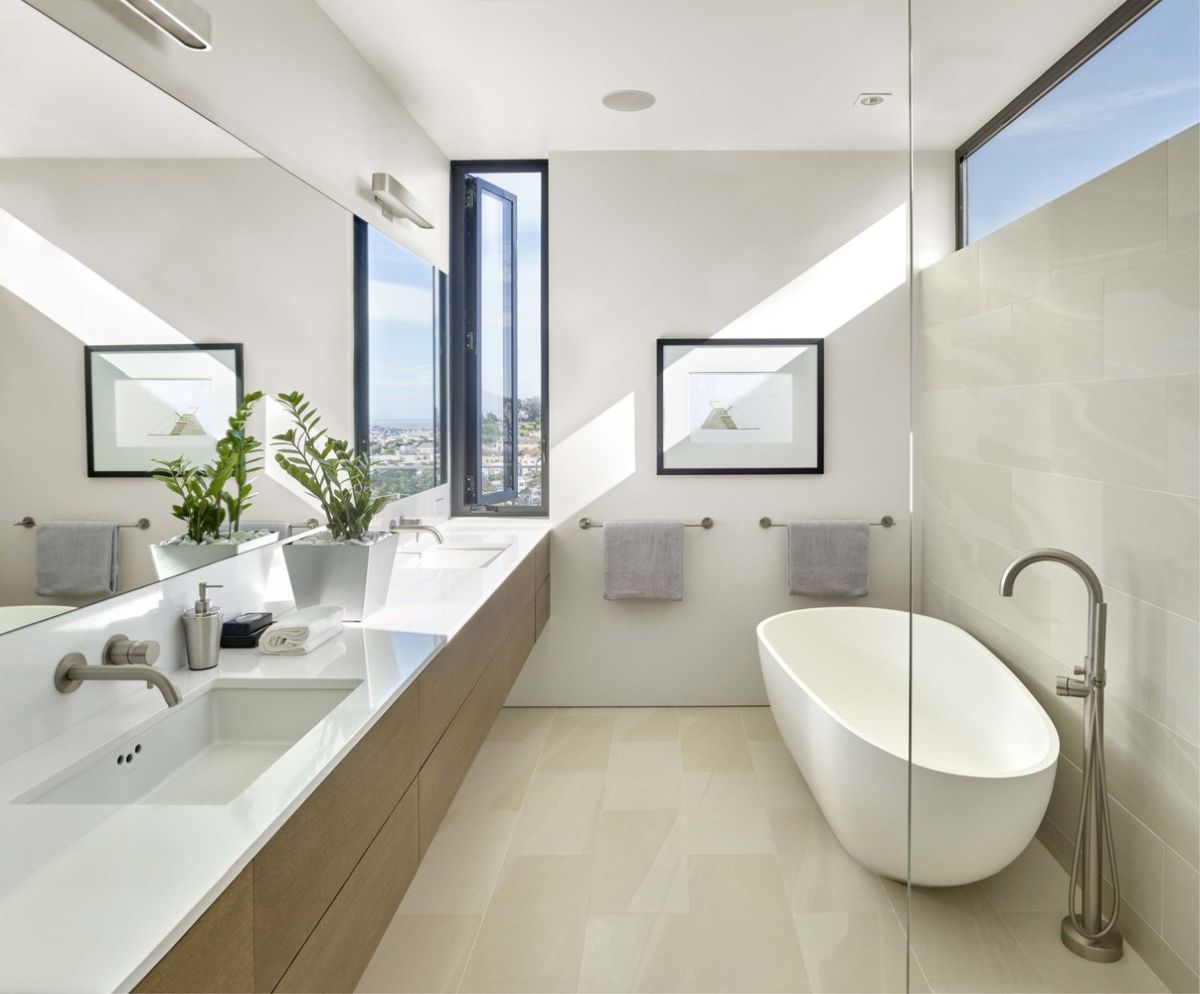
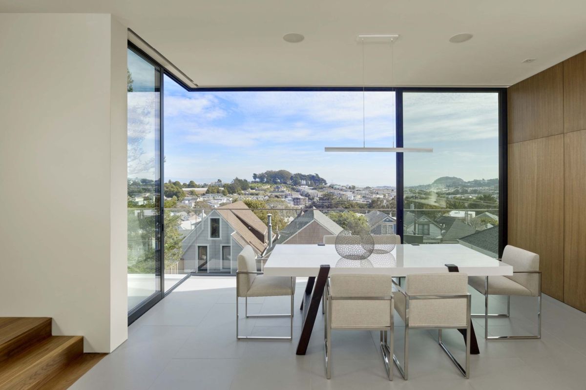
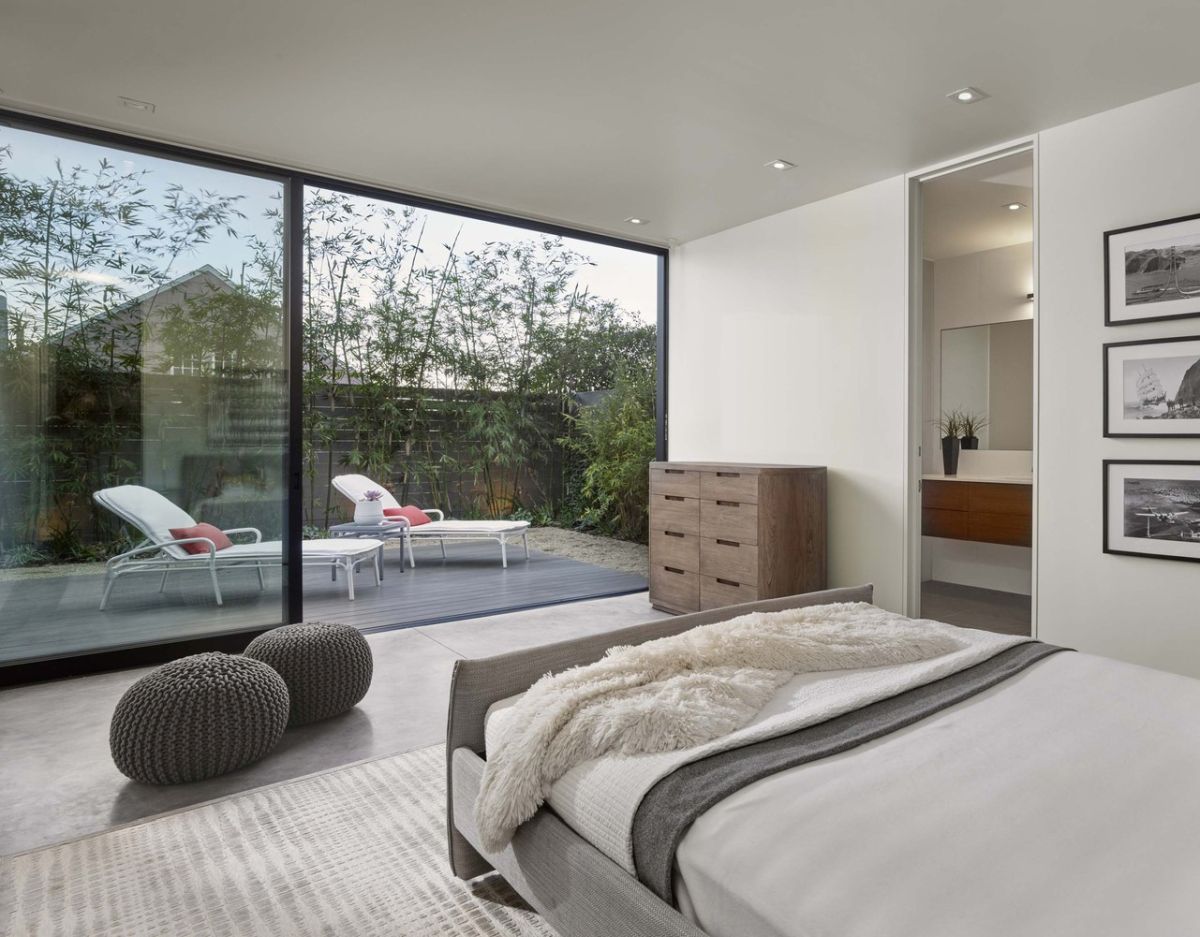
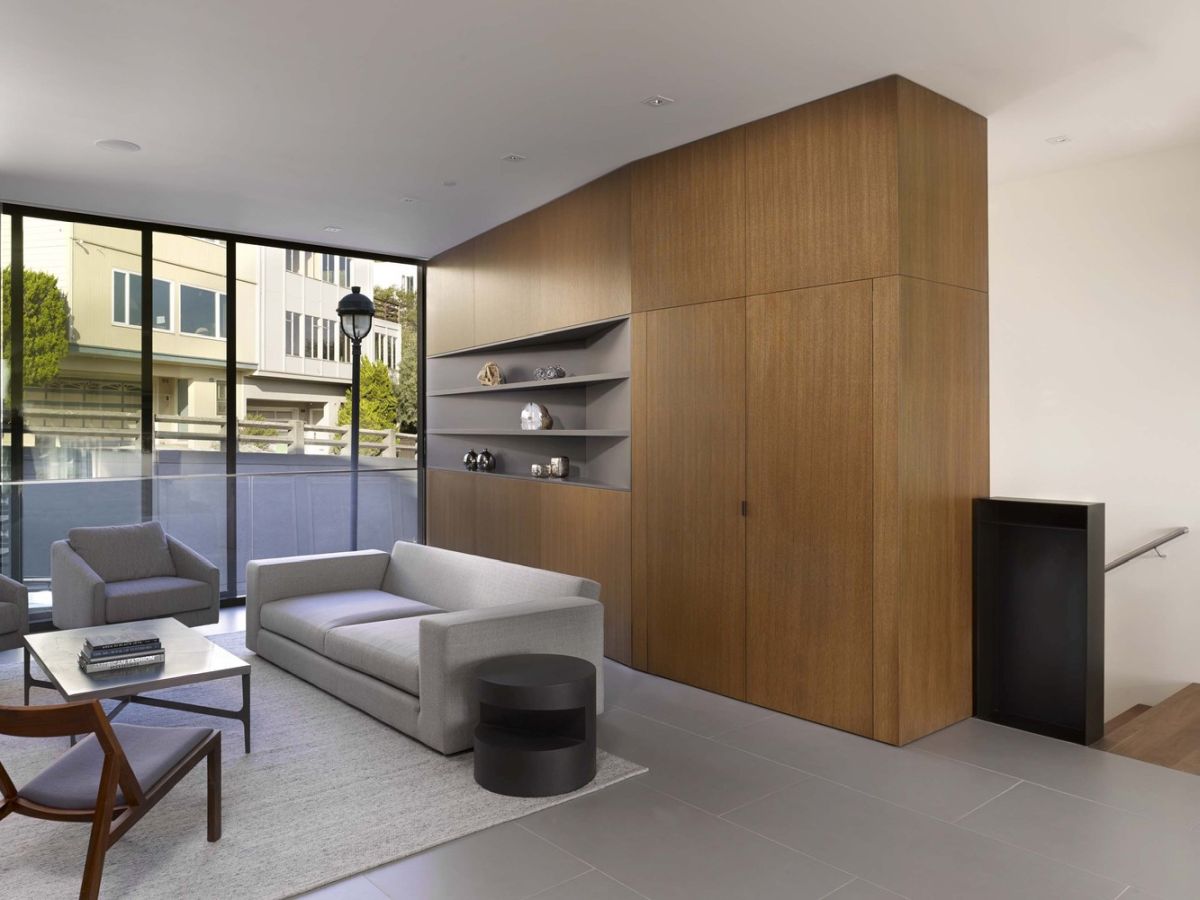
Empty lots in San Francisco are a rarity, but Michael Hennessey Architecture was fortunate to have one for their design of this Glen Park home. Floor-to-ceiling glass is a key feature for this 4000-square-foot home, which pulls in copious natural light while highlighting views of downtown and a park, as well as the split-level street out front. Inside, the open plan main living area is unified by a wall of rift-sawn oak veneer cabinetry that continues through the full length of the space that contains the living room, kitchen, and dining area. The top floor holds three bedrooms while a guestroom is located on the lower level and has direct access to the backyard. The glass on both the front and back of the house are said to challenge the “traditional notions of privacy between the public and residential realms.”
Inspired by Yoga and the Landscape
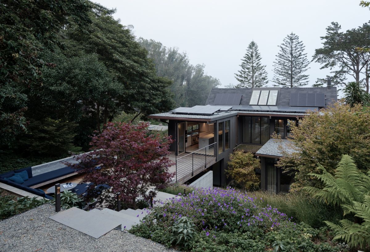
With a unique look and location, this 3,000-square-foot San Francisco home overlooks the Mount Sutro Open Reserve. Designed by Feldman Architecture, the Twin Peaks Residence is inspired by the sloping hill and gardens and was created specifically for a young couple passionate about yoga and travel. The original dark and boxy floor plan was modernized into an open style that connects with the backyard both physically and visually. The main structure was retained to highlight the high ceiling and exposed beams, along with the “Japanese ski cabin-esque design.” The residence features a pitched ceiling and skylights over a reading nook with direct access to a roof deck, that offers magnificent views of the Golden Gate Bridge. A yoga annex is combined with the master bedroom flows out into the yard. The entire home features a minimalist palette that includes special pieces and elements collected during the couple’s travels.
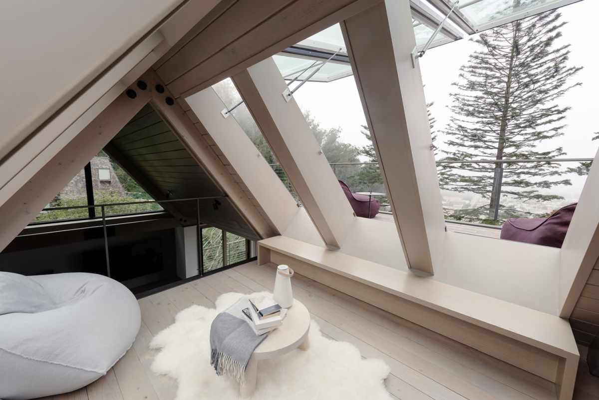
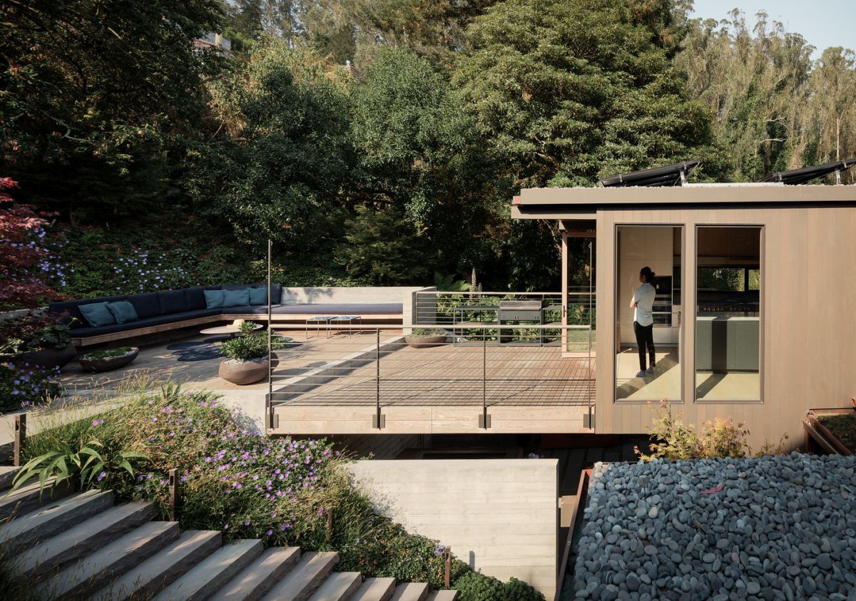
Scandinavian-Inspired Gable House
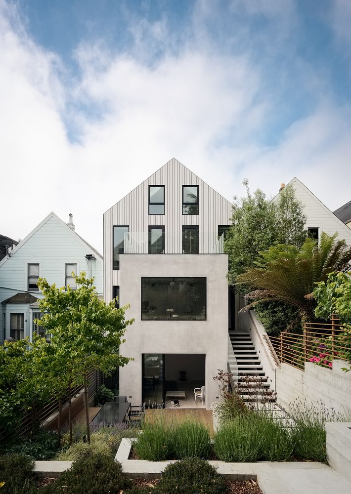
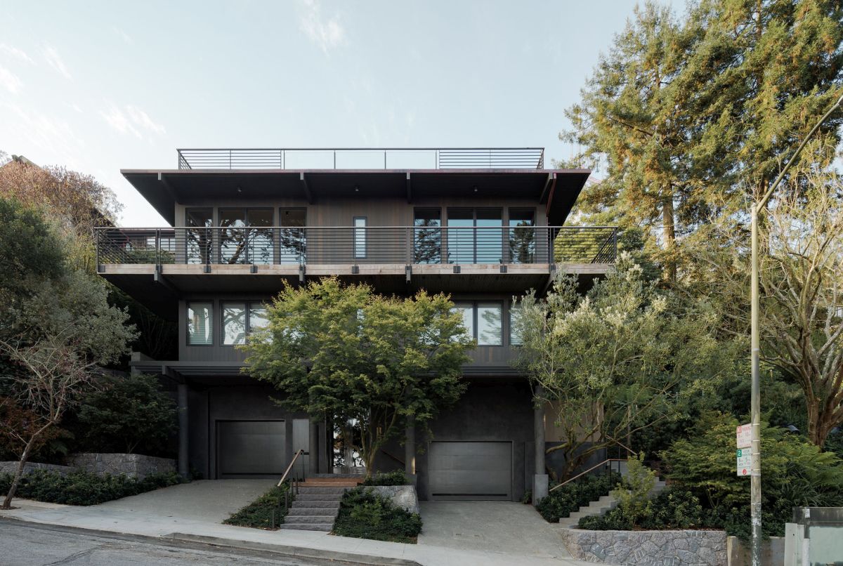
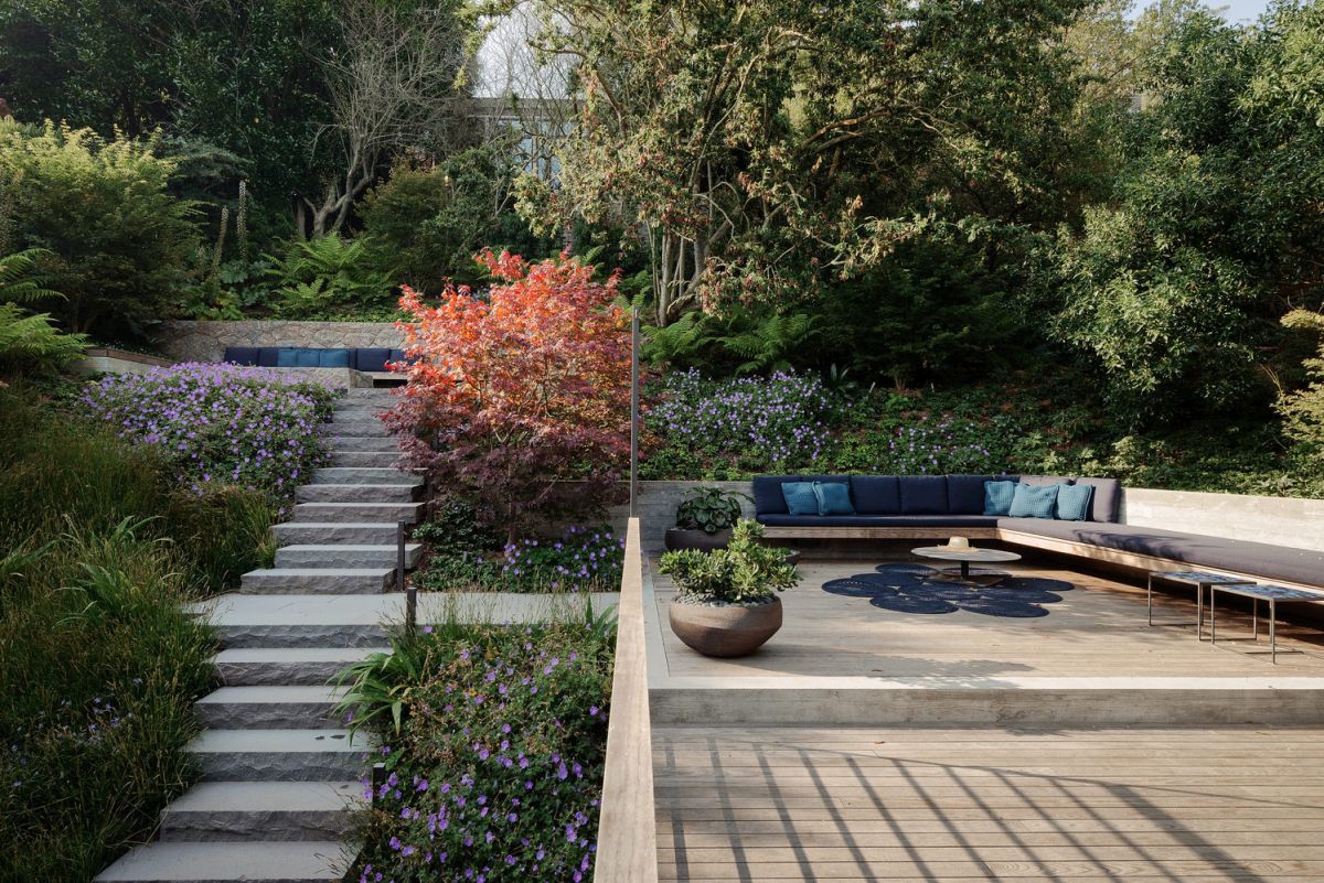
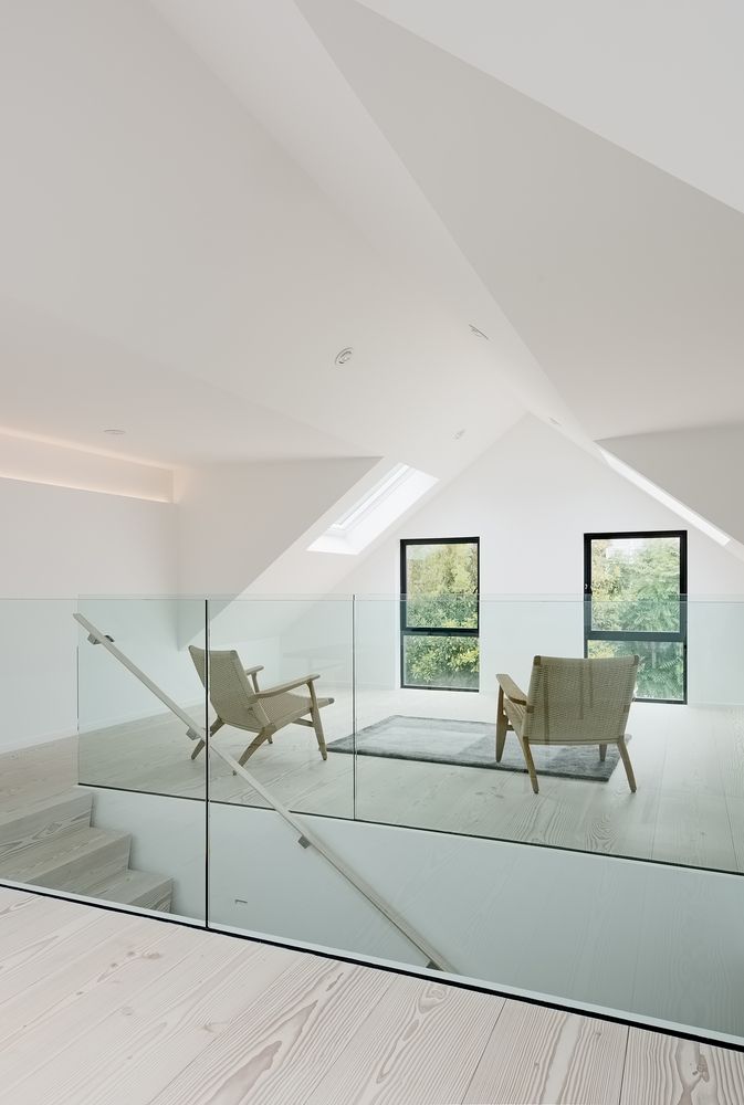
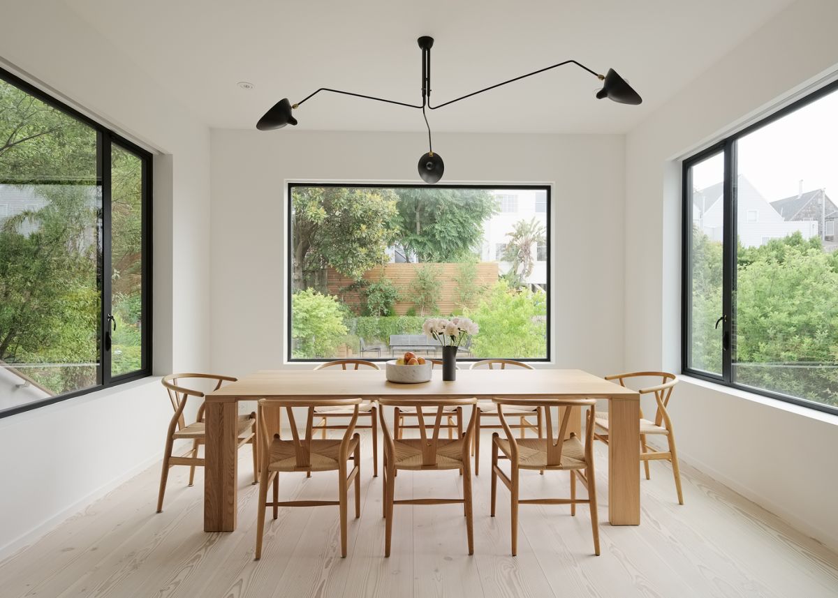
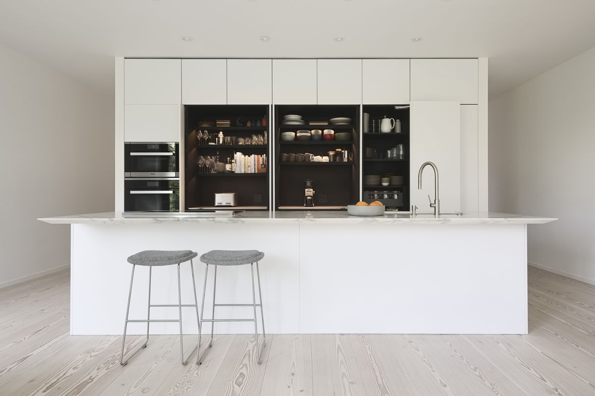
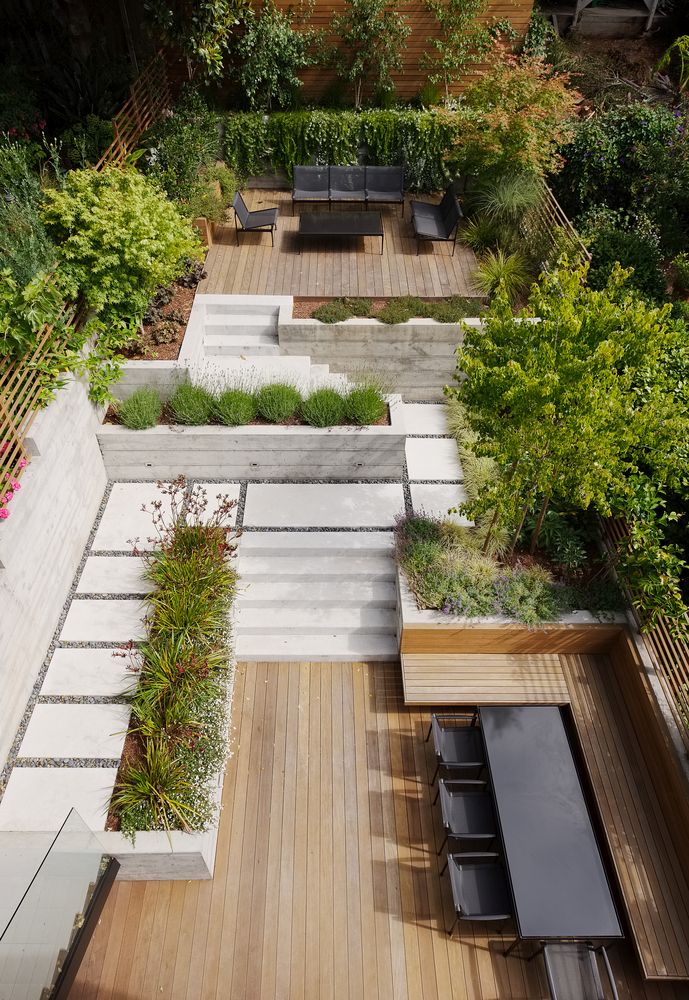
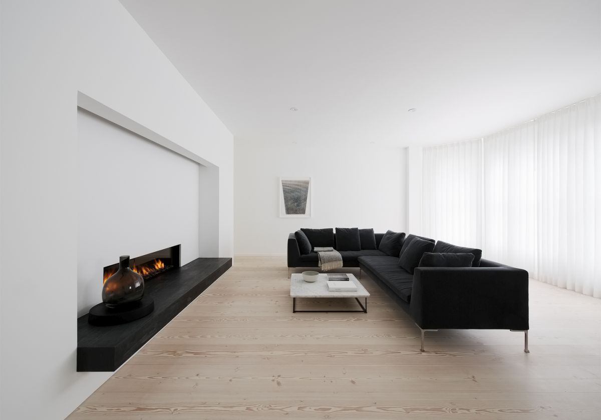
When a designer is the client, the work is more of a collaboration, which is exactly what happened when Edmonds + Lee Architects designed The Gable House. The 3,000-square-foot home is a renovated Victorian that eschews today’s open floor plans in favor of a “procession of rooms.” The roof is pitched rather than flat, the typical choice for local renovations, yet creates a light-filled and tactile home. The design and aesthetics are an homage to Scandinavian sensibilities, and some of the materials used are Scandinavian as well. The flooring is actually Dinesen Douglas Fir that was brought in from Denmark as extra long planks for a seamless living room. Throughout the utterly minimalist home, a number of elements tie the spaces together, including a glass wall that carries through the house with the staircase.
Stacked Minimalist Family Home
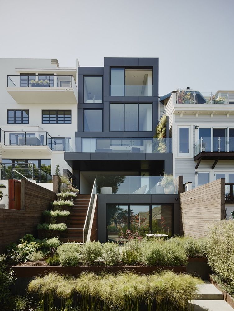
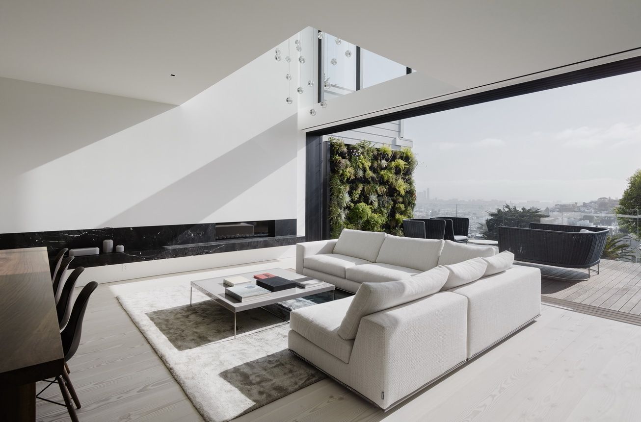
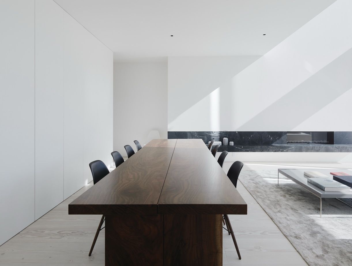
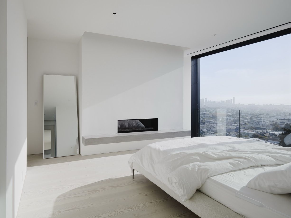
Designed to be a spacious architectural adventure, the Remember House in San Francisco’s Noe Valley is focused on the concept of vertical stacking. Edmonds + Lee Architects devised a design that sections the house, which carried a small cost in terms of usable space but paid huge dividends in better architecture. The home is centered around double-height spaces as well as a central staircase. The interior spaces have a white-on-white palette that meets the homeowner’s desire for a spare minimalist aesthetic, which seamlessly ties them all together and allows the focus to be on the art and the furnishings. Large windows and glass sliders allow the residents to enjoy the views from many of the rooms. As far as color is concerned, the exterior of the house is the opposite, clad in a dark material to distinguish it from the homes on either side.
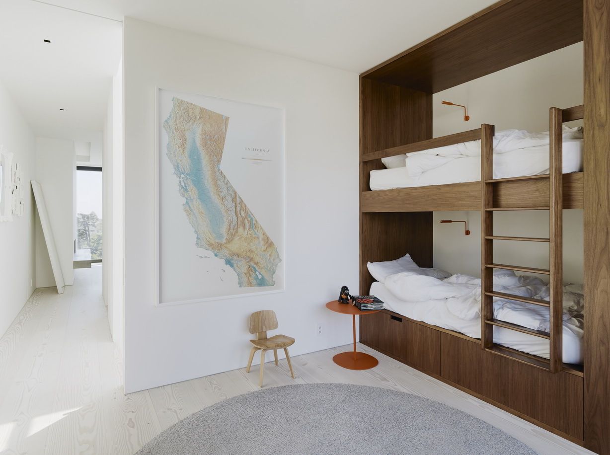
Sophisticated Telegraph Hill Home
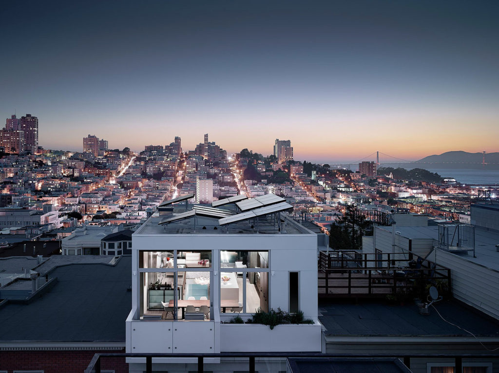
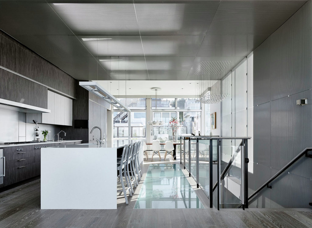
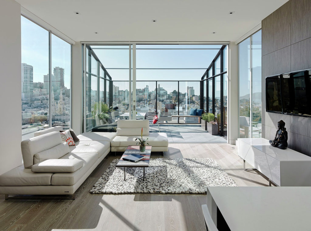
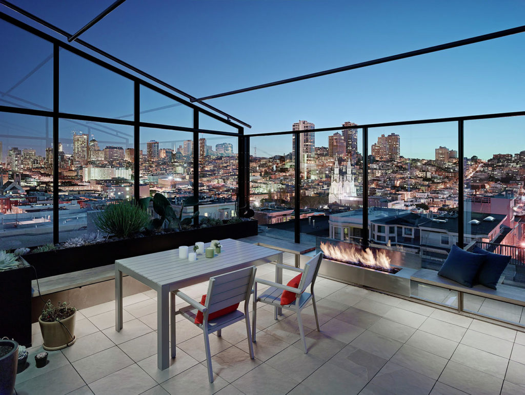
Perched atop San Francisco’s Telegraph Hill, this tall-ceilinged residence went from stuccoed and disjointed to a spectacular modern design inside and out. Feldman Architecture renovated the house, starting with its exterior, now finished in a sophisticated gray limestone cladding. Metal framed windows add panache and the garage also is highlighted with metal. The entire uppermost level was transformed into one great room, spectacularly fitted with large windows on three sides. Skylights being in addittional natural light and all along the main staircase, the architects added a perforated screen to filter light from the big window that faces south. Best of all, a deck that joins to the living area was added for enjoying the unparalleled views, enhanced by a fireplace, and an operable awning for shade.
The post Modern Homes in San Francisco That Will Make You Want to Move There appeared first on Home Decorating Trends – Homedit.
