35 Open Concept Kitchen Designs That Really Work
The idea of an open concept kitchen is not at all unusual, especially in the case of modern and contemporary homes. Nowadays the tendency is to make the interior as fluid as possible and to simplify the structure and the décor as much as possible without sacrificing the functionality. It’s why eliminating the barrier between the kitchen and the social spaces is a practical move.
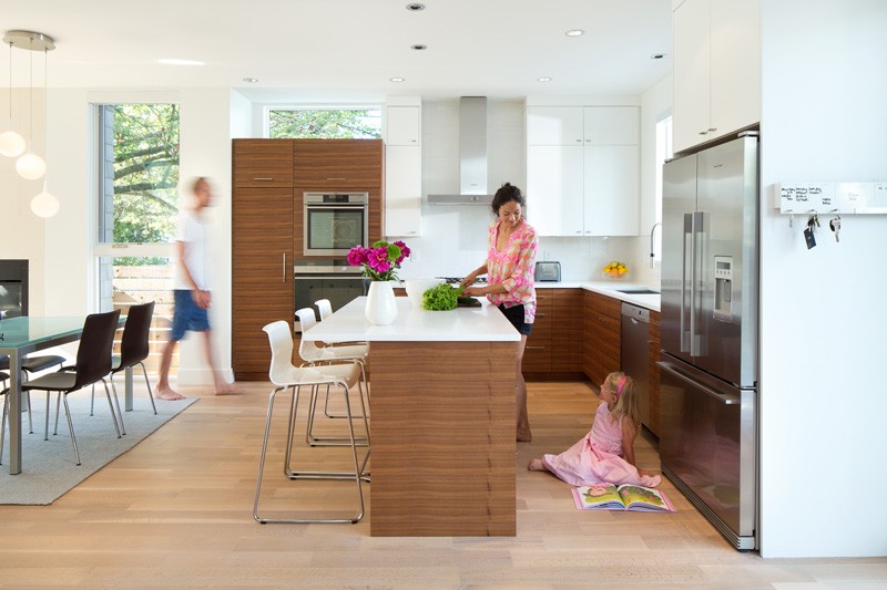
Most often, the kitchen is linked to the dining area and the two spaces are adjacent. The dining table usually becomes a buffer zone between the kitchen and the living/ seating area. This house in Vancouver designed by architect Randy Bens is a good example.

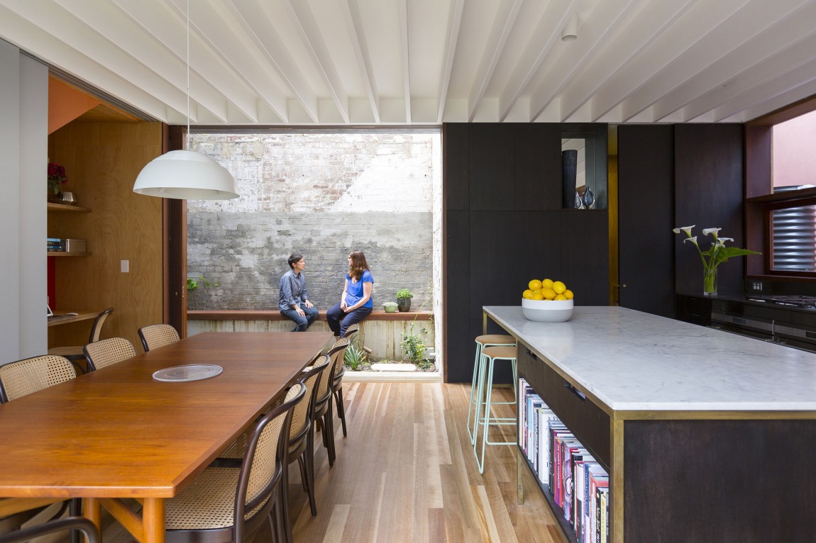
Sometimes the three functions are not necessarily all part of the same open floor plan. The kitchen and the dining space, because of their similarities, can form a single zone while the other social areas form another. It’s a concept that Aileen Sage Architects used when designing the Courtyard House, one of the many kitchen floor plans that complement modern homes.
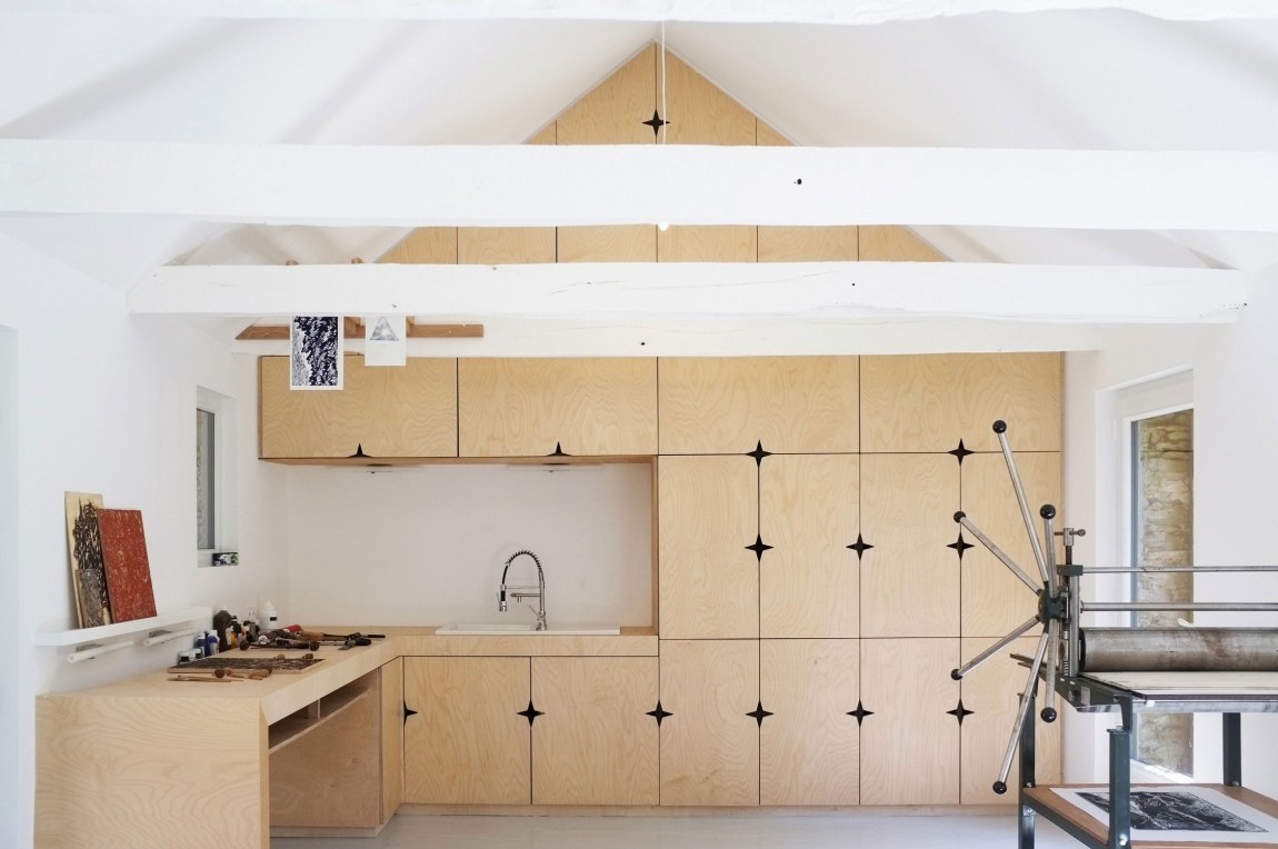
Open concept kitchens are a practical design solution in the case of small homes. Located in Sizun, France, this house by Modal Architecture has a small and compact kitchen that makes the most of every little nook and cranny. It has custom cabinetry that occupies an entire wall and follows the lines of the slanted roof.

The Riverview Way residence by Tom Hurt Architecture illustrates how flexible the design of an open concept kitchen can be. Without fixed restrictions and walls, the kitchen can be better organized and thus it can be more functional and user-friendly.

Sometimes a little bit of privacy in the kitchen, dining room or living area can be useful. Without any separating walls, this can be a problem. But Smart Design Studio found a viable solution when designing the Heritage residence. The large open floor plan features curtains which can separate the different functions if needed.
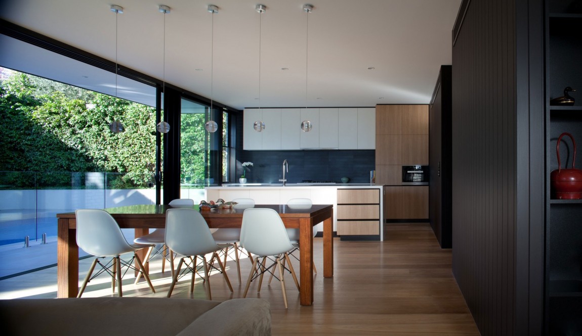
The natural light and the views are important, even in the case of the kitchen. It’s why the team from Chan Architecture placed the kitchen, the dining area and the living space parallel to each other, along a glass wall and sliding door that opens this entire zone to the pool and the exterior.

The Bolton Residence by NatureHumaine offers splendid views but the interior spaces are not exactly large. The kitchen is quite small but, because it has an open concept design, it feels spacious. Also, all the built-in appliances and the simple color palette in combination with the sculptural ceiling create a refined look.

Even though part of an open floor plan, both the kitchen and the dining space feel, in this case, like private spaces. They fit in a nook in continuation of the living spaces and this offers them some extra privacy. Floor-to-ceiling windows open the spaces to the outdoors. This is just a portion of the beautiful home designed by Dorrington Atcheson Architects in Auckland, New Zeeland.

Sometimes an open concept kitchen can be the main attraction without even standing out that much. It’s case of the City Beach House designed by Cambuild and Banham Architects. It’s large and spacious and it’s all white which allows it to blend in and to let the dining table become the center of attention.

In a lot of cases, even though the kitchen is a part of the open floor plan and there are no walls between the zones, there’s still a clear visual distinction between the spaces. This distinction is highlighted here by Tense Architecture Network through the use of different materials, finishes and colors.

The biggest problem with open concept kitchens is that they don’t usually feel warm and engaging. Yet that’s not true in the case of projects such as the Wairau Valley Residence by Parsonson Architects. Here the kitchen is both inviting and airy thanks to the large windows and the selection of finishes.

Glen 2961 by Saota is a project with a large, open kitchen in an even larger open floor plan. A faux wooden ceiling delimitates the area as a distinct zone yet the elements included it its design make it an eclectic space. The staircase acts as a space divider.

It may be small, but this kitchen is really bright and cheerful. Located in a 1902 building in Stockholm, the apartment of which it’s a part of was reconfigured from a two-bedroom into a one-bedroom home and, as a result, the kitchen became a part of the living space. It has open shelves, built-in appliances and enough storage despite the dimensions.

This luxury beach apartment by Daniel Hasson, on the other hand, doesn’t need bright colors and clever storage solutions to make the kitchen appealing and functional. The huge windows and panoramic views take on that role.
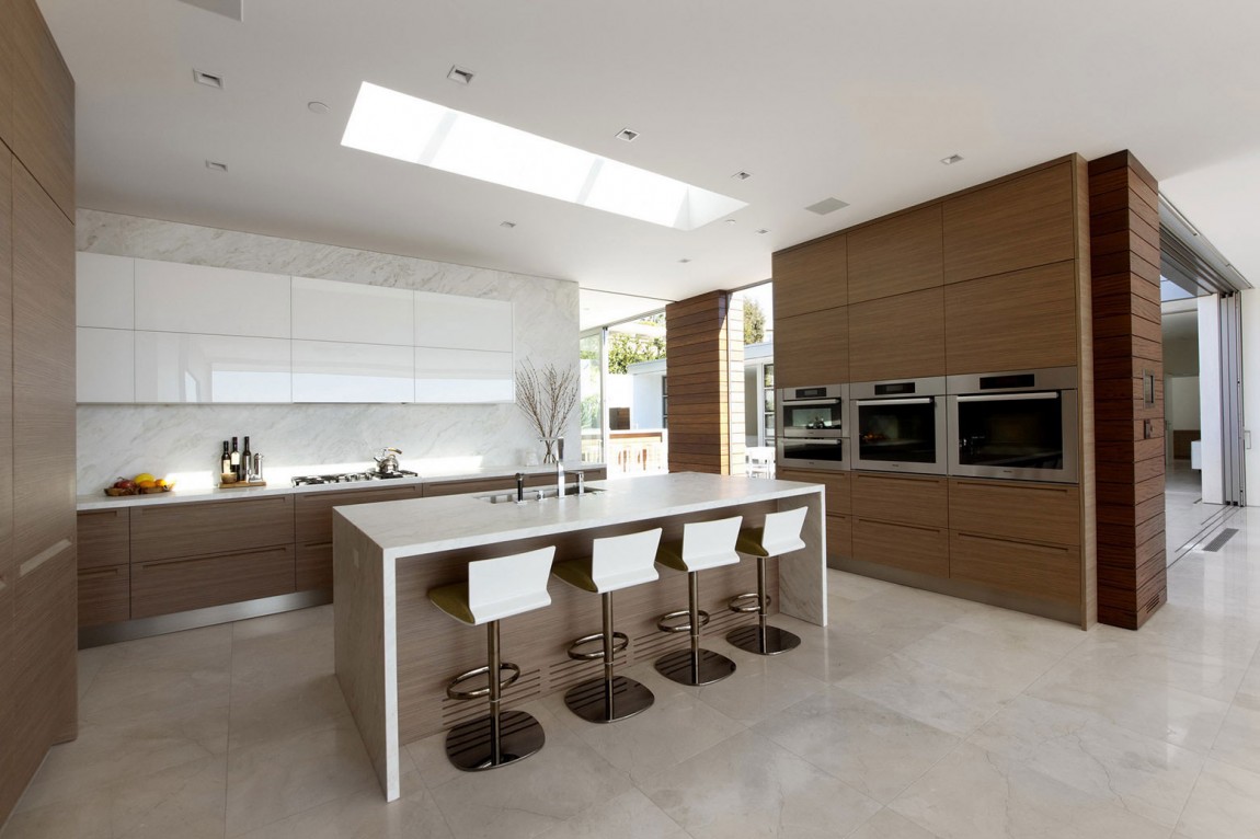
The kitchen island usually serves as a barrier between the kitchen workspace and the rest of the open floor plan. The space designed by Ehrlich Architects for the McElroy Residence has a large kitchen island that coordinates with the cabinetry in a really elegant way.

The curved is a simple but interesting feature for both the kitchen and the other areas. Again, the kitchen island is a centerpiece and this contemporary home by C+M Studio relies on its simple but imposing design.
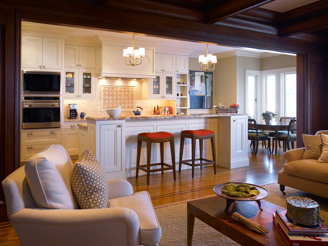
Whether it’s a minimalist, contemporary residence or a traditional home such as this one by Gast Architects, an open kitchen can be a good design solution if the layout allows it. This kitchen even has a lovely breakfast nook.

Christine Kelly of Crafted Architecture gave the island in this contemporary kitchen the function of space divider. It doubles as a bar and can be useful I a variety of ways. There are no other elements that could separate the kitchen and the living area except maybe for the hanging pendant lamps. In addition, the corner kitchen cabinets are a very practical feature in this case.

But not all open concept kitchens feature islands or bars. For example, there are no visual or physical delimitations between the kitchen and the rest of the open plan in this studio apartment by FILD. The functions flow into one another in a really casual and seamless manner.

Light and dark shades complement each other in the kitchen created by Smart Design Studio. But the colors and the overall simplicity are secondary to the beauty of the space in general. In fact, the whole kitchen seems more like an extension of the classy dining area, even though it’s a large and stylish space itself. The grey kitchen cabinets harmonize the whole space beautifully.
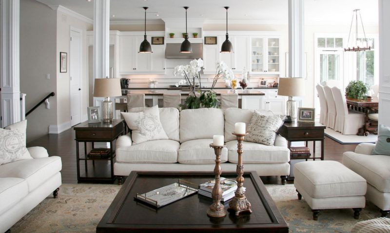
Sometimes an open concept kitchen can be an extension of the living space is it blends in really well. This is a suitable example. The traditional residence by Staples Design Group was envisioned the whole open floor plan as a bright and inviting space and the kitchen was designed with white cabinetry and beige accents.

With a design somewhere in between rustic and modern, the kitchen designed by Balance Associates Architects features wooden cabinetry complemented by stainless steel and black elements including the backsplash and the kitchen island countertop.

Unless a more minimalist look is preferred, natural and organic finishes and colors are usually used when designing open kitchens. This helps create a warm and welcoming ambiance, allowing the spaces to feel comfortable and to form an inviting social zone. Wooden beams along the ceiling serve this purpose in the case of the residence designed by Kaplan Thompson Architects.

In the case of beach-style homes, those warm, earthy colors and materials are replaced with shades of blue and white complemented by certain specific textures. Even though the ceiling fans are actually a part of the living room design in this case, they also influence the kitchen ambiance.
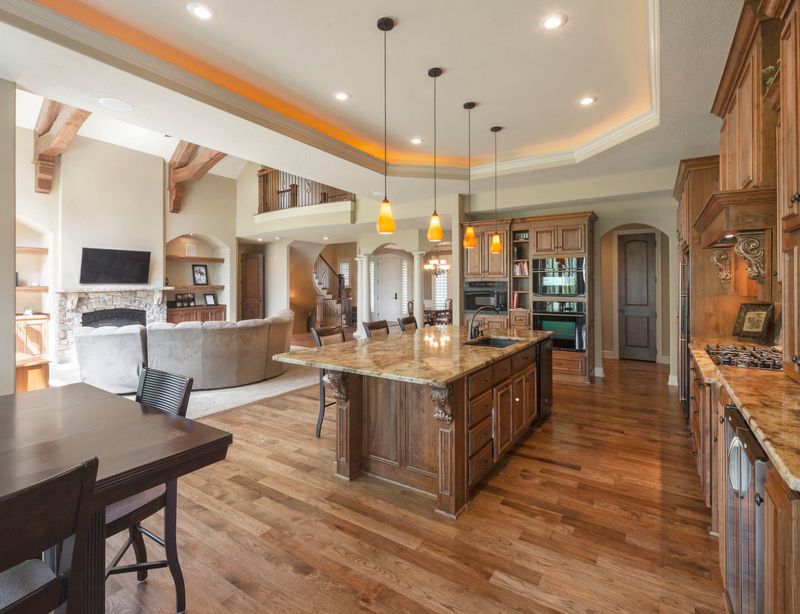
The use of oak wood for the cabinetry, the kitchen island and the floor allows this open concept kitchen by Starr Homes to extend a lot further than in most cases. It occupies a large portion of the open floor plan, also including the dining area. The ceiling design also plays an important role in the overall compartmentalization of the space.

In order for an open concept kitchen design to work the transition between the different spaces needs to be as seamless as possible. That’s definitely the case here. The kitchen, dining area and living room are beautifully combined into one large and open space with wooden flooring and timeless materials and colors. This entire apartment interior was created by Fimera Design Studio.

The design of this particular kitchen created by JUMA architects is quite impressive even though it’s also very simple. The dark ceiling and he massive wooden wall unit add a very rich and elegant feel and the large island is beautifully designed with space for a bar stool, ensuring a natural transition towards the rest of the floor plan.

Another gorgeous kitchen was designed by Perathoner Architects and this time the emphasis is not on the interior design but rather on the magnificent views which are framed by the large floor-to-ceiling windows. The black island features a built-in sink and a cooking station and is position in a way that exposes it to the beautiful landscape.

The curved lines and edges of this kitchen soften the minimalism of its design and in combination with all the rich wood used throughout the space they create a very inviting and comfortable ambiance. The island is the centerpiece of the room and introduces unexpected materials and finishes into the design. This is an interior create by studio Bean Buro.

In the context of this design created by EVA architects the kitchen, dining area and living room are part of a single large volume but at the same time they each enjoy their individuality. The kitchen for example is very simple and lacks any bold colors or unexpected finishes. It does however transition into the double-height dining area in a very seamless and natural manner.

The kitchen inside this elegant apartment by interior design studio Coblonal has an open concept design, closely connected to the dining area and the lounge space. Although it’s part of a whole it also has a lot of individuality. In fact, it’s very much its own contained area, with all the appliances and all the storage modules and everything else combined into a cohesive unit.

This beautiful waterfront villa completed by studio Design Haus Liberty enjoys a strong connection with the lush surroundings which is emphasized by the large windows, curved glass walls and sliding glass doors. The open kitchen transitions into a casual dining area with a marble table and both spaces have direct access to a minimalist covered deck.

In theory, an all-gray kitchen would look rather bland, boring and monotonous. However, that’s definitely not always the case, as demonstrated by this sophisticated interior designed by CMT architetti. The kitchen, dining area and living room share a big open floor plan and use minimalism in their favor in order to create a welcoming and refined décor and ambiance.

This is such a cozy-looking kitchen. It’s large and open and it includes a dining area with a bench and what looks like a reclaimed wood table. The island has a wooden base, a sleek white top and a double sink and more wood was used for all the cabinetry, the flooring and additional furniture. The design is done by studio Bradley VanDerStraeten.

The main idea behind the interior design created by ilya Taslitskiy for this beautiful apartment was to create a large common area which gives the impression of several separate rooms when in fact they’re all combined into one. As such, the kitchen looks and feels like its own separate room but remains open to the dining room and the living area.
The post 35 Open Concept Kitchen Designs That Really Work appeared first on Home Decorating Trends – Homedit.
