This San Francisco Apartment Blurs the Line Between Indoor and Outdoor Space
Smack in the middle of downtown San Francisco, a very basic apartment was converted into a spectacular space that overlooks the city. The residence is located on 19th street and required Sidell Pakravan Architects to do extensive renovation to the top floor of an existing unit and expansion of a penthouse. Combining two spaces into the apartment helped create a unique relationship between the residence and its surrounding urban context. This minimalist home is big on style, with a focus on comfort and lack of clutter.

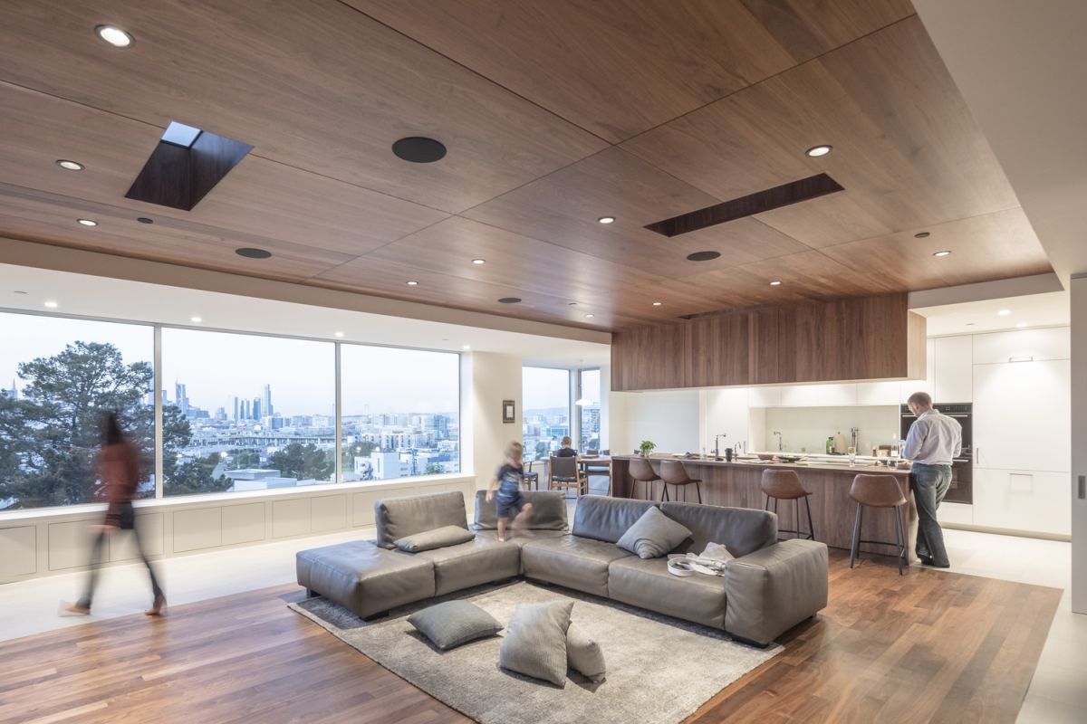
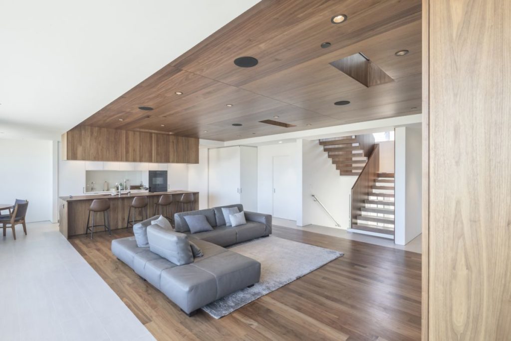
With lots of low ceiling heights, the addition of vertical elements transformed the space. One area controls vertical movement through the home and a second encompasses the main living area and spans upward, creating a large interior living space on the roof of the apartment. The kitchen and family area is defined by a warm-hued wood floor and ceiling, which ties in with the facing on the upper cabinets and breakfast bar. Sightlines throughout the space are clear, with no pendants or chandeliers to block the view. All lighting is recessed and extra daylight is brought in through skylights.
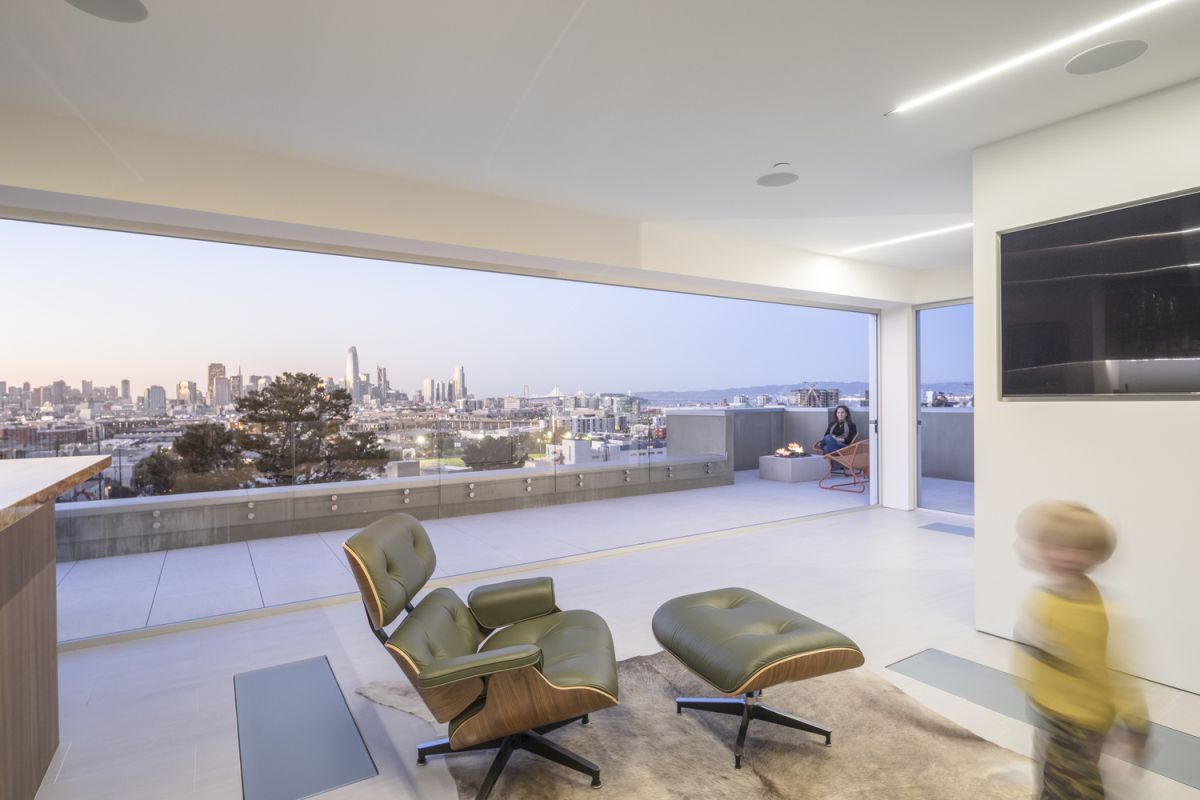
On the main level, views are framed by a major window that runs the length of the penthouse through the large aperture, which opens completely to meld the interior with the exterior realms. The entire space is filled with stunning mid-century pieces like this chair and ottoman. The sleek and classic design is perfect for the stylish space. The architects enhanced the view of the San Francisco skyline by removing the dated ornamentation that was previously used on the roof, opening up the view, whether the glass is closed or not.
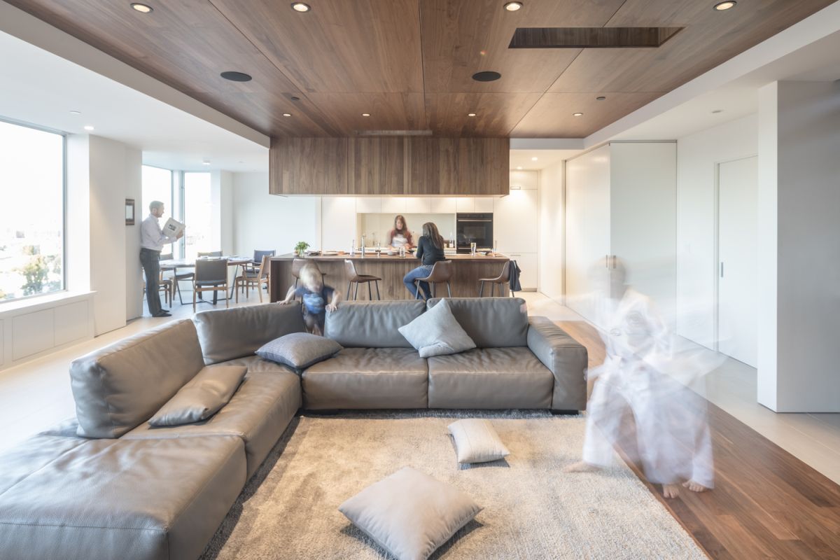
Despite the open design, the apartment still feels very cozy. A sectional sofa is both sophisticated and casual and its proximity to the kitchen area is ideal for a family or for couples. The open-plan space is casual, functional as well as design forward. A neutral palette makes the space very refined and modern despite its casual nature. As a matter of fact, this type of flexible, functional space is exactly what clients look for when working with San Francisco designers. The furnishings chosen are casual and family-friendly, especially this leather sectional that dominates the room. In the kitchen, chairs are mid-century style, which suits the space very well. All parts of the main living area have marvelous flow, with storage and other spaces concealed by sliding and folding doors.
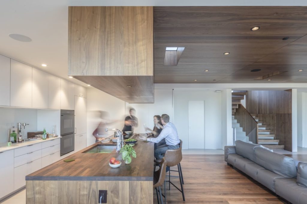
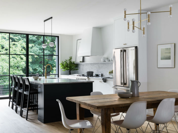
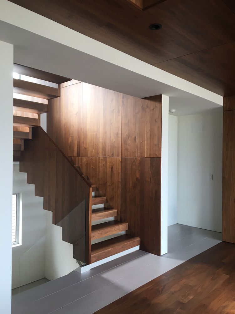
The neutral, clean walls and kitchen elements emphasize the feeling of lightness and space in the residence. Sleek appliances and minimal hardware on the cabinetry maintain the pared-down vibe in the kitchen area. When the surrounding view is stunning, interiors such as this one help frame the view and don’t compete. The use of wood as a unifying element continues in the stairwell on the walls and on the risers, which are are individual pieces to allow light to filter through from the windows.
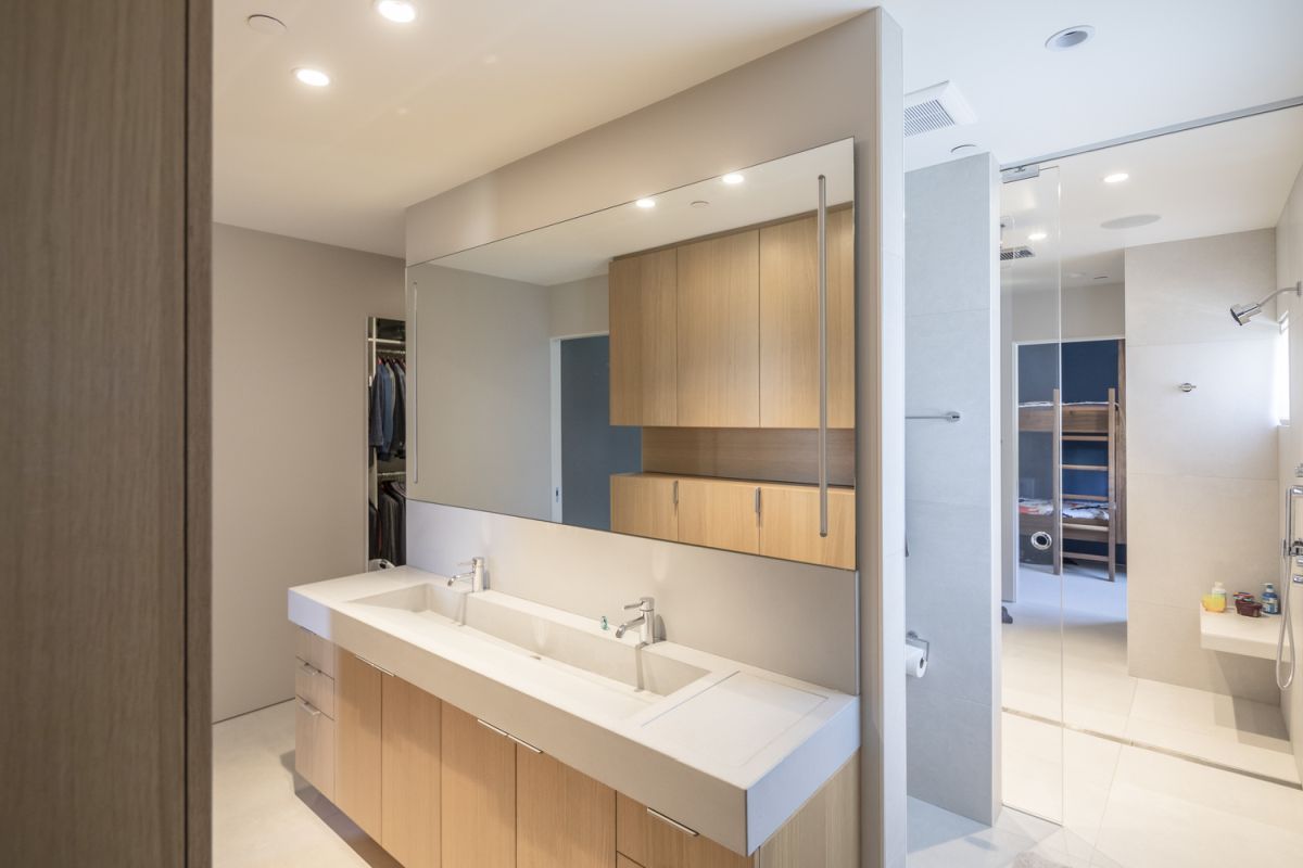
Carrying through the modern and clean lines of the main living spaces, the architects gave the bathroom distinct areas for the most functionality. The large vanity has a single long basin with two taps to accommodate multiple family members. The toilet is set into a separate alcove and the walk-in shower is spacious and bright. Cabinets under the vanity as well as on the facing wall provide ample storage for towels, personal care products and other necessities, helping to minimize visual clutter. Once again, lighting is confined to the ceiling, which makes the room feel larger and more open.
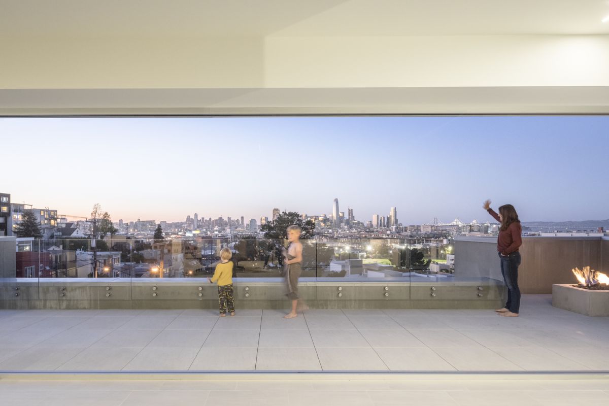
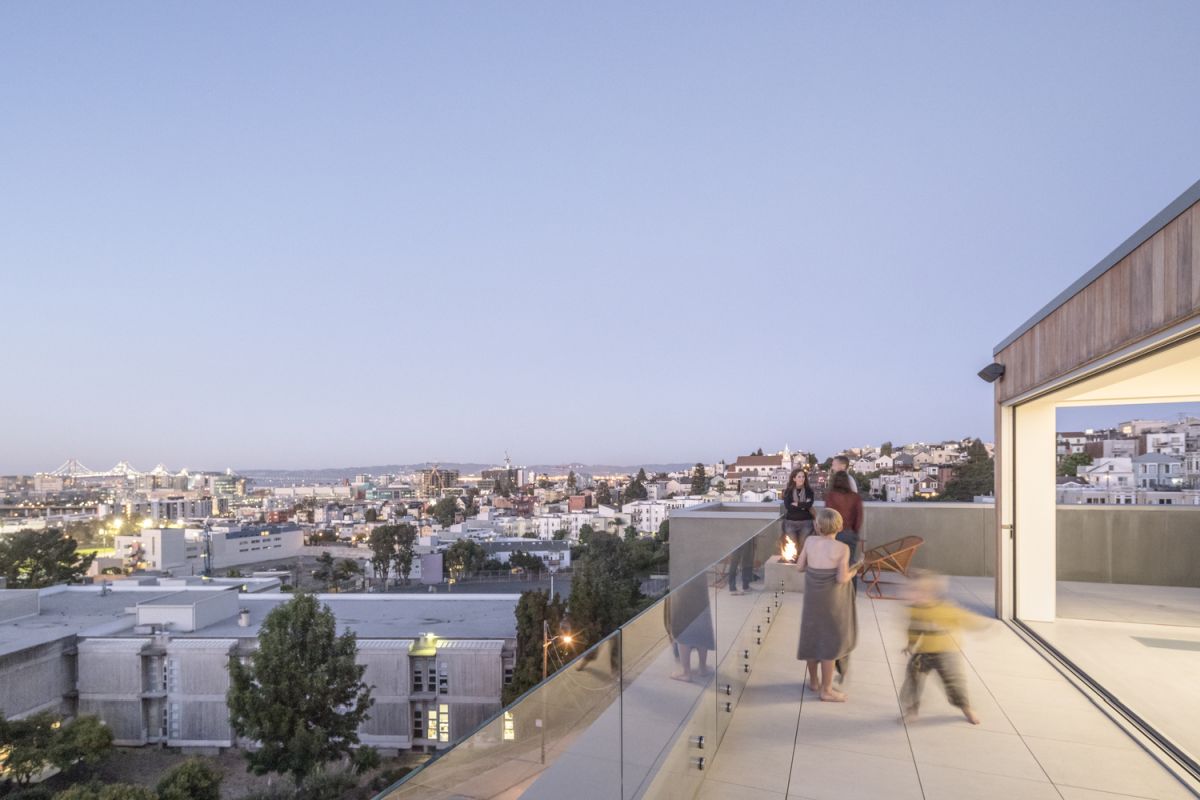
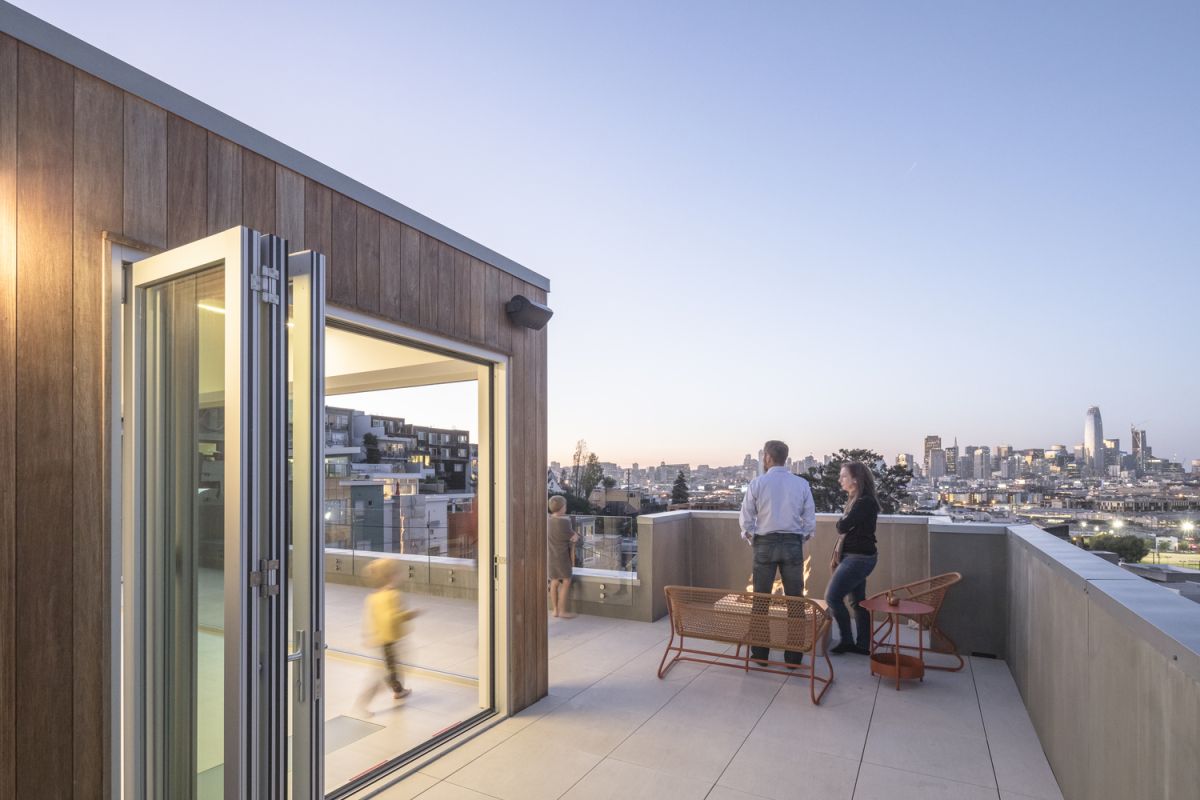
From the inside or outdoors on the roof, the city skyline is the key feature. Plenty of space along the length of the roof provides room for children to play and is also an ideal area for elegant entertaining — casual or formal. The glass wall opens up, dissolving the boundaries between the roof and the indoor living space, creating a single, spectacular area for all kinds of enjoyment. The built-in gas firepit allows the homeowner to enjoy cooler evenings on the roof as well. extending the usability of the outdoor space.
The post This San Francisco Apartment Blurs the Line Between Indoor and Outdoor Space appeared first on Home Decorating Trends – Homedit.
